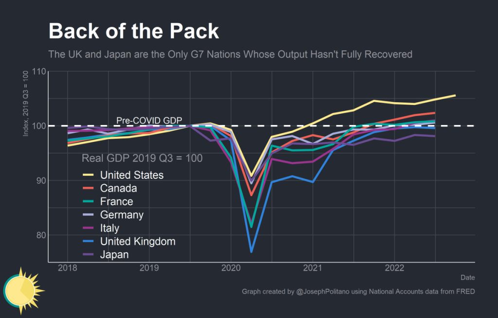
How well have countries recovered from the declines in the pandemic? It’s actually a bit difficult to answer that question, because it depends on how you measure it. Even if we agree that GDP is the best measure, how do we measure recovery? One possibility is to simply ask whether the country has exceeded its pre-pandemic GDP level. Exactly which quarter to use as the baseline is debatable, but here is a chart that Joseph Politano made for G7 countries using the 3rd quarter of 2019 as the baseline.
But we know that absent the pandemic, most countries would have continued growing (absent a recession for some other reason), so just getting back to pre-pandemic levels isn’t necessarily a full recovery. But how much growth should we have expected? It’s a hard question, but here’s a chart along those lines from the Washington Post, using the CBO’s measure of “potential GDP” as what growth might have looked like.

Using either of these approaches, it appears that the US has recovered pretty well, although it would be nice to have a comparison across countries using the same approach as the Washington Post chart does. While there is no consistent measure similar to CBO’s potential GDP figure for all countries, a simple approach is to project growth forward using the average pre-pandemic growth rate. I have done so for a number of countries, using the average growth rate from 2017-2019. In the following charts, the blue line is actual GDP levels, and the orange line is projecting the 2017-2019 growth rate forward. Sorry that I can’t easily fit all these into one chart, so here come the charts!
First, the G7 countries. Note: for Japan I used the average rate stopping in the 3rd quarter of 2019, since they had a big dip in the 4th quarter of 2019 making the chart hard to interpret. For all others, my baseline is the 4th quarter of 2019. Also, I stop all of the data in the 3rd quarter of 2022, even though 4th quarter data is starting to come out for some countries (I’m using OECD data for all countries).
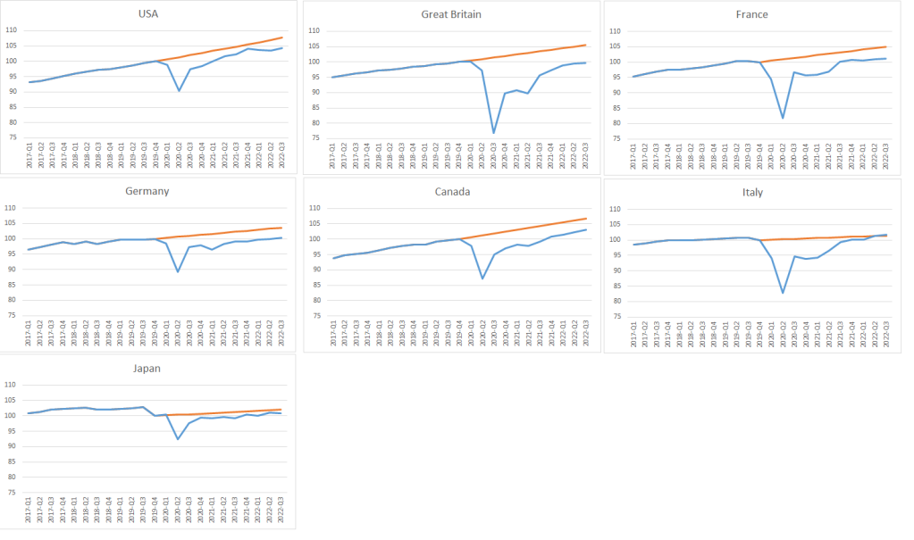
By this measure the US has done pretty well, though we not quite back to trend if we use this approach versus the CBO “potential GDP” measure. Japan and Italy seem to be pretty close, but that’s for a peculiar reason: they have been very slow growing countries in recent years, so my “projected growth rate” is very low for them. Also for each of these countries, we could measure the cumulative lost GDP, in other words, the total value of the area underneath the orange line. Here’s what it looks like for these countries, if we measure in terms of a percent of one year’s GDP:
- US: 10.1%
- Great Britain: 24.3%
- France: 16.3%
- Germany: 11.5%
- Canada: 15.1%
- Italy: 12.4%
- Japan: 5.4%
Again, interpret those numbers as lost GDP as a percent of a single year’s GDP. So the smaller, the better. The US also comes out looking pretty good with this approach, and Great Britain especially bad. Italy’s performance looks pretty good, but remember we’re not assuming they would have grown very much (ditto for Japan).
Here’s another set of countries, selected not totally at random by me.
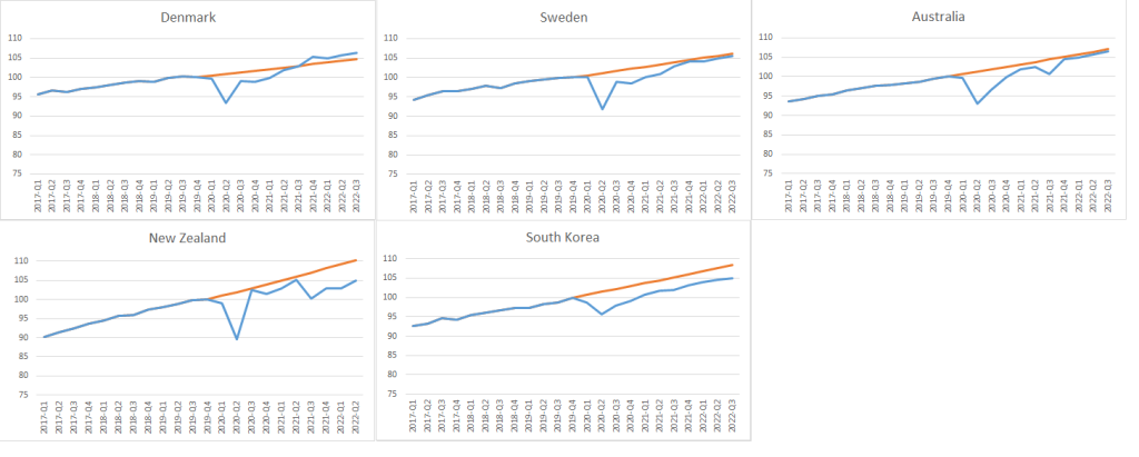
I chose these countries because they are all countries that, by some measures, fared well in the pandemic. Here’s how they fared in terms of cumulative GDP loss:
- Denmark: 2.6% net positive growth
- Sweden: 6.3%
- Australia: 6.4%
- New Zealand: 11.1%
- South Korea: 9.2%
Denmark stands out at the clear winner here. Not only are they above the projected growth, but the losses during the bad quarters were also small enough that they’ve more than fully recovered all the GDP! And given that Denmark also has fairly low deaths during the pandemic, they would be a good candidate for best performing country overall the past 3 years. And Denmark isn’t benefitting from a low projected growth rate in my analysis, unlike Japan and Italy.
Also interesting is that Sweden and Australia have had very similar GDP growth patterns, despite very different pandemic policies in terms of government restrictions. New Zealand is the worst among these 5, but it’s actually better than most of the G7 despite very harsh restrictions for some parts of the pandemic (note: the 3rd quarter 2022 data for NZ isn’t available yet from OECD).
If anyone would like to see this analysis for other countries, let me know and I will write an update soon.

Reblogged this on Utopia, you are standing in it!.
LikeLike
The gorilla in the room is China, of course. How did they fare/are faring?
LikeLike
Unless I am misremembering, didn’t Sweden NOT lockdown hard, whereas other Scandinavian countries did? Not clear if that made a difference in the end, according to these data.
LikeLike