Kevin Erdmann has written a detailed and thoughtful response to my post from last week on housing spending as a percent of income. My goal in that post was to look at consumer spending as a percent of income for a variety of different sub-groups (my primary interest was by age group, but I tried to get into more detail for other sub-groups).
As Erdmann emphasizes in his post, I left out one set of sub-groups that the CEX data allows us to use: renters vs. homeowners. And these are very important groups to look at, since for homeowners (as he points out) many of the costs are implicit (such as the opportunity cost of those that don’t have a mortgage). Lumping all of these households together may obscure some of the different trends.
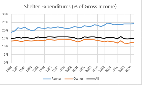
Be sure to read Erdmann’s post in full (he says many smart and correct things), but the key result is in his Figure 2 (reproduced here). Renters have seen the share of their income spent on shelter rise from 19% in 1984 to 24% in 2021. This is not a trivial increase. Owners, by contrast, have seen their share of spending fall, which is how it all gets washed out in the average.
I will concede that Erdmann is probably right on many of his many points. Still, I wanted to see this at a much finer level of detail, since national aggregates might be giving us confusing results. The micro-data in the CEX is probably not detailed enough to give us good breakdowns by MSA.
But there is another source we can turn to: the American Community Survey. And the Harvard Joint Center for Housing Studies has a nice data tool that uses ACS data to look at the percent of renters that are “cost burdened” by MSA, meaning that they spend 30% or more of their income on rent. They have this data historically for all MSAs (and micropolitan areas) from 2006-2019. This isn’t as long a timeframe as we would like (and also doesn’t show the most recent run-up in shelter costs), but it does give us a decent time-frame to look at. By 2019, renter’s shelter costs had already hit the 24% of income that we saw in 2021, but unfortunately 2006 isn’t the best base year since we’d already seen 4 of the 5 percent point increase in Erdmann’s Figure 2.
Still the results are interesting. Take San Francisco MSA as an example, the poster child for out of control housing costs. Between 2006 and 2019, the percent of renters that were cost-burdened actually fell from 48% to 43%. In NY and LA (MSAs) the proportion was roughly constant, at 49% and 54% respectively. Of course, these numbers are extremely high! But the key is: they aren’t rising, at least in this timeframe.
One reason for these trends is likely because people at the margin are moving out of expensive cities and into more affordable ones. This should mean that some cities will see increases is cost-burdened renters, while others will see decreases. Indeed that’s what we find if we look at all MSAs and micropolitan areas in the JCHS data: 423 areas saw the share of cost-burdened renters fall, 114 were “stable” (I’m using plus or minus 1% to be stable), and 397 areas saw the share of cost-burdened renters rise.
Some of the changes are huge: The Villages, Florida saw a 25-percentage point increase! Meanwhile, Eau Claire, Wisconsin, saw a 29-percentage point decrease in the share of cost-burdened renters. And you can find urban areas all in between these two extremes. But for all these areas, the average (unweighted) of cost-burdened renters doesn’t change much between these two years: it’s about 41% in both cases.
Is there any pattern to which cities are seeing increases and which are seeing decreases in the share of cost-burdened renters? Perhaps, as the scatterplot below shows.

There is a general downward trend apparent in the scatterplot. That is to say, areas with a small share of cost-burdened renters in 2006 were more likely to see an increase over the next 13 years. And vice versa: areas with a lot of cost-burdened renters generally saw a decrease over the next 13 years. I wouldn’t read too much into this one scatterplot with no controls, but it is suggestive: households are probably moving out of high-cost areas into the low-cost areas.
This movement of households is something we should worry about. Not only are people leaving places that probably represent a better match for their skills, but there is a limit to this process. If currently “cheap” areas start to become expensive in the years ahead, there is nowhere else for households to move. Unless they leave the US, of course. That would be an even worse outcome.

A blog post replying to a blog post replying to a blog post.
What is this, 2010?
You love to see it
LikeLike
Isn’t this a good thing though? House mobility will ease the housing crunch in overloaded cities and support prices in cheap ones. I’ll bet these people are moving to small cities that still have jobs and services, not underproductive rural areas.
I was taught that housing mobility is/was part of the “secret sauce” of economic mobility in America compared to places like Europe.
LikeLike