A recent viral Tweet shares a political cartoon from 1894, which shows a worker being squeezed by high rents and low wages. The Tweet claims “the problem has only gotten worse.”
Can this be true? Are workers today actually worse off than they were in 1894? At first blush, this seems obviously wrong. Here is a chart I created showing real (inflation-adjusted) wages since 1894. They are eight times higher today (I have combined two wage series and two price indices, so don’t take this as being perfect, but roughly accurate).
Figure 1

Whatever concerns we might have about high rents today, there must have been some other major improvements in the cost of living relative to wage increases since 1894, given that one hour of work can purchase about 8 times as many real goods and services today.
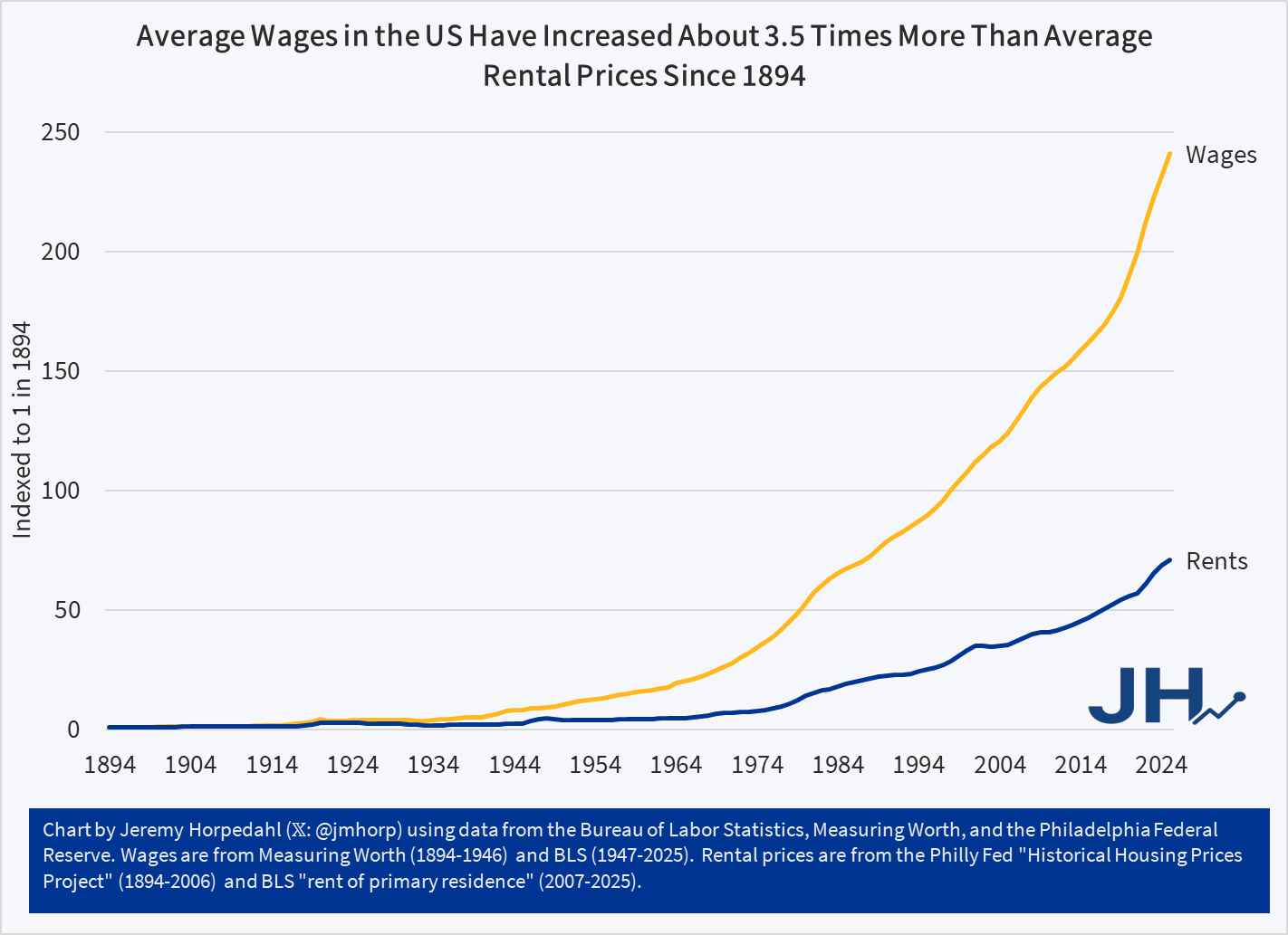
But is there a narrower case for the cartoon? What if we only focus on wages? We can do this by using a great new resource from the Philadelphia Fed, which provides some long-run data on housing prices in the US, for both purchasing a home and renters. The data series conveniently goes all the way back to 1890, so we can make the comparison with 1894 using the nominal rent index (it ends in 2006, but we can merge it with the modern CPI for rental housing). What if we compare this rental price series to the same wage series I used in the chart above?
Figure 2
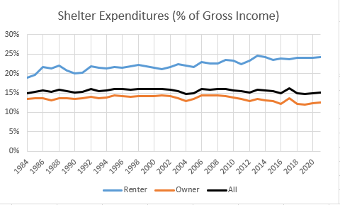
The trend in this second chart is very troubling. Rents have increased much faster than nominal wages. While other goods and services may be more affordable, rents — which consume around 24 percent of household income for renters — are rising relative to wages. Sure, we can talk all day about how the quality has improved — larger apartments, indoor plumbing, modern safety features that didn’t exist in 1894 — yet still, renters can only rent what is available. And today rental housing is much more expensive than on April 1, 1894.
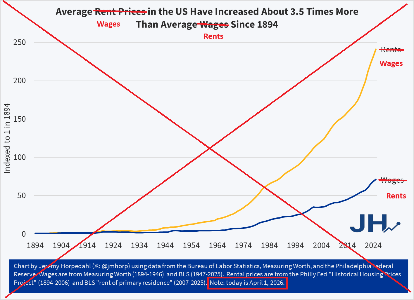
APRIL FOOLS!
The data was all correct, other than the fact that I tricked you by swapping the wage and rent lines. Wages have actually increased much faster than rents since 1894 (though they have increased roughly equal rates in recent decades). Sorry for that little trick, I’m a little surprised no one noticed. Perhaps I am just too well-known for being a straight shooter with data. Here is the real chart: