Have you seen this chart?

The chart originates from Statista, as you can see from the label in the image. But it is very frequently shared on social media, Reddit, and elsewhere (often with the Statista label clipped), occasionally generating millions of views and lots of heated comments.
But it’s a bad graph. In so many ways. Let’s break them down.
The data comes from BLS’s Consumer Expenditures Survey. I use this data frequently, as regular readers probably know. The data in the viral chart is from 2021 (more on that in a moment), but if I create a similar chart using the most recent data in 2023 but also include spending by those older than Baby Boomers (primarily the Silent Generation), you will notice a curious thing:

It appears that the Silent Generation also doesn’t drink very much! But is this the correct way to interpret the data? No. As you might guess, there are a lot fewer living members of the Silent Generation than the generations after them. In the BLS survey, there are just about 11,000 Silent households, while there are over 41,000 Boomer households. And guess what? A similar thing is going on for Gen Z! There are just about 9,000 Gen Z households in the 2023 data.
That brings up an important point. The BLS spending data is for households, and the generation of the household is determined by the head of the household. Most members of Gen Z are not living in households where they are the head — according to the CPS IPUMS data, only about 16% of Gen Z members were the head of their own household (or the spouse of the head). You see, in 2023, the age range of Gen Z was 11 to 26. In 2021 (the year of the original Statista chart data), they were only 9 to 24. In other words, only about 1/4 of the group was of legal drinking age, and only about 1/6 had formed households!
Another thing that is true about both the Silent generation and Gen Z households is they have lower income than the other 3 generations: Silents because they are all retired, Gen Z because they are very early in their careers (or possibly still in school, though less likely to be true for household heads). If we create another version of the chart using percent of income spent on alcohol, it is radically different from the first chart:
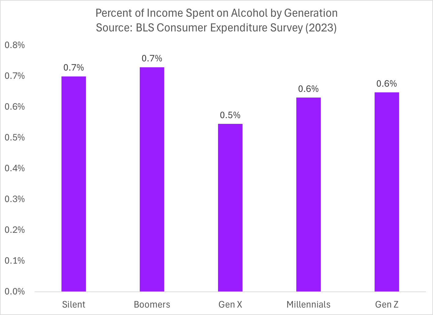
The chart may be radically different from the previous one, but what is notable about this chart is how radically similar the share of income spent on alcohol is across generations! Indeed, given that these are from survey data with some margin of error, it’s probably reasonable to say these numbers are equivalent. At least among the members of Gen Z that are household heads, they spend just as much of their income on alcohol as past generations are spending right now.
So we see that the original viral chart was not only wrong, it was wrong in multiple ways: Gen Z is mostly too young to drink; Gen Z has mostly not formed households yet; Gen Z households have lower income (as younger generations always do!).
But is the general point correct? Is Gen Z drinking less than past generations? There actually is some evidence that younger generations are drinking less, for example as summarized in this Time article. And people have probably heard this evidence before, which is why they accepted the horribly wrong spending chart as accurate. But keep in mind that the drop in drinking has been going on for decades, and despite that Millennials are still spending… about as much as older generations do on alcohol (as a share of their income).
Among young people, there is perhaps a 10 percentage point drop in drinking from 72 to 62 percent in the past 20 years. That’s notable, but it’s not the almost 90 percent drop in spending suggested by the viral chart.
