Many people take a basic statistics course in college. Those course usually include an overview of standard graphs and best practices for visualizing data.
To keep that section from getting boring (“here’s a line graph… here’s a bar chart…”) you can borrow my slides on #chartcrimes Teaching people best practices is more engaging when you can show real examples of charts gone wrong.
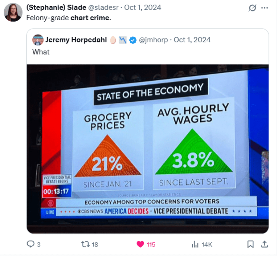
These are pictures I dropped directly into slides and talked through:


P.S. Joke I made about this section of my textbook:
Older post about teaching stats to Gen Z: Probability Theory for the Minecraft Generation

Some of these examples hurt my soul… thanks for sharing!
LikeLike