Beware of Scatterplots

Scatterplots are a great investigatory tool. You can scatterplot raw data for two variables and, if the relationship is strong, then you can see the functional form that relates x and y (linear, polynomial, exponential, etc.). However, there are two data characteristics that are a scatterplots Achilles’ heel: large samples and discrete variables. And they create misleading scatterplots for the same reason.

Examine the below scatterplots for y vs the discrete variables x1, x2, & x3 on the interval [0,10]. What do you think slopes or correlations are?

Continue reading

Business Analytics Textbook plus Discussion Book

Many undergraduates take at least one business analytics course at the 200 course level. A book that I and other professors at our business school have selected to teach business statistics is by Albright and Winston

Business Analytics: Data Analytics and Decision Making (Amazon link)

This book provides three essential ingredients to a successful course:

  1. Covering core concepts like descriptive statistics and optimization
  2. Providing relevant examples in a business context (e.g. how much inventory should a retail store order)
  3. Showing step-by-step instructions for how to do applications in a specific software which in this case is Excel

Microsoft Excel is essential for business school graduates (arguably all college graduates). No one is born knowing how to select cells or enter formulas. The book does not assume anything, so the professor does not have to require supplementary material on how to use Excel. There are lots of exercise and examples that teach proficiency in the tool while demonstrating the concepts. Analytics courses should be hands-on.

Sometimes statistics courses do not feel like they allow for critical thinking or discussions. There is only one correct formula for an average, and it is merely and exactly what the formula determines it to be. Therefore, an interesting addition to a technical class is the book by Muller

The Tyranny of Metrics (Amazon link)

Muller spends most of the book pointing out cases where measuring results backfired. He is not so much against “analytics” as he is skeptical of pay-for-performance management schemes. Many of these schemes were sold to the public as incredible technocratic improvements, such as No Child Left Behind. I do not always agree with Muller, but he gives students something to debate. Note that only select chapters should be assigned so that it does not take up too much time from the other course material.

The Tall and Short of Student Experience

Every semester in my intro STAT course I have my students create a variety of survey questions. After I combine their questions into a single survey, they collect responses from the student body at Ave Maria University. Most of the questions are vanilla. Other are not. They typically get in excess of 100 responses from the ~1,100 person student body.

While exploring the data, I found a really beautiful example for the week that we spend on multiple regression and dummy variables.  The survey results illustrate a clear, linear association between student height (inches) and their student experience at AMU (scored 1-10).

So strange! Why might this be? Except for that solitary 7 ft+ student on the basketball team, how in the world might height matter for student experience?

As it turns out a separate relationship holds the key.

Confirmed with a simple unpaired t-test (unequal variances), women rank their student experience much more highly. For this, students have multiple explanations at the ready.

  • Our school is in a rural location and women are more socially satisfied.
  • Men are less happy generally.
  • Men are less studious or have lower grades.
  • Men get less sleep and stay up later

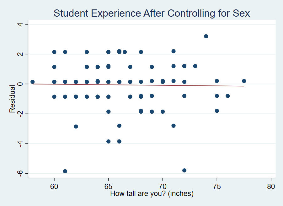
The list goes on and I don’t know what the reasoning is or which ones actually play a role. But what I do know, is how to make fun scatterplots in Stata. As it turns out, if you control for sex, height loses all of its effects on student experience. Men are taller on average and they aren’t happy students relative to women (apparently). We can see in the figure below that all of the action in the two fitted lines occurs in the intercept. The slopes are practically flat for both men and women. In other words, height neither adds nor subtracts from a student’s experience rating.

What’s going on is that neither men’s nor women’s experience is affected by being taller. But, what’s actually going on here – you know – statistically? The simple version is that the bar chart above dominates the scatter plot. If we subtract the mean male experience score from the male values and do the same for the females, then we’re left with what is practically white-noise. How do all those other students of a different height experience the world? Well, as students, not so differently from you.

A Covid Conversation… But with Humility.

We know WAY more about Covid-19 than we used to. But there is plenty of appropriate and inappropriate incredulity concerning the data meaning, validity, and implication. I want to take a minute and give it the good ol’ Stat – 201 college try. Here’s the level-headed and appropriately humble Covid statistics conversation.

A: “The US has more cases of Covid than Portugal.”

B: “Yes, but that’s not important. They are very different countries. After all, 65% of people in Portugal live in urban centers. For the US, that number is 80%. Obviously, people being close together, such as in urban places, will contribute to more Covid cases.”

A: “OK. Fine. They may be incomparable. But the US has more cases than the UK, which has a similarly urban population of 83%.”

B: “Yes, but the US is larger. The UK has a smaller population – Of course the US has more cases.”

A: “Ah! And the US also has a Covid positivity rate well in excess of the UK.”

B: “Hmm… That is something. The problem is that the testing is not administered in the same fashion in both places (or across time). That is, neither set of tests is a simple random sample of people and neither is biased in sampling in the same sort of relevant ways.”

A: “But how do you know that the samples aren’t collected in the same sort of ways? Someone feels poorly, then they go and get tested. Isn’t that how is works everywhere?”

B: “Not necessarily at all. Some countries and municipalities offer free testing. Other places have more or less scarcity of tests and surely that affects whom they decide to test. Not only that, different people are differently willing to get tested (maybe they’d have to involuntarily stop working, for example). My point is that the testing samples are not both biased in favor or against positives in the same way and we have little way of telling either the direction or magnitudes. The fact that both countries test a similar proportion of the population doesn’t address the sampling method.”

A: “OK. Well, I suppose that we ought not try at all then, according to you? Isn’t some problematic data better than none?”

B: “Problematic data is not better than none at all if we have good reason to think that there isn’t enough in common between sample collection methods to make valid comparisons.”

A: “Right, so you’re saying that we have to be agnostic.”

B: “In some sense, yes. But rather than Covid cases, we can track relevant variables whose sampling is more comparable. Hospitalizations are better, but we still have the issue of selection bias among those being admitted and a bias due to different hospital capacities between localities. The best measure is the number of deaths due to Covid. People can’t elect out of that sample.”

A: “Hm… Ok. But while total deaths is a more dependable statistic, it is less relevant. Of course deaths matter a great deal, but Covid makes people feel terrible and may even have long term effects.”

B: “You’re right. Covid deaths Vs cases has the trade-off of relevance Vs dependability. Arguably, deaths are the most important possible symptom – although I take your point that it’s not the only relevant symptom. Ultimately, however, the death numbers are more dependable and we should use them if we want a high degree of certainty.”

A: “Fine. The US has more Covid deaths than does the UK, both in level and in deaths per thousand of population.”

B: “Yep. You are right. But the US has more Covid cases, so of course it has more Covid deaths than the UK. The correct statistic is, given a Covid diagnosis, how likely are you to die of Covid? In the UK, a much higher proportion of people with a Covid diagnosis die. In other words, Covid is more dangerous in the UK than it is in the US.”

A: “Time out. Two things: 1) Didn’t you say just a moment ago that the testing data wasn’t reliable enough? Now you’re using it as if it’s reliable. 2) If we are making a cross country comparison, then can’t we just say that a person, randomly drawn from the population, is more likely to die from the Covid in the US than in the UK?”

B: “Mea culpa. You’re right on both points. At the end of the day, a US person is more likely to die of Covid. But, in the UK a person with Covid may be more likely to die. So what do we do about that?”

A: “Good question…”