Scatterplots are a great investigatory tool. You can scatterplot raw data for two variables and, if the relationship is strong, then you can see the functional form that relates x and y (linear, polynomial, exponential, etc.). However, there are two data characteristics that are a scatterplots Achilles’ heel: large samples and discrete variables. And they create misleading scatterplots for the same reason.
Examine the below scatterplots for y vs the discrete variables x1, x2, & x3 on the interval [0,10]. What do you think slopes or correlations are?
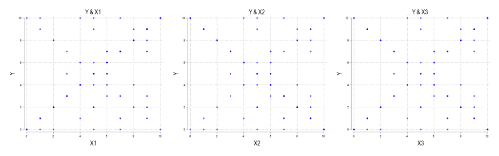
Take your time.
It’s a bit tricky.
The lines of best fit for these scatterplots all have very different slopes. Are you sure that you’re ready? Let’s see how you did. Below are the same scatterplots with their lines of best fit and 95% confidence intervals.
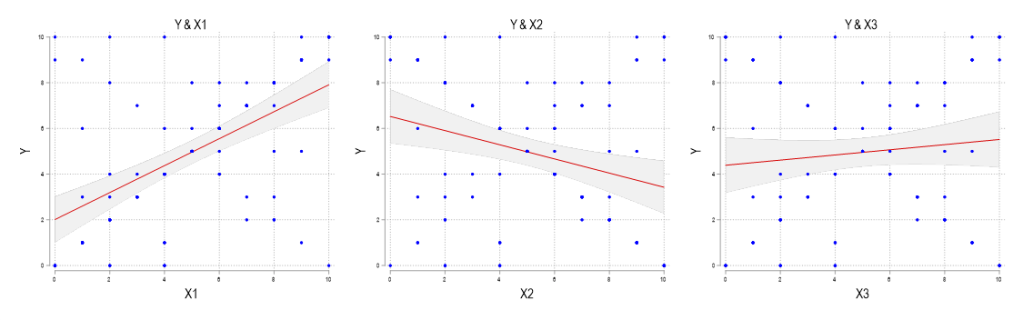
What gives? First, those are definitely the correct linear fits – I didn’t make them up. Second, if you struggled with guessing the slopes or how they differed, then don’t worry. That’s the point. All 3 of the above scatterplots appear identical because they are identical. How can identical scatterplots yield different lines of best fit?
The answer is that multiple observations with identical coordinates on a scatterplot look no different from a single observation. Therefore, what we don’t see when we scatter these variables is that X1 has more frequent observations with an upward sloping pattern (same for X2, which as a downward sloping pattern). When we have discrete data, scatterplot coordinates overlap more often. When you’re doing your statistical investigations, it’s a good idea to include the line of best fit by default. Then you can skip the potential for error (this error anyway). Continuous variables exhibit this problem less because almost no scatterplot coordinates are identical. However, we are limited by our abilities to illustrate large samples clearly. Some values are so close that their difference is indecipherable by visual inspection.
Another way to avoid the error of ‘hiding’ observations is to create a scatterplot that adjust the marker sizes by the popularity of their coordinate. Below are the weighted marker scatterplots. Once you see them, then it’s much easier to guess which way the correlation goes.

