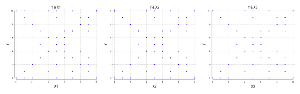
Scatterplots are a great investigatory tool. You can scatterplot raw data for two variables and, if the relationship is strong, then you can see the functional form that relates x and y (linear, polynomial, exponential, etc.). However, there are two data characteristics that are a scatterplots Achilles’ heel: large samples and discrete variables. And they create misleading scatterplots for the same reason.
Examine the below scatterplots for y vs the discrete variables x1, x2, & x3 on the interval [0,10]. What do you think slopes or correlations are?