Last week I wrote a fairly long post in response to an essay by Michael Green. His essay attempted to redefine the poverty line in the US, by his favored calculation up to $140,000 for a family of four. That $140,000 number caught fire, being covered across not only social media and blogs, but in prominent places such as CNN and the Washington Post. That $140,000 number was key to all of the headlines. It grabbed attention and it got attention. So it’s useful to devote another post this week to the topic.
And Mr. Green has written a follow-up post, so we have something new to respond to. Mr. Green has also said a lot of things on Twitter, but Twitter can be a place for testing out ideas, so I will mostly stick to what he posted on Substack as his complete thoughts. I am also called out by name in his Part 2 post, so that’s another reason to respond (even though he did not respond directly to anything I said).
Once again, I’ll have 3 areas of contention with Mr. Green:
- As with last week, I maintain that $140,000 is way too high for a poverty line representing the US as a whole (and Mr. Green seems to agree with this now, even though $140,000 was the headline in all of the major media coverage)
- There are already existing alternative measures of what he is trying to grasp (people above the official poverty line but still struggling), such as United Way’s ALICE, or using a higher threshold of the poverty rate (Census has a 200% multiple we can easily access)
- His idea of the “Valley of Death” is already well-covered by existing analyses of Effective Marginal Tax Rates, and tax and benefit cliffs. This isn’t to say that more attention is warranted, but Mr. Green doesn’t need to start his analysis from scratch. And this “Valley” is probably narrower than he thinks.
1. $140,000 is Way Too High
Mr. Green has already conceded this point in Part 2: “I concede it is indeed a higher cost of living region.” In his Part 1 Substack post he claimed he was building a budget, and therefore a poverty line, with “conservative, national-average data.” In Part 2, he admits that this data is for Essex County, New Jersey — a much higher cost of living and higher income city. How much higher?
According to the MIT Living Wage Calculator (which he now tells us is where he got the cost data from), Essex County families with 2 children and 2 working adults need $136,498 of market income to meet all expenses. But now Mr. Green suggests Lynchburg, Virginia as a more representative US city. The MIT LWC says the income needed for a similar family in Lynchburg is $93,755. In other words, Mr. Green’s costs in Part 1 were 45.6% too high if he wants this to be a nationally representative number. This is even worse than I said in my first post, where I suggested Mr. Green was using costs 30-40% too high!
Let’s take one expense which I discussed in my first post: childcare. Mr. Green’s first post makes much of this expense, both in terms of its cost — an eye-popping $33,000 for two kids! — and its relation to household decisions about whether to have both spouses working. But that was for Essex County, NJ, which I said in my first post was way, way too high to serve as a national benchmark. What are childcare costs in his new favored city, Lynchburg? $12,544. And yes, that’s for two children. So his childcare cost figure was 161% too high.
Again, think about this not only in terms of the total budget, but decision making about working. From Green’s Part 1: “The second earner is working to pay the stranger watching their children so they can go to work and clear $1-2K extra a month.” But given that median pay for a full-time female is $61,020 (see my post last week), and Lynchburg is a median city, the mother choosing to work puts another $4,000 of pre-tax income into the budget, not the mere $1-2K he claims. Yes, that $4,000 will be taxed, but even so he is understating the income from the second earner (even accounting for costs) by around 100%. Keep in mind, also, as I state in my first post, that these are temporary expenses, but the woman’s income persists over a lifetime, long after the kids leave daycare.
I think the $140,000 poverty line is dead in the water now (Mr. Green even pretty much admits as much), though the national headlines will live on.
2. Other Measures of Poverty/”Valley of Death”
In Part 2, Mr. Green tells us that the actual “poverty line” is not the main point of his analysis. The main point is people below this level. Whether we set the level at $140K, or $100K, or even $80K, there are a lot of families above official poverty, but below some higher necessary income threshold. And they are struggling. This point can’t be denied. Even if I tell you that median family income for married couples with children in Lynchburg, Virginia was $109,544 in 2024, you could rightly turn around and say: but some families earn less than that. And of course by definition this is true: half of families earn less than the median. BY DEFINITION! So while the median family could handle $93,755 in taxes and expenses, there are lots of families who can’t handle those expenses, but aren’t officially classified by the government as in poverty.
Can we say anything more about these non-poor but struggling families? Yes! In fact, many researchers over the years have looked at near-poor families. One common measure is from the United Way, called ALICE: asset-limited, income constrained, and employed. The term is a bit of a misnomer: although the first word is “asset,” they make no attempt to measure the family’s assets. Instead, the measure is solely based on income. The great thing about this measure is that they attempt to count the number of families that are in this category: out of official poverty, but still struggling financially.
The figures are actually quite comparable to the MIT LWC. Using the ALICE Household Survival Budget calculator, they say that a 2-adult, 2-child family needs $92,808 of pre-tax income in Lynchburg, VA, very similar to MIT. I don’t mean to suggest these numbers are perfect (see Scott Winship’s criticism of the MIT LWC), but rather that they are in the ballpark of the figures Mr. Green wants to use. The ALICE project then uses these county-specific figures (Virginia has some cities that aren’t part of counties, so really these are “county equivalents”), which are also adjusted by family size and other factors (e.g., whether kids are of school age) to make some nationwide calculations.
Do they find, as Mr. Green said in Part 1, that “only 34% of Americans have managed to escape deprivation” — in other words, that 66% of families are either officially in poverty, or living in Mr. Green’s “Valley of Death”?
No. According to ALICE calculations, among all households, fully 58% are above the ALICE threshold. But when we look at working age (25-64) families, it is almost two-thirds above the threshold (63-64%), the exact inverse of what Mr. Green claims. For married couples with children — the very family Mr. Green is interested in — fully 80% of households are above the ALICE threshold. That’s quite a bit more than 34 percent. True, this means 20% of married with kids families are below the threshold, and 6% of them are in official poverty. We should care about those families, and think about how we can help them.
Is the 80% of married couples above the threshold merely a veil for the “ghost households” that Mr. Green mentions in Part 2, families that choose not to have kids because it would be too expensive? Certainly these families exist, but it is not the primary driver. If we look at non-elderly households with no children, we still see 60% over the ALICE threshold — less than 80%, but almost double Green’s figure of 34%. Who are the families really struggling? Single parents! Among single mothers, only 25% are over the ALICE threshold (for the smaller group of single fathers, it is 44%). That’s your Valley of Death: 36% of single-female headed families are above poverty but below the ALICE threshold — almost as many as are officially in poverty (39%).
So the Valley of Death families do exist, but they are not primarily the married couples deciding whether to pay for daycare or not while the second spouse goes back to work. There are, according to ALICE, 7.5 million single-parent families below their Survival Budget threshold, but only 4.6 million married couples with children in the same position. Even if we look only at those within the Valley of Death, there 3.9 million single-parent families but only 3.2 million married-couple families. 3.2 million families is still quite a bit, but when Green says in Part 1 that “roughly 45% of the country—is actually the Working Poor” this implies almost 60 million households: 20 times too high!
I’ll return to what we should do to think about those ~3 million “Valley of Death” families in section 3 of this post, but briefly here is one more way to look at those near-poverty families. I can hear the cackles already: ah, so you think “only” 3 million working poor families don’t matter! No, that’s not what I am saying. Please read on.
While Mr. Green and many, many others have heaped much scorn on the official poverty line, Census has never treated it as the one end-all, be-all of poverty measurement. As I pointed out in part 1, Census has also developed the Supplemental Poverty Measure, which includes more than just an inflation-adjusted 1960s food cost. The SPM does produce a higher poverty measure today than the Official Poverty Measure! But if we make a historical comparison and consistently use the SPM over time, we see that the poverty rate fell from 13% in 1980 to 6.1% in 2023. That’s real progress, using a completely different — and much better — poverty measure.
Another approach is to use other multiples of the Official Poverty Line. Census has some nice tables that go up to 200% of the official poverty line. With enough work, you could create these tables going up to 300% or 400% of the official poverty line — probably getting closer to what Mr. Green wants to measure — but I still think the conveniently available 200% calculations are illustrative. And unlike the ALICE Thresholds, which we only have for very recent years, the Census data can take us back 50 years:
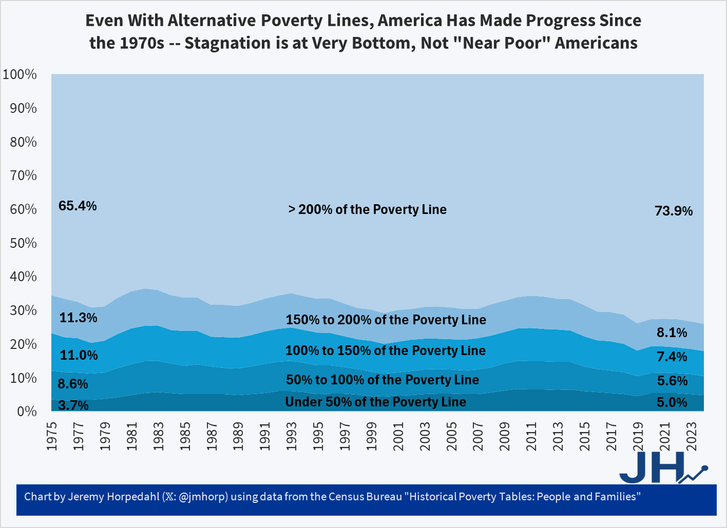
What the chart shows is that the percent of Americans over 200% of the federal poverty line (around $60,000 for a family of four in 2024) has risen by 8.5 percentage points since 1975. There are always business cycle wiggles, but I’m not cherry picking: if I wanted to cherry pick, I would have started the chart in 1983 and got it to jump 10.5 percentage points. But what about near-poor families, those above official poverty but still below some higher threshold? That number has fallen! From 22.3% of Americans in 1975 to 15.5% of Americans in 2024, a drop of 6.8 percentage points.
The chart is not completely optimistic, though. Notice that those at the very bottom, with less than 50% of the poverty line in income, have actually risen slightly from 3.7% to 5.0% (note: it had been as high as 6.7% in 2010). This is concerning, especially if we are concerned with the least well-off, in a Rawlsian sense. That’s a conversation worth having. But it’s not the conversation Mr. Green is having. If the Valley of Death is 100-200% of the poverty line, that group has been shrinking over time. Some of the shrinking could be due to the rise of dual-income households — the very issue he is discussing — but that can only explain the trends up until about the mid-1990s, when dual-income families peaked as I have previously explained. But this 100-200% FPL group has shrunk by about another 3 percentage points since the mid-1990s!
3. Tax and Benefit Cliffs and High EMTRs (and some policy proposals)
In Part 1, Mr. Green states (after making a view back-of-the-envelope calculations: “When you run the net-income numbers, a family earning $100,000 is effectively in a worse monthly financial position than a family earning $40,000.”
In Part 2, he stresses that this was actually the main point of Part 1: “This is the policy failure that was actually at the heart of Part 1: We have created benefit cliffs and income phase-outs that systematically capture the working poor, ensuring that climbing the ladder only leads to loss of essential benefits and permanent financial fragility.”
Mr. Green here is talking about a concept very well known to economists and policy analysts that study our tax and transfer system: tax and benefit cliffs, or in some cases not pure “cliffs” but Very High Effective Marginal Tax Rates. As any student of the US federal income tax knows, the top marginal tax rate (paid by the very rich, those with over $500,000 of annual income) is 37 percent. But advanced students know this isn’t quite true: at many points in the tax system, the rate is much higher than 37 percent, due to the phase-out of benefits.
Some of these benefits are within the tax code, for example the Earned Income Tax Credit, which phases out at 21 percent if you have two or three children. Other benefits are outside the tax system but still tied to income, such as SNAP benefits which generally phase out around 30 percent (it varies). Then there are the actual tax rates you pay: probably 10-12% (though maybe 22%) federal income tax for most of the families we are talking about, plus another 7.65% FICA taxes, and maybe another 0-8% of state and local income taxes. The key here is that these rates stack on top of each other. If you are in the phase-out for both the EITC and SNAP, plus considering your income tax rates, you could easily be paying 60-70%. Throw in other benefits like Medicaid and ACA subsidies, and you can imagine this rate hitting 100% (or more!) at times, especially if the benefit completely drops off at some income level (a literal cliff, with an infinite tax rate).
Lots of policy analysts and think tanks have written about this topic over the years. I linked to a half dozen or so on Twitter, though most of these examples are for single-parent households. Thankfully, the Atlanta Fed has a very nice Benefits Cliff tool that lets you fully customize these sorts of scenarios. Here’s one I did, for Lynchburg, VA (our new favorite town) with the following parameters: married couple, two children (under 5), minimal savings ($1,000), housing costs of $1,334 (from the MIT LWC, higher than ALICE), childcare of $2,042 (from ALICE, higher than MIT LWC), and a generous suite of public assistance programs (EITC, CTC, SNAP, Medicaid and ACA subsidies, CDCTC, and free/reduced school meals). You can tinker with them if you don’t like my assumptions!
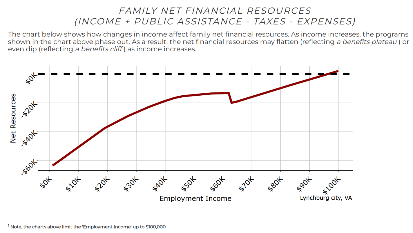
The chart is very interesting. First, you will notice that this family is always underwater until they get to almost $100,000: both in poverty and above poverty. There does appear to be a small “Valley of Death”: between about $45,000 and $62,000, there is almost no increase in net resources as income goes up, since many public benefits are phasing out in this range. And then at $63,000, there is a true cliff as SNAP benefits are cut off. So at $63,000, net resources are no greater than at about $40,000.
But beyond $63,000, there is no further Valley of Death. Mr. Green’s claim that the $100,000 family is worse off than the $40,000 family is clearly wrong: they have about $20,000 more in net resources. And that already takes account of taxes, benefit phase-outs, and expenses. Now, you would be correct to say this is a very high implicit tax rate over this range: about 67%! But once you get to about 200% of the poverty rate (hey! that sounds familiar!), the Valley of Death is over. ACA subsidies are still phasing out (at about 15%), and you are now paying perhaps 12% federal income tax rates (almost 20% with payroll), but you are keeping about two-thirds of what you earn rather than losing two-thirds in the prior range.
Again, you can tinker with the tool, maybe finding longer “Valleys of Death” for different cities, with different combinations of public assistance programs. But you will be hard pressed to make a $100,000 family worse off than a $40,000 family.
But that range where the family is losing 67% of their income is concerning. The $40,000-$63,000 range is especially concerning. What to do? The system is obviously overly complicated, and part of this is because of the stacking of multiple programs on top of one another. I’m not even 100% certain the Atlanta Fed tool gets this right, even though it was designed by experts on this subject: imagine how hard the interactions are to determine for a typical poorer family.
Here are a few possible solutions to the high EMTR/cliff issue:
A. The benefits never phase out: a Universal Basic Income. Solves the implicit tax rate problem, but is very expensive: a true UBI of $1,000 per month per person is in the range of $4 trillion. And this can only really replace cash and near-cash benefits, probably not Medicaid, so the savings are nowhere near $4 trillion.
B. Extend the phase-out ranges for existing programs: cheaper, but still expensive. We could set phase outs to start around $100,000, and have them phase out at lower rates. This would be less than $4 trillion, but I’m guessing still doubling the cost of most programs (especially if Medicaid is part of this expansion, it could potentially be $4 trillion as well!).
C. Reduce the size of the welfare state. This would save the government money! But depending on how you do it, it might just shift the “Valley of Death” to an even lower level of income.
As someone who is generally classical liberal/libertarian, I think Option C should at least be discussed. But I also try to live with the current Overton Window, rather than trying to shift it, so my primary focus is how can we make the existing welfare state the least destructive of incentives.
A fourth solution is the Negative Income Tax. While Milton Friedman didn’t invent the idea, he certainly popularized it. If you aren’t familiar with it, you can listen to Friedman explain it, but it essentially works like a UBI with a phase-out. For families with no income, there is a maximum subsidy (likely based on family size), this subsidy then phases out at some rate (Friedman said no more than 50%) until the subsidy goes to $0, and once your income is past that exemption level, you are now a net taxpayer.
Depending on the details (how big? what’s the rate?) you can have a wide variety of total costs of the NIT, but you can construct a number of options that cost under $1 trillion. That’s a lot of money! But when you consider that this could also be a partial replacement for Social Security in addition to eliminating most current welfare programs, the budget math starts to look good. I won’t get into a full accounting here, but I think something like the NIT is worth considering because it mitigates those high EMTRs and “Valleys of Death” (especially benefit cliffs), without the enormous costs of Options A&B above. Strict libertarians will want to push more on Option C, but I think the NIT is worth considering.
Note: Mr. Green’s Part 2 post doesn’t include any policy proposals to fix the problem he thinks he has identified. Apparently a Part 3 is coming? Ultimately if we think there is a problem, we need a solution. Or I guess we can just complain. But that solution needs to be tailored to the problem, and to address the problem we need to properly quantify it. “$140,000 poverty line” doesn’t actually get us anywhere in finding reality or a policy solution, nor do claims that “families with $100K are worse off than those with $40K.” These are not based in reality.
High EMTRs are a problem, and policy analysts have been trying to work on small solutions to these in many areas (while Mr. Green apparently things I’m working for the Waltons, if there is any small way that I have impacted Arkansas tax policy it is in convincing legislators to get rid of some pretty bad tax cliffs). But maybe we need a big solution now: consolidating the patchwork federal welfare system, and its implicit interaction with the tax code.
Finally, so Kevin Erdmann won’t be mad: yes, we should also build more housing!

Thank you for pointing me to this follow up. I think it highlights that the “Valley of Death” is real, though maybe not as bad as Mr. Green depicts. Looking to his past writing over the years he does seem to enjoy long term projection. That is not to say we shouldn’t work on righting the ship using the methods you identify. Most concerning to me amongst all this is the decline in birth rate; an uncomfortable but very real truth here in the USA. I suspect that the “Valley of Death” is a significant contributor to the decline. The family of four is discussed often, as a fair benchmark. But I would be interested in attempting to reconcile the financial data with the decline of the family of 2+. A tall order, perhaps.
LikeLike
2+ children, that is.
LikeLike
2+ children, I mean.
LikeLike
re: “build more housing” – 2 years ago (2023) United Way reported there are more vacant housing units than there are unhoused individuals.
“Building more housing” seems counterproductive unless it will be affordable for unhoused individuals
https://www.linkedin.com/pulse/vacant-homes-vs-homelessness-us-united-way-worldwide/
LikeLike
These numbers show one third of working-age American families in poverty; many more would fall into poverty if they tried to afford children.
Even if the magnitude of the problem is half as bad as Green suggests, this is still a calamity, and it would produce the political outcomes that he describes.
LikeLike