The government continues to be great at collecting data but not so good at sharing it in easy-to-use ways. That’s why I’ve been on a quest to highlight when independent researchers clean up government datasets and make them easier to use, and to clean up such datasets myself when I see no one else doing it; see previous posts on State Life Expectancy Data and the Behavioral Risk Factor Surveillance System.
National Health Expenditure Accounts Historical State Data: The original data from the Centers for Medicare and Medicaid Services on health spending by state and type of provider are actually pretty good as government datasets go: they offer all years (1980-2020) together in a reasonable format (CSV). But it comes in separate files for overall spending, Medicare spending, and Medicaid spending; I merge the variables from all 3 into a single file, transform it from a “wide format” to a “long format” that is easier to analyze in Stata, and in the “enhanced” version I offer inflation-adjusted versions of all spending variables. Excel and Stata versions of these files, together with the code I used to generate them, are here.
A warning to everyone using the data, since it messed me up for a while: in the documentation provided by CMMS, Table 3 provides incorrect codes for most variables. I emailed them about this but who knows when it will get fixed. My version of the data should be correct now, but please let me know if you find otherwise. You can find several other improved datasets, from myself and others, on my data page.
Some economists love to write about sports because they love sports. Others love to write about sports because the data are so good compared to most other facets of the economy. What other industry constantly releases film of workers doing their jobs, and compiles and shares exhaustive statistics about worker performance?
To take an extreme example, suppose an average high-school athlete got thrown into a professional football or basketball game; a fan asked to evaluate them could probably figure out that they don’t belong there within minutes, or perhaps even just by glancing at them and seeing they are severely undersized. But what if an average high school coach were called up to coach at the professional level? How long would it take for a casual observer to realize they don’t belong? You might be able to observe them mismanaging games within a few weeks, but people criticize professional coaches for this all the time too; I think you couldn’t be sure until you see their record after a season or two. Even then it is much less certain than for a player- was their bad record due to their coaching, or were they just handed a bad roster to work with?
The sports economics literature seems to confirm my intuition that coaches are difficult to evaluate. This is especially true in football, where teams generally play fewer than 20 games in a season; a general rule of thumb in statistics is that you need at least 20 to 25 observations for statistical tests to start to work. This accords with general practice in the NFL, where it is considered poor form to fire a coach without giving him at least one full season. One recent article evaluating NFL coaches only tries to evaluate those with at least 3 seasons. If the article is to be believed, it wasn’t until 2020 that anyone published a statistical evaluation of NFL defensive coordinators, despite this being considered a vital position that is often paid over a million dollars a year:
Companies and non-profit organizations tend to be managed day-to-day by a CEO, but are officially run by a board with the legal power to replace the CEO and make all manner of changes to the company. But last week saw two striking demonstrations that corporate boards’ actual power can be much weaker than it is on paper.
The big headlines, as well as our coverage, focused on the bizarre episode where OpenAI, the one of the hottest companies (technically, non-profits) of the year, fired their CEO Sam Altman. They said it was because he was not “consistently candid with the board”, but refused to elaborate on what they meant by this; they said a few things it was not but still not what really motivated them.
Technically it is their call and they don’t have to convince anyone else, but in practice their workers and other partners can all walk away if they dislike the board’s decisions enough, leaving the board in charge of an empty shell. This was starting to happen, with the vast majority of workers threatening to walk out if the board didn’t reverse their decision, and their partner Microsoft ready to poach Sam Altman and anyone else who left.
After burning through two interim CEOs who lasted two days each, the board brought back ousted CEO Sam Altman. Formally, the big change was board member Ilya Sutskever switching sides, but the blowback was enough to get several board members to resign and agree to being replaced by new members more favored by the workers (including, oddly, economist Larry Summers).
A similar story played out at IZA last week, though it mostly went under the radar outside of economics circles. IZA (aka the Institute for Labor Economics) is a German non-profit that runs the world’s largest organization of labor economists. While they have a few dozen direct employees, what makes them stand out is their network of affiliated researchers around the world, which I had hoped to join someday:
Our global research network ist the largest in labor economics. It consists of more than 2,000 experienced Research Fellows und young Research Affiliates from more than 450 research institutions in the field.
But as with OpenAI, the IZA board decided to get rid of their well-liked CEO. Here at least some of their reasons were clear: they lost their major funding source and so decided to merge IZA with another German research institute, briq. Their big misstep was choosing for the combined entity to be run by the the much-disliked head of the smaller, newer merger partner briq (Armin Falk), instead of the well-liked head of the larger partner IZA (Simon Jaeger). Like with OpenAI, hundreds of members of the organization (though in this case external affiliates not employees, and not a majority) threatened to quit if the board went through with their decision. Like with OpenAI, this informal power won out as Armin Falk backed off of his plan to become IZA CEO.
Each story has many important details I won’t go into, and many potential lessons. But I see three common lessons between them. First is the limits to formal power; the board rules the company, but a company is nothing without its people, and they can leave if they dislike the board enough. Second, and following directly from this, is that having a good board is important. Finally, workers can organize very rapidly in the internet age. At OpenAI nearly all its employees signed onto the resignation threat within two days, because the organizers could simply email everyone a Google Doc with the letter. Organizers of the IZA letter were able to get hundreds of affiliates to sign on the same way despite the affiliates being scattered all across the world. In both cases there was no formal union threatening a strike; it was the simple but powerful use of informal power: the voice and threatened exit of the people, organized and amplified through the internet.
Sometimes it’s easy to take for granted the good things you’ve always had; you don’t know what you’ve got till it’s gone.
In that spirit, after lacking it for much of the last month, I am extremely thankful for reliable indoor plumbing. Our clay sewer pipes that had lasted 100+ years finally started to crack, which made for a big mess and took $8000 to repair. But we’re now back in business, and thanks to the magic of pipe relining we didn’t have to dig through our deck to do it.
Hopefully this lets you all appreciate your plumbing too without having to go through the whole experience yourself.
I’m heading to New Orleans tomorrow for the 2023 meeting of the Southern Economic Association, where I’ll present research on the labor market effects of Certificate of Need laws.
I’ll take this as an excuse to re-up two previous posts on New Orleans:
I recommend reading the whole thing, but here’s the conclusion:
As much as things have changed since 2013, my overall assessment of the city remains the same: its unlike anywhere else in America. It is unparalleled in both its strengths and its weaknesses. If you care about food, drink, music, and having a good time, its the place to be. If you’re more focused more on career, health, or safety, it isn’t. People who fled Katrina and stayed in other cities like Houston or Atlanta wound up richer and healthier. But not necessarily happier.
The RWI − Leibniz Institute for Economic Research has funding for researchers to replicate papers in development economics:
RWI invites applications for several positions of Replicator on a self-employed basis to conduct a robustness replication of a published microeconomic study in the field of Development Economics. The successful applicant will work with us on the project “Robustness and Replicability in Economics (R2E)”, funded by the German Science Foundation (DFG) Priority Programme “Meta-Rep”….
The ultimate goal is to contribute to the ongoing debate about replicability and replication rates in eco- nomics. We collaborate closely with the Institute for Replication (I4R). All robustness replications will contribute to a meta-paper summarizing the collective findings. We plan to publish this meta-paper by the end of 2024, and all replication fellows will be co-authors….
The position starts as soon as possible and is limited to six months. The work can be done fully remotely. The applicant will receive compensation of 2,500 € gross in total, possible distributed in installments based upon predetermined deliverables. Additionally, replication fellows will be listed as co-authors on the meta-paper. At the conclusion of the project, it is foreseen to gather all fellows for a final workshop at RWI in Essen, Germany.
I don’t know the team here but I’m alwayshappy to see more attempts to make economic research more reliable. The funding and the planned publication make this potentially a good deal for applied microeconomists, especially grad students. Full details are here (warning: PDF).
This week I was in Bretton Woods, New Hampshire. The Mount Washington Resort there is lovely on its own terms as a grand old hotel surrounded by mountains, but it is better known (at least among economists) as the site of the 1944 conference that gave us the International Monetary Fund, the World Bank, and the postwar international monetary system.
This got me thinking about what other destinations should top the list of sites for economics tourism. Adam Smith’s house in Scotland has to be on there. In the US I’ve been trying to visit all 12 Federal Reserve banks; they tend to have nice architecture as well as a Money Museum. You can stay at Milton and Rose Friedman’s cabin in Vermont, Capitaf. I’d like to go to Singapore for many reasons, but one is that they seem to listen to economists more than any other country; I’m not sure what places to visit within Singapore that best reflect that, though.
The places I’ve listed so far are somewhat inward looking to the economics profession; you could get a much bigger list by looking outward to the economy itself, doing “economic tourism” rather than “economics tourism”. Visit a port, a mine, or a factory (like Adam Smith visiting a pin factory and getting ideas for the Wealth of Nations); visit a stock exchange or a bazaar. Visit whatever country currently has the fastest economic growth, or the worst inflation.
Those are my ideas, but I’d love to hear yours: what are the best places for econ tourism?
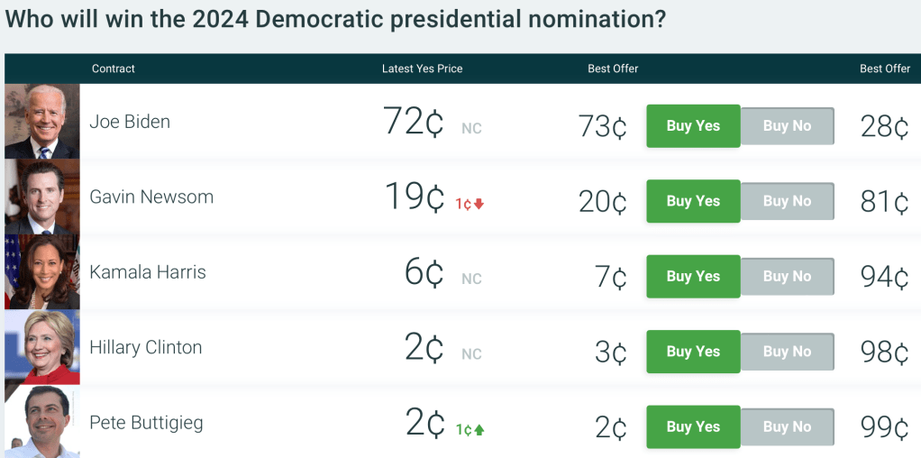
President Biden winning the Democratic nomination is currently priced at 72 cents on PredictIt, implying a roughly 72% chance of winning the nomination. Not the general 2024 election- where he is priced at a mere 43 cents- but the Democratic nomination.
To me it seems crazily underpriced to put the odds of an incumbent president being renominated by his own party at only 72%. Yes, his approval ratings are underwater, and yes he’s old, but the base rates here very much work the other way. No incumbent president has lost a vote to be renominated since Chester Arthur in 1884. It think its extremely unlikely Biden would run for nomination and lose; it makes more sense that he would choose not to run, like LBJ in 1968, but I see no indications of that.
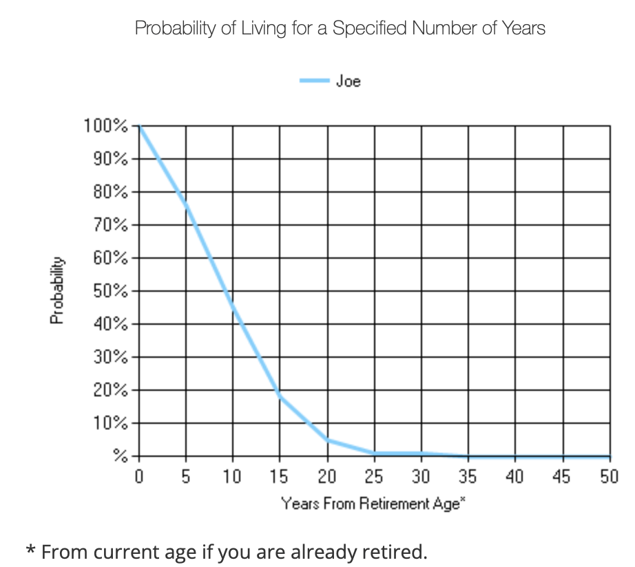
I think Biden will only fail to be renominated if he dies or experiences a major decline in his health by the convention next August. This is certainly possible for an 80 year old but the odds of it are well below the 28% implied by PredictIt. A recent WSJ article lays out the details:
a nonsmoking male with Biden’s birthday, in good health, would be expected to live nine more years after next year’s Election Day, while for one with Trump’s birthday, it would be 11 years.
WSJ focuses on his chance of finishing a second term and doesn’t give an estimate for just making it to renomination, but my own look at actuarial tables shows that the average 80 year old has only a 6.5% probability of dying within a year. The chance of dying or getting a disabling health condition in a year is of course higher than that, but the convention is actually less than a year away in August, and the primaries will be done by June. Plus the WSJ article gives several reasons to think Biden is in better health than the average 80 year old:
First, the median includes people who drink alcohol. Regular drinking of two or more drinks, three or more times a week, shortens life expectancy by about seven years. Both Trump and Biden are teetotalers, in addition to being nonsmokers.
“Those are two of the biggest killers right there,” said Bradley Willcox, a professor and research director at the Department of Geriatric Medicine at the University of Hawaii. “When you eliminate excessive alcohol intake and smoking, one thing you’re left with is genetics.”
Here, Trump and Biden picked their parents well. Trump’s mother lived to 88 and his father to 93, though late in life he developed Alzheimer’s disease. Biden’s mother died at 92—living long enough to see her son become the sixth-oldest vice president. Joe Biden Sr. died at 86. That is even more impressive than it sounds: When those four individuals were born, life expectancy was around 50.
Biden and Trump are each highly educated at a time when the life-expectancy gap between the educated and uneducated has been growing. They are wealthy, also a strong predictor of longer life. They receive excellent healthcare.
Add it all up and I think Biden has over a 90% chance of being renominated, so being able to bet on him at 72 cents seems like a great deal (even if it means tying up money that could now earn 5% interest elsewhere). PredictIt has betting limits and high withdrawal fees, but other prediction markets are in the same ballpark; Polymarket currently has Biden at 75c.
For similar reasons Trump is may also be underpriced to win the nomination, currently at 68 cents on PredictIt. He’s not an incumbent the same way, but he’s enough of one that I don’t think any of his electoral opponents can beat him for the nomination; he’d have to beat himself by dying or withdrawing (very unlikely), or be beaten by the legal system (he’ll continue to have trouble but I don’t think it will be enough to get him disqualified or in prison by the June convention).
It’s boring and its not my preference, but I think we are headed for a rematch of 2020. On the bright side, 80 isn’t what it used to be:
The latest Global Valuation update this week shows that Poland (along with Colombia) has some of the world’s cheapest stocks. Their overall Price to Earnings ratio is 8, compared to 28 for the US:
Does this mean Polish stocks are a good deal, or that investors are rationally discounting them as being risky or slow-growing? After all, they had a low P/E ratio last time I wrote about them too.
Stocks can rise either based on higher investor expectations (higher P/Es) or improved fundamentals (earnings rise, investors see this and bid up the price, but only enough to keep the P/E ratio roughly constant). Over the past year Polish stocks have done the latter; I bought EPOL (the only ETF I know of that focuses Poland) a year ago because its P/E was about 6. Since then its up 70% and the P/E is still… about 6.
Why haven’t investors been excited enough about this earnings growth to bid up the valuation? I think the biggest concern has been political risk, given that the ruling Law and Justice party has been alienating the EU and arguably undermining the rule of law and finding pretexts to arrest businessmen critical of the government.
The recent Polish election promises to change all this. A coalition of ‘centrist’ opposition parties won enough votes to oust the current government, and Washington, the EU, and business seem relieved:
As Europe’s sixth-largest economy, a revitalised pro-EU attitude in Poland would be particularly welcome.
“It will be a positive development for sure because it will unlock the (EU) money that has been withheld and reduce a lot of the tension that has been created with Brussels,” said Daniel Moreno, head of emerging markets debt at investment firm Mirabaud.
Some 110 billion euros ($116 billion) earmarked for Poland from the EU’s long-term budget and the post-pandemic Recovery and Resilience Facility (RRF) remain frozen due to PiS’ record of undercutting liberal democratic rules.
The case for optimism is an influx of EU funds, less risk for business, and an appetite for higher valuations among Western investors who no longer dislike the government.
Being an economist I also have to give you the “other hand”, the case for pessimism: the new government hasn’t actually formed yet, meaning the current one still has the chance for shenanigans; population growth has been strong recently with the influx of Ukrainian refugees, but it is likely to go negative again soon; and EPOL is almost half financial services, which have relatively low P/E even in the US right now.
Nothing is guaranteed but this is my favorite bet right now. I find it amusing that this “risky” emerging market has had a great year while “safe” US Treasury bonds are having a record drawdown (easy to be amused when I don’t own any long bonds and they have done surprisingly little damage in terms of blowing up financial institutions so far). I emphasize the investing angle here but hopefully this signals a bright future for the Polish people.
Disclaimers: Not investment advice, I’m talking my book (long EPOL), I’ve never been to Polandand I’m judging their politics based on Western media reports
This week the Nobel Foundation recognized Claudia Goldin “for having advanced our understanding of women’s labour market outcomes”. If you follow our blog you probably already know that each year Marginal Revolution quickly puts up a great explanation of the work that won the economics Prize. This year they kept things brief with a sort of victory lap pointing to their previous posts on Goldin and the videos and podcast they had recorded with her, along with a pointer to her latest paper. You might also remember our own review of her latest book, Career and Family.
But you may not know that Kevin Bryan at A Fine Theorem does a more thorough, and typically more theory-based explanation of the Nobel work most years; here is his main take from this year’s post on Goldin:
Goldin’s work helps us understand whose wages will rise, will fall, will equalize going forward. Not entirely unfairly, she will be described in much of today’s coverage as an economist who studies the gender gap. This description misses two critical pieces. The question of female wages is a direct implication of her earlier work on the return to different skills as the structure of the economy changes, and that structure is the subject of her earliest work on the development of the American economy. Further, her diagnosis of the gender gap is much more optimistic, and more subtle, than the majority of popular discourse on the topic.
He described my favorite Goldin paper, which calculates gender wage gaps by industry and shows that pharmacists moved from having one of the highest gaps to one of the lowest as one key feature of the job changed:
Alongside Larry Katz, Goldin gives the canonical example of the pharmacist, whose gender gap is smaller than almost every other high-wage profession. Why? Wages are largely “linear in hours”. Today, though not historically, pharmacists generally work in teams at offices where they can substitute for each other. No one is always “on call”. Hence a pharmacist who wants to work late nights while young, then shorter hours with a young kid at home, then a longer worker day when older can do so. If pharmacies were structured as independent contractors working for themselves, as they were historically, the marginal productivity of a worker who wanted this type of flexibility would be lower. The structure of the profession affects marginal productivity, hence wages and the gender gap, particularly given the different demand for steady and shorter hours among women. Now, not all jobs can be turned from ones with convex wages for long and unsteady hours to ones with linear wages, but as Goldin points out, it’s not at all obvious that academia or law or other high-wage professions can’t make this shift. Where these changes can be made, we all benefit from high-skilled women remaining in high-productivity jobs: Goldin calls this “the last chapter” of gender convergence.
There is much more to the post, particularly on economic history; it concludes:
When evaluating her work, I can think of no stronger commendation than that I have no idea what Goldin will show me when I begin reading a paper; rather, she is always thoughtful, follows the data, rectifies what she finds with theory, and feels no compunction about sacrificing some golden goose – again, the legacy of 1970s Chicago rears its head. Especially on a topic as politically loaded as gender, this intellectual honesty is the source of her influence and a delight to the reader trying to understand such an important topic.
This year also saw a great summary from Alice Evans, who to my eyes (admittedly as someone who doesn’t work in the subfield) seems like the next Claudia Goldin, the one taking her work worldwide:
Claudia Goldin has now done it all. With empirical rigor, she has theorised every major change in American women’s lives over the twentieth century. These dynamics are not necessarily true worldwide, but Goldin has provided the foundations.
I’ve seen two lines of criticism for this prize. One is the usual critique, generally from the left, that the Econ Nobel shouldn’t exist (or doesn’t exist), to which I say:
The critique from the right is that Goldin studied unimportant subjects and only got the prize because they were politically fashionable. But labor markets make up most of GDP, and women now make up almost half the labor force; this seems obviously important to me. Goldin has clearly been the dominant researcher on the topic, being recognized as a citation laureate in 2020 (i.e. someone likely to win a Nobel because of their citations). At most politics could explain why this was a solo prize (the first in Econ since Thaler in 2017), but even here this seems about as reasonable as the last few solo prizes. David Henderson writes a longer argument in the Wall Street Journal for why Claudia Goldin Deserves that Nobel Prize.
Best of all, Goldin maintains a page to share datasets she helped create here.