LIFE Survey Comes Alive

Last year I posted that the Philly Fed had started a new quarterly survey on Labor, Income, Finances, and Expectations (LIFE). I thought it looked promising but had yet to achieve its potential:

It will be interesting to see if this ends up taking a place in the set of Fed surveys that are always driving economic discussions, like the Survey of Consumer Finances and the Survey of Professional Forecasters. If they keep it up and start putting out some graphics to summarize it, I think it will. My quick impression (not yet having spoken to Fed people about it) is that it will be the “quick hit” version of the Survey of Consumer Finances. It asks a smaller set of questions on somewhat similar topics, but is released quickly after each quarter instead of slowly after each year. If they stick with the survey it will get more useful over time, as there is more of a baseline to compare to.

But a year later the survey now has what I hoped for: a solid baseline for comparisons, and pre-made graphics to summarize the results. It continues to show complex and mixed economic performance in the US. People think the economy is getting worse:

They are cutting discretionary (but not necessity) spending at record levels:

They are worried about losing their jobs at record levels:

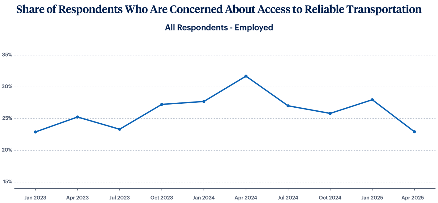
But key areas like housing, childcare, and transportation are stabilizing:

Overall I think we can synthesize these seemingly contradictory pictures by saying that Americans’ finances are fine now, but they are quite worried that things are about to get worse, perhaps due to the tariffs taking effect. You can find the rest of the LIFE survey results (including all the non-record-setting ones) here.

The End of Easy Student Loans

The Senate Health, Education, Labor and Pensions Committee is proposing to cut off student loans for programs whose graduates earn less than the median high school graduate. The House proposed a risk-sharing model where colleges would partly pay back the federal government when their students fail to pay back loans themselves. Both the House and Senate propose to cap how much students can borrow for graduate loans. Both would reduce federal spending on higher ed by about $30-$35 billion per year, cutting the size of the $700 billion higher ed sector by 4-5%. I expected that something like this would happen eventually, especially after the student loan forgiveness proposals of 2022:

While we aren’t getting real reform now, I do think forgiveness makes it more likely that we’ll see reform in the next few years. What could that look like?

The Department of Education should raise its standards and stop offering loans to programs with high default rates or bad student outcomes. This should include not just fly-by-night colleges, but sketchy masters degree programs at prestigious schools.

Colleges should also share responsibility when they consistently saddle students with debt but don’t actually improve students’ prospects enough to be able to pay it back. Economists have put a lot of thought into how to do this in a manner that doesn’t penalize colleges simply for trying to teach less-prepared students.

I’d bet that some reform along these lines happens in the 2020’s, just like the bank bailouts of 2008 led to the Dodd-Frank reform of 2010 to try to prevent future bailouts. The big question is, will this be a pragmatic bipartisan reform to curb the worst offenders, or a Republican effort to substantially reduce the amount of money flowing to a higher ed sector they increasingly dislike?

Of course, there is a lot riding on the details. How exactly do you calculate the income of graduates of a program compared to high school grads? The Senate proposal explains their approach starting on page 58. They want to compare the median income of working students 4 years after leaving their program (whether they graduated or dropped out, but exempting those in grad school) to the median income of those with only a high school diploma who are age 25-34, working, and not in school.

Nationally I calculate that this would make for a floor of $31,000. That is, the median student who is 4 years out from your program and is working should be earning at least $31k. In practice the bill would implement a different number for each state. This seems like a low bar in general, though you could certainly quibble with it. For instance, those 4 years out from a program may be closer to age 25 than age 34, but income typically rises with age during those years. If you compare them to 26 year old high school grads, the national bar would be just $28k.

What sorts of programs have graduates making less than $31k per year?

Continue reading

The Average Teaching Load of US Professors

“One of the closest guarded secrets in American higher education is the average teaching loads of faculty.” -Richard Vedder

I saw this quote in a recent piece arguing that US professors should teach more. I thought it sounded extreme, but as I look into it, it is surprisingly difficult to find data on this compared to other things like salaries:

Since 1996, for instance, the University of Delaware has administered the annual National Study of Instructional Costs and Productivity, surveying faculty and teaching assistants about course loads and enrollment. The data, though, are “only available to four-year, non-profit institutions of higher education.”[7] This secrecy, needless to say, is not the norm for surveys collected by publicly supported institutions. Tellingly, this study is being discontinued because the number of participating institutions “has slowly declined to unsustainable levels.”[8] *

There are some decent older studies that are public, like this 2005 survey of top liberal arts colleges showing that almost all have teaching loads between 4 and 6 courses per year. But in terms of recent data that is publicly available, the best I’ve found is the Faculty Survey of Student Engagement. It still isn’t great, since their 2024 survey only covers 54 of the 2000+ bachelor’s degree granting colleges in the US, and their tables show that these 54 aren’t especially representative. They make nice graphics though:

The graphics show exact percentages if you hover over them on the original Tableau site. Doing this shows that the median professor teaches 4 undergraduate courses per year. Knowing the full distribution would require the underlying data they don’t share, but from these graphics we can at least compute a rough average (rounding 4+ graduate courses to 4 and 9+ undergraduate courses to 9).

This shows that the average professor teaches 4.43 undergraduate courses and 0.75 graduate courses, for a total of 5.18 courses per academic year. If I restrict the data to full-time tenured or tenure-track professors, they teach an average of 4.72 undergraduate courses and 0.91 graduate courses, for a total of 5.63 courses per academic year.

Overall these loads are higher than I expected, especially since the survey sample is skewed towards research schools. But its still lower than the standard 3-3 load at my own institution, and low enough that it makes for a great job, especially compared to teaching K-12.

Overall though I don’t know why we need to rely on one-off surveys to get data on teaching loads, it seems like data the US Department of Education should collect from all accredited schools and share publicly.

*The Delaware Cost study is not just discontinuing new surveys, they plan to pull down existing data by December 15th 2025. Only schools that participate in their survey get access, so I can’t get the data, but perhaps some of you can.

Queens 2060: Where Upzoning Matters Most

Most US cities make it hard for housing supply to meet demand because of rules that prevent large apartment buildings. Usually cities do this with zoning rules that limit the number of homes per parcel, often to as low as 1. New York City relies more on rules about Floor Area Ratio (the ratio of the floor area to the area of the parcel). But how binding are these rules? If we relaxed or repealed them, how much new construction would we see, and where would we see it?

MIT PhD student Vincent Rollet has calculated this for New York City:

I build a dynamic general equilibrium model of the supply and demand of floorspace in a city , which I estimate using a novel parcel-level panel dataset of land use and zoning in New York City. I validate the model using quasi-experimental variation from recent zoning reforms and use it to simulate the effects of zoning changes on construction and prices.

He finds that eliminating these rules in NYC would lead to a construction boom, with a 79% increase in the amount of floor space available by 2060. This would allow many more people to live in New York, with a 52% increase in population; but many of the benefits would go to existing NYC residents, with more floor space per person and modestly lower rents leading to higher wellbeing:

Where exactly would we see the building boom? Not Manhattan, but Brooklyn and Queens. The intuition is that zoning is most binding in places where housing prices are currently high but where the buildings are currently small; this is where there is the biggest incentive to tear down existing buildings and build taller if you are allowed to.

Corporate Debt by Industry Sector

A reporter recently told me she thought there is a national trend toward hospitals issuing more bonds. I tried to verify this and found it surprising hard to do with publicly available data. But once I had to spend an hour digging through private Compustat data to find the answer, I figured I should share some results. Here’s the average debt in millions of companies by sector:

Source: My graph made from Compustat North American Fundamentals Annual data collapsed by Standard Industrial Classification code into the Fama-French 10 sectors

This shows that health care is actually the least-indebted sector, and telecommunications the most indebted, followed by utilities and “other” (a broad category that actually covers most firms in the Fama-French 10). But are health care firms really more conservative about debt, or are they just smaller? Let’s scale the debt by showing it as a share of revenue:

My graph made from Compustat North American Fundamentals Annual data collapsed by SIC code into the Fama-French 10 sectors (dltt/revt).

It appears that health care firms are the most indebted relative to revenue since 2023. But which parts of health care are driving this?

Hospitals in 2023 followed by specialty outpatient in 2024. However, seeing how much the numbers bounce around from year to year, I suspect they are driven by small numbers of outlier firms. This could be because Compustat North America data only covers publicly traded firms, but many sectors of health care are dominated by private corporations or non-profits.

I welcome suggestions for datasets on the bond-market side of things that are able to do industry splits including private companies, or suggestions for other breakdowns you’d like to see me do with Compustat.

The Most Regulated States

The Mercatus Center has put together a page of “Snapshots of State Regulation” using data from their State RegData project. Their latest data suggests that population is still a big predictor of state-level regulation, on top of the red/blue dynamics people expect:

They also made pages with much more detail on each state, like what the most regulated industries in each state are and how each one compares to the national average:

You can find your state here.

“How Can the US Manufacture More” Is a Reasonable Question That Deserves Reasonable Answers

Many regular Americans and policymakers say they want the US to manufacture more things domestically. But when they ask economists how to accomplish this, I find that our most common response is to question their premise- to say the US already manufactures plenty, or that there is nothing special about manufacturing. It’s easy for people to round off this answer to ‘your question is dumb and you are dumb’, then go ask someone else who will give them a real answer, even if that real answer is wrong.

Economists tell our students in intro classes that we focus on positive economics, not normative- that we won’t tell you what your goals should be, just how best to accomplish them. But then we seem to forget all that when it comes to manufacturing. Normally we would take even unreasonable questions seriously; but I think wondering how to increase manufacturing output is reasonable given the national defense externalities.

So if you had to increase the value of total US manufacturing output- if you were going to be paid based on a fraction of real US manufacturing output 10 years from now- how would you do it?

I haven’t made a deep study of this, but here are my thoughts. Better ideas at the top, ‘costly but would increase manufacturing output’ ideas at the bottom:

Continue reading

Kaggle Wins for Data Sharing

I like to take existing datasets, clean them up, and share them in easier to use formats. When I started doing this back in 2022, my strategy was to host the datasets with the Open Science Foundation and share the links here and on my personal website.

OSF is great for allowing large uploads and complex projects, but not great for discovery. I saw several of my students struggle to navigate their pages to find the appropriate data files, and they seem to have poor SEO. Their analytics show that my data files there get few views, and most of the ones they get come from people who were already on the OSF site.

This year I decided to upload my new projects like County Demographics data to Kaggle.com in addition to OSF, and so far Kaggle is the clear winner. My datasets are getting more downloads on Kaggle than views on OSF. I’ve noticed that Kaggle pages tend to rank highly on Google and especially on Google Dataset Search. I think Kaggle also gets more internal referrals, since they host popular machine learning competitions.

Kaggle has its own problems of course, like one of its prominent download buttons only downloading the first 10 columns for CSV or XLSX files by default. But it is the best tool I have found so far for getting datasets in the hands of people who will find them useful. Let me know if you’ve found a better one.

Anti-Tariff Declaration

The Smoot-Hawley Tariff of 1930 was opposed by a thousand economists, but passed anyway, exacerbating the Great Depression. Now that the biggest tariff increase since 1930 is on the table, the economists are trying again. I hope we will find a more receptive audience this time.

The Independent Institute organized an “Anti-Tariff Declaration” last week that now has more signatures than the anti-Smoot-Hawley declaration, including many from top economists. One core argument is the sort you’d get in an intro econ class:

Overwhelming economic evidence shows that freedom to trade is associated with higher per-capita incomes, faster rates of economic growth, and enhanced economic efficiency.

But I thought the Declaration made several other good points. Intro econ textbooks say that tariffs at least benefit domestic producers (at the expense of consumers and efficiency), but in practice these tariffs have been mainly hurting domestic producers, because:

The American economy is a global economy that uses nearly two thirds of its imports as inputs for domestic production.

I get asked to sign a petition of economists like this every year or so, but this is the first one I have ever agreed to sign onto. Most petitions are on issues where there are good arguments on each side, like whether to extend a particular tax cut, or which Presidential candidate is better for the economy. But the argument against these tariffs is as solid as any real-world economic argument gets.

The full Declaration is quite short, you can read the whole thing and consider signing yourself here.

The Best Investments of the 1970s

The tariffs still have me thinking about buying VIX calls and stock puts (especially when policy changes loom on certain dates like July 8th), and on the bigger question of finding the sort of investments that did well in the 1970’s, another decade of stagflation that was kicked off by a President who broke America’s commitment to an international monetary system that he thought no longer served us.

That’s how I concluded last week. So this week I’ll answer the question- what were the best investments of the 1970’s? When the dollar is losing value both at home and abroad, holding dollars or bonds that pay off in dollars does poorly:

Source: My calculations using Aswath Damodaran’s data

Stocks can do alright with moderate inflation, but US stocks lost value in the stagflation of the 1970’s. Foreign stocks and commodities generally performed better. Real estate held its value but didn’t produce significant returns; gold shone as the star of the decade:

Source: My calculations using Aswath Damodaran’s data

Gold is easy to invest in now compared to the 1970s; you don’t have to mess with futures or physical bullion, there are low-fee ETFs like IAUM available at standard brokerages.

Of course, while history rhymes, it doesn’t repeat exactly; this time can and will be different. I doubt oil will spike the same way, since we have more alternatives now, and if it did spike it wouldn’t hurt the US in the same way now that we are net exporters. Inflation won’t be so bad if we keep an independent Federal Reserve, though that is now in doubt. At any time the President or Congress could reverse course and drop tariffs, sending markets soaring, especially if they pivot to tax cuts and deregulation in place of tariffs ahead of the midterms.

Things could always get dramatically better (AI-driven productivity boom) or worse (world war). But for now, “1970s lite” is my base case for the next few years.