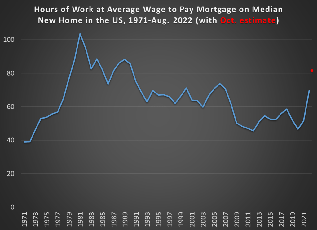
Housing is certainly more expensive than in the past. I have written about this several times, including a post from last year showing that between about 2017 and 2022 housing started to get really expensive almost everywhere in the US, not just on the West Coast and Northeast (as had previously been the case). I don’t think the housing affordability crisis is in serious doubt anymore, and it can’t be explained over the past few years by increasing size and amenities, since those haven’t changed much since 2017 (though it is relevant when comparing housing prices to the 1970s).
But why did this happen? Knowing why is crucial, not merely to blame the causes, but because the policy solution is almost certainly related to the causes. I and many others have argued that supply-side restrictions, such as zoning laws, are the primary culprit. The policy solution is to reduce those restrictions. But a recent op-ed titled “Why your parents could afford a house on one salary – but you can’t on two,” the authors place the blame for housing prices (as well as the stagnation of living standards generally) on a different factor: Nixon’s 1971 “severing the dollar’s link to gold.” The authors have a book on this topic too, which I have not yet read, but they provide most of the relevant data in this short op-ed.
Does their explanation make sense? I am skeptical. Here’s why.
Continue reading