Mortgage interest rates are climbing quickly, while housing prices are still mostly high. These factors combined means that it is much more expensive to buy a home than in the recent past. But how much more expensive? And how does this compare with the past 50 years of history?
The chart below is my attempt to answer those questions. It shows the number of hours you would need to work at the average wage to make a mortgage payment (principal and interest) on the median new home in the US.
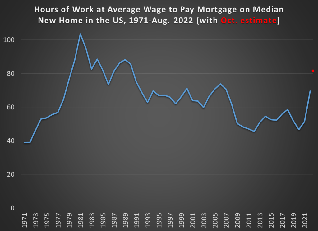
My goal here was to provide the most up-to-date estimate of this number consistent with the historical data. Thus, I had to use average wage data rather than median wage data, since the median hourly wage data is not available for 2022 yet. But as I’ve discussed before, while median and average wages are different, their rate of increase is roughly the same year-to-year, so it would show the same trends.
The final point plotted on the blue line in the chart is for August 2022, the last month for which we have median home price data, average wage data, and 30-year mortgage rates. Mortgage rates are the yearly average (or monthly average in the case of August 2022).
You’ll also notice a red dot at the very end of the series. This is my guess of where the line will be in October 2022, once we have complete data for these three variables (right now only mortgage rates are available in October for the three series I am using). I’m doing my best here to provide as much of a real-time picture as possible, given that rates are rising very sharply right now, while still providing consistent historical comparisons. If that estimate is roughly correct, mortgage costs on new homes are now less affordable than any year since 1990.
What do you notice in the chart?
For me, what sticks out is that up until 2022 we had just lived through a golden decade of housing affordability. Did you ever see that headline in the past 10 years? Perhaps someone wrote about it, but the dominant narrative is about how expensive housing has been. But over the past 50 years, the only time period that really compares is the early 1970s, which was slightly (not dramatically, slightly) cheaper in terms of housing costs compared with wages.
The late 1970s and the early 1980s saw a spike in both housing prices and mortgage interest rates (side note: many younger Boomers were buying their first houses at this time). Then, we see a gradual decline in housing costs in the late 1980s up until 2006. And then we saw the collapse of both housing prices and interest rates in the 2007-2009 recession. Housing prices started increasing again after the recession, though they wouldn’t exceed the prior peak until 2013 (in nominal terms). But interest rates just kept falling.
Of course, housing prices aren’t uniform across the country. Many of the headlines you read about dramatically increasing home prices were about particular local housing markets. They were generally true. But the if we look at the median housing price across the country, as I did in the chart above, 2009 through 2021 was indeed a golden age.
A Note on Down Payments
Built into the assumption of the data is that the buyer is making a 20% down payment (I didn’t include insurance and taxes, since it’s really hard to get averages for these, but I doubt those would change the trends, only raising the level). Of course, not all buyers make a 20% down payment anymore (and thus pay PMI until they do), so another relevant chart is how many hours you would need to work to save for a 20% down payment. That data is shown in the chart below.
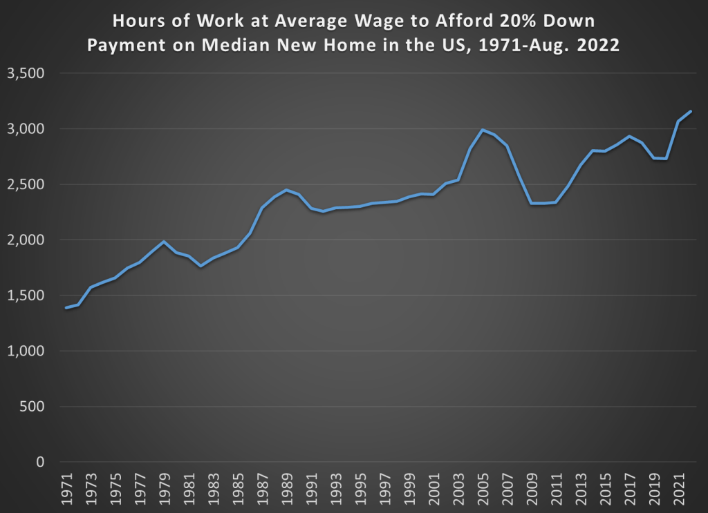
By this measure, it has become much harder to buy a home, or at least in takes longer to save for a home. It now takes about twice as many hours of work as the early 1970s to save for a 20% down payment. This is a different way of thinking about housing affordability, but it is potentially the one that is most relevant to first-time home buyers. What this means in reality is not that first-time homebuyers are shut out of the market, but that they make smaller down payments and then pay PMI until they hit 20% equity. I can’t find a long time series on this, but here’s a report suggesting that first-time buyers typically put about 5% down. With PMI, of course, mortgage payments will be slightly higher than what my first chart showed.
But Houses Are Also Much Bigger Today
There are several more things we could correct for in the data I’ve presented. The biggest is that houses are much bigger today. The median floor size of a new single-family home in 2021 was 2,273 square feet, about a 50% increase from 1,525 square feet in 1973 (and it was over 2,400 square feet from 2014-2017). I could have made an “hours per square foot” calculation in the charts, and I think there’s a certain logic to that. Of course bigger houses will cost more!
Also, the average family size has shrunk slightly from about 3.5 people in the early 1970s to about 3.1 people lately. Putting these two factors together, each person in an average family has about 68% more square feet available to them today than in the early 1970s.
I could have made these adjustments, but I didn’t. First, I think some might consider this a bit too much fudging of the data. But more importantly, people have to buy what housing is available. The concept of the “missing middle” is a real one, often driven by local zoning regulations, whereby houses that are similar in size to the past (like the early 1970s!) just aren’t available today as new construction. In 2021, just 24% of new single-family homes were under 1,800 square feet. Recall that the median in 1973 was 1,525 square feet. And that 24% includes condos and townhomes — for detached single family homes, it was just 16% under 1,800 square feet.
Deregulating housing markets would be an important step towards making housing even more affordable, and reintroducing that “missing middle,” especially in specific housing markets where there is a big premium due to zoning and other similar restrictions. But we shouldn’t let this distract us from the broader long-term trends: housing was more affordable in the past decade than it was in most people’s adult lives. We are now shocked by the spike in prices (last year) and mortgage rates (this year) because we just lived through a decade of affordable housing, not because it’s necessarily expensive compared with the past 50 years of history.

Is it a golden decade only for those who kept their jobs during the housing crash? (We bought our house for a steal in 2009.) I wonder if inequality is factoring into this: as wealth distribution bifurcates, you’re only capturing the richer half of the population, since the poorer half leaves the market (loses their house, or never buys in the first place.) Maybe look at hours worked to make 1 month’s total housing cost (mortgage or rent-equivalent?)
LikeLike