US Stocks Are Expensive, These Countries Are Not

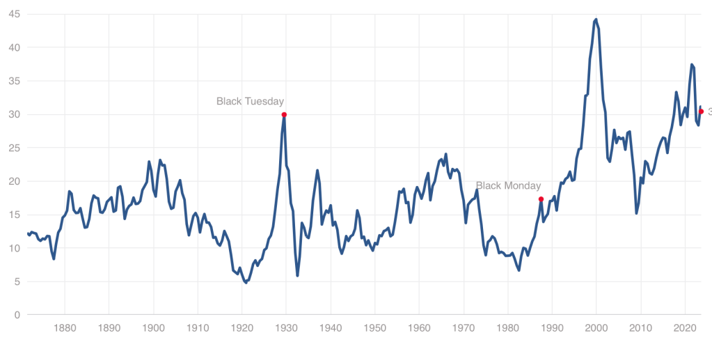
While we have stepped back from the meme stock craziness of 2021, US stocks remain quite expensive by historical standards, with our Cyclically Adjusted Price to Earnings (CAPE) ratio at almost twice its long-run average:

Source

Even at a high price, US stocks could still be worth it, and I certainly hold plenty. But I also think it it a good time to consider the alternatives. US Treasury bond yields are the highest they’ve been since 2007. But there are also many countries where stocks are dramatically cheaper than the US- and not just high-risk basket-cases, but stable “investable” countries.

There are several reasonable ways to measure what counts as “expensive” for stocks in addition to the CAPE ratio I mention above. The Idea Farm averages out four such measures to determine how expensive different “investable” (large, stable) country stock markets are. Here is their latest update:

MSCI Investable Market Indices:

Source: The Idea Farm Global Valuation Update

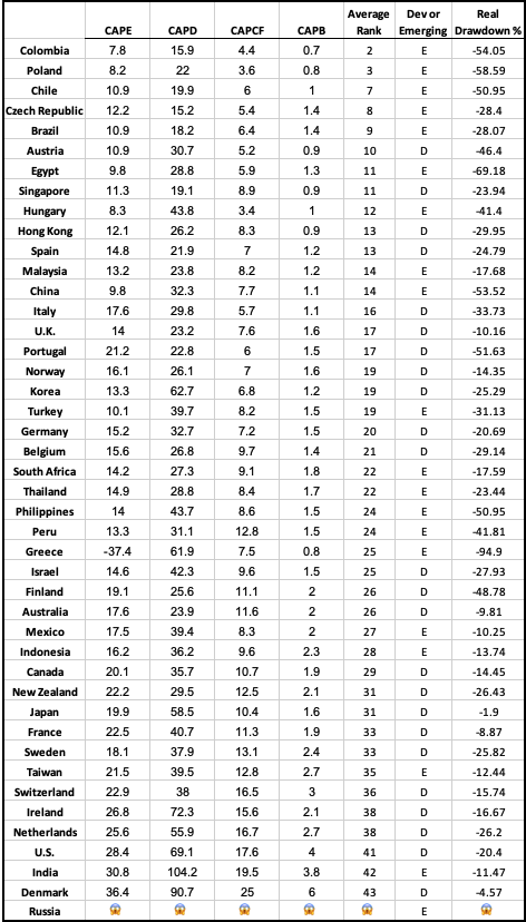
You can see that US stocks are expensive not only relative to our own history, but also relative to other countries, lagging only India and Denmark. That means that much of the world looks like a relative bargain, with the cheapest countries being Colombia, Poland, Chile, Czech Republic, and Brazil.

Of course, sometimes stocks, just like regular goods and services, are cheap for a reason: they just aren’t that good. They might be cheap because investors expect slow growth, or a recession, or political risk. But if you don’t share these expectations about a cheap stock (or country), that’s when to really take a look. I certainly did well buying Poland after I saw they were the cheapest in last year’s global valuation update and thought there was no good reason for them to stay that cheap.

I like that the chart above provides a simple ranking of investable markets. But if you wish it included more valuation measures, or small frontier markets, you can find that from Aswath Damodaran here. Some day I hope to provide a data-based, rather than vibes-based, analysis of which countries are “cheap/expensive for a reason” vs “cheap/expensive for no good reason”, featuring measures like industry composition, population growth, predictors of economic growth, and economic freedom. For now you just get my uninformed impression that Poland and Colombia seem like fine countries to me.

Disclosure: I’m long stocks or indices in several countries mentioned, including EPOL, FRDM, PBR.A, CIB, and SMIN. Not investment advice.

Continue reading

Historical Price to Earnings Ratios By Industry

Getting long-run historical PE ratios of US stocks by industry seems like the kind of thing that should be easy, but is not. At least, I searched for an hour on Google, ChatGPT, and Bing AI to no avail.

I eventually got monthly median PEs for the Fama French 49 industries back to 1970 from a proprietary database. I share two key stats here: the average of median monthly industry PE 1970-2022, and the most recent data point from late 2022.

IndustryLong Run MeanEnd 2022
AERO12.1419.49
AGRIC10.759.64
AUTOS9.6517.52
BANKS10.3810.46
BEER15.2335.70
BLDMT12.0015.41
BOOKS12.9517.60
BOXES12.1810.69
BUSSV12.0713.03
CHEMS12.4019.26
CHIPS10.4817.47
CLTHS11.4510.94
CNSTR8.984.58
COAL8.042.92
DRUGS1.148.01
ELCEQ10.7817.85
FABPR10.2819.40
FIN11.1612.97
FOOD14.3025.03
FUN9.1021.06
GOLD3.18-5.95
GUNS11.505.05
HARDW7.9619.16
HLTH11.916.09
HSHLD12.6020.15
INSUR10.9516.33
LABEQ13.4625.18
MACH12.5120.27
MEALS13.8319.19
MEDEQ6.8127.64
MINES8.0616.27
OIL6.969.00
OTHER12.2027.68
PAPER12.5016.69
PERSV12.86-0.65
RLEST8.13-0.30
RTAIL12.268.58
RUBBR12.1112.81
SHIPS9.7917.42
SMOKE11.7417.79
SODA12.3832.09
SOFTW8.21-2.85
STEEL8.184.30
TELCM6.759.58
TOYS9.18-1.32
TRANS11.2513.11
TXTLS9.43-49.00
UTIL12.3417.41
WHLSL11.0813.13
Mean Industry Median10.5212.73

One obvious idea for what to do with this is to invest in industries that are well below their historical price, and avoid industries that are above it (not investment advice). Looking just at current PEs is ok, but a stock with a PE of 8 isn’t necessarily a good value if its in an industry that typically has PEs of 6.

By this metric, what looks overvalued? Money-losing industries (negative current earnings): Gold, Personal Services, Real Estate, Software, Toys, and Textiles. Making money but valuations 19+ above historical average: Medical Equipment, Beer, Soda. Most undervalued relative to history: Guns, Health, Coal, Construction, Steel, Retail (all 3+ below the historical average).

Of course, I don’t recommend blindly investing in these “undervalued” industries- not just for legal reasons, but because sometimes the market prices them low for a reason- that earnings are expected to fall. The industry may be in secular decline due to new types of competition (coal, steel, retail). Or investors may expect it to get hit with a big cyclical decline in an upcoming recession or rotation from the Covid goods/manufacturing economy back to services (guns, construction, steel, retail). Health services (as opposed to drugs and medical equipment) stands out here as the sector where I don’t see what is driving it to trade at barely half of its usual PE.

I’d still like to get data on long run market-cap weighted mean PE by industry, as opposed to the medians I show here. The best public page I found is Aswath Damodaran’s data page, which has a wide variety of statistics back to about 1999. Some of the current PEs he calculates are quite different from those in my source, another reason to tread carefully here. I’m not sure how much of this is mean vs median and how much is driven by different classification of which stocks fit in which industry category.

This gets at a big question for anyone trying to actually trade on this- do you buy single stocks, or industry ETFs? Industry ETFs make sense in principle (since we’re talking about industry level PEs overall) and also add built-in diversification. But the PE for the ETF’s basket of stocks likely differs from that of the industry as a whole. It would make more sense to compare the ETF’s current PE to its own historical PE, but most industry ETFs have very short track records (nothing close to the 53 years I show here). PE is also far from the only valuation metric worth considering.

All this gets complex fast but I hope the historical PE ratio by industry makes for a helpful start.