I said years ago on my Ideas Page that we need data and research on Benefit Cliffs:
Benefits Cliffs: Implicit marginal tax rates sometimes go over 100% when you consider lost subsidies as well as higher taxes. This could be trapping many people in poverty, but we don’t have a good idea of how many, because so many of the relevant subsidies operate at the state and local level. Descriptive work cataloging where all these “benefits cliffs” are and how many people they effect would be hugely valuable. You could also study how people react to benefits cliffs using the data we do have.
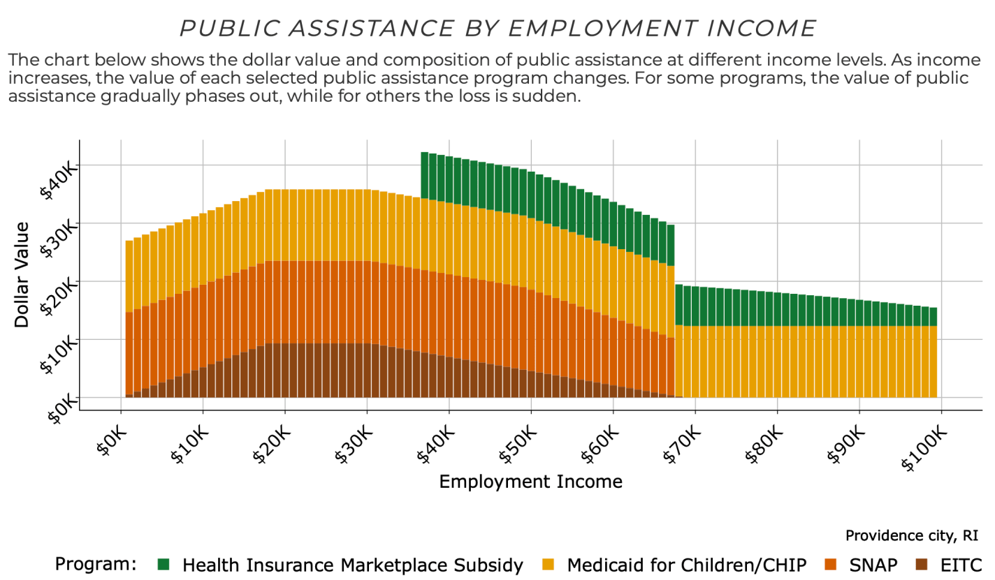
But it turns out* that the Atlanta Fed has now done the big project I’d hoped some big institution would take on and put together the data on benefits cliffs. They even share it with an easy-to-use tool that lets you see how this applies to your own family. Based on your family’s location, size, ages, assets, and expenses, you can see how the amount of public assistance you are eligible for varies with your income:
Then see how your labor income plus public assistance changes how well off you are in terms of real resources as your labor income rises:

For a family like mine with 3 kids and 2 married adults in Providence, Rhode Island, it shows a benefit cliff at $67,000 per year. The family suddenly loses access to SNAP benefits as their labor income goes over $67k, making them worse off than before their raise unless their labor income goes up to at least $83,000 per year.
I’ve long been concerned that cliffs like this in poorly designed welfare programs will trap people in (or near) poverty, where they avoid taking a job, or working more hours, or going for a promotion, or getting married, in order to protect their benefits. This makes economic sense for them over a 1-year horizon but could keep them from climbing to independence and the middle-class in the longer run. You can certainly find anecdotes to this effect, but it has been hard to measure how important the problem is overall given the complex interconnections between federal, state, and local programs and family circumstances.
I look forward to seeing the research that will be enabled by the full database that the Atlanta Fed has put together, and I’m updating my ideas page to reflect this.
*I found out about this database from Jeremy’s post yesterday. Mentioning it again today might seem redundant, but I didn’t want this amazing tool to get overlooked for being shared toward the bottom of a long post that is mainly about why another blogger is wrong. I do love Jeremy’s original post, it takes me back to the 2010-era glory days of the blogosphere that often featured long back-and-forth debates. Jeremy is obviously right on the numbers, but if there is value in Green’s post, it is highlighting the importance of what he calls the “Valley of Death” and what we call benefit cliffs. The valley may not be as wide as Green says it is and it may be old news to professional tax economists, but I still think it is a major problem, and one that could be fixed with smarter benefit designs if it became recognized as such.


