Does More Health Spending Buy Better Outcomes for States?

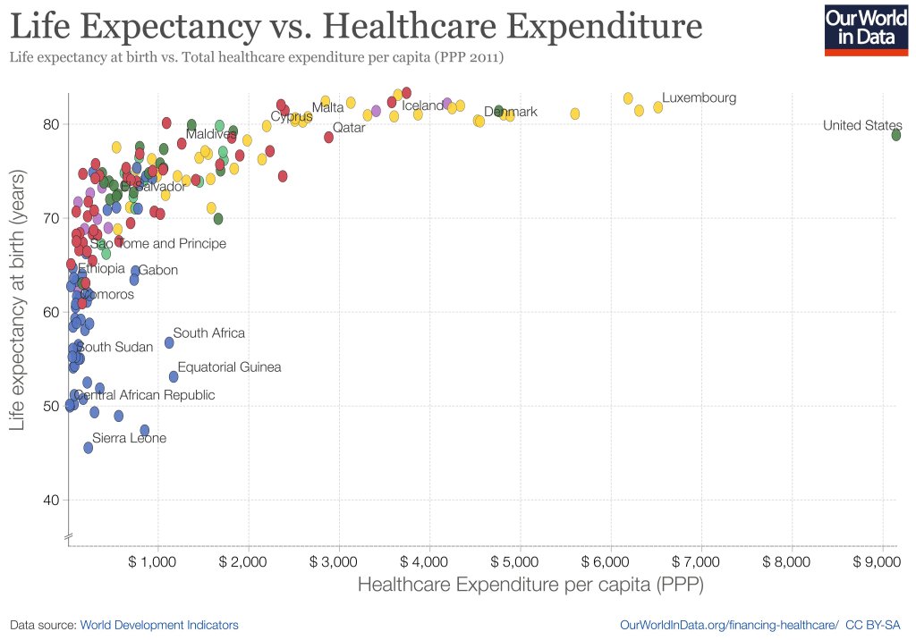
When you look across countries, it appears that the first $1000 per person per year spent on health buys a lot; spending beyond that buys a little, and eventually nothing. The US spends the most in the world on health care, but doesn’t appear to get much for it. A classic story of diminishing returns:

Source: https://twitter.com/MaxCRoser/status/810077744075866112/photo/1

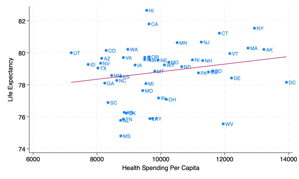
This might tempt you to go full Robin Hanson and say the US should spend dramatically less on health care. But when you look at the same measures across US states, it seems like health care spending helps after all:

Source: My calculations from 2019 IHME Life Expectancy and 2019 KFF Health Spending Per Capita

Last week though, I showed how health spending across states looks a lot different if we measure it as a share of GDP instead of in dollars per capita. When measured this way, the correlation of health spending and life expectancy turns sharply negative:

Source: My calculations from 2019 IHME life expectancy, Gross State Product, and NHEA provider spending

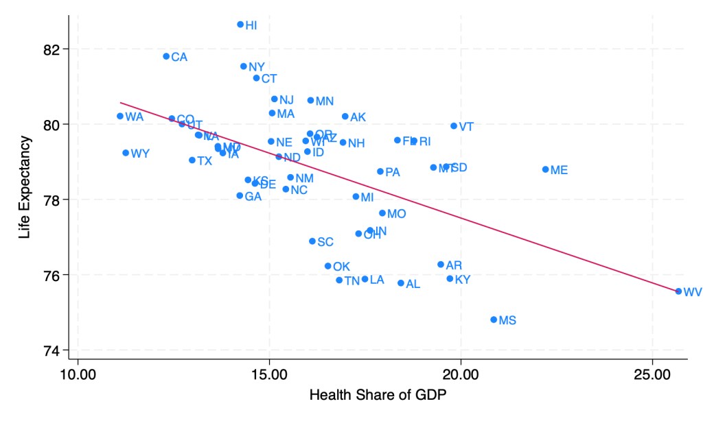
Does this mean states should be drastically cutting health care spending? Not necessarily; as we saw before, states spending more dollars per person on health is associated with longer lives. States having a high share of health spending does seem to be bad, but this is more because it means the rest of their economy is too small, rather than health care being too big. Having a larger GDP per capita doesn’t just mean people are materially better off, it also predicts longer life expectancy:

Source: My calculations from 2019 IHME life expectancy and 2019 Gross State Product

As you can see, higher GDP per capita predicts longer lives even more strongly than higher health spending per capita. Here’s what happens when we put them into a horse race in the same regression:

The effect of health spending goes negative and insignificant, while GDP per capita remains positive and strongly significant. The coefficient looks small because it is measured in dollars, but what it means is that a $10,000 increase in GDP per capita in a state is associated with 1.13 years more life expectancy.

My guess is that the correlation of GDP and life expectancy across states is real but mostly not caused by GDP itself; rather, various 3rd factors cause both. I think the lack of effect of health spending across states is real, between diminishing returns to spending and the fact that health is mostly not about health care. Perhaps Robin Hanson is right after all to suggest cutting medicine in half.

Life Expectancy By State 1990-2019

I’m making a panel of historical life expectancy data by state available here:

Life Expectancy By State 1990-2019

It covers the years 1990 to 2019 for every US state, and has life expectancy at birth, age 25, and age 65. It includes breakdowns by sex and by race and ethnicity, though the race and ethnicity breakdowns aren’t available for every state and year.

This is one of those things that you’d think would be easy to find elsewhere, but isn’t. The CDC’s National Center for Health Statistics publishes state life expectancy data, but only makes it easily available back to 2018. The United States Mortality DataBase has state life expectancy data back to 1959, but makes it quite hard to use: it requires creating an account, uses opaque variable names, and puts the data for each state into a different spreadsheet, requiring users who want a state panel to merge 50 sheets. It also bans re-sharing the data, which is why the dataset I present here is based on IHME’s data instead.

The IHME data is much more user-friendly than the CDC or USMDB, but still has major issues. By including lots of extraneous information and arranging the data in an odd way, it has over 600,000 rows of data; covering 50 states over 30 years should only take about 1,500 rows, which is what I’ve cleaned and rearranged it to. IHME also never actually gives the most basic variable: life expectancy at birth by state. They only ever give separate life expectancies for men and women. I created overall life expectancy by state by averaging life expectancy for men and women. This gives people any easy number to use, but a simple average is not the ideal way to do this, since state populations aren’t exactly 50/50, particularly for 65 year olds. If you’re doing serious work on 65yo life expectancy you probably want to find a better way to do this, or just use the separate male/female variables. You might also consider sticking with the original IHME data (if its important to have population and all cause mortality by age, which I deleted as extraneous) or the United States Mortality DataBase (if you want pre-1990 data).

Overall though, my state life expectancy panel should provide a quick and easy option that works well for most people.

Here’s an example of what can be done with the data:

If states are on the red line, their life expectancy didn’t change from 1990 to 2019. If a state were below the red line, it would mean their life expectancy fell, which done did (some state names spill over the line, but the true data point is at the start of the name). The higher above the line a state is, the more the life expectancy increased from 1990 to 2019. So Oklahoma, Mississippi, West Virginia, Kentucky and North Dakota barely improved, gaining less than 1.5 years. On the other extreme Alaska, California, New York improved by more than 5 years; the biggest improvement was in DC, which gained a whopping 9.1 years of life expectancy over 30 years. My initial thought was that this was mainly driven by the changing racial composition of DC, but in fact it appears that the gains were broad based: black life expectancy rose from 65 to 72, while white life expectancy rose from 77 to 87.

You can find other improved datasets on my data page, and once again this life expectancy data is here: Life Expectancy By State 1990-2019