23 MSAs Produce Half of US GDP

The 23 blue-shaded MSAs in this map produce half of US GDP:

You might be tempted to think this map, like so many maps, is just a map of US population. It kind of is, but not completely. These 23 MSAs have 133 million people (as of the 2020 Census), or about 40% of the US population. That’s a lot, but it’s much less than half, which the GDP proportion they account for. In other words, these MSAs also tend to have above-average per capita income.

The three largest MSAs by population (NY, LA, Chicago) are also the three largest by GDP. But after the first three there are some interesting discrepancies. The San Francisco MSA is the 4th largest by GDP, but only the 12th largest by population — San Fran has a population similar to the Phoenix MSA, but almost double the GDP. San Francisco MSA has a very high GDP per capita (the third highest).

The San Jose MSA is also among these 23 largest MSAs for GDP, and also sticks out — it is the 13th largest by total GDP, but only the 36th largest by population. San Jose has a population similar to Cleveland and Nashville, but well over double the GDP of these two MSAs individually. In fact, there are 12 MSAs larger in population than San Jose, but that aren’t among these 23 MSAs that produce half of US GDP: places like St. Louis, Orlando, San Antonio, Pittsburgh, and Columbus. Silicon Valley really pulls up San Jose: it has the 2nd largest GDP per capita among MSAs, only beaten by much smaller Midland, Texas and its oil income.

Here is the full list of those 23 MSAs:

  1. New York-Newark-Jersey City, NY-NJ-PA
  2. Los Angeles-Long Beach-Anaheim, CA
  3. Chicago-Naperville-Elgin, IL-IN-WI
  4. San Francisco-Oakland-Berkeley, CA
  5. Dallas-Fort Worth-Arlington, TX
  6. Washington-Arlington-Alexandria, DC-VA-MD-WV
  7. Houston-The Woodlands-Sugar Land, TX
  8. Boston-Cambridge-Newton, MA-NH
  9. Seattle-Tacoma-Bellevue, WA
  10. Atlanta-Sandy Springs-Alpharetta, GA
  11. Philadelphia-Camden-Wilmington, PA-NJ-DE-MD
  12. Miami-Fort Lauderdale-Pompano Beach, FL
  13. San Jose-Sunnyvale-Santa Clara, CA
  14. Phoenix-Mesa-Chandler, AZ
  15. Minneapolis-St. Paul-Bloomington, MN-WI
  16. Detroit-Warren-Dearborn, MI
  17. San Diego-Chula Vista-Carlsbad, CA
  18. Denver-Aurora-Lakewood, CO
  19. Baltimore-Columbia-Towson, MD
  20. Austin-Round Rock-Georgetown, TX
  21. Charlotte-Concord-Gastonia, NC-SC
  22. Riverside-San Bernardino-Ontario, CA
  23. Tampa-St. Petersburg-Clearwater, FL

Where Can You Still Buy an Affordable Home in the US?

A few months ago I looked at the richest and poorest MSAs in the US, including adjusting for the cost of living in each MSA. One big thing I found was that the list doesn’t change that much when you adjust for the cost of living: San Jose, San Francisco, Bridgeport (CT), Boston, and Seattle are still the highest income MSAs even after accounting for the fact that they are also high-cost-of-living places to live. The gap shrinks, but they are still in the lead.

But that was adjusting for all the factors in the cost of living. But what if we just looked at one important aspect of the cost of living: housing. And since the cost-of-living adjustments (BEA’s RPP) that I was using are from 2021, what if we tried to bring the data up as close to the present as possible? We know that housing prices have increased a lot since 2021, but also that the cost of borrowing has risen dramatically too. What would this show us about the cost of living for different MSAs?

A tool from the Harvard Joint Center for Housing Studies allows us to make some pretty up-to-date comparisons. Their interactive map shows data for the 179 largest MSAs (about half of the total MSAs in the US) on the median price of each home for the second quarter of 2023 and uses interest rates from that quarter to show the rough principal and interest cost (assuming a 3.5% down payment). Taxes and insurance costs for each MSA are also estimated.

Based on those assumptions, their tool provides the minimum income you would need to purchase a home in that area, assuming a 31% debt-to-income ratio for the mortgage. And the income levels needed vary quite widely across MSAs, from a low of $44,000 in Cumberland, Maryland, to a high of over $500,000 in San Jose, CA. That’s a huge difference.

Of course, we know that incomes also vary across MSAs. But they don’t vary that much. The JCHS tool doesn’t provide this data (though a JCHS map from 2017 did compare house prices to incomes), but we can look up median family income for each MSA from Census. Doing so we see that San Jose is indeed unaffordable based on the current (2022) median income, which is “only” about $170,000. A nice income compared to the national median, but only about 1/3 of the $500,000 you would need to afford a home in San Jose. Cumberland looks much better though: median family income is over $77,000 there, about 76% more than you would need to buy a home!

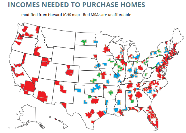
What if we did a similar calculation for all MSAs in the JCHS data? The following map is my attempt to do so. Sorry, but my graphics skills are not the best, so this map isn’t as pretty as it could be (I started with the JCHS map, and just shaded in the colors I wanted to use). But I think it conveys the general idea.

Green-shaded MSAs are the most affordable: places like Cumberland, Maryland, where median family income is well above (at least 20% above, my arbitrary threshold) the amount JCHS says you need to buy a home. There are 27 Green-shaded MSAs. Blue-shaded MSAs are affordable too, and median income is between 100% and 120% of the amount needed to afford a home on the JCHS standard. There are 41 of these, making 68 total MSAs out of these 179 that are affordable. Red-shaded MSAs are less than 100%, and thus unaffordable (though as I will discuss below, some are much closer to affordable than others).

Continue reading