Demography is cool generally, but life tables are really cool in their elegance. Don’t know what a life table is? Let me ‘splain.
A life table uses data from private or public death registers, or even genealogical records, to identify a variety of survival and death estimates. Briefly, the tables include for each age:
- Probability of death in the next year
- Probability of surviving to the age
- The life expectancy
There is more in the tables, but these are the big items that people often want to know. All of the various table columns can be calculated from survival rates. The US government and the UN each has created many such tables for a variety of time, locations, and development details. For example, the earliest and most dependable one is from 1901 and includes separate tables by race, sex, migrant status, urbanity, and even for some specific states.
One cool thing about knowing survival rates, is that you can estimate how many dead people are missing from a sample and when they were born. That is, given data at some decadal census year, we can calculate the number of people who were born since the previous census and died before the next census. Nifty! For example, knowing that only 91.6% of people survive to age 10 allows us to calculate that the current cohort of 10-year-olds was initially 9.2% larger (=1/0.916) in their birth year. Isn’t that something? This is all standard stuff for demographers, but I think that it’s beautiful.
Another cool thing is that survival rates between the ages of one and eighty can dependably transformed to follow a logistic function.* See below the survival rates for white US males.
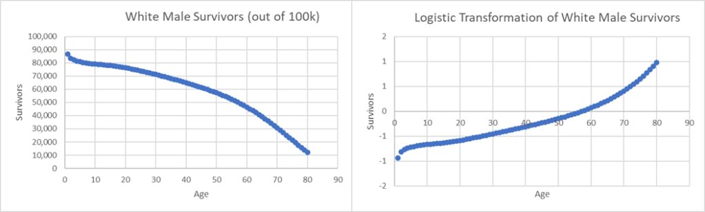
I mean, so what? Why does it matter what kind of functional form survival rates follow? It matters because plotting any two logit functions against one another yields a straight line. Again, so what? Well! I’m glad you asked! If we have two sets of survival rates, say from urban and rural populations, then we can calculate their weighted average according to some target population. Getting these urbanity details right affects the rate of survival and the shape of the logistic function. If there is some other population out there about whom we know the urbanity details and little else, then we can estimate their life table! DON’T YOU SEE? We can estimate births, deaths, and survival rates with much less information than we had for the initial life table construction.
Below is a scatter plot of logit transformed survival rates for American women Vs American men at the turn of the 20th century.
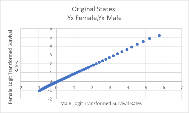
The slope of this line should match if the characteristics are similar enough (their deaths at each age follow a similar pattern). If we know the life expectancy of women, then that’s all we need to create an entire life table for them. The intercept of the line of best fit can be adjusted, the series untransformed to yield the survival rates, and then the life expectancy rates calculated. If we know just one life expectancy at any age, then we can just keep adjusting the intercept until we reach it.** Batta-bing-batta-boom! By mimicking the development details of a population and by knowing the life expectancy for just one age we can back out the entire life table. We can count people who were born and died before any enumerator was ever able to see them.
I find this fascinating. And I hope that you do too.
*Brass, W. On the scale of mortality. In: Brass, W., editor. Biological Aspects of Demography. London: Taylor and Francis Ltd.; 1971.
**Hacker, J.David. 2010. “Decennial Life Tables for the White Population of the United States, 1790–1900.” Historical Methods 43 (2): 45–79. https://doi.org/10.1080/01615441003720449.
