If you didn’t know already, the past five years has been a whirl-wind of new methods in the staggered Differences-in-differences (DID) literature – a popular method to try to tease out causal effects statistically. This post restates practical advice from Jonathan Roth.
The prior standard was to use Two-Way-Fixed-Effects (TWFE). This controlled for a lot of unobserved variation over individuals or groups and time. The fancier TWFE methods were interacted with the time relative to treatment. That allowed event studies and dynamic effects.
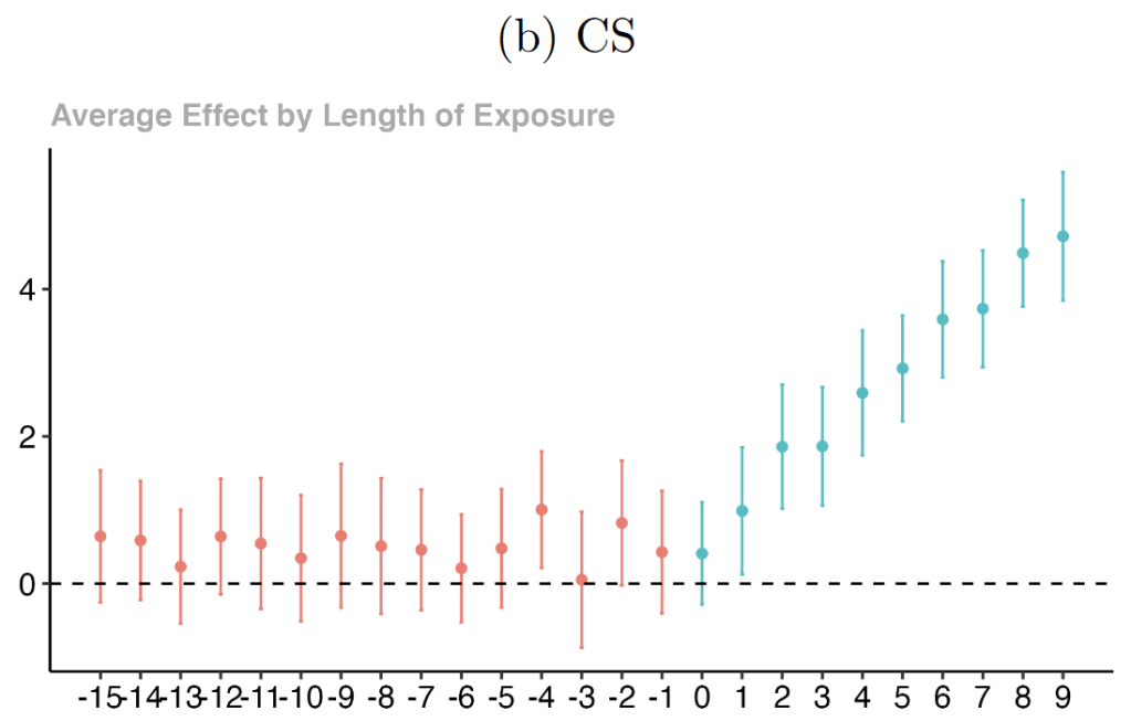
The current most popular method for binary treatments is the method by Callaway & Santa Anna (CS). Their method is relatively straightforward, easy to implement, and allows multiple levels of aggregation. That means that we can estimate the effect of treatment as a single number or at some horizon after treatment. Or we can estimate dynamic effects in an event study. Or we can estimate the effect for cohorts who were treated a different times. Finally, one could even measure the effect by absolute time period, but it’s not as clear how that helps in a staggered DID research design.
The new methods create plots like the below and appear very similar to the old TWFE plots. THEY ARE NOT THE SAME AND YOU CAN’T JUST EYEBALL THEM. I suspect that this will soon be known by everyone. If you eyeball the below event study estimation results, you might think that 1) the parallel pre-trend condition is satisfied, 2) that there is an effect of the intervention, and 3) that the effect grows over time.
Now look at the same estimation results below for the classic dynamic TWFE method. That, my friends, is a whole lot of nothing. The differences between the two graphs are stark and make one question what they heck we’re all doing.
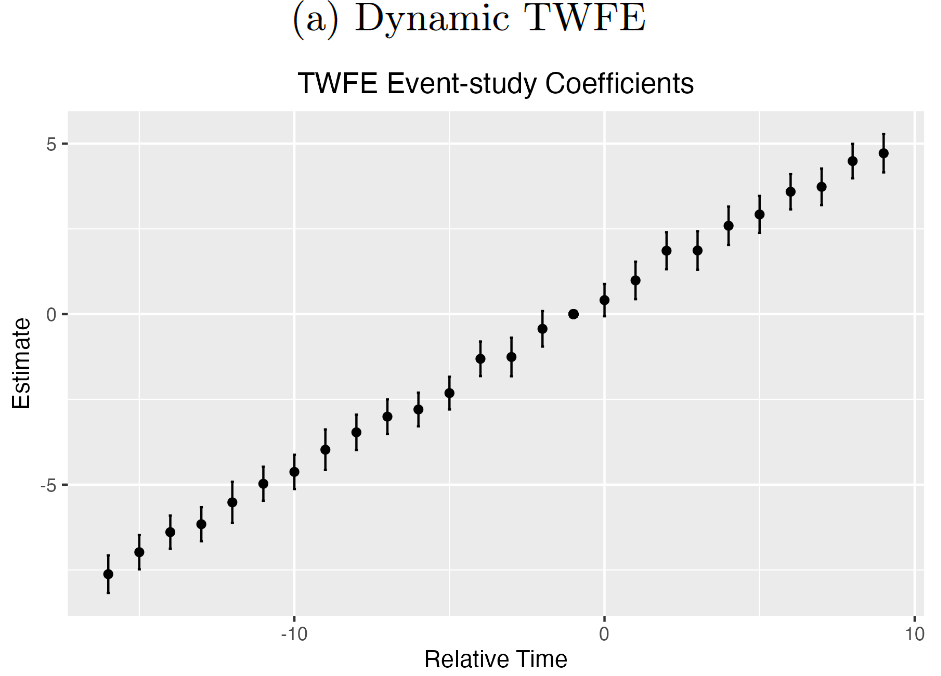
The reason for the difference is super simple and easy to fix. The TWFE model compares all dynamic effects to the period just prior to the treatment intervention. The CS method compares the post-intervention estimates to that same baseline at time -1. Both plots reflect very similar post-treatment plots. The difference is in how the two models treat the pre-treatment section. By default, the CS method estimates the pre- and post-treatment effects separately. The pre-treatment effects are each compared against the prior effect. That’s why each of those pre-treatment dots on on the CS plot are above zero, albeit insignificantly. If you were to compare the TWFE pre-treatment effect similarly, then you’d get a result that looks more like the CS plot.
I don’t need to tell you that this is potentially SUPER misleading. Imagine that a researcher says that they use the most modern methods, shows you the first CS plot, and then enjoys their publication on false (maybe mistaken) pretenses. That’s mundane! Imagine an internal researcher for a company or other institution making the same mistake. Or worst yet, a policy maker. I don’t know about you, but that scares me.
So what to do? It’s easy. In both R and Stata, there is an optional setting to estimate the pre- and post-interventions symmetrically. That is, compare them both to the period ‘-1’ baseline. In R you specify ‘base_period=”universal”‘. In Stata you just specify ‘long2’.
Importantly, omitting “long2” doesn’t invalidate results so long as parallel pre-treatment trends are satisfied. Rather, it means that visual inspection can’t distinguish between a violation of parallel trends and an actual treatment effect post-intervention. I encourage anyone who wants greater elaboration to read the whole paper.
