Alex Tabarrok was kind enough to share a chart of mine showing that one-third of families in the US have incomes greater than $150,000. This is a massive increase since the 1960s, or even since the 1980s.
In addition to questions about inflation adjustments and general disbelief, one of the more common questions about this data is how much of it is driven by rising dual-income families, where both the husband and wife work (for purposes of this post, I will look only at opposite-sex couples, since going back to the 1960s this is the only way we can really make consistent comparisons).
In short: most of the growth of high-income families can not be explained by the rise of dual-income families. The basic reason is that the growth in dual-income families had mostly already occurred by the 1980s or 1990s (depending on the measure). So the tremendous growth since about 1990, when just about 15 percent of families were above $150,000 (in 2024 dollars), is better explained by rising prosperity, not a trick of more earners.
You can see this in a number of ways. First, here is the share of married couples where both spouses are working. I have presented the data including all married couples (blue line), as well as only married couples with some earners (gold line), since the aging of the population is biasing the blue-line downwards over time.
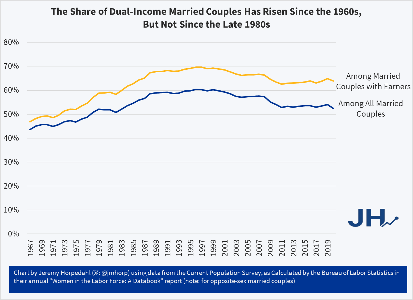
Two trends are clear in this first chart: dual-income families do rise from the 1960s (and likely before that if we had data), but the rise is complete by the late 1980s or so: the figures for 2019 are almost identical to about 1987. There is some business cycle effect, especially with the blue line, but there is no upward trend. In fact, overall by 2019 (pre-pandemic, I include 2020 but it’s probably unreliable), these figures were noticeably lower than the late 1990s. Among couples with earners (that is, primarily excluding retirees), the majority of married couples were dual-income families as early as 1973.
The data in the first chart comes from a BLS report on women in the labor force, but they haven’t updated it with comparable data since 2020 (so far as I can tell). But we can use a related series from BLS in their “Employment Characteristics of Families” report. Although it only goes back to the early 1990s, we can see the same pattern of not much increase since then. This report allows us to look specifically at married couples with children at home. Admittedly, this is a subset of all families, but it is probably exactly the kind of family people envision when they think of rising dual-income families.
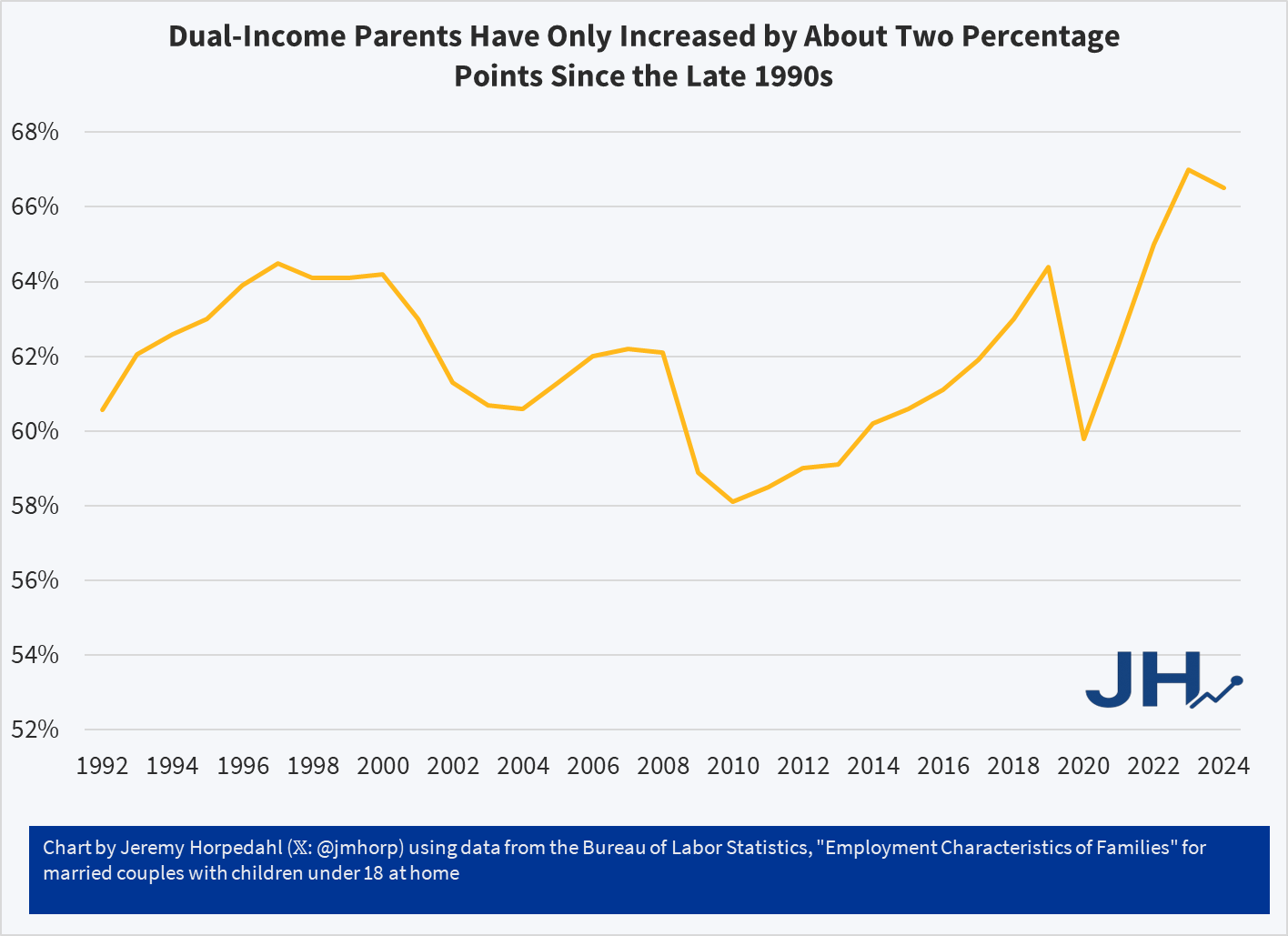
Dual-income parents peaked in the late 1990s (as a share of married couples with children), declined during each of the three recessions since then, and post-COVID have recovered and exceeded the late 1990s peaks. But only about 2 percentage points. And notice also that this was already clearly the majority situation as far back as BLS calculated it, as it was over 60 percent in 1992 (this data likely could be calculated back to 1967 with the CPS — a project for another day!).
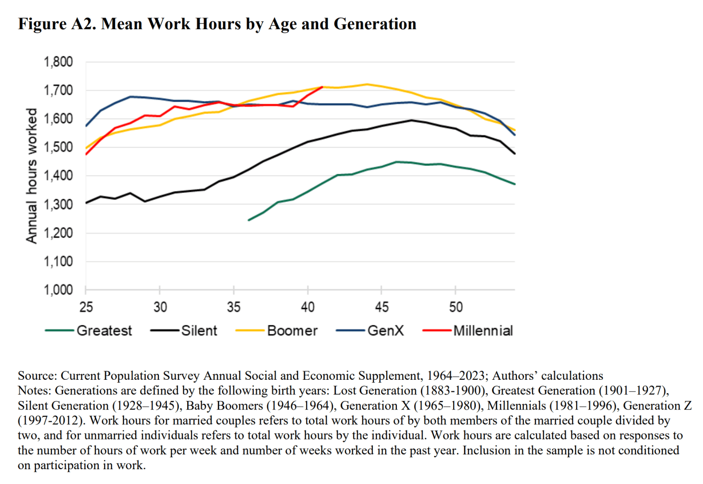
We can see this a few other ways too. For example, in a great paper by Kevin Corinth and Jeff Larrimore (I wrote about it here), they show that total hours worked in the household by married couples did indeed rise from the Greatest Generation and the Silent Generation through the Boomers, but after the Boomers there is no increase. In fact, by their late 30s, Boomers were working slightly more hours (the combined couple hours) than the next two generations! The median Boomer is in their late 30s right around — you guessed it — 1990.
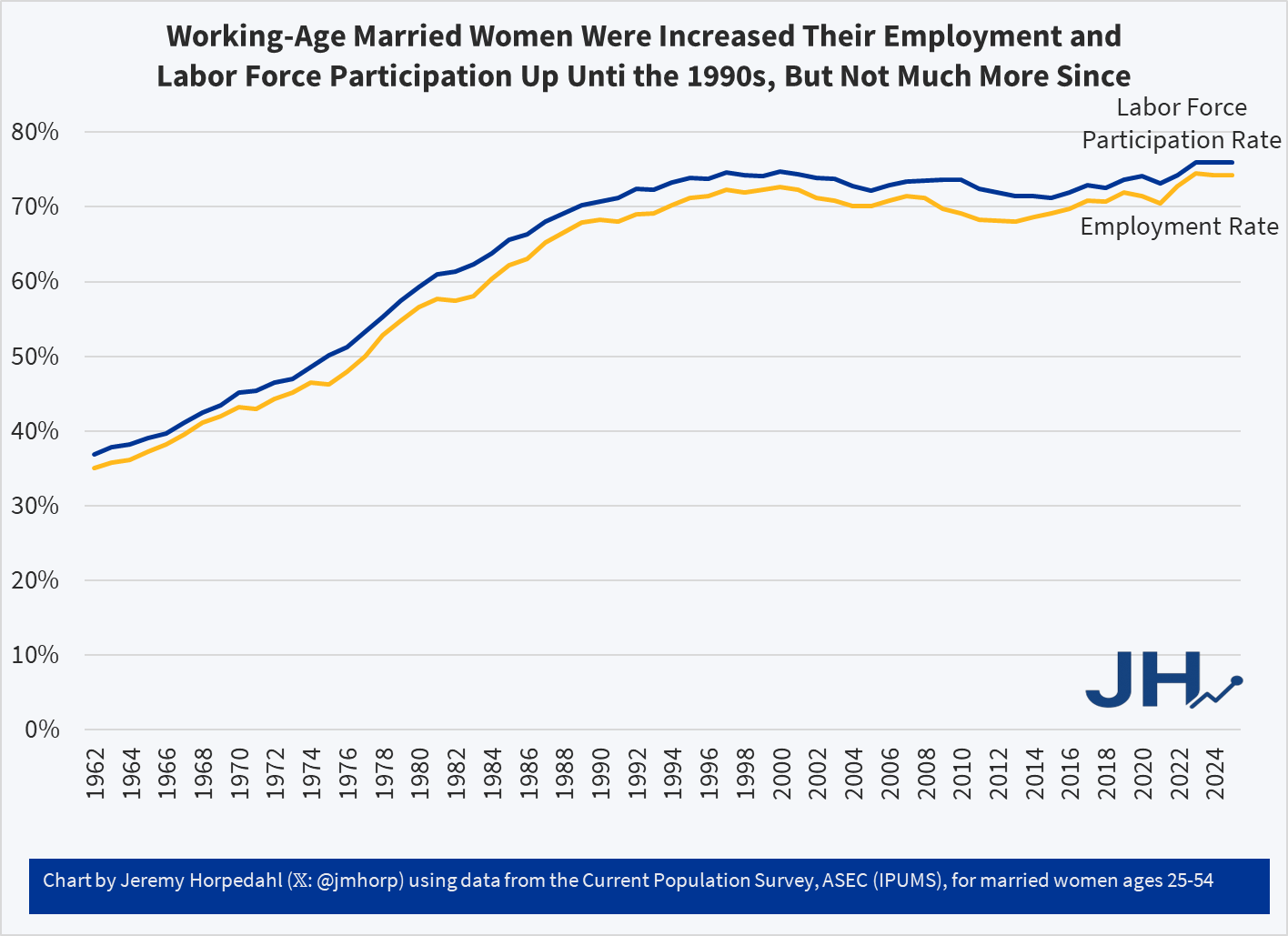
We can see a very similar trend if we look at the employment rate and labor force participation rate of working women ages 25-54: clearly rising through the 1980s, but leveling off in the 1990s. Post-COVID is a bit higher, but not enough to explain the massive increase in high-income families.
Finally, could it just be that women are more likely to work full-time, whereas in the past they mostly worked part-time? Not exactly (one final chart for you!):
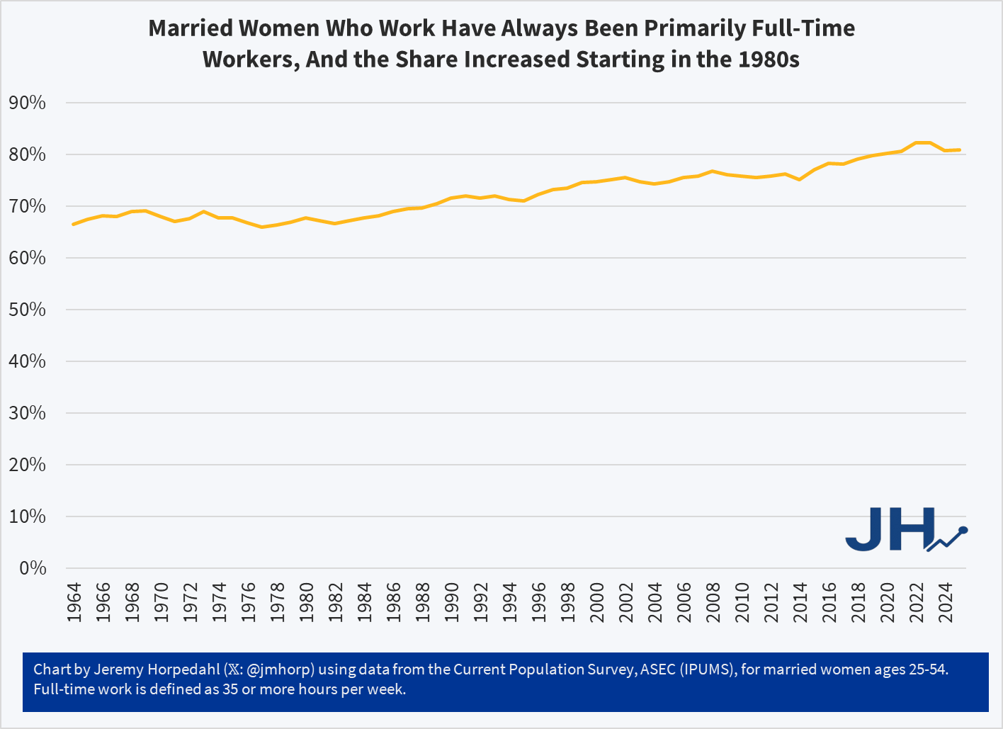
With data going back to 1964, we see that married women workers ages 25-54 have always been primarily full-time workers: it was already over 2/3 of the total in the 1960s and 1970s. This figure did start to rise in the 1980s, and in recent years it is over 80 percent. But keep in mind the earlier chart on total household working hours: while women are working more hours, total hours haven’t changed much since about 1990. That means that male working hours must have decreased slightly. This factor alone would push family income in the other direction: women earn, on average, less than men! We won’t get into the very detailed literature on why this is so today, but as more of the family market labor is from women, this alone would cause family income to fall (recall though that when we include non-market work, women have always worked more than men). So given that change in full-time wife employment, combined with flat family working hours, the increase in total family income is even more impressive.
Keep in mind the long-run trend we are trying to explain: the share of US families with over $150,000 of income (in 2024 inflation-adjusted dollars) was 5.2% in 1967, 15.4% in 1990, and 33.8% in 2024. The change from 1967 to 1990 is impressive, with share tripling, though some of this is likely explained by the rise of dual-income families. But the increase from 1990 to 2024 is even more impressive: while it’s just a little more than a doubling, it is a growth over 18 percentage points! In other words, about 16 million more families out of a total of 86 million families) are now very high income compared to the proportion in 1990. And it is very hard to explain this change since 1990 with more dual-income families (because that hasn’t happened).

I am not an economist, but when I read the article, my immediate assumption was measurement malfunction. Setting aside dollars for a moment, the idea you are trying to capture is “high-ish income”. What I think you are now capturing is the increasing divide in the value of a dollar based on geography. In many places $150k per year is a great combined income for a household of any size, but in other areas — San Mateo, CA comes to mind — that household income could be considered low income. Pretty wild! As economic activity has become more concentrated in urban centers, these distortions in measurement have become greater. Is $150k a measure of wealth in the true sense? Depends on the distance between you and an economic center. https://www.smdailyjournal.com/news/local/report-san-mateo-county-has-countrys-highest-low-income-threshold/article_5f2d6aea-2c8d-11ef-a22a-cf4d16977ef1.html
LikeLike
Is it possible that women had a wage gap that has been closed?
LikeLike