I previously reviewed Vanguard founder John Bogle’s entry in this series, the Little Book of Common Sense Investing:
I can sum it up at much less than book length: the best investment advice for almost everyone is to buy and hold a diversified, low-fee fund that tracks an index like the S&P 500.
Greenblatt offers his own twist on value investing that emphasizes just two value metrics- earnings yield (basically P/E) and return on capital (return on assets). The idea is to blend them, finding the cheapest of the high-quality companies. The specific formula is to pick stocks with a return on assets of at least 25%, then select the ~30 stocks with the lowest P/E ratio among those (excluding utilities, financials, and foreign stocks), then hold them for a year before repeating the process. He shows that this idea performed very well from 1988 to 2010.
How has it done since? He still maintains the website, https://www.magicformulainvesting.com, that gives updated stock screens to implement his formula, which is nice. But the site doesn’t offer updated performance data, and his company (Gotham Capital) offers no ETF to implement the book’s strategy for you despite offering 3 other ETFs, which suggests that Greenblatt has lost confidence in the strategy. Here are the top current top stocks according to his site (using the default minimum market cap):
Perhaps this is worthwhile as an initial screen, but I wouldn’t simply buy these stocks even if you trust Greenblatt’s book. When I started looking them up, I found the very first two stocks I checked had negative GAAP earnings over the past year, meaning Greenblatt’s formula wouldn’t be picking them if it used correct data. The site does at least have a good disclaimer:
“Magic Formula” is a term used to describe the investment strategy explained in The Little Book That Beats the Market. There is nothing “magical” about the formula, and the use of the formula does not guarantee performance or investment success.
Greenblatt’s Little Book is a quick and easy way to learn a bit about value investing, but I think Bogle’s Little Book has the better advice.
Back in February, 2023 I wrote an enthusiastic plug for including managed futures funds in an investment portfolio. That was based on several observations. First, bonds have become often positively correlated with stocks, so the traditional 60/40 stock/bond portfolio provides less hedging or diversification than earlier. Second, during the long grinding bear market of Jan-Oct 2022, managed futures funds shot up, nicely hedging stocks. Third, I had only recently discovered managed futures, so they were for me a shiny new toy.
Managed futures funds hold both long and short positions in futures contracts for a variety of commodities (e.g., oil, gas, metals, cattle), stocks (e.g., domestic vs. international) and other financial instruments (domestic and foreign bonds, currencies, interest rates, etc.). Fund managers usually base their positioning on momentum or trend-following. Historical data shows that if a commodity moves up steadily for, say, a month, there is greater than 50% odds that it will continue moving up for some additional time. If the fund’s positioning is correct, it makes money the next week or month. If it is incorrect, the fund loses money.
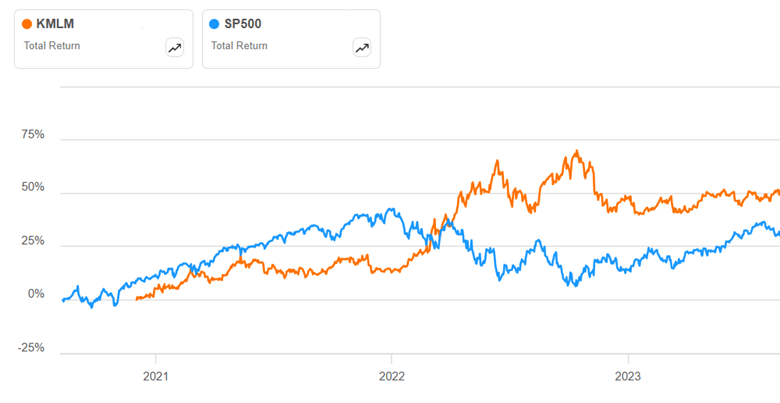
Historically, a good managed futures fund will trade fairly flat or slightly up during a stock bull phase, then step up to give positive return during a stock bear market, to counter the drop in equities prices. We can see below how that worked for managed future (MF) ETF KMLM around 2022. It rose slowly in 2021, then fell back at the end of the year. However, in Jan-Oct 2022 while stocks (and bonds) were painfully grinding down to a 22% loss, KMLM ripped higher by a huge 40%. That seems like a great hedge:
KMLM quickly gave back those gains, for reasons we will discuss. But if you had been consistently rebalancing your portfolio, you would have captured much of those gains.
This sort of performance is why some advisors recommend moving much of your non-stock holdings out of bonds and into managed futures. What’s not to like here?
It turns out that MF funds struggle if there are not fairly long, strong trends in commodity prices. If trends reverse quickly, and then reverse again, then the fund’s positions will lose money over and over. We can see this in the above plot. The story for most of 2022 was interest rates going up and up and up. MF funds were rock stars as they rode that trend for many months. But there was a surprising break in futures trends in November, 2022, as markets suddenly started pricing in an early Fed pivot towards easing in 2023, and so interest rates rose, and bonds and the U.S. dollar tumbled. All the managed futures funds took a sharp hit Nov-Dec 2022. KMLM then went roughly flat for 2023; other MF funds fared worse.
So far, so good. However, it seems like there has been a sea change in futures markets. Before around 2010 or so, there is reason to believe that much of the futures price action was driven by the underlying commodities themselves. For instance, cattle or soybean producers wanted to protect themselves against changes in cattle or soy prices, and so they would buy or sell futures to lock in prices say eight months out. In these situations, there would naturally and normally be months-long trends in futures prices. Wall Street took the other side of those trades. But now it seems to me (can’t give proof reference) that it’s speculators on both sides of the trades, leading to trade algos constantly trying to outguess each other and higher volatility.
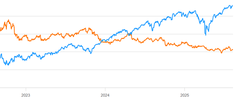
For whatever reason, normal trend-following MF has been a bad business for the past 2 years. Here is a continuation of the chart above, showing mid Aug 2023- mid Aug 2025 for KMLM (orange line) compared to S&P 500 stocks (blue line):
The scale is not shown here, but KMLM lost some 30% of its value during that time period. That is NOT the kind of hedge you want to hold.
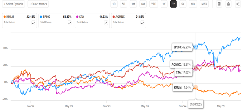
So, should we forget about MF funds? It turns out that not all MF funds perform the same. My informal research suggests that most MF funds have performed similar to KMLM in the past two years (=abysmally). Since my 2023 article, though, (a) an improved MF ETF (CTA) has appeared, and (b) I became aware of a superior MF fund (AQMNX) of the old-style (non-ETF) mutual fund format. Below is a 3-year chart of KMLM, SP500, and the ETF CTA and the mutual fund AQMNX:
We can see that both the new contenders are up instead of down in the past three years, and both were uncorrelated enough to SP500 to cushion the big Feb-April stock drawdown this year. They handily outperformed bonds (e.g. BND, not shown) during this time period.
There are fundamental reasons why those two funds would behave differently than plain vanilla trend-following KMLM. CTA adds a factor called carry (which I will not try to define) to its algo, and also takes large concentrated bets. AQMNX draws on the very sophisticated quantitative resources of the AQM fund family. It also takes long/short bets on equities (e.g. S&P 500 index), which are not in KMLM. AQMNX is not available through all brokerages (it is at Fidelity).
As the months roll by and plain stocks soar effortlessly up and up, it may seem pointless to consider any portfolio hedges. But for those who value diversification, these two funds may merit consider consideration. (As usual, nothing here should be considered advice to buy or sell any security).
To say Warren Buffett is not a fan of gold would be an understatement. His basic beef is that gold does not produce much of practical value. His instincts have always been to buy businesses that generate steady and growing cash by producing goods or services that people need or want – – businesses like railroads, beverage makers, and insurance companies.
Here are some quotes on the subject from the Oracle of Omaha, where I have bolded some phrases:
“Gold … has two significant shortcomings, being neither of much use nor procreative. True, gold has some industrial and decorative utility, but the demand for these purposes is both limited and incapable of soaking up new production. Meanwhile, if you own one ounce of gold for an eternity, you will still own one ounce at its end” — Buffett, letter to shareholders, 2011
“With an asset like gold, for example, you know, basically gold is a way of going long on fear, and it’s been a pretty good way of going long on fear from time to time. But you really have to hope people become more afraid in the year or two years than they are now. And if they become more afraid you make money, if they become less afraid you lose money. But the gold itself doesn’t produce anything” — Buffett, CNBC’s Squawk Box, 2011
This from when the world’s 67-cubic foot total gold hoard was worth about $7 trillion, which by his reckoning was the value of all U.S. farmland plus seven times the value of petroleum giant ExxonMobil plus an extra $1 trillion:
“And if you offered me the choice of looking at some 67-foot cube of gold … and the alternative to that was to have all the farmland of the country, everything, cotton, corn, soybeans, seven ExxonMobils. Just think of that. Add $1 trillion of walking around money. I, you know, maybe call me crazy but I’ll take the farmland and the ExxonMobils” – – Cited in https://www.nasdaq.com/articles/3-things-warren-buffett-has-said-about-gold
And my favorite:
“Gold gets dug out of the ground in Africa, or someplace. Then we melt it down, dig another hole, bury it again and pay people to stand around guarding it. It has no utility. Anyone watching from Mars would be scratching their head“. – – From speech at Harvard, see https://quoteinvestigator.com/2013/05/25/bury-gold/
One thing Buffett did NOT say is that gold is “barbarous relic”. That line is owned by John Maynard Keynes from a hundred years ago, referring to the notion of tying national money issuance to the number of bars of gold held in the national vaults:
“In truth, the gold standard is already a barbarous relic. All of us, from the Governor of the Bank of England downwards, are now primarily interested in preserving the stability of business, prices, and employment, and are not likely, when the choice is forced on us, deliberately to sacrifice these to outworn dogma, which had its value once” – Monetary Reform (1924)
Has Buffett’s Berkshire Hathaway Beaten Gold as an Investment?
Given all that trash talk from the legendary investor, let’s see how an investment in his flagship Berkshire Hathaway company (stock symbol BRK.B) compares to gold over various time periods. I will use the ETF GLD as a proxy for gold, and will include the S&P 500 index as a proxy for the general U.S. large cap stock market.
As always, these comparisons depend on your starting and ending points. In the 1990s and 2000s, BRK.B hugely outperformed the S&P 500, cementing Buffett’s reputation as one of the greatest investors of all time. (GLD data doesn’t go back that far). In the past twelve months, gold (up 41%) has soundly beaten SPY (up 14 %) and completely trounced BRK.A (up 9%), as of last week. A couple of one-off factors have gone into these results: Gold had an enormous surge in January-April as the world markets digested the implications of never-ending gigantic U.S. budget deficits, and the markets soured on BRK.A due to the announced upcoming retirement of Buffett himself.
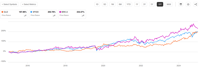
Stepping back to look over the past ten years shows the old master still coming out on top. In this plot, gold is orange, S&P 500 is blue, and BRK.A is royal purple:
Over most of this time period (through 7/21/2025), BRK.A and SP500 were pretty close, and gold lagged significantly. Gold was notably left behind during the key stock surge of 2021. Even with the rise in gold and dip in BRK.A this year, Buffett’s company (up 232%) still beats gold (198%) over the past ten years. BRK.A pulled well ahead of SP500 during the 2022 correction, and never gave back that lead. In the April stock market panic this year, BRK.A actually went up as everything else dropped, as it was seen as a tariff-proof safe haven. SP500 was ahead of gold for nearly all this period, until the crash in stocks and the surge in gold in the first half of 2025 brought them to essentially a tie for the past decade.
Anyone who reads financial headlines knows that gold prices have soared in the past year. Why?
Gold has historically been a relatively stable store of value, and that role seems to be returning after decades of relative neglect. Official numbers show sharply increased buying by the world’s central banks, led by China, Poland, and Azerbaijan in early 2025. Russia, India and Turkey have also been major buyers. There is widespread conviction that actual gold purchases are appreciably higher than the officially-reported numbers, to side-step President Trump’s threatened extra tariffs on nations seen as de-dollarizing.
I think the most proximate cause for the sharp run-up in gold prices in the past twelve months has been the profligate U.S. federal budget deficit, under both administrations. This is convincing key world actors that the dollar will become increasingly devalued over time, no matter which party is in power. Thus, it is prudent to get out of dollars and dollar-denominated assets like U.S. T-bonds.
Trump’s erratic and offensive policies and statements in 2025 have added to the desire to diversify away from U.S. assets. This is in addition to the alarm in non-Western countries over the impoundment of Russian dollar-related assets in connection with the ongoing Russian invasion of Ukraine. Also, there is something of a self-fulfilling momentum aspect to any asset: the more it goes up, the more it is expected to go up.
This informative chart of central bank gold net purchasing is courtesy of Weekend Investing:
Interestingly, central banks were net sellers in the 1990s and early 2000s; it was an era of robust economic growth, gold prices were stagnant or declining, and it seemed pointless to hold shiny metal bars when one could invest in financial assets with higher rates of return. The Global Financial Crisis of 2008-2009 apparently sobered up the world as to the fragility of financial assets, making solid metal bars look pretty good. Then, as noted, the Western reaction to the Russian attack on Ukraine spurred central bank buying gold, as this blog predicted back in March, 2022.
Private investors are also buying gold, for similar reasons as the central banks. Gold offers portfolio diversification as a clear alternative from all paper assets. In theory it should offer something of an inflation hedge, but its price does not always track with inflation or interest rates.
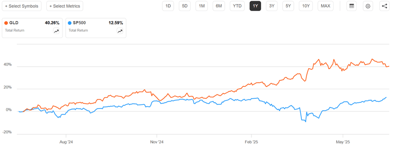
Here is how gold (using GLD fund as a proxy) has fared versus stocks (S&P 500 index) and intermediate term U. S. T-bonds (IEF fund) in the past year:
Gold is up by 40%, compared to 12.6% for stocks. That is huge outperformance. This was driven largely by the fact that gold rose strongly in the Feb-April timeframe, while stocks were collapsing.
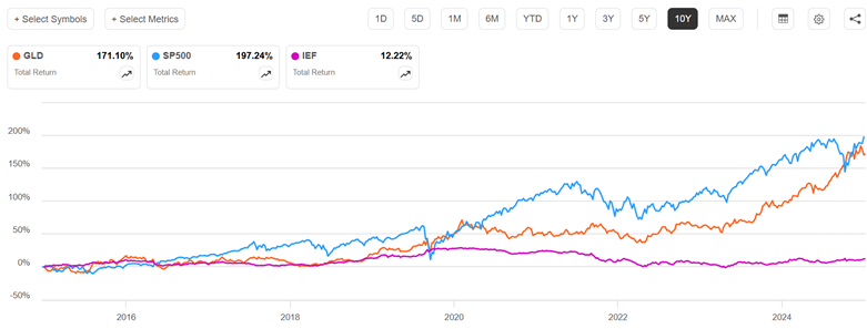
Below we zoom out to look at the past ten years, and include the intermediate-term T-bond fund IEF:
Gold prices more than doubled from 2008 to 2011, then suffered a long, painful decline over the next two years. Prices were then fairly stagnant for the mid-2010s, rose significantly 2019-2020, then stagnated again until taking off in 2023. Stocks have been much more erratic. Most of the time stock returns were above gold, but the 2020 and 2024 plunges brought stocks down to rough parity with gold. Since about 2019, T-bonds have been pathetic; pity the poor investor who has been (according to traditional advice) 40% invested in investment-grade bonds.
How to invest in gold? Hard-core gold bugs want the actual coins (no-one can afford a full bullion bar) to rub between their fingers and keep in their own physical custody. You can buy coins from on-line dealers or local dealers. Coins are available from the U.S. Mint, but reportedly their mark-ups are often higher than on the secondary market.
An easier route for most folks is to buy into a gold-backed stock fund. The biggest is GLD, which has over $100 billion in assets. There has long been an undercurrent of suspicion among gold bugs that GLD’s gold is not reliably audited or that it is loaned out; they refer derisively to GLD as “paper gold” or gold derivatives. The fund itself claims that it never lends out its gold, and that its bars are held in the vaults of the custodian banks JPMorgan Chase Bank, N.A. and HSBC Bank plc, and are independently audited. The suspicious crowd favors funds like Sprott Physical Gold Trust, PHYS. PHYS is claimed to have a stronger legal claim on its physical gold than GLD. However, PHYS is a closed-end fund, which means it does not have a continuous creation process like GLD, an open-end ETF. This can lead to discrepancies between the fund’s share price and the value of its gold holdings. It does seem like PHYS loses about 1% per year relative to GLD.
Disclaimer: Nothing here should be taken as advice to buy or sell any security.
Everybody follows a different path. Sometimes that path includes a late start on saving for retirement. Say that you have $0 in your retirement account right now. Is it too late? What can you get as a result of contributing $100 per month? Maybe more than you think.
Let’s start with an annuity equation that tells us our balance at retirement with some assumptions baked in. Let’s assume that we have zero dollars saved and contribute $100 per month. What rate of return do we earn? The S&P earns an average of 10% per year, which may not keep happening. We can conservatively assume 7.5%, but there are other concerns. Taxes and inflation will both eat away at that. Let’s subtract 2.5% for inflation with the Fisher approximation, leaving a real rate of return of 5%. We’ll chop off 20% due to taxes*. Below is the annuity equation that tells us the balance at retirement, depending on how many years from now you retire.
Assuming that you retire at 65 years of age, the graph below describes your balance at retirement depending on the age at which you started saving $100 per month. Of course, it’s not the balance that most people are worried about. Rather, we care about the implied monthly retirement check. The graph describes that on the right axis too, assuming that constant real payments will be made forever as perpetuity payments. We can see that getting started early matters a lot. But starting at age 40 still gets you real monthly retirement payments that are just shy of $200. That’s not too shabby.
Of course, nobody receives all of the perpetuity payments.
According to Merriam-Webster, “money” is: “something generally accepted as a medium of exchange, a measure of value, or a means of payment.” Money, in its various forms, also serves as a store of value. Gold has maintained the store of value function all though the past centuries, including our own times; as an investment, gold has done well in the past couple of decades. I plan to write more later on the investment aspect, but here I focus on the use of physical gold as a means of payment or exchange, or as backing a means of exchange.
Gold, typically in the form of standardized coins, served means of exchange function for thousands of years. Starting in the Renaissance, however, banks started issuing paper certificates which were exchangeable for gold. For daily transactions, the public found it more convenient to handle these bank notes than the gold pieces themselves, and so these notes were used instead of gold as money.
In the late nineteenth and early twentieth centuries, leading paper currencies like the British pound and the U.S. dollar were theoretically backed by gold; one could turn in a dollar and convert it to the precious metal. Most countries dropped the convertibility to gold during the Great Depression of the 1930’s, so their currencies became entirely “fiat” money, not tied to any physical commodity. For the U.S. dollar, there was limited convertibility to gold after World War II as part of the Bretton Woods system of international currencies, but even that convertibility ended in 1971. In fact, it was illegal for U.S. citizens to own much in the way of physical gold from FDR’s (infamous?) executive order in 1933 until Gerald Ford’s repeal of that order in 1977.
So gold has been essentially extinct as active money for nearly a hundred years. The elite technocrats who manage national financial affairs have been only too happy to dance on its grave. Keynes famously denounced the gold standard as a “barbarous relic”, standing in the way of purposeful management of national money matters.
However, gold seems to be making something of a comeback, on several fronts. Most notably, several U.S. states have promoted the use of gold in transactions. Deep-red Utah has led the way. In 2011, Utah passed the Legal Tender Act, recognizing gold and silver coins issued by the federal government as legal tender within the state. This legislation allows individuals to transact in gold and silver coins without paying state capital gains tax. The Utah House and Senate passed bills in 2025 to authorize the state treasurer to establish a precious metals-backed electronic payment platform, which would enable state vendors to opt for payments in physical gold and silver. The Utah governor vetoed this bill, though, claiming it was “operationally impractical.”
The new legislation, House Bill 1056, aims to give Texans the ability, likely through a mobile app or debit card system, to use gold and silver they hold in the state’s bullion depository to purchase groceries or other standard items.
The bill would also recognize gold and silver as legal tender in Texas, with the caveat that the state’s recognition must also align with currency laws laid out in the U.S. Constitution.
“In short, this bill makes gold and silver functional money in Texas,” Rep. Mark Dorazio (R-San Antonio), the main driving force behind the effort, said during one 2024 presentation. “It has to be functional, it has to be practical and it has to be usable.”
Arkansas and Florida have also passed laws allowing the use of gold and silver as legal tender. A potential problem is that under current IRS law, gold and silver are generally classified as collectibles and subject to potential capital gains taxes when transactions occur. Texas legislator Dorazio has argued that liability would go away if the metals are classified as functional money, although he’s also acknowledged the tax issue “might end up being decided by the courts.”
But as Europeans found back in the day, carrying around actual clinking gold coins for purchasing and making change is much more of a hassle than paper transactions. And so, various convenient payment or exchange methods, backed by physical gold, have recently arisen.
Since it is relatively easy and lucrative to spawn a new cryptocurrency (which is why there are thousands of them), it is not surprising that there are now several coins supposedly backed by bullion. These include include Paxos Gold (PAXG) and Tether Gold (XAUT). The gold of Paxos is stored in the worldwide vaults of Brinks, and is regularly audited by a credible third party. Tether gold supposedly resides somewhere in Switzerland. The firm itself is incorporated in the British Virgin Islands. Tether in general does not conduct regular audits; its official statements dance around that fact. These crypto coins, like bullion itself or various funds like GLD that hold gold, are in practice probably mainly an investment vehicle (store of value), rather than an active medium of exchange.
However, getting down to the consumer level of payment convenience, we now have a gold-backed credit card (Glint) and debit card (VeraCash Mastercard). Both of these hold their gold in Swiss vaults. The funds you place with these companies have gold allocated to them, so these are a (seemingly cost-effective) means to own gold. If you get nervous, you can actually (subject to various rules) redeem your funds for actual shiny yellow metal.
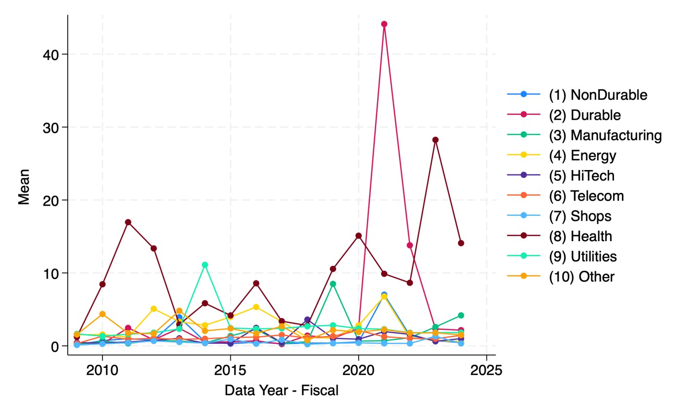
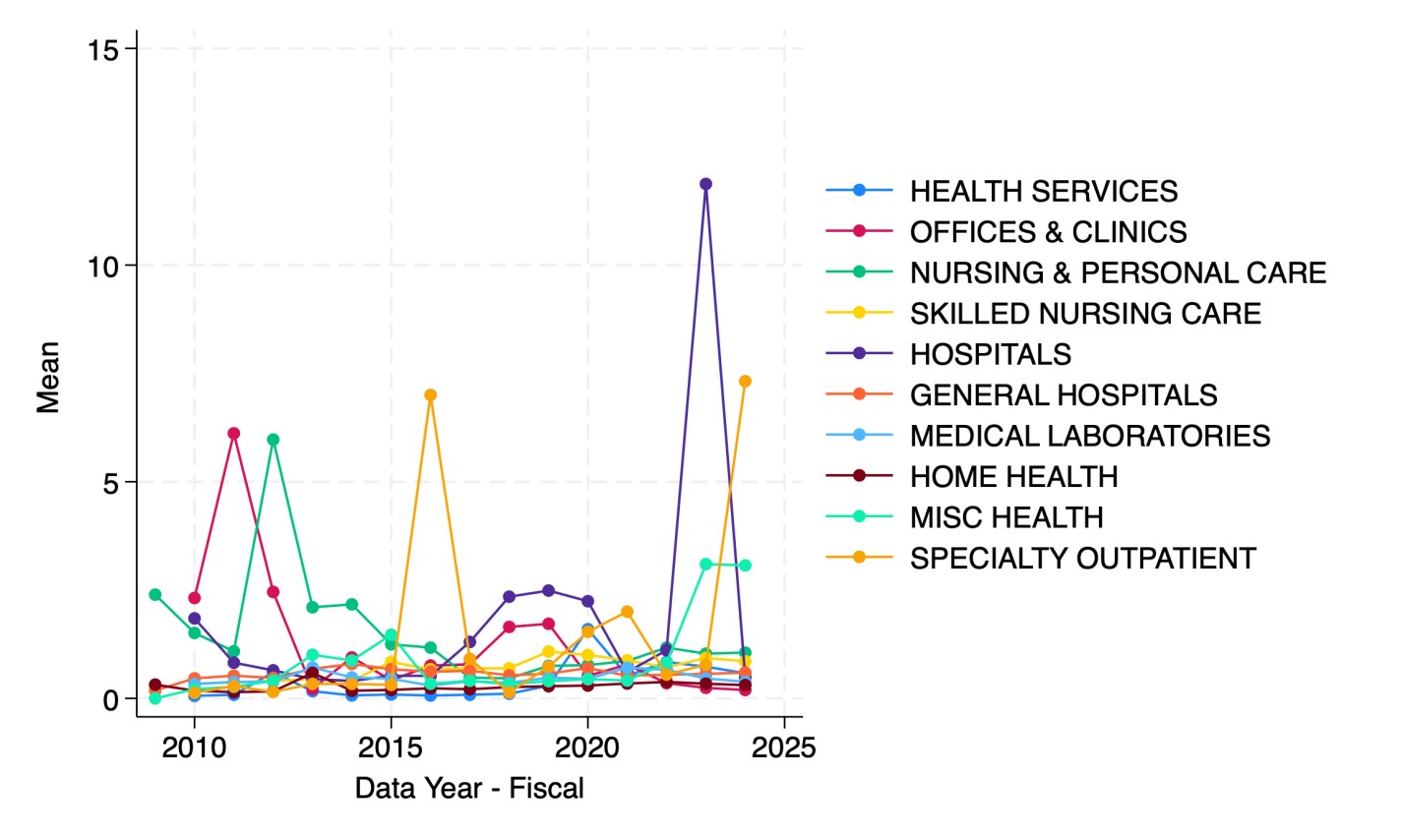
A reporter recently told me she thought there is a national trend toward hospitals issuing more bonds. I tried to verify this and found it surprising hard to do with publicly available data. But once I had to spend an hour digging through private Compustat data to find the answer, I figured I should share some results. Here’s the average debt in millions of companies by sector:
Source: My graph made from Compustat North American Fundamentals Annual data collapsed by Standard Industrial Classification code into the Fama-French 10 sectors
This shows that health care is actually the least-indebted sector, and telecommunications the most indebted, followed by utilities and “other” (a broad category that actually covers most firms in the Fama-French 10). But are health care firms really more conservative about debt, or are they just smaller? Let’s scale the debt by showing it as a share of revenue:
My graph made from Compustat North American Fundamentals Annual data collapsed by SIC code into the Fama-French 10 sectors(dltt/revt).
It appears that health care firms are the most indebted relative to revenue since 2023. But which parts of health care are driving this?
Hospitals in 2023 followed by specialty outpatient in 2024. However, seeing how much the numbers bounce around from year to year, I suspect they are driven by small numbers of outlier firms. This could be because Compustat North America data only covers publicly traded firms, but many sectors of health care are dominated by private corporations or non-profits.
I welcome suggestions for datasets on the bond-market side of things that are able to do industry splits including private companies, or suggestions for other breakdowns you’d like to see me do with Compustat.
The United Healthcare Group (UNH) is a gigantic ($260 B market cap, even after recent dip) health plan provider, which until recently seemed to be the bluest of blue-chip companies. It is a purveyor of essential medical services with a wide moat, largely unaffected by tariff posturing, and considered too big to fail. The ten-year stock price chart shows it steadily grinding up and up, shrugging off market tantrums like 2020 and 2022, and even the tragic gunning down of one of its division presidents in December.
But things really unraveled in the past month. Let’s look at the charts, and then get into the underlying causes.
The year-to-date chart above shows the price hanging around $500, then rising to nearly $600 as the April 17 quarterly earnings report approached. Presumably the market was licking its chops in anticipation of the usual UNH earnings beat. The actual report was OK by most corporate standards, but it failed to match expectations. Revenue growth was a hearty +9.8% Y/Y, but this was $2.02B “miss”. Earnings were up 4% over year-ago Q1, but they missed expectation (by a mere 1%). What was probably much more disturbing was guidance on 2025 total adjusted earnings down to $26 to $26.50 per share, compared to $29.74 consensus.
That took the stock down from $600 to around $450 immediately, and then it drifted below $400 in the following month as investors looked for and failed to find better news on the company. But then two things happened last week. The effects are seen in the 1-month chart below:
On May 13 (blue arrow) the company came out with a stunning dual announcement. It noted that the recently-appointed CEO, Andrew Witty, had suddenly resigned “for personal reasons.” The blogosphere speculated (perhaps unfairly) that you don’t suddenly resign from a $25 million/year job unless your “personal reasons” involve things like not going to prison for corporate fraud. The other stunner was that the company completely yanked 2025 financial guidance, due to an unexpected rise in health care costs (i.e., what they must pay out to their participants). Over the next day or two, the stock fell to about 50% of its value in early April.
Then on May 14 the Wall Street Journal came out with an article claiming that the U.S. Department of Justice is carrying out a criminal investigation into UNH for possible Medicare fraud, focusing on the company’s Medicare Advantage business practices. The WSJ said that while the exact nature of the allegations is unclear, it has been an active probe since at least last summer.
UNH promptly fired back a curt response to the “deeply irresponsible” reporting of the WSJ:
We have not been notified by the Department of Justice of the supposed criminal investigation reported, without official attribution, in the Wall Street Journal today.
The WSJ’s reporting is deeply irresponsible, as even it admits that the “exact nature of the potential criminal allegations is unclear.” We stand by the integrity of our Medicare Advantage program.
The stock nose-dived again (red arrow, above), touching 251, as investors completely panicked over “Medicare fraud.” Cooler heads promptly started buying back in, leading to substantial recovery. That includes the new CEO, Steven Hemsley, who was the highly-paid CEO from 2009 to 2017, and since then has been the highly-compensated “executive chairman of the board”, a role created just for him. Pundits were impressed that he stepped in to buy some $25 million of UNH stock near its lows, saying wow, he is really putting some skin in the game. Well, not really: the dude is worth over $1 billion (did I mention high compensation of health care execs?), so $25 mill is hardly heroic. He is already up some 12% or a cool $3 million on this purchase, a tidy little example of how the rich become richer.
In last week’s post, I described how short volatility funds work. They are short (as opposed to long) near-term VIX futures. This means that when a market panic hits and VIX (as measure of volatility) spikes, the prices of these short vol funds plunge, along with stock prices. But as optimism returns to the markets, prices of short vol funds start to recover, as do stocks.
Thus, both short vol funds and general stock funds are reasonable ways to play a market panic. If (!!!) you manage to call the bottom and buy there, you can hold for maybe a couple of weeks until prices recover, and then sell at a profit. I tried to do just that with the market meltdown last month in the wake of the president’s tariff ultimatums: I bought some short vol funds (SVXY, which is a moderate -0.5X VIX fund, and the more aggressive -1X fund SVIX), and also some leveraged stock funds. I discussed leveraged funds here.
I chose to buy into SSO, a 2X leveraged S&P 500 stock fund, whose daily price moves up (or down) by twice the percentage as does the S&P. Obviously, if you think stocks will go up say 10% in the next month, you will make more money by buying a fund that will go up 20% instead, which is why I bought a 2X fund rather than a plain vanilla (1X) stock fund. A related fund, which I did not buy this time, is UPRO, which is a 3X stock fund.
Things are always clear in hindsight. After the smoke of battle clears, you can see right where the bottom was. But it is not clear when you are in the thick of it. I erred by committing much of my dry powder trading funds too early, maybe halfway through the big drop. C’est la vie. It’s hard to improve on that for next time. But a significant learning, that I will act on during the next panic, was how differently short vol versus leveraged stocks recovered from the crash. They both plunged and recovered, but leveraged stocks recovered much better.
It turns out that much of the time, the price movements over say a six-month period of SVXY and SSO largely match each other, so these are useful for comparisons for trading short vol versus leveraged stocks. For instance, below is a chart of SVXY (orange line) and SSO (green line) over the past six months or so. The blue arrow notes the April crash, which bottomed roughly April 8. For November through early April, the price movements of the two funds roughly matched. By April 8, both had plunged to a level some 35% lower than their starting prices. However, by May 12, SSO had recovered to -10% (relative to starting), which is about where it was in late March (green level line drawn in). SVXY, however, remained 21% below its start.
Chart of SVXY ( -0.5X VIX ETF, Orange line) and SSO (2X Stock fund, green line), Nov 2024-May 2024. Blue arrow marks April 2025 volatility spike/stock crash. Chart from Seeking Alpha.
Thus, from its nadir (-35%) to its recovery as of Tuesday, May 12, SSO gained by 38% (i.e., ratioing 0.90/0.65), whereas SVXY gained only 21% (from ratioing 0.79/0.65). Also, it looks like SVXY will not regain its earlier price levels any time soon. So SSO looks like the winner here.
We can do a similar comparison between the -1X VIX fund SVIX and the 3X stock fund UPRO. These two funds are plotted below, along with a plain (1X) S&P 500 stock fund, SPY (in blue). SVIX (orange) and UPRO (green) trend pretty closely for October through March. When the April crash came, SVIX dropped much harder, down to a heart-stopping -59%, compared to -44% for UPRO. SPY dropped only to -15%. SPY comes to a full recovery (0%) by May 12, while UPRO recovers only to -13% [1]. SVIX has recovered only to -21%. If you managed to buy each of these funds on April 8, and sold them today, you would have made the following gains:
SPY 17% ; UPRO 55%; SVIX 43%. Clearly the winner here in short term trading of the April crash is the 3X stock fund UPRO.
Chart of SVIX ( -1X VIX ETF, Orange line), UPRO ( 3X Stock fund, green line), and SPY (1X Stock fund, blue line), Oct 2024-May 2024. Chart from Seeking Alpha.
As a cross check, below is a plot of SVXY (orange) and SSO (green) covering the August, 2024 volatility spike. This was a peculiar event, discussed here, where volatility went crazy for a couple of days, while stock prices experienced only a moderate drop. If (!!!) you timed it just right, and bought at the bottom and sold a week or so later, you could have made good money on SVXY. But zooming out to the larger picture, SVXY never came close to recovering its old highs, whereas SSO just kept going up and up (green arrow). So SSO seems like a safer trading vehicle: it is a reasonable buy-and-hold, whereas SVXY may be hazardous to your portfolio’s health if you don’t get the timing perfect.
Chart of SVXY ( -0.5X VIX ETF, Orange line) and SSO ( 2X Stock fund, green line), Oct 2023-Oct 2024. Blue arrow marks early August 2024 volatility spike. Chart from Seeking Alpha.
Over certain longer (say one-year) periods, there are regimes where short vol could out-perform leveraged stocks (discussed earlier), but that is the exception, rather than the rule.
Disclaimer: Nothing here should be considered advice to buy or sell any security.
ENDNOTE
[1] While UPRO changes X3 the change of SPY on a daily basis, for reasons discussed earlier, the longer-term performance of UPRO diverges from a simple X3 relationship with SPY. In volatile times, UPRO tends to fall well below a 3X performance over say a six-month period.
The VIX is a calculated measure of stock market volatility, based on the prices of stock options. It spikes up when there is a market upset, then seemingly always settles back down again after a few days or weeks. So, it seems simple to make a quick profit from this behavior: short the VIX when it spikes, and then close your trade when it comes back down. What could possibly go wrong?
VIX Index, May 2024-April 2025. From Seeking Alpha.
It’s a bit more nuanced than that, since you can’t directly buy or sell the VIX. It is just a calculated number, not a “thing.” However, there is a market for VIX futures. The value of these futures is based on expectations for what VIX will be on some specific date. The values of these futures go up and down as the VIX goes up and down, though there is not an exact 1:1 relationship. There are funds that short VIX futures, which are a proxy for shorting the VIX futures yourself. So, the individual investor could buy them after the VIX spikes (which would drive down the short VIX fund price), then sell them when VIX declines (and the short VIX fund goes back up).
The chart below shows the VIX (% change, orange curve) in the past twelve months prior to May 1. There were three episodes (Aug 2024, Dec 2024, Apr 2025) where VIX spiked up. These episodes are marked with green arrows. As expected, when VIX spikes up, the short volatility fund SVIX (purple line) drops down. In August and December, if you were clever enough to buy SVIX at its low, you could turn around and sell in a week later for a good profit. The movements of SVIX are dwarfed this plot by the gyrations of VIX in this chart, but a couple of short red horizontal lines are drawn at the bottoming values for SVIX, to show the subsequent rise. A 3x leveraged S&P 500 fund, UPRO, is shown in blue.
There are important nuances with these funds. One is that a long or short VIX futures fund, at the end of the trading day, must buy and sell some futures shares to meet their performance mandate. As of say May 1, the -1X VIX fund SVIX was short 14,311 May VIX futures contracts (expiring 5/20/2025), and short 10,222 June futures (exp. 6/17/2025). To keep its exposure centered at on one month out from the present date, the fund must buy back some near month (here, May) contracts each day, and short some additional next month (June), at the close of every trading day. If the market value of the near month VIX futures contract is lower than the next month contract (being in “contango”), as it generally is during periods of low volatility, this rolling process makes money every day, to the tune of maybe 5% per month. That compounds big time over time, to over a 60% gain in twelve months. That’s the good side. The VIXcentral site shows current and historical VIX futures prices for the next several months out.
A bad side of these short funds is that the day-to-day inverse movements can rachet the fund value down and down, as VIX goes up and down. So even if the VIX ends up in six months at the same value as it is today, it is possible for a short VIX fund to be lower or higher. This can lead to a more or less permanent step down in fund value. Also, in volatile times, the near futures price is higher than the next month out, and so the daily roll works against you.
There is a term that trading pros use for amateurs who jump into volatility funds without really knowing what they are doing: “volatility tourists”. These hapless investors sometimes hear of big profits that have been made recently in vol, and then buy in, often at what turns out to be the wrong time. Then market storms arise, things don’t go the way they expected, and they get shipwrecked.
Such was the case in 2018. SVXY at that time was a fund that moved inversely to volatility futures, on a -1X daily basis. This short vol trade made insane profits in 2H 2016 and in 2017, far outpacing stocks. Someone who bought into SVXY at the start of 2017 would have quintupled their money by the end of the year. (See chart below, orange line).
However, February 5, 2018 is a day that will live in volatility infamy. Because of the roaring success of short VIX in the previous two years, investors had piled into short VIX ETFs. The VIX suddenly doubled that day, and the short vol funds could not do the daily futures trades they needed, and so their value was decimated. This event is known as Volmageddon. The chart below shows the rise (and fall) of the -1X VIX fund SVXY in orange, compared to a stodgy S&P 500 fund SPY (in green).
Folks who bought SVXY looked like geniuses, until Feb 5. Then they lost it all, more or less. The tourists licked their wounds and moved on, and short vol went clean out of fashion for a while. One short VIX fund, XIV, actually an exchange traded note (ETN), went to zero and closed. SVXY itself lost over 90% of its value. After this near-death experience in 2018, SVXY contritely modified its charter from being -1X VIX futures to being -0.5X. That reduces its exposure to vol shocks. That modification served it well in March, 2020 when the world shut down and VIX shot to the moon and stayed there for some time. SVXY lost something like 70% of its value then, but it lived to trade another day, and slowly clawed its way back.
However, short vol has made a comeback in recent years. The -0.5X SVXY was joined in mid-2022 with a new -1X VIX fund, SVIX (for investors who don’t remember what happened to -1X funds in 2018! ). Short vol actually had a very good run in 2022, 2023, and first half of 2024:
The chart above shows SVIX ( -1X, purple) and SVXY (-0.5X, blue), along with the S&P500 (stodgy orange line) over the past three years. The two inverse vol funds totally smoked the S&P through July, 2024. Investors in SVIX were up over 300%, compared to 35% in stocks. Even the more conservative vol fund SVXY was up 165%. Yee-haw!
The volatility tourists poured in, and then came August 5, 2024, with a short, sharp, unexpected spike in volatility. As we noted earlier, it was not so much that stocks cratered, but there was a hiccup in the global financial system, mainly around unwinding of the yen carry trade. The values of the short vol funds got decimated. Then the recent brouhaha over tariffs in April 2025 whacked them again. This drove the value of SVIX below the three-year rise in stocks, although SVXY still outpaces stocks (57% vs 35% rise).
There were dips in SVIX and SVXY in March 2023 (Silicon Valley Bank blowup), October 2023 (Yom Kippur attacks on Israel by Hamas), and April, 2024, corresponding to spikes in VIX. In those cases, it worked great to buy the dip, since within a few months SVIX and SVXY churned to new highs. Many were the articles in the investing world on the wonderful virtues of the daily VIX futures roll. But then August 2024 and April 2025 hit, where there was no complete, rapid recovery from the huge price drops.
What to take away from all this? What comes to my mind are well-worn truisms like:
If it looks too good to be true, it’s probably not true; There is no free lunch on Wall Street; It’s not different this time.
The reason I know this much about these trading products is that I got sucked in a bit by the lure of monster returns. Fortunately, I kept my positions small, and backstopped some trades by using options, so all in all I have probably roughly broken even. That is not great, considering how much attention and nail-biting I have put into short vol trading in the past twelve months.
In an upcoming post, I will report on an alternative way to trade volatility spikes, which has worked out much better.
Disclaimer: Nothing here should be considered advice to buy or sell any security.