The flurry of posts about polyamory
Continue readingmarriage
Most Married Women with Children Were Working By the Late 1970s
A recent essay by Jeffrey Tucker asks “Has Life Really Improved in Half a Century?” Specifically, Mr. Tucker is interested in measuring median income of families (he uses household income, but families are clearly what he is interested in).
Tucker grants that real median household income has increased by about 40 percent from 1984 to 2024 (if he had used family income instead, the increase is almost 50 percent). But… he says this is illusory. That’s because it now takes two incomes to achieve that median income, whereas it only took one income in the past:
“Adding another income stream to the household is a 100 percent rise in work expectations but it has yielded only a 20-plus percent rise in material income. The effective pay per hour of work for the household has fallen by 40 to 50 percent!”
(He makes a data error by saying that in 1976 real median household income was $68,000-$70,000, when it was actually $59,000 in 2024 dollars in 1976 — real income didn’t fall from 1976 to 1984!)
Continue readingThe Middle of the 20th Century was a Weird Time for Marriage
Yesterday on Twitter I shared a chart showing the age at first marriage for white men and women in the US, with data going back to 1880. I pointed out an interesting fact: at least for men, the age was essentially the same in 1890 and 1990 (27), though for women it was a bit higher in 1990 than in 1890 (by about 1 year).
This Tweet generated quite a bit of interest (over 800,000 impressions so far), and (of course!) a lot of skeptical responses. One skeptical response is that I cut off the data in 1990, when trends since then have shown continuously rising ages at first marriage, and by 2024 the comparable figures were much higher than in 1890 (by about 4 years for men and 6.5 years for women). In one sense, guilty as charged, though I only came across this data when looking through the Historical Statistics of the US, Millennial Edition, and that was the most current data available when it was printed. Here is a more updated chart from Census:

But there is another interesting fact about that data: the massive decline age of first marriage in the first half of the 20th century. Between 1890 and 1960, the median age at first marriage fell by about 3 years for men and 2 years for women. For men, most of the decline (about 2 years) had already happened by 1940. Thus, if we start from the low-point of the 1950s and 1960s (as many charts do, such as this one), it appears marriage is continuously getting less common in US history, while the fuller picture shows a U-shaped pattern.
This same pattern shows up in another measure of marriage data: the percentage of people that never get married. If we look at White, Non-Hispanic Americans in their late 40s, the picture looks something like this (keen observers will note that the Hispanic distinction is a modern one dating from the 1970s, but Census IPUMS has conveniently imputed this classification back in time based on other demographic characteristics):
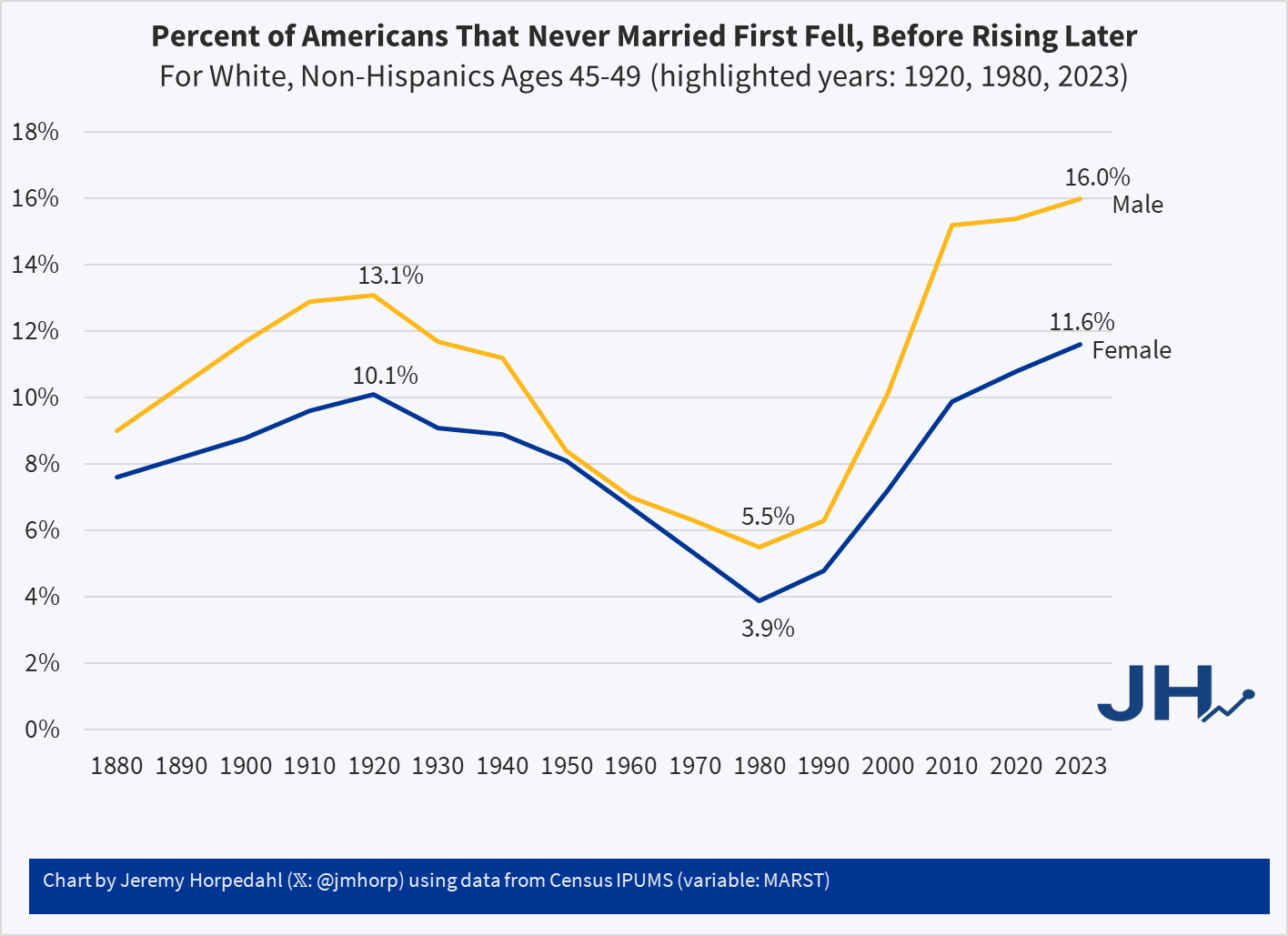
Looking at people in their late 40s is useful because, at least for women, they are past their childbearing years. And using, say, the late 50s age group doesn’t alter the picture much: even though some people get married for the first time in their 50s, it’s always been a small number.
Here we can see an even more dramatic pattern. 100 years ago, it was not super rare for people to never marry: over 1/10 of the population didn’t! But by 1980 (thus, for people born in the early 1930s), it was much rarer: less than 4% of women were never married (among White, Non-Hispanics). In fact, the peak in 1920 of 10% unmarried women wasn’t surpassed again until 2013! And it’s not substantially higher today than 1920 for women, especially when considering the full swing downward. Men are quite a bit higher today, though the 1920 peak of 13% wasn’t surpassed again until 2006.
For a measure that peaks in 1920, we might wonder if new immigrants are skewing the data in some way, given that this is right at the end of about 4 decades of mass immigration. But just the opposite: if we focus on native-born women, the 1920 level was even higher at 11.1%, which wasn’t surpassed until 2022, and even in the latest figures it is less than 1 percentage point higher than 1920.
Precisely why we observed this U-shaped pattern in marriage (both first age and ever married) is debated among scholars, though my sense among the general public is that it isn’t much thought about. Most people (from my casual observation) seem to assume that marriage rates and ages were always lower in the past, and that modern times are the outliers. But in reality, the middle part of the 20th century seems to be the outlier. The “Baby Boom” of roughly 1935-1965 is possibly better understood as a “Marriage Boom,” with more babies naturally following from more and younger marriages.
College Major, Marriage, and Children Update
In a May post I described a paper my student my student had written on how college majors predict the likelihood of being married and having children later in life.
Since then I joined the paper as a coauthor and rewrote it to send to academic journals. I’m now revising it to resubmit to a journal after referee comments. The best referee suggestion was to move our huge tables to an appendix and replace them with figures. I just figured out how to do this in Stata using coefplot, and wanted to share some of the results:
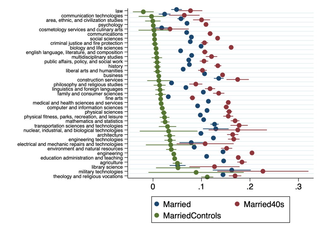

Many details have changed since Hannah’s original version, and a lot depends on the exact specification used. But 3 big points from the original paper still stand:
- Almost all majors are more likely to be married than non-college-graduates
- The association of college education with childbearing is more mixed than its almost-uniformly-positive association with marriage
- College education is far from uniform; differences between some majors are larger than the average difference between college graduates and non-graduates
College Major, Marriage, and Children
The American Community Survey began in 2000, and started asking about college majors in 2009, surveying over 3 million Americans per year. This has allowed all sorts of excellent research on how majors affect things like career prospects and income, like this chart from my PhD advisor Doug Webber:

But the ACS asks about all sorts of other outcomes, many of which have yet to be connected to college major. As far as I can tell this was true of marriage and children, though I haven’t searched exhaustively. I say “was true” because a student in my Economics Senior Capstone class at Providence College, Hannah Farrell, has now looked into it.
The overall answer is that those who finished college are much more likely to be married, and somewhat more likely to have children, than those with no college degree. But what if we regress the 39 broad major categories from the ACS (along with controls for age, sex, family income, and unemployment status) on marriage and children? Here’s what Hannah found:
Every major except “military technologies” is significantly more likely than non-college-grads to be married. The smallest effects are from pre-law, ethnic studies, and library science, which are about 7pp more likely to be married than non-grads. The largest effects are from agriculture, theology, and nuclear technology majors, each about 18pp more likely to be married.
For children the story is more mixed; library science majors have 0.18 fewer children on average than non-college-graduates, while many majors have no significant effect (communications, education, math, fine arts). Most majors have more significantly more children than non-college graduates, with the biggest effect coming from Theology and Construction (0.3 more children than non-grads).
In this categorization the ACS lumps lots of majors together, so that economics is classified as “Social Sciences”. When using the more detailed variable that separates it out, Hannah finds that economics majors are 9pp more likely than non-grads to be married, but don’t have significantly more children.
I love teaching the Capstone because I get to learn from the original empirical research the students do. In a typical class one or two students write a paper good enough that it could be published in an academic journal with a bit of polishing, and this was one of them. But its also amazing how many insights remain undiscovered even in heavily-used public datasets like the ACS. We’ve also just started to get good data on specific colleges, see this post on which schools’ graduates are the most and least likely to be married.
What Was a “Normal Person” 50 Years Ago?
If you spend much time on Twitter, you may have seen the following cartoon or something like it:
The implication here is that many of the social beliefs we hold today are very different from what people held 50 years ago, and (possibly, therefore) it’s not radical to still hold those beliefs today. The Tweet above doesn’t specify exactly what those beliefs are, but we can use survey data to dig into what those might be. Thankfully, one of the greatest social surveys out there was first conducted in 1972, exactly 50 years ago: the General Social Survey.
What exactly did a normal person believe around 1972, according to the GSS?
Continue reading