Are you better off than you were four years ago? That question was asked at the Presidential debate last night. But more importantly, we also got a massive amount of new data on income and poverty from Census yesterday. That data allows us to make that just that comparison, although somewhat imperfectly.
The Census data is excellent and detailed, but it’s annual data, meaning that the release yesterday only goes through 2023. We won’t have 2024 data for another year. Such is the nature of good data. (Note: I’ve tried to address this same question with more real-time data, such as average wages). Still, it’s a useful comparison to make. It’s especially useful right now because the new 2023 data on income are (for most categories) the highest ever with one exception: 4 years ago, in 2019.
A reasonable read of the data on income (whether we use households, families, or persons) is that in 2023 the median American was no better off than in 2019, after adjusting for inflation. In fact, they were probably slightly worse off. I fully expect this will no longer be true when we have 2024 data: it will certainly be above 4 years prior (2020) and likely above 2019 too (more on this below). But we can’t say that for sure right now.
So let’s do a comparison of “are you better off than 4 years ago” for recent Presidents that were up for reelection (treating 2024 as a reelection year for Biden-Harris too), using the 4-year comparison that would have been available at the time using real median family income. Notice that this data would be off by one year, but it’s what would have been known at the time of the election.
A few months ago I looked at the richest and poorest MSAs in the US, including adjusting for the cost of living in each MSA. One big thing I found was that the list doesn’t change that much when you adjust for the cost of living: San Jose, San Francisco, Bridgeport (CT), Boston, and Seattle are still the highest income MSAs even after accounting for the fact that they are also high-cost-of-living places to live. The gap shrinks, but they are still in the lead.
But that was adjusting for all the factors in the cost of living. But what if we just looked at one important aspect of the cost of living: housing. And since the cost-of-living adjustments (BEA’s RPP) that I was using are from 2021, what if we tried to bring the data up as close to the present as possible? We know that housing prices have increased a lot since 2021, but also that the cost of borrowing has risen dramatically too. What would this show us about the cost of living for different MSAs?
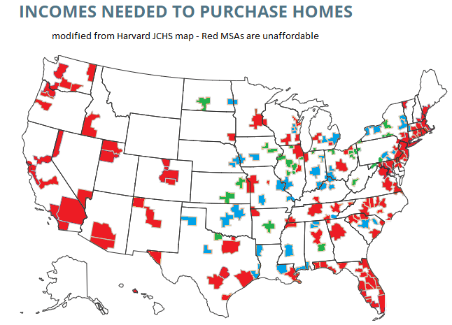
A tool from the Harvard Joint Center for Housing Studies allows us to make some pretty up-to-date comparisons. Their interactive map shows data for the 179 largest MSAs (about half of the total MSAs in the US) on the median price of each home for the second quarter of 2023 and uses interest rates from that quarter to show the rough principal and interest cost (assuming a 3.5% down payment). Taxes and insurance costs for each MSA are also estimated.
Based on those assumptions, their tool provides the minimum income you would need to purchase a home in that area, assuming a 31% debt-to-income ratio for the mortgage. And the income levels needed vary quite widely across MSAs, from a low of $44,000 in Cumberland, Maryland, to a high of over $500,000 in San Jose, CA. That’s a huge difference.
Of course, we know that incomes also vary across MSAs. But they don’t vary that much. The JCHS tool doesn’t provide this data (though a JCHS map from 2017 did compare house prices to incomes), but we can look up median family income for each MSA from Census. Doing so we see that San Jose is indeed unaffordable based on the current (2022) median income, which is “only” about $170,000. A nice income compared to the national median, but only about 1/3 of the $500,000 you would need to afford a home in San Jose. Cumberland looks much better though: median family income is over $77,000 there, about 76% more than you would need to buy a home!
What if we did a similar calculation for all MSAs in the JCHS data? The following map is my attempt to do so. Sorry, but my graphics skills are not the best, so this map isn’t as pretty as it could be (I started with the JCHS map, and just shaded in the colors I wanted to use). But I think it conveys the general idea.
Green-shaded MSAs are the most affordable: places like Cumberland, Maryland, where median family income is well above (at least 20% above, my arbitrary threshold) the amount JCHS says you need to buy a home. There are 27 Green-shaded MSAs. Blue-shaded MSAs are affordable too, and median income is between 100% and 120% of the amount needed to afford a home on the JCHS standard. There are 41 of these, making 68 total MSAs out of these 179 that are affordable. Red-shaded MSAs are less than 100%, and thus unaffordable (though as I will discuss below, some are much closer to affordable than others).
Last week I wrote about median income in the US, and how it had declined since 2019 and 2021 through 2022 (inflation adjusted, of course). The big story is that median income (both for households and families) has been falling in recent years. While there are some silver linings when looking at subgroups, such as Black families, the overall data isn’t good.
But while that is true for the US overall, it’s not true for every state. In fact, it’s not even true for most states! From 2019 to 2022, there were 29 states that saw their median family incomes rise! That’s adjusted for inflation (I’m using the C-CPI-U, which is Census’s preferred inflation measure for this data). The income data in this post all comes from the Census ACS 1-year estimates.
Here’s a map showing the states that had increases in median family income (green) and those that had decreases (in red). (This is my first time experimenting with Datawrapper maps, feedback appreciated!)
Some states had pretty robust growth, with New Mexico and Arizona leading the way with around 5 percent growth. There is substantial variation across US states, including with big declines like Wyoming at -5 percent, and Oklahoma and Illinois are -3 percent.
A few weeks ago I also wrote about the richest and poorest MSAs in the US. But what about the richest and poorest states in the US? The following map shows that data.
The immediate fact which will jump out at you is that the lowest income US states are almost all located in the South. This will probably not surprise most of us, although it probably is a bit surprising since the data is adjusted for differences in the cost of living (using the BEA RPP data). Even after making these adjustments, the South is still clearly the poorest region (and it definitely was the poorest without the adjustments).
Among the higher income states, they are distributed pretty well across the rest of the non-South. There are 16 states (plus DC) that have median family incomes over $100,000 (again, cost of living adjusted), and while many of these are in New England and the Mid-Atlantic, there area still a few in the Midwest, Great Plains, and the West. Utah and New Jersey have similar incomes, as do Virginia and Rhode Island.
The highest income states are Massachusetts and Connecticut, with over $112,000 in median family income, while the lowest are Mississippi and West Virginia, both under $78,000. Median family income in Massachusetts is 46 percent higher than Mississippi. And that’s after adjusting for differences in the cost of living.
This week the Census Bureau released their annual update on “Income, Poverty and Health Insurance Coverage in the United States.” This release is always exciting for researchers, because it involves as massive release of data based on a fairly large (75,000 household) sample with detailed questions about income and related matters. For non-specialists, it also generates some of the most commonly used national data on income and poverty. Have you heard of the poverty rate? It’s from this data. How about median household income? Also from this data.
I’ll focus on income data in this post, though there is a lot you could say about poverty and health insurance too. The headline result on median income is, once again, a dismal one. Whether you look at median household income (very commonly reported, even though I don’t like this measure) or median family income (which I prefer), both are down from 2021 to 2022 when adjusted for inflation. Both are still down noticeably from the pre-pandemic high in 2019 (though both are also above 2018 — we aren’t quite back to the Great Depression or Dark Ages, folks!).
These headline results are bad. There is no way to sugarcoat or “on the other hand” those results. And these results are probably more robust and representative than other measures of average or median earnings, since they aren’t subject to “composition effects” — when those with zero wages in one period don’t show up in the data. I will note that these results are for 2022, and we are highly likely to see a turnaround when we get the 2023 data in about a year (inflation has slowed to less than wage growth in 2023).
But given that obviously bad headline result, was there any good data? As I mentioned above, a ton of data, sliced many different ways, is released with this report. Some of it also gives us consistent data back decades, in some cases to the 1940s. What else can we learn from this data release?
Median Income by Race
When we look at median income by race, there are a few silver linings. The headline data from Census tells us that only the drop in household income for White, Non-Hispanics was statistically significant. For other races and ethnicities, the changes were not statistically significant from 2021 to 2022 — and some of those changes were actually positive. We shouldn’t dismiss White, Non-Hispanics — they are the largest racial/ethnic group! — but it is useful to look at others.
Black household and families are the most interesting to look at in more detail, especially because they are the poorest large racial group in the US. Black household and family income increased from 2021 to 2022, although the increase was small enough that we can’t say it is statistically significant (remember, this is a sample, not the universe of the decennial Census).
But what’s more important is that median Black household income is now at the highest level it has ever been (adjusted for inflation, as always). Median Black household income is about $1,000, or around 2 percent higher than in 2019 — the peak date for overall median income. Two percent growth over 3 years is nothing to shout from the rooftops, but it is very different from White, Non-Hispanic households, which are down over 6 percent since 2019.
Median black family income is roughly flat since 2019, but it is up about 1.5 percent in the past year — not quite as robust, but still better than the overall numbers.
Historical Income Data
The other silver lining I always like to mention is the long-run historical data. This data often gets overlooked in the obsessive focus on the most recent changes, so it’s useful to sit back and look at how far we have come. Let’s start where we just left off, with Black families. I wrote a post back in February about Black family income, which had data current through 2021, but it’s useful once again to look at the data with another year (plus they have updated the inflation adjustments for 2000 onward).
The chart shows the percent of Black families that are in three income groups, using total money income data. The data is adjusted for inflation. The progress is dramatic. In 1967, the first year available, half of Black families had incomes under $35,000. By 2022 that number had been cut in half to just one quarter of families (the 2022 number is the lowest on record, even beating 2019). Twenty-five percent is still very high, especially when compared to White, Non-Hispanics (it’s about 12 percent), but it’s still massive progress. It’s even a 10-percentage point drop from just 10 years ago. And Black families haven’t just moved up a little bit: the “middle class” group (between $35,000 and $100,000) has been pretty stable in the mid-40 percentages, while the number of rich (over $100,000) Black families has grown dramatically, from just 5 percent to over 30 percent.
We saw earlier that progress for White, Non-Hispanics has stumbled in the past 3 years, but the long run data is much more optimistic (this data starts in 1972).
The progress here should be evident too, but let me highlight one thing for emphasis: as far back as 1999, the largest of these three groups was the “rich” (over $100,000 group). And since 2017, the upper income group has been the majority, with median White Non-Hispanic family income surpassing $100,000 in 2017, up from $70,000 at the beginning of the series in the early 1970s (all inflation adjusted, of course).
The next question I often get with this historical data is: How much of this increase is due to the rise of two-income households. Well, this same data release allows us to look at that data too! This final chart shows median family income for families with either one or two earners (there are families with zero earners or more than two, but these two categories make up the bulk of families). This data is pretty cool because it goes all the way back to 1947.
This chart doesn’t look so good for one-earner families. After growing along with two-earner families in the 1950s and 1960s, it basically stagnates from the early 1970s until the late 2010s. Then you get a little growth. Not good!
I think more investigation is needed here, but the share of families that have two earners has grown dramatically, from 26 percent of families in 1947 to 42 percent in 2022. Single earner families shrunk from 59 percent to 31 percent, and dual-income families have been the most common family type since the late 1960s. There are some important compositional differences here in what types of families only have one earner. If we imagine some alternate history where, by law, only one spouse was allowed to work, certainly the single earner line would have risen more. And many of the single earner families today are single mothers, who for a variety of reasons have much lower earning potential than the fathers heading married couples in the 1950s and 1960s. So the numbers aren’t perfectly comparable.
Still, even for single earner families, real median income has more than doubled since 1947 — though most of that growth had happened by the early 1970s.
As we make our way through a challenging economic time following the pandemic and 2 years of unusually high inflation, hopefully we can look forward to a future of resuming the upward trajectory of incomes for all kinds of families.
Income varies a lot across the US. So does the cost of living. Does it mostly wash out when you adjust incomes for the costs of living? No, not even close. Apples-to-apples comparisons are always hard, but it’s still worth making comparisons.
Let’s use some data that Ryan Radia put together that I really like, for several reasons. He uses the 100 largest MSAs — these comprise about 2/3 of the US population. He uses median income, so outliers shouldn’t effect the income data. He uses median family income, since the more common median household income is, in my opinion, very difficult to interpret (5 college students living together are a household, and so is one elderly person living alone). And Ryan also limits it to non-elderly, married couples, and then separates the data by the employment status of each member of the couple.
As an illustration, let’s use the data for married couples with only one spouse working full-time (I have played around with the data for other working statuses, and the results are similar). Before adjusting for the cost of living, here are the top MSAs with the highest median incomes: