Fossil Fuel Frenzy: The Driving Force Behind US Extractive Growth

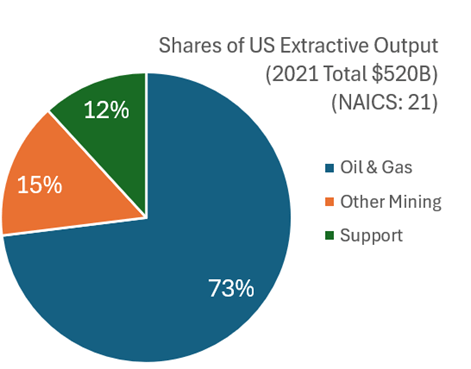
What with all the talk about semi-conductor production and rare-earth mineral extraction, I think that it’s worth examining what the USA produces in terms of what we get out of the ground. This includes mining, quarrying, oil and natural gas extraction, and some support activities (I’ll jump more into the weeds in the future). I’ll broadly call them the ‘extractive’ sectors. How important are these industries? In 2021 extractive production was worth $520 billion. That was roughly 2% of all GDP. Below is the break down by type of extraction.

Examining the graph of total extraction output below tells a story. The US increased production of extracted material substantially between the Great Depression and 1970.  That’s near the time that the clean water and clean air acts were passed. But the change in the output growth rate is so stark, that I suspect that those were not the only causes of change (reasonable people can differ). For the next 40 years, there was a malaise in output. This was the period during which it was popular to talk about our natural resource insecurity. As in, if we were to be engaged in a large war, then would we be able to access the necessary materials for wartime production?  

https://fred.stlouisfed.org/graph/?g=1kWNU

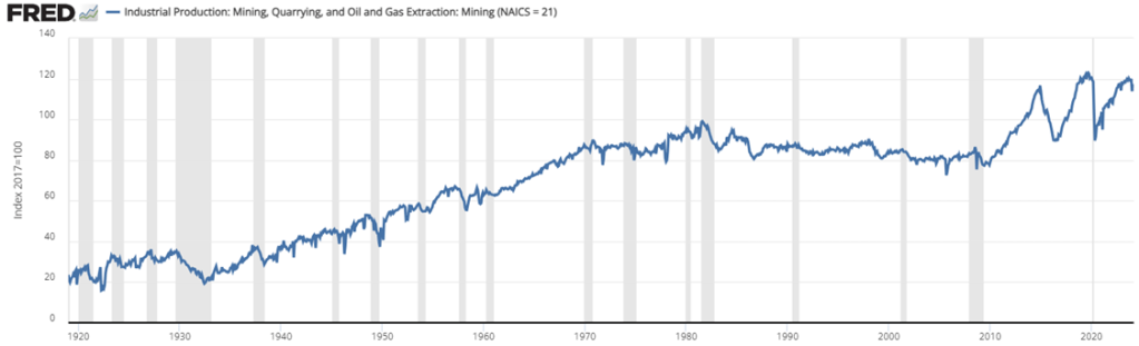
But for the past 15 years we’ve experienced a boom with extracted output rising by 50%, an average growth rate of 2.7% per year. That’s practically break-neck speeds for an old industry at a time when the phrase ‘great stagnation’ was being thrown about more generally. By 2023, we were near all-time-high output levels (pre-pandemic was higher by a smidge).

For people concerned about resource security, the recent boom is good news. For people who associate digging with environmental degradation, greater extraction is viewed with less enthusiasm. Those emotions are especially high when it comes to fossil fuel production. Below is a graph that identifies the three major components of extraction indexed to the 2021 constant prices. By indexing to the relative outputs of a particular year, the below graph is a close-ish proxy to real output that is comparable in levels.

Continue reading

Overview of Peak Oil Theory

Shell Oil scientist M. King Hubbert made a remarkable prediction in 1956. He had analyzed the depletion patterns of various natural resources, and proposed that the production rates of a given resource from a given region would tend to follow a roughly bell-shaped curve.  More specifically, he used what is now called the “Hubbert curve”, which is a probability density function of a logistic distribution curve. This curve is like a gaussian function (which is used to plot normal distributions), but is somewhat “wider”:

Normalized Hubbert Curve. Source: Wikipedia.

Hubbert used various reasonable assumptions (which we will not canvass here) in formulating this model curve. Notably, it predicts that the peak production rate will occur when the total resource from that region is 50% depleted, and that the fall in production on the back side of the curve will be as fast as the rise in production on the front (left) side of the curve.

In 1956, while U.S. oil production was still rising briskly, he fit his curve to the data to that point in time, and predicted that U.S. production would peak in 1970 and thereafter enter a rapid and permanent decline. His prediction was somewhat ridiculed at the time, but it proved to be uncannily accurate over the following 25 years; oil production peaked right when King said it would, and then declined per his curve until about 1990:

Lower 48 U.S. Oil Production: Actual (Green curve) vs. 1956 Hubbert Prediction (Red Curve). Blue Arrow marks deviation ~ 1990-2008, and green arrow marks acceleration of shale oil production. Source: Wikipedia, with arrows added.

I drew in a red arrow at 1956 to show when King made his prediction, and also a blue arrow showing a significant deviation that starting to show after about 1990. Once production had declined maybe halfway down from its peak, the production started to flatten out and decline much more slowly. More on this “fat tail” feature below.

Another feature I called attention to with a green arrow is the remarkable resurgence in production after 2008, which is mainly due to “fracking” of tight shale formation. That new-to-the-world technology has unlocked a new set of oil fields which had previously been inaccessible for production. This illustrated a well-recognized feature of Hubbert curves, which is that a given curve can (at best) apply only to a given region and for a “normal” pace of technological improvement. Fracking production should sit on its own up-and-then-down production curve.

The  plot above is for lower 48 states only; a big find in Alaska gave a bump in production 1980-2000 (not shown here) which distorted the whole-U.S. production curve. That Alaska oil peaked by about 2000 and is now in its own terminal decline pattern.

The shape of production curve on the back (declining) side is of particular interest in trying to do economic modeling of future oil production. If the declines really follow a Hubbert curve, the prognosis is pretty scary – – oil production is slated to crash to practically nothing in the near future. However, it seems that in reality, after an initially rapid decline, production can often be sustained much longer than predicted by a simple symmetrical curve. We saw that pattern in the lower 48 curve above, starting around 1990, even before the fracking revolution. Below I show two other examples showing the same feature. The first example, from Hubbert’s original paper, is Ohio oil production 1885-1956:

A second example is oil production in Norway:

I am not prepared to make quantitative generalizations, but there does seem to be a pattern of sustained production at reduced levels, following the initial rapid decline from the peak. Others also have noted that  asymmetric curves may give better fits to real-world production. These “fat tails” on production from various oil-producing regions should help us keep our cars running longer than predicted by simple peak-oil models. How this pertains to future U.S. shale oil production, and to global oil production, are (since oil and gas are the main energy sources for the world economy) key questions, which we may address in future articles.