I love data, I love maps, and I love data visualizations.
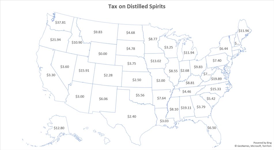
While we tend not to remember entire data sets, we often remember some patterns related to rank. Speaking for myself anyway, I usually remember a handful of values that are pertinent to me. If I have a list of data by state, then I might take special note of the relative ranking of Florida (where I live), the populous states, Kentucky (where my parents’ families live), and Virginia (where my wife’s family lives). I might also take special note of the top rank and the bottom rank. See the below table of liquor taxes by State. You can easily find any state that you care about because the states are listed alphabetically.

A ranking is useful. It helps the reader to organize the data in their mind. But rankings are ordinal. It’s cool that Florida has a lower liquor tax than Virginia and Kentucky, but I really care about the actual tax rates. Is the difference big or small? Like, should I be buying my liquor in one of the other states in the southeast instead of Florida? Without knowing the tax rates, I can’t make the economic calculation of whether the extra stop in Georgia is worth the time and hassle. So, the most useful small data sets will have both the ranking and the raw data. Maybe we’re more interested in the rankings, such as in the below table.

But, tables take time to consume. A reader might immediately take note of the bottom and top values. And given that the data is not in alphabetical order, they might be able to quickly pick out the state that they’re accustomed to seeing in print. But otherwise, it will be difficult to scan the list for particular values of interest.
Given that we’re looking at data in the first place, most readers will have a pretty good idea of what goes where on a map. Given a map of US states, the vast majority of people can point out Texas, Florida, Alaska, Hawaii, California, and Louisiana. Without data labels, there might be a small amount of confusion. Like, which of those rectangles is Colorado? Is Oregon above or below Washington? Is Alabama on the left, or is it Mississippi? A lot of people can just forget about being able to identify states that are in New England and the northeast. But these challenges are mostly small potatoes.
Enter the Maps chart in Excel. It’s pretty great, though not perfect. In fact, it’s quite limited. You won’t be winning any data visualization awards, but you can quickly create a data map that will often be good enough to get the job done.
If we examine a map, then people can quickly check raw values and rankings for the states that they care about. But it’s no good to just label the states with their ranking and raw values. See the simple map below. Now that the states are in geographic order, it’s harder to find the highest and lowest ranking states. The reader spends time looking for particular ranks or values instead of spending time looking for a state in a typed list. Unfortunately, Excel maps only display one type of label at a time.
Adding color can help readers to identify relative values easily. Maybe a very dark colored state is one extreme, and a light colored one is the other. Even here, there is room for discretion. Does one shade the location values by rank or by the raw data values? If there is an outlier, then shading by rank might make sense. After all, most values are similar to one another and we want to be able to distinguish relative values among the states, even if they have similar tax rates.
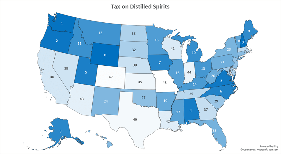
Or maybe your point to emphasize how much of an outlier a state really is. In which case, you should maybe shade by raw data values rather than rank. There is some room for deceptive data visualization here. Let’s compare the map above and the map below. Say that you want to acknowledge that the state with the highest liquor tax is [checks notes] Washington, but that you don’t want to make it seem so exceptional. If you are a special interest who likes the high tax rate, then you would shade by rank, such as in the map above. The color of Washington is not so different from the color of Oregon. How oppressive could the Washington tax be? (Unfortunately, Excel Maps doesn’t like when you try to omit values. New Hampshire has ABC stores and not an excise tax. But excel *really* wants to make those omissions a rank of zero.)
If you are trying to argue that Washington has a very high tax rate on liquor, and that it’s way out of line with the other states in the country, then you could shade by the raw data values. Look how dark the color of Washington is in the map below! How dark? SO MUCH DARKER than all the other states. This calls for a policy reform!
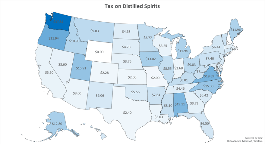
A little more deceptive still would be to list the raw values as the state data labels, but to shade according to the ranking. This way, the reader will observe the raw data, but shading will provide the sense that things aren’t so bad compared to other high-ranking states.
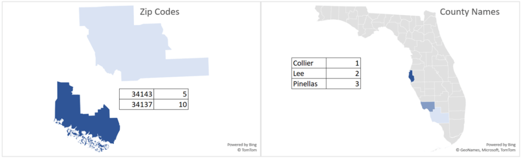
The Map function in Excel is pretty cool. You don’t just have to list states. You can also list countries, provinces, counties, and zip codes. Excel uses Bing, which is pretty smart and can recognize context clues. I typed the below bare-bones data tables and it recognized what I wanted without issue. Excel will do its best to show the relevant universe by default, such as whether to display the state, country, region, or world. But you can also adjust the settings to show only areas with data, such as in the below map on the left.
All of these features are fun to play with and will get the job done. But, the Excel Map tool is still in its early stages. There is an limited amount of visual format flexibility. But the data capabilities and labeling functionality fall flat. Regardless, I strongly recommend this tool for students, teachers, policy analysts, and for arguments on the internet. So long as you understand and accept the limitations, you won’t get too frustrated. Personally, I think that the gold standard for mapping data is set by the Tax foundation. Their maps are informative, detailed, and accommodating. All of the state liquor tax data is from them. You can see their much map using 2021 data below.


Very informative, thanks
LikeLike