Many households are now 2-income households. And that can make parenting a slog.
You go to work for 8-10 hours, you may or may not need to provide transportation for children to/from school, and child-care can eat a substantial portion of income. If the children are small, then the parents clean the floors, the dishes, and the clothes. Not to mention any home improvements or repairs. And food! Do you want to eat a home-cooked meal as a family? If both parents work typical hours, then prepare to eat no earlier than 6 PM, and maybe as late as 7:30.
Hey but there’s the weekend, right? NOPE! Someone has to do that big weekly shopping trip. How long is that going to take? The whole ordeal is enough to make someone think twice before having that 2nd kid. After all, if one kid getting sick throws a wrench in even a single day’s routine, then the whole week can be affected. How many sick kids before things stop getting done? Having a grandparent around to help would be a huge privilege and blessing.
At this point, I think that I can begin to call myself an experienced parent. I’ve got 4 kids who are ages 6 and younger. Plenty of modern conveniences make life easier. Many groceries can be purchased ahead of time for ‘order pick-up’ or online for delivery. Nice. Books are super cheap, and so are bubbles and drawing supplies. If I have to get some work/chores done while the kids are awake, then I can buy myself some time. But, like it or not, when the kids are asleep in the evening is when most chores will get done.
Regular readers will know that we love not only economics, but also history and data. We especially love it when “data heroes” take data that was difficult or impossible to access and make it easily available to everyone. The Federal Reserve Bank of Philadelphia just announced a project that brings together all of these things we love, their new Center for the Restoration of Economic Data:
Our mission is to advance research in topics related to regional economics and consumer finance by making economic data available in readily accessible, digital form. CREED combines state-of-the-art machine learning technology with deep subject matter expertise to convert natively unstructured data (information in books, images, and other undigitized formats) into readily accessible digital data.
The CREED research team shares the original analog or unstructured data as well as the code used to recover and clean these data, which are aggregated for use in novel economic research. Our collection features volumes of old, often overlooked, and frequently inaccessible data, which have been mined, restored, and converted into unstructured digital and analytically usable formats.
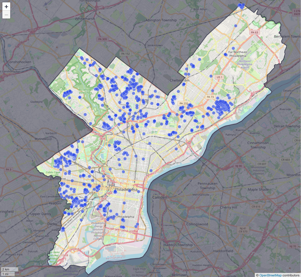
Their first project is to map all of the racially restrictive covenants in the city of Philadelphia. Until the U.S. Supreme Court declared such covenants to be unenforceable in 1948, they often barred properties from being sold to non-whites or non-citizens. After 1948 redlining took different forms, some of which may still persist today.
CREED shares the underlying data used to build the map here, and they say much more is one the way. I love it when economic historians (and regular historians) digitize old paper records and share the resulting data, and hope to see more examples like this to share in the coming years.
Disclaimer: I am a visiting scholar at the Federal Reserve Bank of Philadelphia but I was not involved with this project
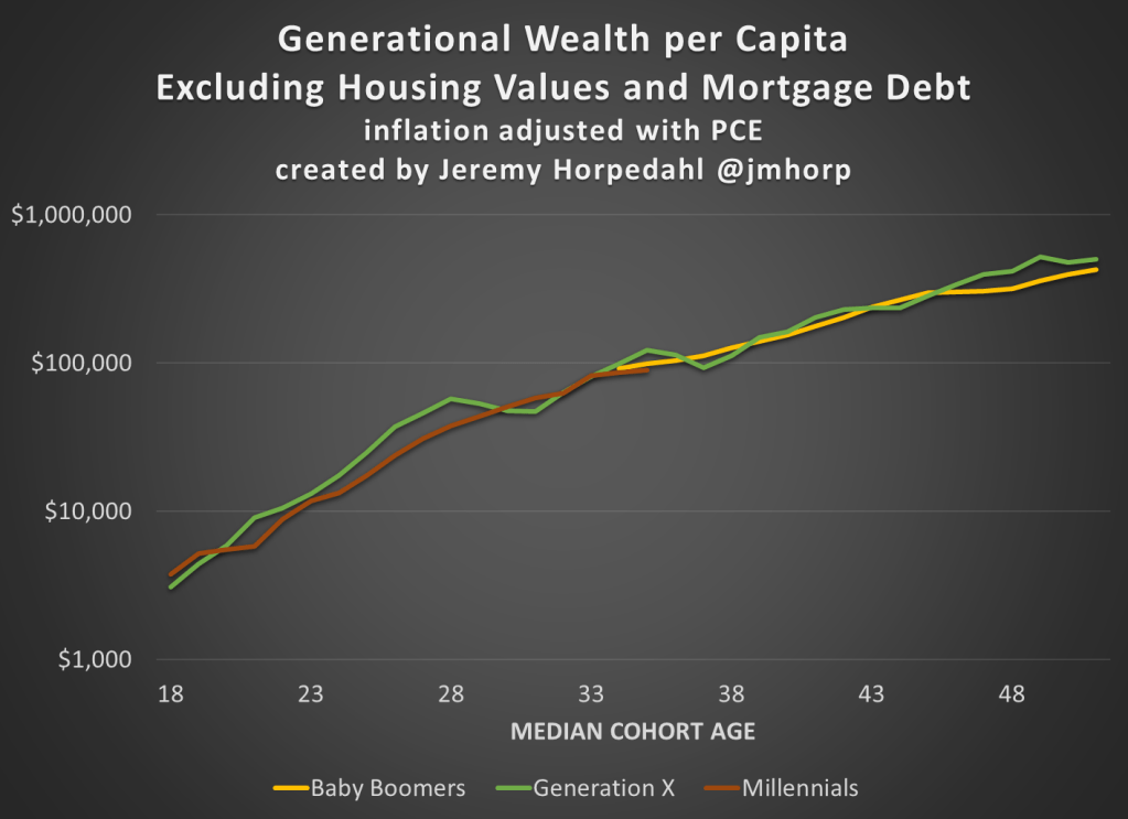
The Federal Reserve has released the latest update to their Distributional Financial Accounts data, which the data underlying several of my past posts on generational wealth. With that recent data, I have updated the chart of wealth for Baby Boomers, Generation X, and Millennials.
The data is shown on a log scale to better show growth rates and allow for easier visual comparisons. But if you are interested in the more precise numbers, in the most recent quarter (2023q2) Generation X has, on average about $620,000 in net wealth, which compares favorably with Baby Boomers at about the same age (in 2006) with about $539,000 in net wealth per person. That’s about 20 percent more.
Millennials have about $115,000 in net wealth on average, which also compares favorably with Baby Boomers, who had slightly more at about the same age (in 1990) with $121,000 in net wealth on average. Given the uncertainties of all the data that goes into this, I’d say those are roughly equal. Gen X had a bit more around the same age (in 2007) with $149,000, but that fell significantly the next two years during the Great Recession.
(For more detail on my approach to creating the chart, see the linked post above, but in short I’m using the Fed DFA data for wealth, Census Bureau data by single year of age for population, and the Personal Consumption Expenditures price index for inflation adjustments (I also have a chart with the CPI-U — it’s not much different). Wealth data is for the 2nd quarter in each year (to match 2023), except for 1989 since the 3rd quarter is the first available.)
Given how much wealth can fluctuate based on housing values (see above for Gen X from 2007-2009), it might be useful to look at the data with housing. Housing is also a weird kind of wealth — for the most part, you can’t access it without selling (other than certain home equity loans), and when you do sell, unless your home appreciated more than average, you just have to move to another home that also appreciated.
Here’s the chart excluding housing value and mortgage debt:
The chart… doesn’t change much. The values are all lower, of course, but the comparisons across generations look pretty similar. Gen X right now is 17 percent wealthier than Boomers at the same age. And if we look at all three generations around the median age of 35, they are pretty close: Gen X with $123,000 (but slipping over the next few years), Boomers with $99,000, and Millennials with $90,000.
We reported last month on yet another COVID surge beginning, driven by yet another new, highly transmissible variant. When I checked in on the state of affairs this week, I found two different narratives.
With the demise of widespread public testing, it has become more difficult to track the progress of the disease. One means to do so now is to monitor hospital admissions for COVID. The New York Times provides this service, and it shows a continued uptrend in cases, at least through September 8:
The chart above is for the whole country. It turns out that these cases are highly localized in certain hot spots, especially along the Atlantic seaboard (Delaware through South Carolina), plus the region of St. Joseph, Missouri:
An alternate means of monitoring the progress of COVID is to do ongoing testing of municipal wastewater. The virus is “shed” (to put it delicately) in sewage, and can be detected there some days before a person reports any symptoms. Most recent wastewater analyses indicate that incidence of the disease is plateauing for now, according to an NBC News article by Erika Edwards:
Biobot Analytics, a company that tracks wastewater samplesat 257 sites nationwide, said that the current average Covid levels across the United States are approximately 5% lower than they were last week.
“All fingers crossed,” Cristin Young, a Biobot epidemiologist said, “this wave is plateauing and may be declining.”
After a mid- to late-summer rise, the CDC’s Covid wastewater surveillance now shows declines in mid-Atlantic states, such as Virginia and Maryland.
The findings are backed up from surveillance in North Carolina, said Jessica Schlueter, an associate professor in the department of bioinformatics and genomics at the University of North Carolina Charlotte. Her lab is responsible for testing 12 sites across the state.
The increase in Covid wastewater samples during the last six months “seems to be peaking and starting to taper off,” she said. …Wastewater collection sites in the Midwest and the Northeast, however, show a steady uptick in Covid spread.
Hospitalizations and deaths are lagging indicators, whereas wastewater analysis provides something of a leading indicator. Putting it all together, it may be that what we are seeing now is the usual late summer COVID increase, which may come down in the next two months, to be followed by another winter surge. Do get your latest booster shots.
The NFL has filed a grievance against the players union, alleging a conspiracy to fake injuries on the part of running backs to gain greater leverage in salary negotiations. To grant necessary context as succinctly as possible: running backs carry the ball while giant humans attempt to harm them. They do this 15 to 30 times per game. They are important to team success, but not as important as they once were. At the same time, they incur significant traumatic and cumulative damage, resulting in the shortest expected career length of any position in professional football. The NFL has a cap on total team salaries negotiated between the players union and the owners group/cartel/partnership. Running backs have seen their salaries decline even as the damage incurred as become more apparent and measurable. This raises an interesting question: where are the compensating wage differentials for risk? Everyone gets paid more if their job is dangerous. Do running back wages reflect their physical risk?
Supply and demand always come first, and any explanation for the (relative to other positions) decline in running backs salaries has to start with declining demand. Running backs are viewed as less valuable, more interchangable than they once were. At the margin, the returns to employing the best running back relative to the 30th best running back are viewed as thinner than in earlier eras. And that could be 95% of the answer, but it’s worth investigating the supply side as well.
The understood risk of injury facing running backs has increased. With greater risk typically comes less labor supply, the shifting equilibrium pushing wages up. Is this what we are seeing in football? Are fewer athletes interested in being a running back? Are running backs retiring earlier? Maybe, but that can cut both ways, reducing supply and demand.
But the supply side has multiple dimensions: both players entering the market (the “extensive” margin) and the amount they are willing to play (the “intensive” margin). Has the injury “threshold” shifted for running backs who are now less willing to play while already carrying significant damage? Because that’s exactly what I think we are seeing. I think running backs are beginning to reduce the amount of their bodies’ usable careers they are willing to sell at the current market price. They have reduced supply on the intensive margin. Running backs are demanding greater compensating wage differentials for risk and the owners don’t like it. They thought the supply of running back labor would remain almost perfectly inelastic under the terms of the collective bargaining agreement, but they were wrong.
Now, is trying to organize a collective reduction in labor supply in order to better negotiate compensating wage differentials fair play on the part of the players? Absolutely. Why do I say absolutely? Because they are not only bargaining against a cartel of owners, they are implicitly bargaining against the rest of the players association, who have failed to deliver compensation for their risk, at least in part, because the rest of the players, the non-running backs, benefit from every dollar under the cap not spent on running back salaries.
I’ll put it bluntly. Everyone has the right not to supply their labor. Everyone has the right not to incur physical risk and damage if they aren’t being sufficiently compensated. Organizing to collectively restrict that supply is fair game, triply so if there are explicit (the owners) and implicit (the other players) groups that are collectively organizing against you.
I’ve seen NFL games. I know how much you’d have to pay me to carry the ball once on an NFL field, let alone dozens of times every week. If I wasn’t getting paid my reservation wage, there is no collective bargaining agreement you could wave in my face, no public shaming, no pressure from fans that could get me on that field.
All the collective bargaining in the world can’t make the laws of supply and demand go away. Professional sports are a labor-intensive industry, and football is a high risk endeavor for labor. If you want millionaires to show up every week to willingly endure the equivalent of a half-dozen car accidents, you’re going to have to pay them. Oh, but you can’t pay them that much, they’re a depreciating asset since the damage incurred shortens their career? Good point, the price just went up. You don’t want to commit to long term contracts because injury can end a career on any play? Good point, the price just went up. We have a big game this week, we need …you…to…ohhhhh
One of today’s best econbloggers, Matt Yglesias, just wrote “What I learned losing 70 pounds: Medical interventions work, among other things”
This is not about lemon juice or cutting out dessert. Matt wrote about getting surgery that he paid for out of pocket. No one wants to talk about medical stuff publicly. No one wants to admit that they have a hard time doing obvious correct things like eating less and exercising. Matt did this to help people. He’s inspired me to share something about health, too.
Around the time my second child was 6 months old, I decided it would be nice to get back into some kind of “shape.” So, it was time to head out the door and try to run around the block. Ouch. My knee was wrong.
To keep this short, so I’ll just say that I already knew what a doctor would tell me to do. I knew that I should do targeted exercises to strengthen the muscles around the knee. There are very boring ways to do that, such as counting reps by yourself in a quiet room.
Likewise, Matt Y knew that he could lose weight by simply eating less. It’s easier said than done. Matt took advantage of money and new technology to get results. In a less extreme way, so did I. Instead of doing “physical therapy,” I joined a friend’s Pilates studio. I paid someone to talk to me and count my reps and play music. I paid for accountability. It worked.
There is even better news. If you have Youtube access, you can get almost the full benefit of Pilates classes for free by following along with videos. Or, you can pay a little bit for even better videos with no ads. This is just one way that economic growth and technological innovation have made our lives much better.
A lot of our readers are men. You might think this only applies to women in yoga pants. Not so.
There is a certain stigma surrounding Pilates due to its vast popularity amongst women owing to its numerous health benefits and its versatility (suitable to all age groups and ability levels). However, Pilates was actually developed by a man named Joseph Pilates to help rehabilitate injured soldiers imprisoned during World War 1.
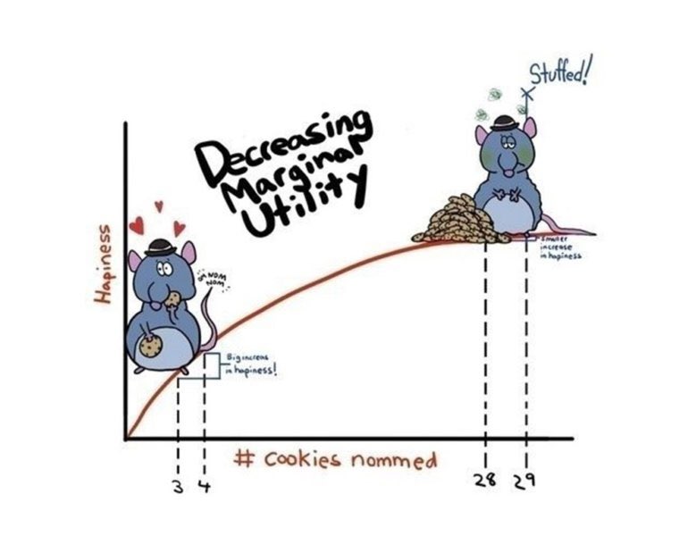
This week on Twitter (X.com), someone said it was their favorite graph. Upon replying I learned that he had used it for teaching. It’s fun when you know one of your ideas is out in the world helping people.
For real? I absolutely HOWLED when I found it on a google image search! Bravo! I taught HS Econ for many years and this was the kind of stuff that kept kids awake!
Blogger privilege is to manifest a new conversation on here. If one of my research articles were to achieve the same level of influence as the stuffed rat, then people might tweet something along the following lines:
This original project, both in terms of methodology and subject, is one of the first controlled experiments on intellectual property protection, which has inspired subsequent lab work on this issue. We present a color cube mechanism that provides a creative task for subjects to do in an experiment on creative output. The results indicate that IP protection alone does not cause people to become inventors, although entrepreneurs are encouraged to specialize by IP protection.
“Smile, Dictator, You’re On Camera,” (2017), with Matthew McMahon, Matthew Simpson and Bart Wilson. Southern Economic Journal, 84:1, 52-65.
The dictator game (DG) is attractive because of its simplicity. Out of thousands of replications of the DG, ours is probably the controlled experiment that has reduced “social distance” to the farthest extreme possible, while maintaining the key element of anonymity between the dictator and their receiver counterpart. In our experiment the dictator knows they are being watched, which is the opposite of the famous “double-blind” manipulation that removed even the view of the experimenter. As we predicted, people are more generous when they are being watched. Anyone teaching about DGs in the classroom should show our entertaining video of dictators making decisions in public: https://www.youtube.com/watch?v=vZHN8xyp6Y0&t=22s
There is a lot of talk about reference points. No matter how you feel about “behavioral” economics, I don’t think anyone would deny that reference-dependent behavior explains some choices, even very big ones like when to sell your house. Considering how important reference points are, can people conceive of the fact that different people have different reference points shaped by their different life experiences? Results of this study imply that I tend to assume that everyone else has my own reference point, which biases my beliefs about what others will do. Because this paper is short and simple, it would make a good assignment for students in either an experimental or econometrics class. I have a blog post on how to turn this paper into an assignment for students who are just learning about regression for the first time.
“If Wages Fell During a Recession,” (2022) with Daniel Houser, Journal of Economic Behavior and Organization. Vol. 200, 1141-1159.
The title comes from Truman Bewley’s book Why Wages Don’t Fall during a Recession. First, I’ll take some lines directly from his book summary:
A deep question in economics is why wages and salaries don’t fall during recessions. This is not true of other prices, which adjust relatively quickly to reflect changes in demand and supply. Although economists have posited many theories to account for wage rigidity, none is satisfactory. Eschewing “top-down” theorizing, Truman Bewley explored the puzzle by interviewing—during the recession of the early 1990s—over three hundred business executives and labor leaders as well as professional recruiters and advisors to the unemployed.
By taking this approach, gaining the confidence of his interlocutors and asking them detailed questions in a nonstructured way, he was able to uncover empirically the circumstances that give rise to wage rigidity. He found that the executives were averse to cutting wages of either current employees or new hires, even during the economic downturn when demand for their products fell sharply. They believed that cutting wages would hurt morale, which they felt was critical in gaining the cooperation of their employees and in convincing them to internalize the managers’ objectives for the company.
We are one of the first to take this important question to the laboratory. The nice thing about an experiment is that you can measure shirking precisely and you can get observations on wage cuts, which are rare in the naturally occurring American economy.
We find support for the morale theory, but a new puzzle got introduced along the way. Many of our subjects in the role of the employer cut the wages of their counterpart, which probably lowered their payment. Why didn’t they anticipate the retaliation against wage cuts? That question inspired the paper “My Reference Point, Not Yours.”
Andreoni & Miller (2002) have been cited over 2500 times for their experiment that shows demand curves for altruism slope down. Economic theory is not broken by generosity. We extend their work to show that demand curves for equality slope down. Individuals don’t love inequality, but they also don’t love parting with their own money. There is a higher demand for reducing inequality with other people’s money than with own income.
This is the last paper I’ll do here. At this point, readers probably would like a funny animal picture. Here’s a meme about the difficult life of computer programmers:
For decades, tech skills have had a high return in the labor market. There is very little empirical work on why more people do not try to become computer programmers, although there are policy discussions about confidence and encouragement.
I ran an experiment to measure something that is important and underexplored. One thing I found is that attempts to increase confidence, if not carefully evaluated, might backfire.
Would you predict it’s more important to have taken a class in programming or for a potential worker to report that they enjoy programming? My results imply that we should be doing more to understand both the causes and effects of subjective preferences (enjoyment) for tech work.
A few more decades to go here… I will try to top the stuffed rat picture.
In standard microeconomics, the long-run demand is unimportant for the market price of a good. Firm competition, entry, and exit causes economic profits to be zero and the price to be equal to firms’ identical minimum average cost. This unreasonably assumes that they have constant technology. That is, they have a constant mix of productive inputs and practices.
Just so we’re clear: time is passing such that firms can enter, exit, and adjust the price – but no productive innovation occurs. For the modeling, we freeze time for technology, but not for other variables. The model ceases to reflect reality on the margin of scale-induced innovation. The standard model assumes an optimal quantity of production for each firm and the only way for total output to change is for there to be more or fewer firms. The model precludes adopting any different technology because firms are already producing at the minimum average cost – if they could produce more cheaply, then they would.
Enter Scale
One of my favorite details about production was taught to me by Robin Hanson.* Namely, that the scale of production isn’t merely with the aid of more raw materials, labor, and capital. There are perfectly well-known existing technologies and methods that reduce the average cost – if the firm could produce a large enough quantity. This helps to illustrate what counts are technology. A firm can achieve lower average costs without inventing anything, and merely by adopting a superficially different production method.
OpenAI created the popular Dall-E and ChatGPT AI models. They try to make their models “safe”, but many people make a hobby of breaking through any restrictions and getting ChatGPT to say things its not supposed to:
Now trying to fool OpenAI models can be more than a hobby. OpenAI just announced a call for experts to “Red Team” their models. They have already been doing all sorts of interesting adversarial tests internally:
Now they want all sorts of external experts to give it a try, including economists:
This seems like a good opportunity to me, both to work on important cutting-edge technology, and to at least arguably make AI safer for humanity. For a long time it seemed like you had to be a top-tier mathematician or machine learning programmer to have any chance of contributing to AI safety, but the field is now broadening dramatically as capable models start to be deployed widely. I plan to apply if I find any time to spare, perhaps some of you will too.
The models definitely still need work- this is what I got after prompting Dall-E 2 for “A poster saying “OpenAI wants you…. to fool their models” in the style of “Uncle Sam Wants You””
Last week I wrote about median income in the US, and how it had declined since 2019 and 2021 through 2022 (inflation adjusted, of course). The big story is that median income (both for households and families) has been falling in recent years. While there are some silver linings when looking at subgroups, such as Black families, the overall data isn’t good.
But while that is true for the US overall, it’s not true for every state. In fact, it’s not even true for most states! From 2019 to 2022, there were 29 states that saw their median family incomes rise! That’s adjusted for inflation (I’m using the C-CPI-U, which is Census’s preferred inflation measure for this data). The income data in this post all comes from the Census ACS 1-year estimates.
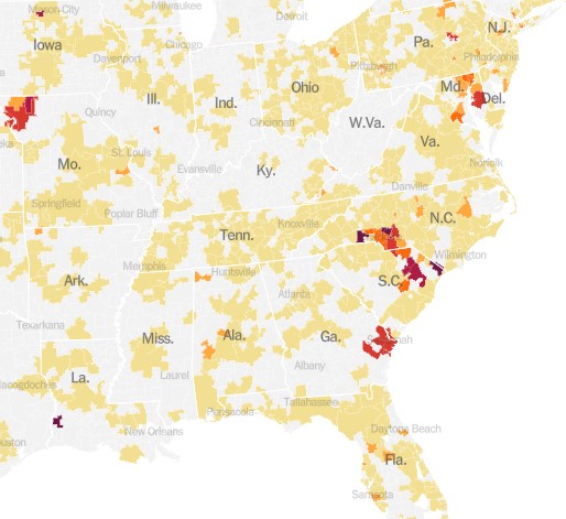
Here’s a map showing the states that had increases in median family income (green) and those that had decreases (in red). (This is my first time experimenting with Datawrapper maps, feedback appreciated!)
Some states had pretty robust growth, with New Mexico and Arizona leading the way with around 5 percent growth. There is substantial variation across US states, including with big declines like Wyoming at -5 percent, and Oklahoma and Illinois are -3 percent.
A few weeks ago I also wrote about the richest and poorest MSAs in the US. But what about the richest and poorest states in the US? The following map shows that data.
The immediate fact which will jump out at you is that the lowest income US states are almost all located in the South. This will probably not surprise most of us, although it probably is a bit surprising since the data is adjusted for differences in the cost of living (using the BEA RPP data). Even after making these adjustments, the South is still clearly the poorest region (and it definitely was the poorest without the adjustments).
Among the higher income states, they are distributed pretty well across the rest of the non-South. There are 16 states (plus DC) that have median family incomes over $100,000 (again, cost of living adjusted), and while many of these are in New England and the Mid-Atlantic, there area still a few in the Midwest, Great Plains, and the West. Utah and New Jersey have similar incomes, as do Virginia and Rhode Island.
The highest income states are Massachusetts and Connecticut, with over $112,000 in median family income, while the lowest are Mississippi and West Virginia, both under $78,000. Median family income in Massachusetts is 46 percent higher than Mississippi. And that’s after adjusting for differences in the cost of living.