While there are many factors to consider, ultimately whether living standards are rising is a race between prices and income. What does that race look like if we start the clock in December 2019, just before the pandemic?

Whether we use median weekly earnings (the purple line) or average hourly earnings for non-management workers (the blue line), they have clearly won the race with two commonly used price indexes (the CPI-U and the PCEPI). That’s good news, and probably not something you hear very often in the discourse about the economy (unless you spend a lot of time reading this blog).
If you start the clock in December 2020 (just before Biden takes office), the picture is a little less optimistic: the income measures trail the CPI but beat the PCEPI. Late 2020 is also a challenging time to start the clock for data purposes, as a large number of workers were still out of the workforce due to the lingering effects the pandemic and the responses to it (both from governments and consumers). And since these out-of-the-workforce workers were disproportionately lower-income, it had the effect of artificially increasing measured wage levels at that time, thus creating a higher baseline (clearly visible in the chart above).
All of that is (I think) fairly well-known. But there is another concern we might address: there is a distribution of wages. And since December 2019, wages have not increased equally across the distribution. But this effect has been different than you might suspect: wage growth was better for poorer workers than for high-income earners. Arin Dube has been tracking this data carefully over the past several years, and here is a chart from his latest update (through December 2023):
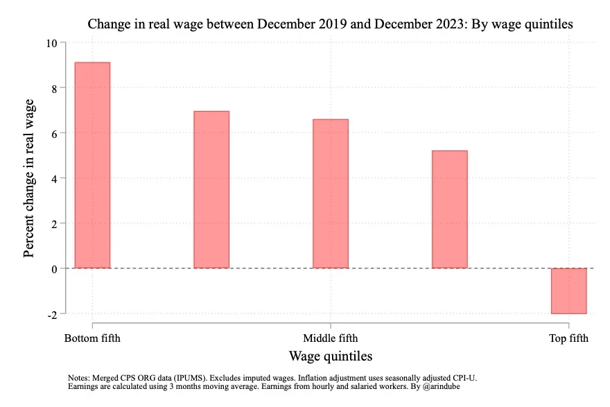
The data is inflation-adjusted with the CPI-U (more on that in a moment). And the results are fascinating. Not only was the growth at the bottom of the distribution the best, for the top fifth of earners they have lost the race between income and prices over the past 4 years! This flips the old expression on its head: the poor got richer, and the rich got poorer.
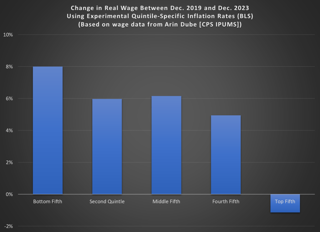
But you might suspect that different quintiles of income also experienced different rates of inflation. And you are correct, at least based on an experimental series created by BLS of inflation rates by income quintile. The series starts in 2005 and looking over the entire series through 2023 we see that the poorest earners have indeed had higher inflation rates: about 61% vs 53% for the highest income quintile.
This general pattern (higher rates of inflation at the bottom of the income distribution) holds up if we look from December 2019 to December 2023, but is it enough to overturn Dube’s result? No! Compared with the overall change in the CPI-U, the poorest quintile saw a rate about 1 percentage point higher, while the richest quintile saw a rate that was about 1 percentage point lower than average. That’s an imporant difference, by it is dwarfed by the differences in wage growth.
Here’s my version of his chart using the different inflation rates:

Thanks for this analysis! Question: how much did the wage gap between top quintile and bottom quintile decline over that time period?
LikeLike