Today I am posting an update to the generational wealth chart that I have posted many times in the past. This update brings the data through the 3rd quarter of 2025 for the youngest cohort, which includes both Millennials and a growing part of Gen Z in the data from the Federal Reserve. I am somehow hesitant to post this chart, as it is starting to be data that is less useful as the younger generations age, for two reasons.
The first problem with the data is that the Fed is lumping everyone from ages 18-43 together as one generation. Given that the youngest Millennials were 29 in 2025, we are now including a significant part of Gen Z, which is OK in itself, but it becomes harder to compare with generations that encompass only 16 or 17 years of birth cohorts. Secondly, the data from the Fed’s Distributional Financial Accounts is only benchmarked every three years with the Fed’s more detailed Survey of Consumer Finances. Currently only the 2022 version of the survey is available, which is now probably a bit out of date. Based on past updates, it is entirely possible that it is underestimating wealth for the youngest cohort. But I think we will have much more certainty about this data once the 2025 SCF is available and used as a benchmark for the DFA data.
With all of those caveats aside, here is the updated chart:
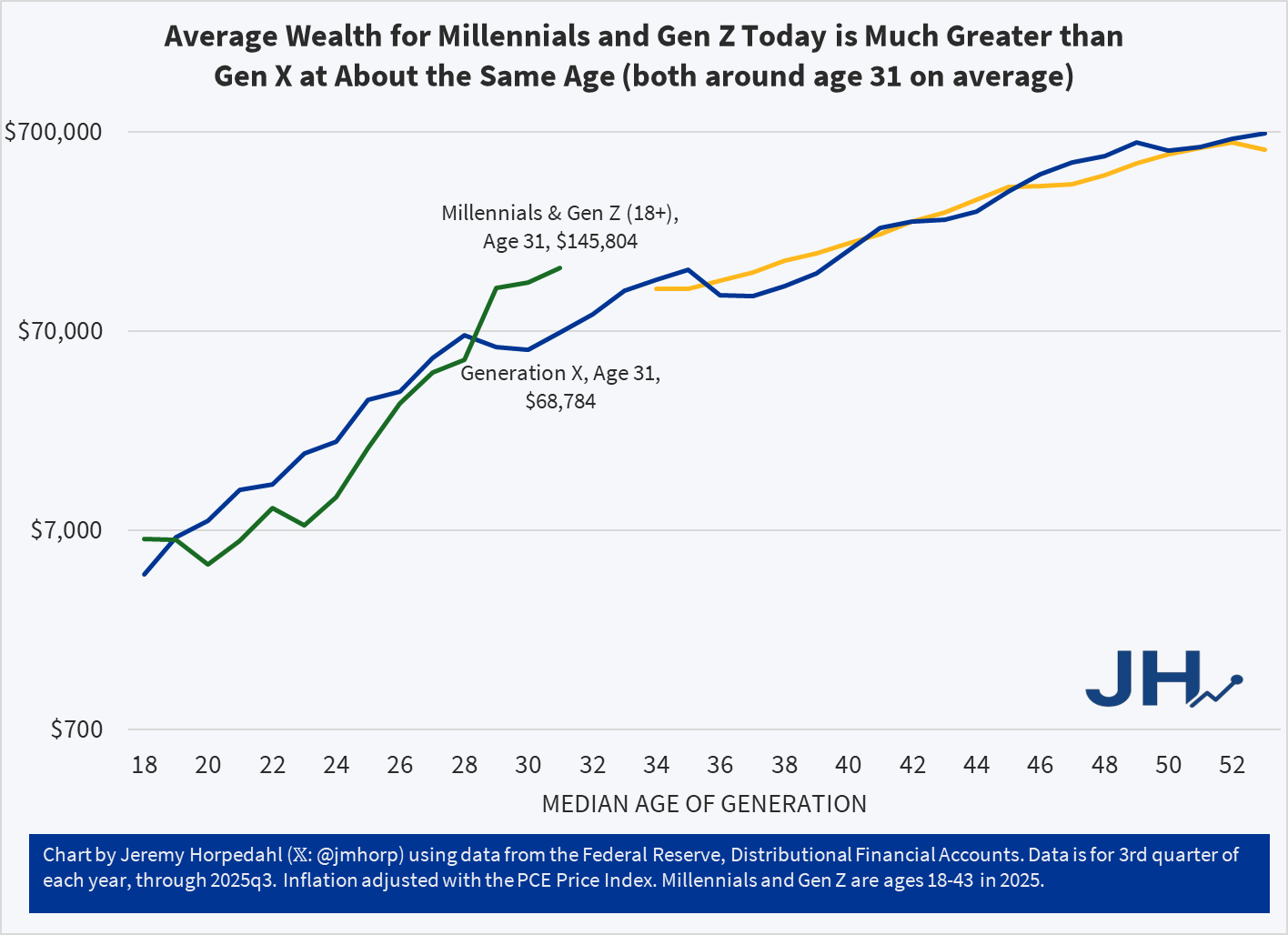
As I am currently working on a book manuscript using the Survey of Consumer Finances, I will be very excited to finally have the 2025 data available. Until then, this is probably the best intergenerational comparison we can do, and it continues to look very positive for the youngest cohorts. With an average of almost $146,000 of wealth for the combined Millennial/Gen Z cohort, they are well ahead of where Gen X was even in their late 30s, and ahead of Boomers at around age 37 as well. All of this bodes well for young people, despite frequent expressions of pessimism, but we should hold off judgement until the 2025 data is fully updated.