How to Think About Inequality Data and Public Policy

Lately I’ve been thinking about the disagreements among economists about the extent to which inequality has increased in recent decades. I am facilitating a reading group at my university on inequality this semester with some great undergrads, so it has very much been on my mind.

With conflicting data showing different trends, how are we as economists to judge this? How can the general public even have a clue how to judge this?

You may have seen this chart before. It comes from an article in The Economist, which actually does a really good job of explaining the debate over the data if you know nothing about it.

TaxProf Blog

According to some estimates, the share of income going to the top 1% has doubled and is now over 20%. That sounds bad. Maybe we need some more redistribution. Maybe a wealth tax.

But according to other estimates, and taking account of our existing system of progressive taxes and redistribution, the share of income going to the top 1% has not risen at all, is only about 5%. Less worrisome. The existing system of taxes and transfers seems to be doing a pretty good job, or at least no worse than in the last 60 years. No need for a new wealth tax, etc.

So who is right?

Sorry, I don’t have the answer. I think I’m pretty good at digging into economic data (follow me @jmhorp on Twitter for an almost daily dose of data debunking!), but I am no expert in this area. There’s probably only a dozen economists that really understand this data and the trade-offs in different forms of measurement.

So instead of giving you the “correct” answer, I offer you a chance to reflect. Our temptation is to say the “correct” data is the one that comports with our political preferences. If you are a progressive, you probably think inequality is bad and getting worse. Piketty is your man. If you are more of a libertarian, you probably think it’s about the same as recent years. Auten and Splinter must be right!

Stop. And instead, consider how you might view the policy implications of the data you don’t like being the correct data. If you are a progressive, would you still think we need a wealth tax even if the Auten and Splinter data is correct? If you are a libertarian, would you still think things are just fine and maybe we should cut the top tax rate if it turns out that Piketty and co-authors have the real data?

If you answer is the same for the policy implications regardless of what the data say, you might want to check yourself. And if so, why are we even arguing about the data?

Perhaps your answer is “I might have the same policy answer regardless of the data, but there are people out there that are convinced by data.” I think that’s possibly reasonable, and I would like it to be true, but where are these people?

Perhaps the answer is “as a libertarian, I don’t care about inequality so long as the poor and middle class are also sharing in the gains.” Or “as a progressive, I will continue to worry about inequality until the top 1% only has 1% of national income.”

I think these are the normal fallback answers. But really? Libertarians: if the income of the top 1% doubled in a decade, but the bottom 99% increased by 0.5%, you would be fine with this, because at least no one declined? Progressives: you would really support increasing taxes on the rich, despite any downside to this, until incomes were exactly equalized?

Frankly, I don’t believe anyone really holds either of those extreme positions. So surely, the data must matter? We want some reasonably shared benefits from economic growth, but no one really demands that they be exactly equal, right?

So, consider your own biases. Don’t engage in motivated reasoning. And think through how your views might change if you are wrong about the data. Perhaps someday Mother Nature will reveal herself, we’ll have the true inequality data, and we’ll see if we were honest about our reflections.

Economic Research on Gender, Race & Ethnicity, and Inequality

How much research do economists devote to the topics of gender, race and ethnicity, and inequality? In a recently published article in Econ Journal Watch, Arnold Kling and I looked at articles published in the American Economic Review as well as the conference papers of the American Economic Association on this topics. We find that economists devote a large amount of space to the topics combined in recent years: over 10% of published articles and over 20% of conference papers. We also find that the share of research on this topics, as measured in these two AEA outlets, has been increasing over time (we go back to 1991, when the current JEL Code system was introduced).

Of the three areas we looked at, papers on gender saw the clearest increase, rising as both a share of published articles and conference papers. Published AER articles addressing inequality have also been increasing over this time period, though AEA conference papers on inequality have been stable. Both published articles and conference papers on race and ethnicity have been stable over the period we studied as a share of the total, though the absolute number has increased.

What is the significance of our results? Our main motivation was to challenge other economists who suggest, in various ways, that economists ignore these topics or don’t study them enough (for examples see these popular writings on gender, race and ethnicity, and inequality). Our research clearly shows that economists devote a good deal of attention to these topics, and for many areas it has shown a clear increase.

It is still possible that economists don’t dedicate enough time to these topics. We make no strong claim in the paper about what the correct amount of time for each topic would be. However, we do note the opportunity cost that comes with an increasing focus on these topics.

More importantly, those who suggest in public venues that economists ignore these areas are doing a disservice to all the scholars that have devoted their careers to studying these important topics and publishing their results in one of the top journals in the discipline. We have much more to learn about gender, race and ethnicity, and inequality, but dismissing the research that has already been done is unfair to a discipline that has increasingly focused on these areas.

OK, Millennial?

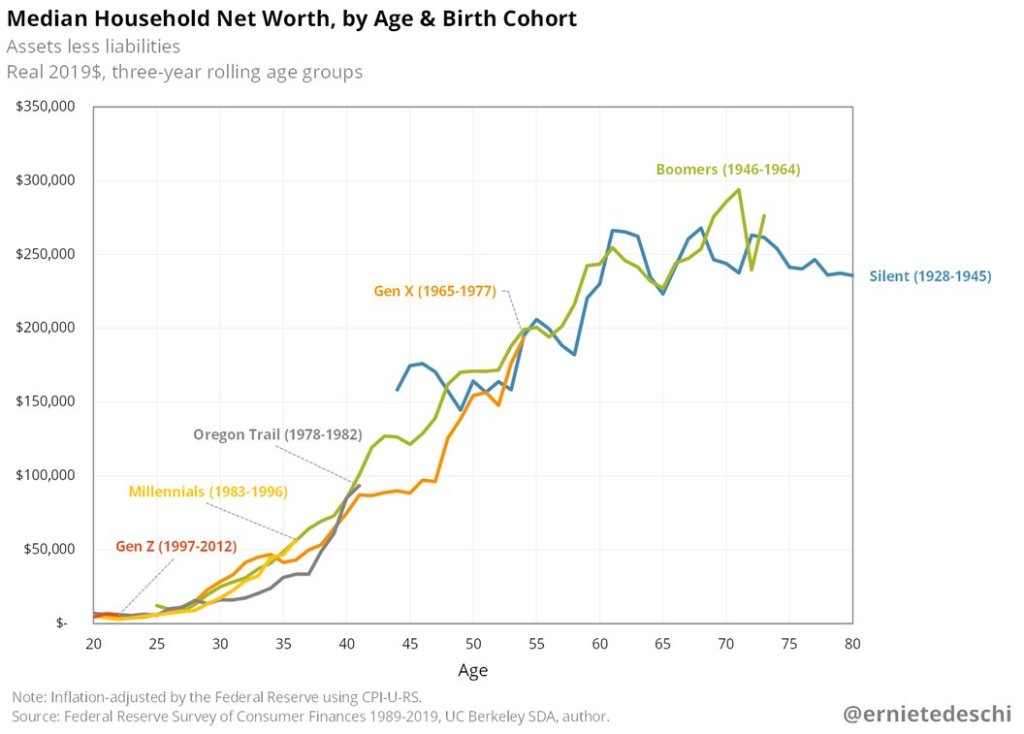
How do young people fare when it comes to household wealth? The recently released Survey of Consumer Finances from the Federal Reserve provides some insights. One major takeaway: the much-maligned Millennials are doing pretty good! Ernie Tedeschi created this informative chart on Twitter:

Looking at household net worth at roughly the same age, Millennials today have roughly the same household wealth as Boomers did in the past. And both of these generations beat the generation between them, Gen X, as well as the “microgeneration” creatively labeled Oregon Trail.

And it’s something of a running joke on Twitter, but I must add: Yes! It’s adjusted for inflation!

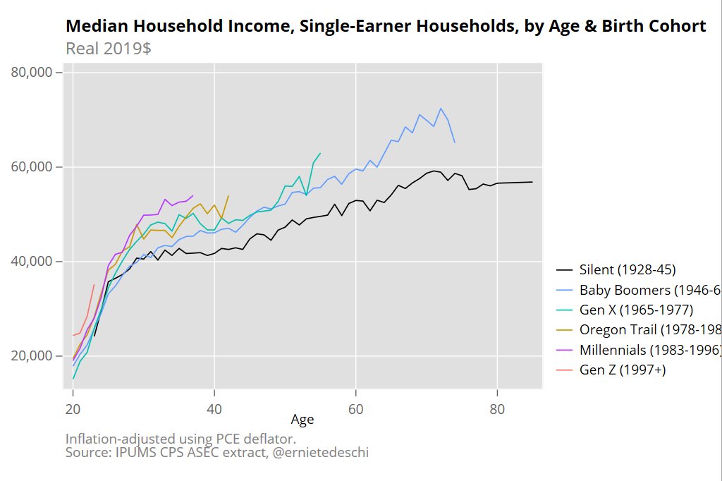
Part of this may be driven by the increase in dual-income households. Certainly that matters. While wealth data by number of earners is harder to track down, income data is more readily available. What if we look at single-income households? Millennials are still in the lead! (Once again, the chart comes from Ernie Tedeschi.)

And before you ask: Yes! It’s adjusted for inflation!

None of this means that Millennials don’t face challenges, including financial ones. This data is current through 2019, so 2020 will almost certainly make these numbers look worse, for a time. But all things considered and anecdotes aside, the kids today seem to be as well or better than past generations.

(Oh, and before you ask: Yes! It’s adjusted for housing, medical, and education costs! In fact, these three factors make up half or more of most inflation adjustment indices.)