You’ve probably heard the phrase that US states are often “laboratories of democracy.” The phrase comes from a Supreme Court case. It’s well known enough that it has a short Wikipedia page. The basic idea is simple: states can try out different policies. If it works, other states can copy it. If it doesn’t work, it only hurts that state.
The 2020-21 pandemic has provided a number of possibilities for the “states as laboratories” concept. Here’s three big ones I can think of (please add more in the comments!):
Do states that end unemployment benefits sooner have quicker labor market recoveries? Or are these not the main drag on the labor market?
Do states that offer incentives for vaccination have higher vaccination rates? And what sort of incentives work best?
These are all good questions, but let me throw some cold water on this whole concept: we might not be able to learn anything from these “experiments”! The primary reason: the treatments aren’t randomly assigned. States choose to implement them.
Let’s think through the potential problems with each of these three areas:
It’s almost summer. About half the US population has at least one dose of a COVID vaccine. For many Americans that haven’t had their employment impacted by the pandemic, their bank accounts are flush with cash and they are ready to do one thing with that cash: travel. See family and friends. See something other than the inside of your own home.
And for many Americans traveling this summer, they will fly. The airlines, no doubt, will appreciate your business. At this time last year, the world had so radically shifted that Zoom’s market cap was bigger than the 7 largest airlines in the world. In May 2020, air passenger traffic in the US was less than 10% of traffic in 2019. Today, we’ve recovered a lot, but we are still only back to about two-thirds of normal levels. And since airplanes are just a marginal cost with wings, flying all their planes at close to full capacity is crucial for airlines to return to profitability. They really need you to fly the friendly skies this summer.
One of the reasons that so many Americans are able to fly in today is because flying is, compared to historical prices, very cheap.
How cheap is flying to today compared to the past? Let’s look at some historical price data for flights.
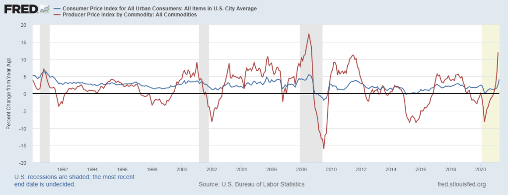
You’ve probably seen the headlines. Corn prices are double what they were a year ago. Lumber prices are triple. You can find all kinds of other scary examples. Is runaway inflation just around the corner? Is it already here?
And yet, measures of prices that consumers pay are much more stable. The most widely tracked measure, the CPI-U, is up 4.2% over the past year. That’s through April — and keep in mind that it’s starting from a low base since March-May 2020 saw falling prices). The Personal Consumption Expenditures index, often preferred by economists, is up just 2.3% (though that’s only through March).
So what gives? Do these consumer measures understate inflation in some way? Or is the increase in commodity prices telling us that consumer prices will increase soon?
Let’s take that second question first. Do higher commodity prices necessarily lead to higher consumer prices? The answer is a clear no. First, we can see that in the data. The producer price index for all commodities (such as corn and lumber) is up 12% over the year (through March, with April data coming out tomorrow). That’s a big increase. But as the chart below suggests, that probably will not lead to 12% increases in consumer prices. It probably won’t even lead to a 5% increase in consumer prices.
Notice two things about this chart. First, commodity prices (the red line) are much more volatile than consumer prices, both on the upside and downside. Second, there really isn’t much of a lag, if any. The direction of change is similar in both indexes, almost to the month. When producer commodity prices go up, consumer prices also go up, that very same month, but not by the same amount. So all of that 12% increase in producer prices is probably already reflected in consumer prices.
Why might this be? Simple supply and demand analysis (hello Econ 101 critics!) can tell us why.
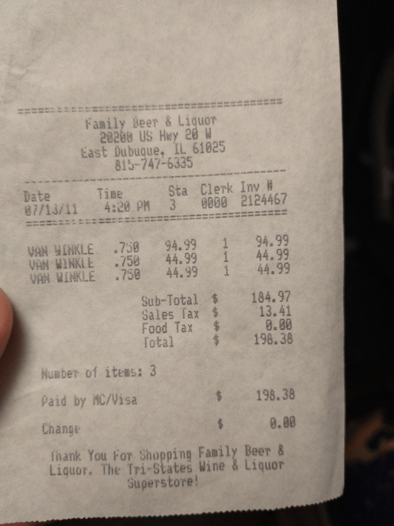
If you drink bourbon whiskey (or even if you don’t) you’ve probably heard of Pappy Van Winkle. Bourbon has experienced something of a revival in the past two decades, after being in decline for much of the 20th century. As part of this revival, some bourbons have become very highly sought after by the nouveau bourbon enthusiasts. And the various offerings of Pappy Van Winkle are arguably the most highly sought after. Finding Pappy is almost impossible these days, though this was also true a decade ago so it’s not really a “new” phenomena.
So here’s the “puzzle” for economists: why aren’t Pappy and other rare whiskies sold at market prices? No one in the “legal” market seems willing to do so. I put “legal” in quotation marks because there is a robust secondary market for these bottles, and the legal status of these sales is entirely unclear to me as an economist (alcohol markets are, to say the least, highly regulated).
In these secondary markets, it is not unusual for a 20-year bottle of Pappy Van Winkle to sell for $2,000. The “manufacturer’s suggested retail price” is $199.99. But you will never find this bottle on the shelf for that price. The bottles are held by retailers, either to sell to friends, auction off for charity, or conduct a lottery for the right to purchase the bottle at well below market prices.
So why doesn’t the distillery raise the MSRP? Clearly, they do this from time to time. Ten years ago, if you were lucky enough to find this bottle it was around $100 (I was lucky enough, on occasion). Clearly, they recognize that prices can increase. And that’s not just “keeping up with inflation”: $100 in 2011 is about $120 in current dollars. By 2016, they had raised the MSRP to $169.99. But why doesn’t the distillery raise the price more, perhaps all the way up to the market clearing price? By doing so, they would, perhaps, be able to ramp up production so that in 2041 there might be a lot more Pappy on the shelf. At the very least, they could dramatically increase their profit.
Receipt for 1 bottle of 20-year Pappy and 2 bottles of 12-year Van Winkle “Special Reserve” from 2011.
Also, why don’t retailers just put bottles on the shelf at $2,000? Stores occasionally do this, but mostly because they are fed up with all of the customers calling about rare bottles. Sometimes they will price it even higher than secondary markets. But usually, they allocate the bottles by something other than the price mechanism. Why? Businesses don’t usually leave dollar bills, especially $1,000 dollar bills, on the table.
Have you seen this chart? I certainly have. It floats around on social media a lot. The chart seems to indicate that poor Americans are better off than the average person in most other rich countries. Roughly equal to Canada and France, and better off than Denmark or New Zealand.
When I’ve asked for sources in the past, people usually aren’t sure. They remember downloading it from somewhere, but they can’t recall where.
But I think I found the source: it’s this article from JustFacts. After seeing how they calculated it, I’m skeptical that it provides a good comparison of poor Americans to other countries.
Here’s what the chart does. For most countries, it uses a World Bank measure of consumption per capita. They then convert that to US dollars using PPP adjustments. For the poor in the US, they use a consumption estimate for the bottom 20% of households (Table 6), and then divide by the average number of people per household. For the poor in the US, the average consumption for 2010 was an amazing $57,049, more than double the poverty line! That’s about $21,000 per poor person.
Bryan Caplan has kindly responded to my latest blog post, which was in turn a response to his blog post on the relative value of human lives by age. Caplan has always been kind in his responses, even when responding to pesky graduate students — kind in both his approach and the time he dedicates to responding thoughtfully. So I appreciate his taking the time to respond to me, and I will offer a few more thoughts on the matter.
To briefly summarize: Caplan believes that young lives (10 year olds) are worth 100-1,000 as much as old lives (80 year olds). I contend that they are closer to roughly equally valued. My disagreement with Caplan can be broken down into two categories:
A. Caplan’s three reasons why young lives are worth more (a lot more!) than old lives. I didn’t respond to that directly, but I will do so here. I think Caplan is narrowing the goalposts.
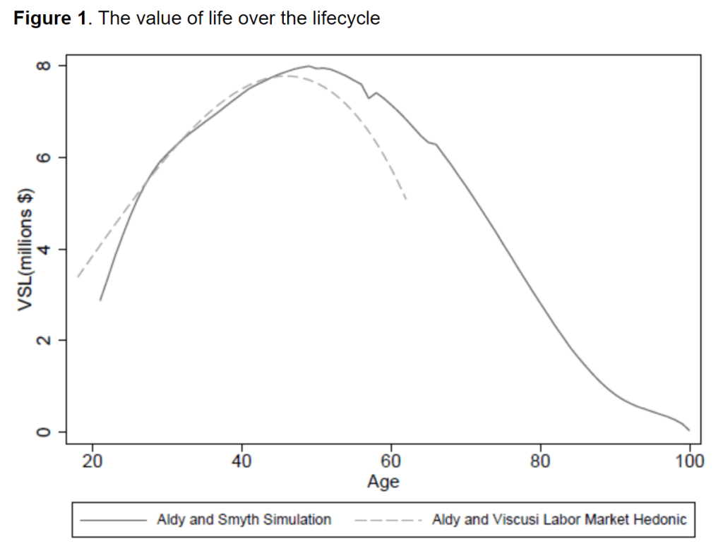
B. A disagreement over the shape of the VSL curve over the lifetime, specifically whether an inverted-U-shaped curve makes sense. I’ll say more about this too, but Caplan doesn’t just have a beef with me, but with almost everyone in the VSL literature!
Let’s start with Caplan’s three reasons, which he calls “iron-clad”: young people have more years to live, those years are generally healthier, and young people will be missed more when they are gone. The first in undeniably true on average, the second is probably true almost all the time, and I’m not sure on the third, but I’m willing to admit it’s not a slam dunk either way.
So how can I disagree? These are only three things. There are many other considerations, and we can imagine other reasons that old lives are valued as much or more than younger lives! I’ll call mine 4-6 to go with Caplan’s 1-3:
Old age spending is the largest component of public budgets in developed countries (and this is unlikely mostly due to rent seeking or the self interest of younger generations).
The elderly possess wisdom which is highly valuable and that the young benefit from.
The last years of your life are, on average, worth a lot more — you are usually very wealthy, have no employment obligations, you have grandchildren you love (without the responsibilities of parenting), and are (until the very end) generally healthy too.
Taken as a whole, I think these three reasons present a strong counterargument to Caplan’s three reasons. And I think we could certainly come up with more! My point being that Caplan has picked three areas where clearly young lives have the advantage, but ignored all the good reasons why old lives are more valuable. These is what I mean by we shouldn’t rely on our intuitions. Neither of our lists are exhaustive, but let me elaborate on a few of these.
Bryan Caplan argues that the life of a 10-year-old is worth 100-1,000 times that of an 80-year-old. But he suggests the modal answer people would give is that the two lives are equally valued.
I’m not sure if he is right about what the modal answer would be that they are exactly equal (though see below for an attempt to answer this question). Surprisingly, though, roughly equally valuing all lives is actually the answer that a normal economic calculation, willingness-to-pay for risk reduction, would give you! Or at least roughly. I haven’t seen an estimate for a 10-year-old, but estimates of the Value of a Statistical Life for 20-year-old is roughly equal to an 80-year-old. I’ve written about this before, and here’s a summary of a working paper by Aldy and Smyth that I am drawing on. Middle age lives are worth more, using this method, though perhaps just 2-3 times more.
Caplan doesn’t directly connect his hypothetical to the COVID pandemic, but in the comments Don Boudreaux does make that connection and says that “surely the correct level of precaution to take against a disease that kills X number of old people is lower [than a disease that kills the same number of young people].” I find this a very interesting statement because Don Boudreaux, and many others, have been against just about any precaution (other than asking the elderly to isolate) in the current pandemic. Would he and others support more caution if they believed the VSL estimate to be true?
So who is right? Caplan’s intuition? Or the modeled VSL calculations? For surely these are miles apart, and they can not both be correct.
In many of my blog posts I address either issues related to COVID or teaching economics. In this post, I want to combine the two. One thing economists of a certain age struggle to do is find examples to illustrate economic concepts which will actually connect with 18-22 year olds. The silver lining of the pandemic is that we now have an example that everyone is familiar with, and can be used to illustrate a host of economic concepts.
A great new book by Ryan Bourne, Economics in One Virus, really pushes this idea to the limit. He uses examples related to COVID to explain almost every single concept you would cover in a typical introductory economics course: cost-benefit analysis, thinking on the margin, the role of prices, market incentives, political incentives, externalities, moral hazard, public choice issues, and more.
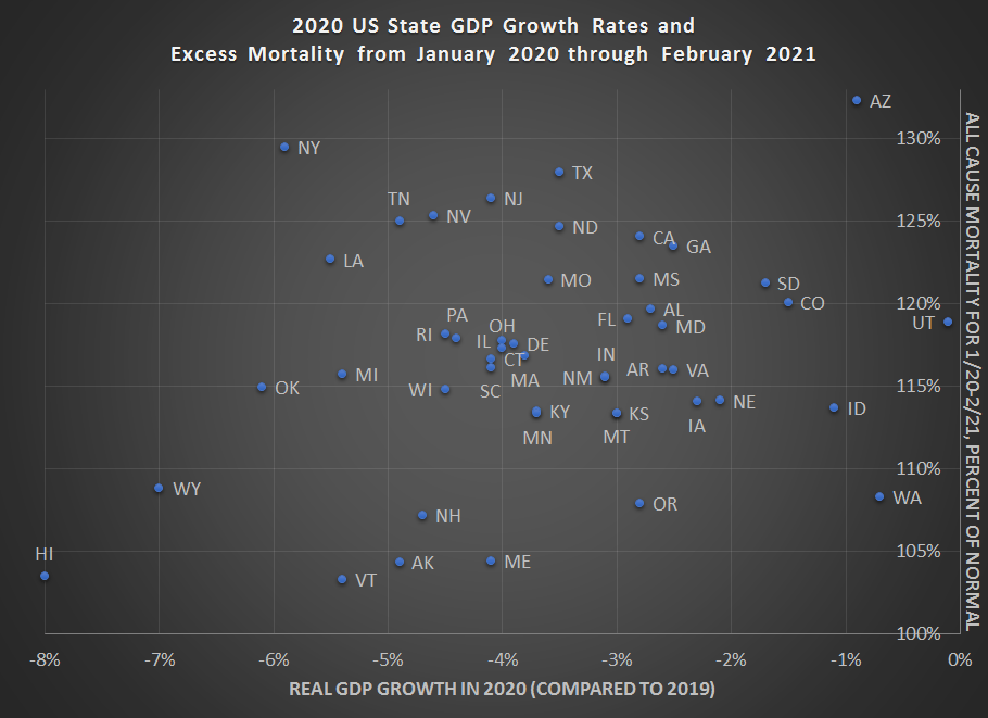
As with the national data, I would look to caution against over-interpreting this data. I’m presenting it here to give a picture of how 2020 went for states (including a few months of 2021 for morality data). One thing you will notice is that there appears to be little correlation with the raw data between GDP declines and mortality. Lots of important factors (policy, behavior, demographics, weather, luck) aren’t controlled for here. Still, I think it’s useful to see all the data in one picture, given how much many of us have been following the daily, weekly, and monthly releases.
Here is the data. Below I’ll explain more how I created this chart, especially the excess mortality data.
40 hours. That’s what we think of as a typical workweek. 8 hours per day. 5 days per week. Perhaps the widespread practice of working from home during the pandemic (as well as the abnormal schedule changes for those unable to work from home), has led some to rethink the nature of the workweek. But the truth is that the workweek has always been evolving.
Take this chart, for example. It comes from Our World in Data (be sure to read their excellent related essay as well), and the historical data comes from a paper by Huberman and Minns. I’ve singled out 4 countries, but you can add others at the OWiD link.
The historical declines are dramatic. This is especially true in Sweden. The average Swedish worker labored for over 3,400 hours per year in 1870. Today, that’s down to 1,600 hours. In other words, the typical Swede works less than half as many hours as her historical counterpart. Wow! The decline for the US is not quite as dramatic, but still astonishing: a US worker today labors for only about 57% of the hours of his 1870 predecessor.
It’s tempting to focus on the differences across countries today: the average worker in the US works about 250 hours more than the average French worker. That’s 6 weeks of vacation! And as recently as 1980, the US and France were roughly equal on this measure. We might also wonder why these historical changes happened. For a very brief introduction to the research, I recommend the last section of this essay by Robert Whaples.
But still, the historical declines are dramatic, even if we in the US haven’t seen much improvement in the past generation (and those poor Swedes, working 100 hours per year more than 40 years ago).
I think another natural question to ask is whether GDP data is distorted, at least as a measure of well being, given these differences in working hours. The answer is partially. Let’s look at the data!