Fellow EWED blogger Jeremy Horpedahl generally gives good advice. Therefore, when the other week he provided a link and recommended that we watch Joel Mokyr’s 2025 Nobel lecture*, I did so.
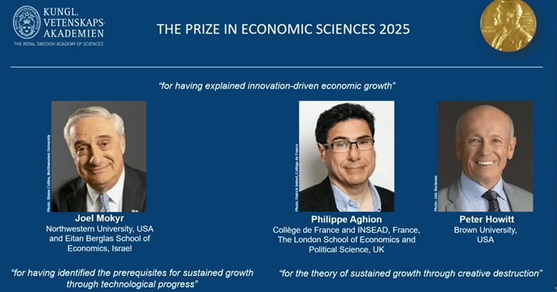
There were three speakers on that linked YouTube, who were the economics laureates for this year. They received the prize for their work on innovation-driven economic growth. The whole video is nearly two hours long, which is longer than most folks want to listen to, unless they are on a long car trip. Joel’s talk was the first, and it was truly engaging.
For time-pressed readers here, I have snipped many of the speakers’ slides, and pasted them below, with minimal commentary.
First, here are the great men themselves:
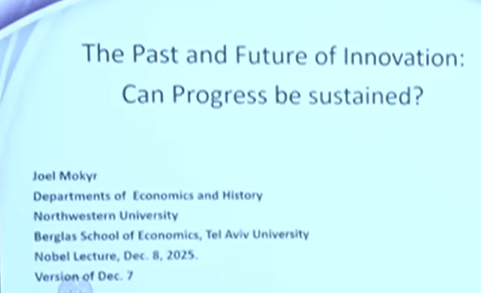
Talk # 1. Joel Mokyr: Can Progress in Innovation Be Sustained?

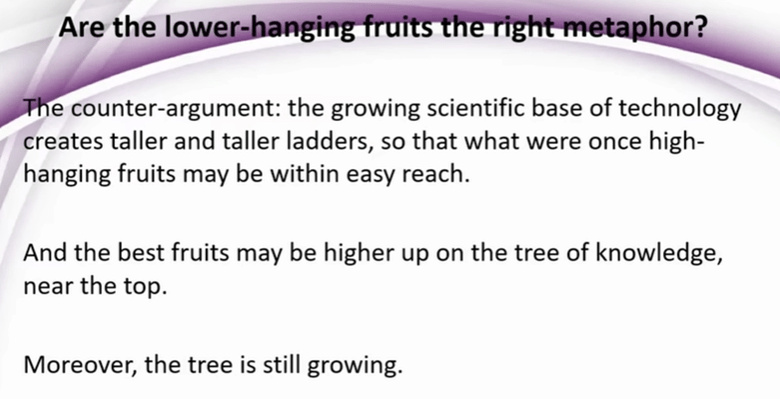
And indeed, one can find pieces of evidence that point in this direction, such as the slower pace of pharm discoveries.
But Joel is optimistic:


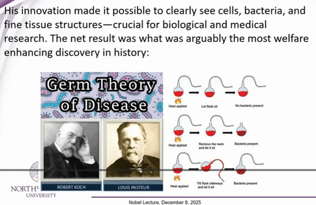
Joel provides various examples of advances in theoretical knowledge and in practical technology (especially in making instruments) feeding each other. E.g., nineteenth century advances in high resolution microscopy led to study of micro-organisms which led to germ theory of disease, which was one of the all-time key discoveries that helped mankind:

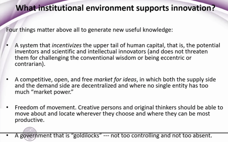

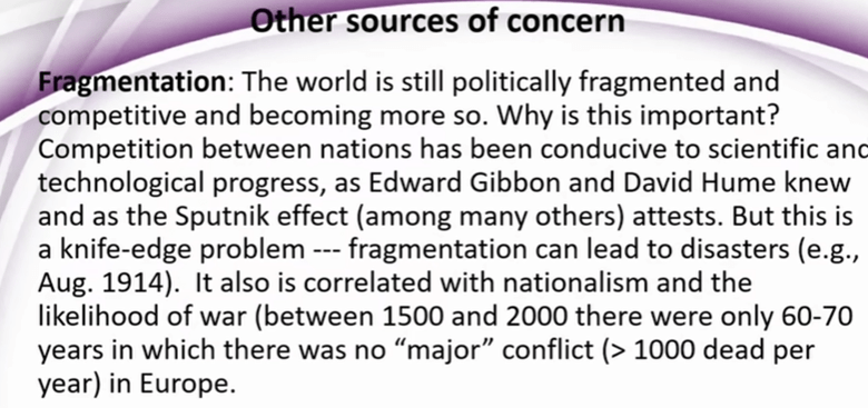
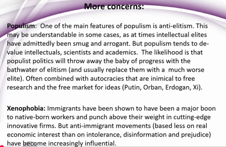
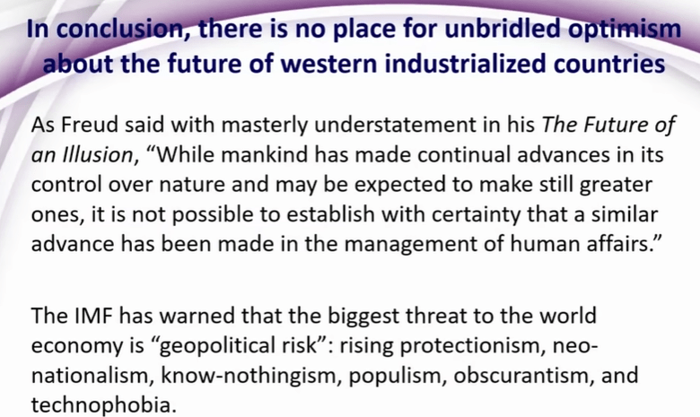
So, on the technical and intellectual side, Joel feels that the drivers are still in place for continued strong progress. What may block progress are unhelpful human attitudes and fragmentation, including outright wars.
Or, as Friedrich Schiller wrote, “Against stupidity, the gods themselves contend in vain”.
~ ~ ~ ~ ~ ~ ~ ~ ~ ~ ~ ~ ~ ~ ~ ~ ~ ~ ~ ~ ~ ~ ~ ~ ~ ~ ~ ~ ~
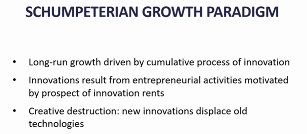
Talk # 2: Philippe Aghion, The Economics of Creative Destruction
He commented that on the personal level, what seems to be a failure in your life can prove to be “a revival, your savior” (English is not his first language; but the point is a good one).
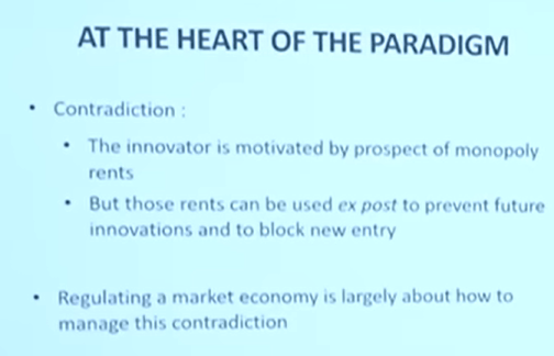
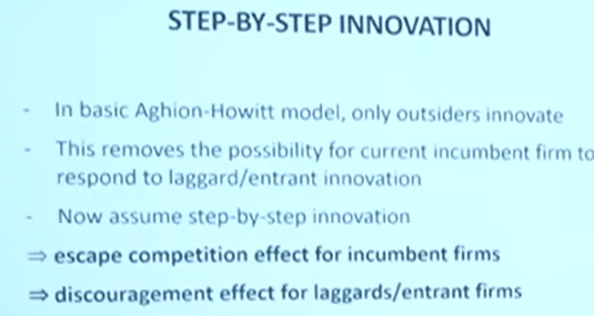
Much of his talk discussed some inherent contradictions in the innovation process, especially how once a new firm achieves dominance through innovation, it tends to block out newer entrants:
KEY SLIDE:
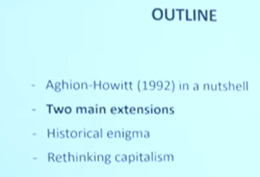
Outline of the rest of his talk:

[ There were more charts on fine points of his competition/innovation model(s)]
Slide on companies’ failure rate, grouped by age of the firm:
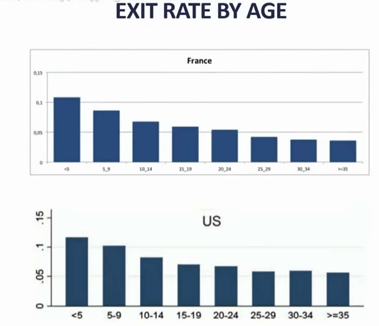
His comment..if you are a young , small firm, it only takes one act of (competitors’) creative destruction to oust you, whereas for older, larger, more diverse firms, it might take two or three creative destructions to wipe you out.
He then uses some of these concepts to address “Historical enigmas”
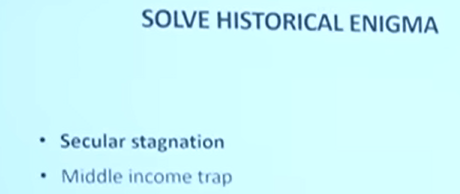
First, secular stagnation:

[My comment: Total factor productivity (TFP) growth rate in economics measures the portion of output growth not explained by increases in traditional inputs like labor and capital. It is often considered the primary contributor to GDP growth, reflecting gains from technological progress, efficiency improvements, and other factors that enhance production]
I think this chart was for the US. Productivity, which grew fast in the 1996-2005 timeframe, then slowed back down.
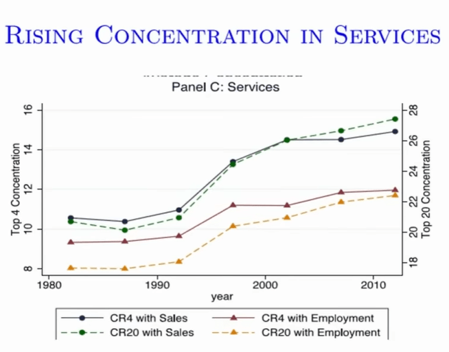
In the time of growth soaring, there was increased concentration in services. The boost in ~1993-2003 was a composition effect, as big techs like Microsoft, Amazon, bought out small firms, and grew the most. But then this discouraged new entries.

Gap is increasing between leaders and laggers, likely due to quasi-monopoly of big tech firms.
Another historical enigma – why do some countries stop growing? “Middle Income Trap”
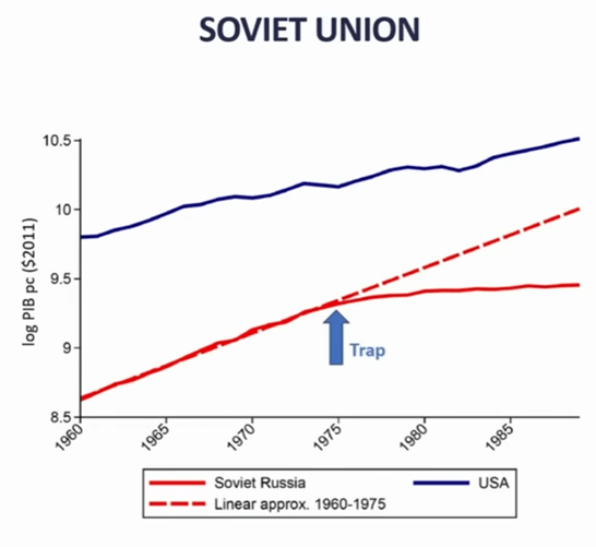
s

Made a case for Korea, Japan growing fastest when they were catching up with Western technology, then slowed down.
China for past 30 years has been growing by catching up, absorbing outside technology. But the policies for pioneering new technologies are different than those for catching up.
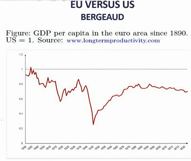
Europe: During WWII lot of capital was destroyed, but they quickly started to catch up with US (Europe had good education, and Marshall plan rebuilt capital)…but then stagnated, because not as strong in innovation.
Europeans are doing mid-tech incremental innovation, whereas US is doing high tech breakthrough.
[my comment: I don’t know if innovation is the whole story, it is tough to compete with a large, unified nation sitting on so much premium farmland and oil fields]
Patents:

Red =US, blue=China, yellow=Japan, green=Europe. His point: Europe is lagging.
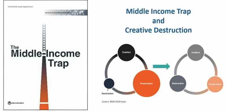
Europe needs true unified market, policies to foster innovation (and creative destruction, rather than preservation).
Finally: Rethinking Capitalism
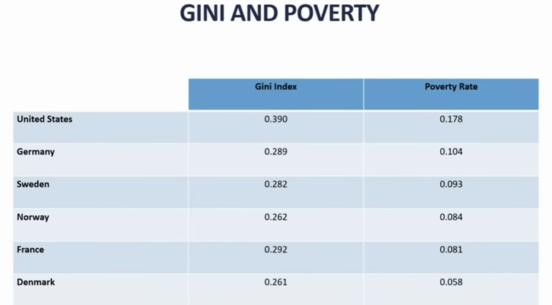
GINI index is a measure of inequality.

Death of unskilled middle-aged men in U.S.…due in part to distress over of losing good jobs [I’m not sure that is the whole story]. Key point of two slides above is that US has more innovation, but some bad social outcomes.
So, you’d like to have best of both…flexibility (like US) AND inclusivity (like Europe).

Example: with Danish welfare policies, there is little stress if you lose your job (slide above).
Found that innovation (in Europe? Finland?) correlated with parents’ income and education level:
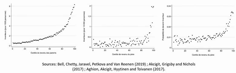
…but that is considered suboptimal, since you want every young person, no matter parents’ status, to have the chance to contribute to innovation. Pointed to reforms of education in Finland, that gave universal access to good education..claimed positive effects on innovation.
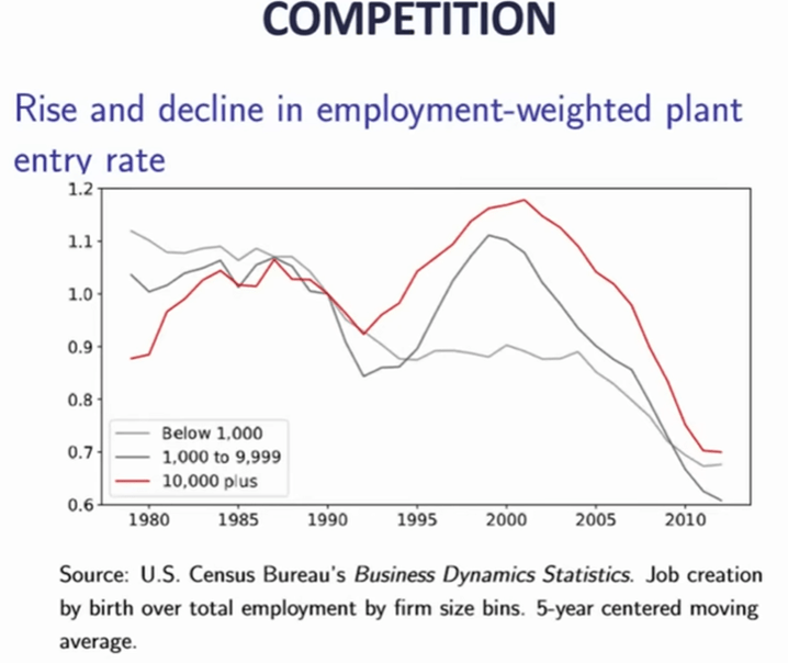
Final subtopic: competition. Again, the mega tech firms discourage competition. It used to be that small firms were the main engine of job growth, now not so much:
Makes the case that entrant competition enhances social mobility.
Conclusions:

~ ~ ~ ~ ~ ~ ~ ~ ~ ~ ~ ~ ~ ~ ~ ~ ~ ~ ~ ~ ~ ~ ~ ~ ~ ~ ~ ~ ~
Talk # 3. Peter Howitt
The third speaker, Peter Howitt showed only a very few slides, all of which were pretty unengaging, such as:

So, I don’t have much to show from him. He has been a close collaborator of Philippe Aghion, and he seemed to be saying similar things. I can report that he is basically optimistic about the future.
* The economics prize is not a classic “Nobel prize” like the ones established by the Swedish dynamite inventor himself, but was established in 1968 by the Swedish national bank “In Memory of Alfred Nobel.”
Here is an AI summary of the 2025 economics prize:
The 2025 Sveriges Riksbank Prize in Economic Sciences in Memory of Alfred Nobel was awarded to Joel Mokyr, Philippe Aghion, and Peter Howitt for their groundbreaking work on innovation-driven economic growth. Mokyr received half of the prize for identifying the prerequisites for sustained growth through technological progress, emphasizing the importance of “useful knowledge,” mechanical competence, and institutions conducive to innovation. The other half was jointly awarded to Aghion and Howitt for developing a mathematical model of sustained growth through “creative destruction,” a concept that explains how new technologies and products replace older ones, driving economic advancement. Their research highlights that economic growth is not guaranteed and requires supportive policies, open markets, and mechanisms to manage the disruptive effects of innovation, such as job displacement and firm failures. The award comes at a critical time, as concerns grow over threats to scientific research funding and the potential for de-globalization to hinder innovation.