Thoughts on end-of-semester lectures (Part 1)

At the end of the semester, I like to make a splash with students. For example, in my intermediate microeconomics course I put together a fun lecture. We have some laughs talking about models. We talk Rolling Stones songs like “you can’t always get what you want” (budget constraints) as well as Queen songs like “I want it all” (monotonicity).

We wax philosophical with Robert Frost’s “The Road Not Taken” about opportunity cost. We reiterate that the arguments in utility functions can be a richer set of desires than food and shelter. As Adam Smith says, “Man naturally desires not only to be loved, but to be lovely.” We emphasize that our models are simplified because good models try to get to the heart of the matter.

Sometimes models are dangerous. Like the “monkey illusion” we become so distracted we miss the heart of the matter. One prime example is how Samuelson continued to update the projection about when the USSR would surpass the US economy (check this out for more info) or Easterly’s depiction of the World Bank notion that if you build it, growth will come.

We discuss the importance of models, how they organize our thinking, the dangers of being too wed to a model but also the importance of empirical testing. We use MobLab in class to test our models as I’ve written about here. But, MobLab can’t give us an empirical test of all the important questions. We have to look elsewhere, out in the world to find evidence. One of my favorite examples of this are cross-border comparisons like East and West Germany, North and South Korea, Haiti and the Dominican Republic, etc.

I remind students that incentives matter. Economic institutions influence the costs and benefits of human action. When costs and benefits change, we expect for behavior to change. Throughout the semester we learned to formalize these ideas and they are not without consequence. As this New York Times piece discusses the work of Amartya Sen,

“Nature causes floods and droughts, but most societies have found ways to get food to those afflicted most of the time. Human folly causes famine, which occurs when those ways are blocked. Amartya Sen, a Harvard economist, argued that there has never been a serious famine in a country — even an impoverished one — with a democratic government and a free press. The press acts as a warning system and the pressures of democracy dissuade rulers from famine-producing policies.”

While economics is fun, interesting, and can be light-hearted, economics can also be deadly serious. The stakes of economic illiteracy are enormous.

Next week we go on to Part 2 where I pivot from this section of the end-of-semester talk to the applications of economic ideas to the everyday life of students.

Rationality and economics

Lately I have been thinking a lot about rationality and economics. In my Economics of the Family and Religion course I exhort students to take the approach, “crazy is lazy”. Like archeologists that brush away the dust from artifacts we should brush away the dust of human decision-making and find the rationality. This is especially useful when it comes to understanding observed patterns in religious practice across time and space. You don’t get very far with, “people are nuts”.

Humans make decisions on purpose. They weigh the costs and benefits of an action and make the choice that seems best to them given their available opportunities. Some students have struggled to integrate this message with their other classes. At FSU we have a deep bench of experimental and behavioral economists so there are ample opportunities for students to see courses with a more psychological approach.

In one famous study, Khaneman and Tversky manipulate whether there is a positive or negative frame on a treatment for a deadly disease. In the positive frame, there was a 33 percent chance that treatment could save the 600 people with the deadly disease. In the negative frame, there was a 66 percent chance the treatment could kill the 600 people with the deadly disease. Notice that both of those probabilities result in 200 people being saved. However, people were far more favorable to the positive frame (72%) compared to the negative frame (22%).

Then there are numerous other behavioral economics findings about seemingly small things that impact the decisions people make. For example, in research about bidding behavior psychologists Dan Ariely and Drazen Prelec and economist George Loewenstein passed out sheets of paper and had students write the last two digits of their social security number (SSN) at the top before they placed a bid for each item on a sheet. Students with SSN in the top 20 percent of the distribution bid 216 to 346 percent higher for the items compared to those with SSN in the bottom 20 percent.

We could go on. In the face of those kind of results, it is no wonder that students pause to reflect about how these findings fit into the larger corpus of economics. Are they useful observations to the extent they help us improve the predictions of our models? Are they damning demonstrations that cut out the heart of the economic approach?

Continue reading

An Economist Learns Piano: Part 1

My life didn’t change all that much due to Covid-19 pandemic. I live in a small university town. I mostly continued to go to work and my kids mostly continued to play with their neighbor friends. After a brief hiatus, I ended up growing much closer to my neighbors. One nearby couple are even the godparents my most recently born child.

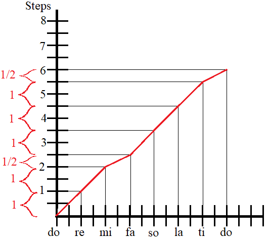
The university at which I teach is a liberal arts school…. And I teach economics. I knew that these music-type of students and professors were out there, but I didn’t have much exposure. I recently obtained a zero-priced piano and had a good 2-hour conversation with a music major. This post illustrates part of I’ve learned so far. First, a graph.

Whether we want to or not, many of us know the musical scale thanks to The Sound of Music. What I didn’t know was that there is not a uniform distance between all of those notes. Along the x-axis is the note labels (do re mi fa so la ti do). The pitch is characterized by an increment called a step. Given some arbitrary pitch for the first note, do, each subsequent note is a specific number of steps away. The pattern is that each increment between notes is 1 step, except the step from mi to fa and from ti to do. Those are half steps. The result is a segmented function.

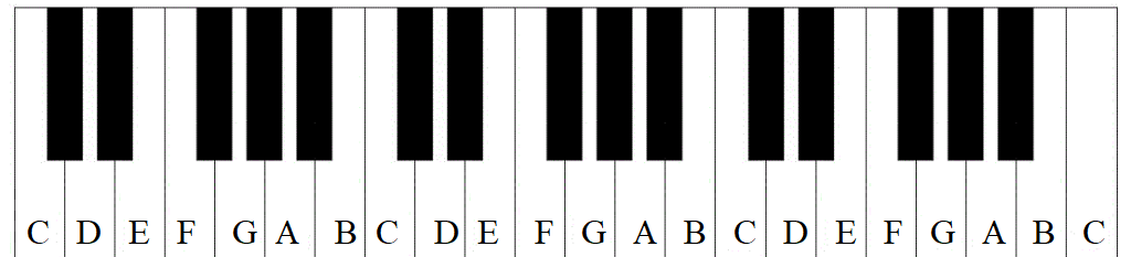
Now, this pattern can be applied to a piano.

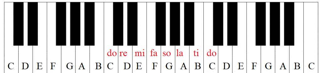
There are a total of 88 keys on a piano. Some are black, others are white. But all of them are a half-step increment from the prior and subsequent key. IDK why there are small black keys and big white ones. But pianos would be a lot bigger without the narrower black keys. Every single white key on a piano is labeled with a letter. The letter *does not move*. A ‘C’ is always a ‘C’.

What can move is the scale label, do, which can be any key. The pattern identified in the graph above must be maintained. To play ‘in the key of C’ means that ‘C’ is identified as do. The remaining keys can be labeled.

The key of ‘C’ is easy because the entire scale can be played on all white keys.

Those two half steps that we mentioned earlier? Those might have been on a black key – except that there is no black key between ‘B’ and ‘C’ or between ‘E’ and ‘F’. The B-C keys are adjacent. That means that their pitch is a half-step apart – exactly what is necessary for the pitch difference between mi and fa. The same is true for the E-F step and the pitch difference between ti and do.

What about the black keys? We can see their roll by placing do on a different lettered key. We can start on ‘D.  

do to re is a full step, from ‘D’ to ‘E’ – skipping the black half-step that’s between them. For re to mi we need to skip a key, all keys are a half step apart. So? To the black key! We skip ‘F’ and land on the subsequent black key. Then, fa falls on ‘G’, a half step and a single key higher in pitch. ‘A is a full step away from ‘G’, so that’s so. la is another full step away on ‘B‘. Recall that all of the keys are separated by a half-step – the key colors are 100% unimportant. ti is a full step higher – but there is no key separating ‘B’ and ‘C’. So, we skip up to the black key again just as we did with mi. Finally, do is a single key and a half step more.

There you have it! One of the things that a pianists can do is play the entire scale, from do to do, starting from any lettered key on the piano. I can’t do that yet, but golly I certainly feel like I have a better handle of what I’m even looking at.

PS – My conversation took a long time and I had to nail down the difference between 1) The note label, 2) the pitch step increments, & 3) the piano key letter labels. Key letter labels and the note labels are ordinal variables while the steps are cardinal. So, the graph at the top of this post isn’t the only important relationship. The graph below includes the relationship between the step and key letter labels. A graph of the note label and the key letter labels requires a rudimentary knowledge of flats and sharps (with two different do’s).

Gen Z on Deep Work

I asked students to read an excerpt of the first chapter of Cal Newport’s book Deep Work and comment in a discussion board. The prompt asked whether deep work goes on in college and what are the barriers to deep work. I think it’s important for society that some people engage in deep work on our problems. I’m interested in how 20-year-olds perceive Newport’s ideas on focus and what barriers they identify to deep work.

Replies ranged from “I do believe that deep work is happening at college, but I think that it is hard to find students using this strategy regularly.” to “I know multiple people who do not practice deep work….” They each have a different subjective view of “deep work” and their replies are anecdotal. It’s possible that some students are too hard on themselves, considering that I biased them to be negative with the discussion prompt. Some of them might have thought that “deep work” requires many consecutive hours of focus, which is not actually what I expect of undergraduates. Still, the discussion could be helpful to others who aspire to deep work.

The following barriers to deep work were identified:

“The barriers that we experience include social media, roommates, friends, significant others, going to classes, having to work, and any number of other things that cause our day to become disjointed …  We are the first generation that has spent the majority of our life utilizing social media… and in general, are used to taking in information from a large number of sources over a short period of time.

“Most students cannot spend a large amount of hours just focused on the one task at hand and that is required for deep work. For most college students it will be nearly impossible to practice deep work because of a job, outside social life, or a heavy class workload …

“I believe that deep work happens in college a lot.  Students often times must prepare/study for tests for a long time and that is when it happens the most.  When someone has to study for hours they are intensely focused if they put themselves in a good studying environment…

“This can be achieved when you are able to clear your mind of external things and place yourself in a non-distracting environment. As a college student, this can be difficult especially because we are constantly thinking about our to-do list, when will we hang out with friends, or what’s for dinner.

Continue reading

Helpful Teaching Resources

In this brief post, I want to commend a few teaching resources that have been helpful over the past few months of teaching.

For teaching students the nuts and bolts of causal inference, the new Mastering Metrics videos with Josh Angrist on Marginal Revolution University are terrific. The causal animations from Nick Huntington-Klein (and other resources) are also very helpful. This app on linear regression from Luke M. Froeb and Keyuan Jiang is a helpful way to help students gain econometric intuition. They have a companion paper to the app on SSRN.

Continue reading

How Should We Teach Public Goods Theory?

Joshua Hendrickson recently wrote about the provision of public goods, and how we teach public goods in economics. My post today is not so much a reply to Hendrickson, but is inspired by his mediation on public goods as I gear up to teach another semester of Public Finance.

The theory of public goods that economists discuss among themselves is pretty straightforward: when a good is both non-rival and non-excludable, there is a strong case for government intervention of some sort (though not necessarily public provision). The opposite is true when a good is both rival and excludable: there is a strong case for laissez faire.

Seems simple enough, right? But communicating this concept to undergraduates and the general public has been a major challenge. Part of the confusion arises from the term itself, “public good.” Non-economists tend to use the term interchangeably with the notion of “the common good, as is clear from Wikipedia, a dictionary, or a conversation with your grandma. For this reason, I sometimes substitute the awkward phrase “collective consumption good” (this is actually Samuelson’s term in his classic article on the topic), but all the textbooks so use it so I often default to the standard terminology.

From Jonathan Gruber’s Public Finance and Public Policy

But I think there’s a deeper problem than just terminology. Economists have put themselves in a box. Literally. Here’s a standard 2×2 matrix from Jonathan Gruber’s undergraduate public finance textbook. I don’t mean to pick on Gruber here — this is a pretty standard presentation. You can find it in many microeconomics textbooks too, or on Wikipedia. Everything goes in a box! It’s a nice stylized way to think of the terminology. It makes for nice test questions. But here’s the real problem with it as a pedagogical tool: it doesn’t seem to help many students! Or at least, it doesn’t seem to help them retain the knowledge between their micro principles courses and upper division courses (at least in my experience, I’d be happy to hear others chime in here).

So how can we teach this concept better? I have a few ideas. I’d like to hear yours too.

Continue reading

Visual Decision Trees in SAS Viya

As I said earlier, I used SAS Viya for Learners this semester. I assigned a final project for students. They had to use the data pre-loaded into the free version of SAS Viya, but otherwise had freedom to select their own variables and construct their own research question.

SAS Viya for Learners just recently opened for any users to make an account. This will allow you to learn SAS Viya functions (but not do your own actual work, because you cannot import new data). I’m using SAS Viya 3.4.

I like the way SAS Viya allows users to create a beautiful intuitive interactive decision tree model. This blog is to show you what that looks like. In traditional EconLit, regressions are more popular than decisions trees. Decision trees are a simple and useful machine learning technique. If you are trying to teach a first-timer about decision trees, then the visualization in SAS Viya for Learners can be helpful.

I’ll demonstrate using a decision tree for classification using built-in SAS data. One of the larger datasets available is USCENSUS1990. I’ll use it to demonstrate (and I do love the 90’s!). Consider the variable about the number of children a person has. This could be reasonably predicted by age and education level. [Footnote 1]

Here’s a chart showing the frequency of family sizes for adult women. (I used a Filter to only include people who are not coded zero in iFertil. See Footnote 1.)

For adult women in 1990, the most frequent category is to have more than 2 children. This would include the parents of Boomers. Think about those big families you know from the Boomer generation.

For input variables to my model, I’ll use age categories and also education levels. I set the new categorical variable I created called NumberChildren as the Response variable for a decision tree model. [Footnote 2] Here’s a zoomed out picture of the visual model output.

It’s immediately obvious that age is more informative than schooling. Women under the age of 30 are much more likely to have no children. The width of the grey tree branches makes it easy to see where the majority of the observations are.

I’ll zoom in on the left side of the tree where most of the people are.

The “>= 4.25” means that women on the far left side are over the age of 40. Among older women, the norm is to have 2 or more children. If you are looking for the older women with exactly two children, you are more likely to find them among those who have an education score of larger than “13”, meaning that they have a Bachelor’s degree or higher.

My point is not to posit causal relationships among education and fertility. My point is how awesome these graphs are. You do have to learn some point-and-click functions within SAS Viya to make them. But I don’t know of any other software that can produce this.

SAS Viya also provides tables and statistics on each node, which is more like what I could get from free open source software a few years ago when I looked into decision tree packages.

[Footnote 1] If you want to replicate what I did, know that the USCENSUS1990 dataset in SAS Viya comes with no explanation. Google brought me to UCI, where I found what I needed in terms of technical documentation.

dAge, iFertil, iSex, iYearsch are the names of the variables you will find in SAS. To create my graphs and models, I converted some of them to categorical variables using the “+New Data Item -> Custom Category” functions. No programming is required.

iSex: 0 indicates Male, 1 indicates Female

dAge is coded as follows: 0 is babies; 1 is under 13, 2 is under 20 (but over 13), 3 is under 30, 4 is under 40, 5 is under 50, 6 is under 65,  7 is for 65 and over

iFertil is coded: 0 is either less than 15 years old or male, 1 is no child, 2 means they have one child (confusing…), 3 means they have two children, all the way up to a 13 which is the code for 12 or more children

iYearsch:  3-10 refers to primary school up to a 10 indicating graduating from high school, 11-13 refer to some college and associate degrees, 14 is a Bachelors degree, 15-17 refers to higher degrees

[Footnote 2]  I decided to set Maximum levels to 5 in Options. This keeps the tree smaller which looks better in the blog.

Teaching with SAS Viya for Learners: Last Report

I used SAS Viya for Learners to teach data analytics to undergraduate business students for one semester.

I’ll start with the benefits of SAS Viya: It’s free; It’s visually appealing and requires no coding; There are some SAS tutorial materials that teachers can use; The way decision tree results are displayed makes intuition easy for students who are new to data mining.

I made a post earlier in which I reported that it actually works. I still think that, but at the end of the semester I did have individual students experience errors and mysterious interruptions to service. It made me wonder if the server gets busy at the end of an academic semester.

SAS is known for making excellent products and charging high fees for them. Since SAS Viya is free, they aren’t going to be giving all the functionality with it. The free version does not let students import any data. There is a sandbox of data to learn with, which is more than enough to fill a semester. I didn’t even open most of the available data sets.

My students did their final projects by choosing one of the pre-loaded datasets and using that for analysis. As far as applying the principles I taught, this was fine. In one sense, it was easier than telling them to fend for themselves and find data on the world wide web.

The downside is that the software-specific skills students learn from free student SAS Viya can’t be used on a project for work or for a different class. Eventually, any useful work involves importing new data.

The decision to use SAS Viya for Learners instead of R should depend on what your students want to do next. Both products will allow them to learn concepts and common functions.

If you are going to use SAS Viya, I highly recommend using the tutorials made by SAS with screenshot-by-screenshot instructions. You can give the instructions to the students, so students aren’t coming to you with questions about every click they need to make.

I paired SAS Viya with a Business Intelligence Textbook. Also note that students had already taken a traditional Business Statistics course previously.

Introducing Students to Text Mining

I’m going to teach text mining in the upcoming week. Most of my students have never heard of it. We have spent the semester talking about what do to with structured data, which includes some of the basic concepts from traditional statistics.

I often ask them to think about what computers can do. We talk about why “data analytics” classes are happening in 2020 and did not happen in 1990. Hardware and software innovations have expanded the boundaries of what computers can do for us.

The gritty details of how text mining works can make for a boring lecture, so I’m going to use the following narrative to get intellectually curious students on board. It always helps to start with fighting Nazis. Alan Turing helps defeat the Nazis by using a proto-computer to crack codes. The same brilliant Turing was smart enough to realize that computer could play chess someday (acknowledgement for me knowing that trivia: Average is Over). Turing didn’t live to see computers beat humans in chess but, in a sense, it didn’t take very long. Only about 50 years later, computers beat humans at chess.

Maybe chess is exactly the kind of thing that is hard for humans and easy for computers. When we discuss basic data mining, I tell students to think about how computers can do simple calculations much faster than humans can. It’s their comparative advantage.

Could Turing ever have imagined that a human seeking customer service from a bank could chat with a bot? Maybe text mining is a big advance over chess, but it only took about one decade longer for a computer (developed by IBM) to beat a human in Jeopardy. Winning Jeopardy requires the computer to get meaning from a sentence of words. Computers have already moved way beyond playing a game show to natural language processing.

How computers make sense of words starts with following simple rules, just as computer do to perform data mining on a spreadsheet of numbers. As I explain those rules to my students this week, I’m hoping that starting off the lecture with fighting Nazis will help them persevere through the algorithms.

Economists and Cocktail Parties

Sometimes I remark to my students, “This is why economists don’t get invited to cocktail parties.” This post is about that.

From 2008 – 2011 I taught a course at Florida State called “Economics of Compassion”. It is a course co-designed with my mentor Mark Isaac. The class discusses historical and contemporary problems related to poverty, both at the domestic and international levels. Having heard about the course, the Social Justice Living Learning Community at Florida State wanted me to teach the course to their incoming freshman. 

It was quite different from other courses they were taking that seemed to talk in terms of solutions without regard for scarcity. My role was to put parameters on their utopia and get the students to think carefully about a couple questions related to issues they care about:

  • Compared to what?
  • What happens next?

The students seemed to like the class, but, for a committed group of people who want to change the world it was also quite a downer. It was a downer for them the same way economics is a downer for people at cocktail parties.

We start with scarcity. Scarcity is a fact of life. There are never enough resources to satisfy everyone and there will always be unmet desires. For the economist, the notion of trade-offs — you must give up one thing to get another — flow from this scarcity. It means that anytime a solution to a problem is attempted you are always giving something up.

For example, the death of George Floyd this summer sparked conversation about how to reduce police violence. One approaching to curbing this important social problem is to eliminate or reform qualified immunity (QI). This is a legal doctrine intended to protect police and others from frivolous lawsuits. The problem is that QI has made accountability extremely difficult. The logic of reforming QI is that doing so will increase accountability, raise the cost of police violence, and therefore lead to less police violence. That’s good economics.

But, remember there are trade-offs. In a new world where police are opened up to lawsuits, local government might need to increase police compensation to retain or attract qualified men and women. Where does the money come from? Can you reduce the number of police and/or will you have to raise taxes? There are other trade-offs too. Will police become more reluctant to enter dangerous neighborhoods? After all, there is a greater chance that inserting themselves into a risky situation will lead to financial ruin.

Moving from heavy to light. If you haven’t seen Yoram Bauman’s comedic schtick on Principles of Economics Translated, take five minutes and check it out here. As he illustrates, “economic profit” depends on alternatives: A Snickers bar valued at one dollar with no alternative implies an economic profit of $1. However, if the alternative was M&Ms that you value at 70 cents then your economic profit is 30 cents … Your profit from pursuing one course action declines as the value of the alternative increases.

By accounting for trade-offs the net benefit of a course of action goes down. When we bring up trade-offs in conversation, economists effectively eat into people’s mental profits for some course of action.

Another thing to consider, when you’re intervening, that intervention can sometimes have dramatic side effects that you didn’t even think about. You cannot merely move people around as if they’re pieces on a chessboard (head nod to Adam Smith).

For example, it is possible that eliminating qualified immunity leads to less police violence but more neighborhood violence overall if police decide not to insert themselves into situations that could be more costly. Beyond this hypothetical example I have been using, there are loads of other unintended consequences economists talk about.

Thinking in this way is the bread and butter of economists. This is how we see the world. But, don’t try this in social settings. As EconTalk host Russ Roberts once commented (this podcast), a pleasant picnic veered into chilly company when he pointed out someone’s proposed minimum wage could have negative employment effects. The others at the picnic started to inch away from him on the picnic blanket. At parties, I’ve had people talk about the idea that a tax won’t effect them because it is only on sellers, homeowners, etc. I’ve had to ask myself, “Is it worth it to bring up that the tax is likely to be passed through?”

So while my last couple posts sing the praises of economics, I should let you know, at cocktail parties people don’t like to think about scarcity, tradeoffs, and unintended consequences. Economists like to think about the seen and unseen. Many others, especially in social settings, would rather the unseen remain unseen.