As I said earlier, I used SAS Viya for Learners this semester. I assigned a final project for students. They had to use the data pre-loaded into the free version of SAS Viya, but otherwise had freedom to select their own variables and construct their own research question.
SAS Viya for Learners just recently opened for any users to make an account. This will allow you to learn SAS Viya functions (but not do your own actual work, because you cannot import new data). I’m using SAS Viya 3.4.
I like the way SAS Viya allows users to create a beautiful intuitive interactive decision tree model. This blog is to show you what that looks like. In traditional EconLit, regressions are more popular than decisions trees. Decision trees are a simple and useful machine learning technique. If you are trying to teach a first-timer about decision trees, then the visualization in SAS Viya for Learners can be helpful.
I’ll demonstrate using a decision tree for classification using built-in SAS data. One of the larger datasets available is USCENSUS1990. I’ll use it to demonstrate (and I do love the 90’s!). Consider the variable about the number of children a person has. This could be reasonably predicted by age and education level. [Footnote 1]
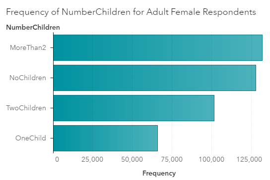
Here’s a chart showing the frequency of family sizes for adult women. (I used a Filter to only include people who are not coded zero in iFertil. See Footnote 1.)

For adult women in 1990, the most frequent category is to have more than 2 children. This would include the parents of Boomers. Think about those big families you know from the Boomer generation.
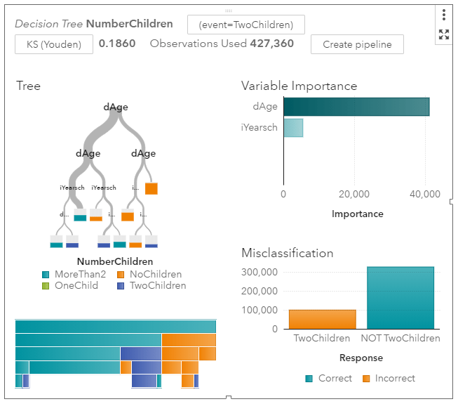
For input variables to my model, I’ll use age categories and also education levels. I set the new categorical variable I created called NumberChildren as the Response variable for a decision tree model. [Footnote 2] Here’s a zoomed out picture of the visual model output.

It’s immediately obvious that age is more informative than schooling. Women under the age of 30 are much more likely to have no children. The width of the grey tree branches makes it easy to see where the majority of the observations are.
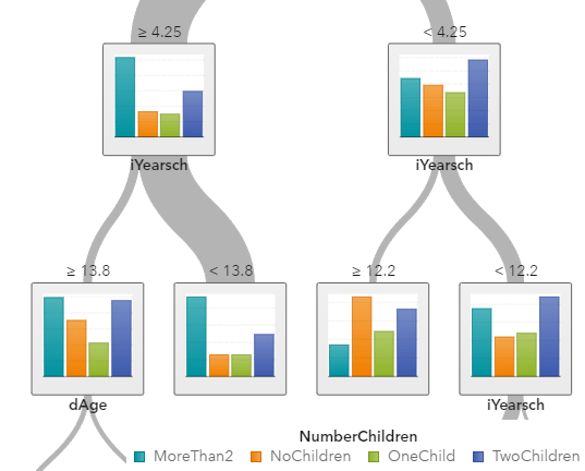
I’ll zoom in on the left side of the tree where most of the people are.

The “>= 4.25” means that women on the far left side are over the age of 40. Among older women, the norm is to have 2 or more children. If you are looking for the older women with exactly two children, you are more likely to find them among those who have an education score of larger than “13”, meaning that they have a Bachelor’s degree or higher.
My point is not to posit causal relationships among education and fertility. My point is how awesome these graphs are. You do have to learn some point-and-click functions within SAS Viya to make them. But I don’t know of any other software that can produce this.
SAS Viya also provides tables and statistics on each node, which is more like what I could get from free open source software a few years ago when I looked into decision tree packages.
[Footnote 1] If you want to replicate what I did, know that the USCENSUS1990 dataset in SAS Viya comes with no explanation. Google brought me to UCI, where I found what I needed in terms of technical documentation.
dAge, iFertil, iSex, iYearsch are the names of the variables you will find in SAS. To create my graphs and models, I converted some of them to categorical variables using the “+New Data Item -> Custom Category” functions. No programming is required.
iSex: 0 indicates Male, 1 indicates Female
dAge is coded as follows: 0 is babies; 1 is under 13, 2 is under 20 (but over 13), 3 is under 30, 4 is under 40, 5 is under 50, 6 is under 65, 7 is for 65 and over
iFertil is coded: 0 is either less than 15 years old or male, 1 is no child, 2 means they have one child (confusing…), 3 means they have two children, all the way up to a 13 which is the code for 12 or more children
iYearsch: 3-10 refers to primary school up to a 10 indicating graduating from high school, 11-13 refer to some college and associate degrees, 14 is a Bachelors degree, 15-17 refers to higher degrees
[Footnote 2] I decided to set Maximum levels to 5 in Options. This keeps the tree smaller which looks better in the blog.