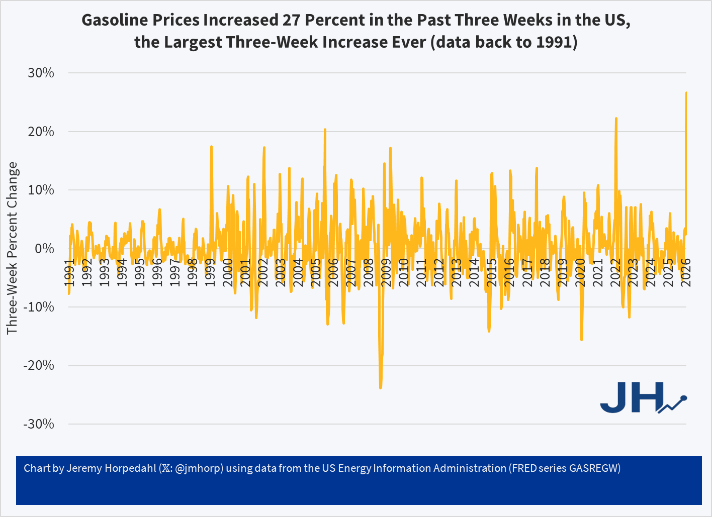
In the (so far) short military engagement with Iran, crude oil and gasoline prices have jumped significantly. The three-week change in gasoline prices at the pump for US consumers was 27 percent, the largest three-week increase consumers in the US have ever seen (with data back through the 1990s). The four-week increase is also a record.
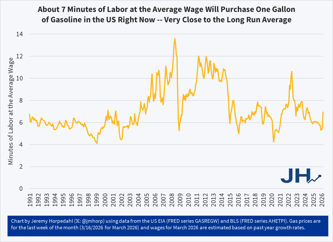
Despite this sharp increase, gasoline prices remain near the long-run average in terms of affordability: it takes about 7 minutes of work at the average wage to purchase a gallon of gasoline. To be sure, this is a big jump of where it had been earlier in 2026, at about 5 minutes of labor. Nonetheless, gasoline is still (for now!) more affordable than it was, relative to wages, for almost all of 2022 and 2023.
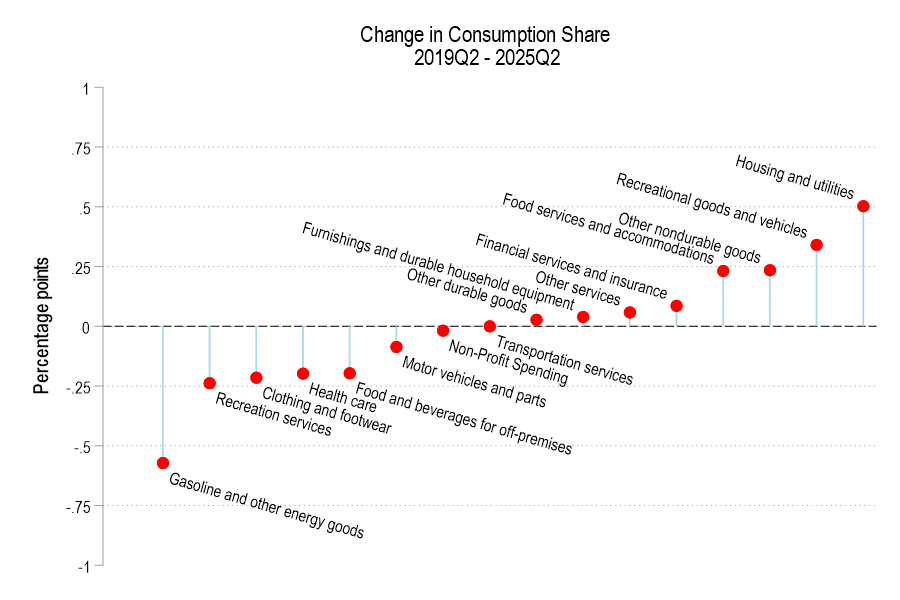
In aggregate, consumer spending on different broad categories of goods is relatively stable. The year 2019 feels like forever ago – and it was more than half a decade ago. But since then we’ve been hit by a pandemic and an AI shock and a trade war, and tariffs, and… plenty. We live in different times. Except, broadly, consumers are spending their money much as they did six years ago. Let’s compare some data from the 2nd quarter of 2019 and 2025.
First the Spending
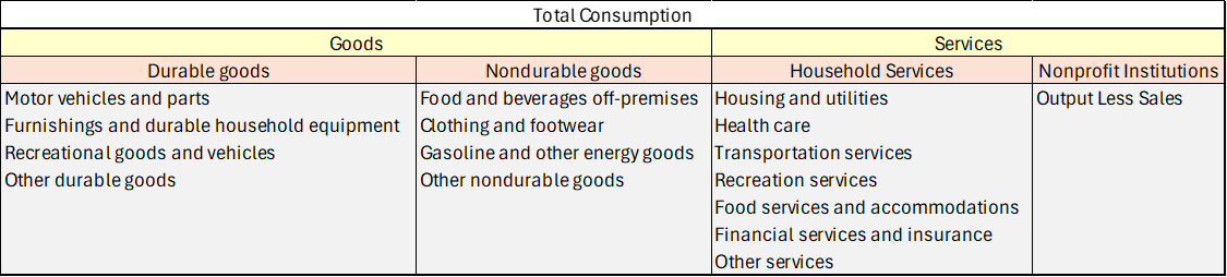
Consumption spending is categorized in the below table.
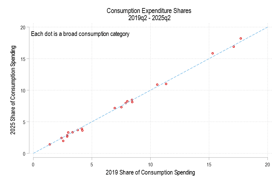
If total consumption spending (not inflation-adjusted) is 100%, then how has the allocation of spending changed? Below is a graph comparing each consumption component’s 2019 share versus 2025. The dotted line denotes an identical share. I haven’t labeled the categories because, suffice it to say, that spending shares are little different. None is more than one percentage point different.
The below figure displays the spending share difference. We’re spending less of our consumption on gasoline and the like, recreational services, and clothing. Surprisingly, we’re also spending less on healthcare and food for off-premises consumption (non-restaurants). However, we’re spending a greater share on housing, recreational goods, food services for on-premises consumption (restaurants).
Really, our richest in the 1890s? Can this be true? Are the anonymous socialist Twitter accounts correct? Let’s look at the data. But the answer probably won’t surprise you: your intuition is correct, we are much better off today than the 1890s, in almost every way of looking at it economically.
In a post from July 2021, I discussed housing affordability and “zoning taxes” — in other words, how land use restrictions such as zoning were driving up the cost of housing in some US cities. San Francisco, Los Angeles, Seattle, and New York stood out as the clear outliers, with “zoning taxes” adding several multiples of median household income to housing costs.
The paper I was summarizing used data from 2013-2018, and it’s a very well done paper. But so much has changed in the US housing market since that time. In my post, I pointed to a map from 2017 showing that a large swatch of the interior country still had affordable housing — loosely defined as median home prices being no more than 3 times median income.
To see how much has changed so quickly, consider these two maps for 2017 and 2022 generated from this interactive tool from the Joint Center for Housing Studies.
A few months ago I looked at the richest and poorest MSAs in the US, including adjusting for the cost of living in each MSA. One big thing I found was that the list doesn’t change that much when you adjust for the cost of living: San Jose, San Francisco, Bridgeport (CT), Boston, and Seattle are still the highest income MSAs even after accounting for the fact that they are also high-cost-of-living places to live. The gap shrinks, but they are still in the lead.
But that was adjusting for all the factors in the cost of living. But what if we just looked at one important aspect of the cost of living: housing. And since the cost-of-living adjustments (BEA’s RPP) that I was using are from 2021, what if we tried to bring the data up as close to the present as possible? We know that housing prices have increased a lot since 2021, but also that the cost of borrowing has risen dramatically too. What would this show us about the cost of living for different MSAs?
A tool from the Harvard Joint Center for Housing Studies allows us to make some pretty up-to-date comparisons. Their interactive map shows data for the 179 largest MSAs (about half of the total MSAs in the US) on the median price of each home for the second quarter of 2023 and uses interest rates from that quarter to show the rough principal and interest cost (assuming a 3.5% down payment). Taxes and insurance costs for each MSA are also estimated.
Based on those assumptions, their tool provides the minimum income you would need to purchase a home in that area, assuming a 31% debt-to-income ratio for the mortgage. And the income levels needed vary quite widely across MSAs, from a low of $44,000 in Cumberland, Maryland, to a high of over $500,000 in San Jose, CA. That’s a huge difference.
Of course, we know that incomes also vary across MSAs. But they don’t vary that much. The JCHS tool doesn’t provide this data (though a JCHS map from 2017 did compare house prices to incomes), but we can look up median family income for each MSA from Census. Doing so we see that San Jose is indeed unaffordable based on the current (2022) median income, which is “only” about $170,000. A nice income compared to the national median, but only about 1/3 of the $500,000 you would need to afford a home in San Jose. Cumberland looks much better though: median family income is over $77,000 there, about 76% more than you would need to buy a home!
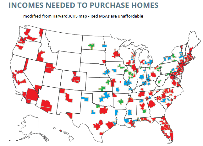
What if we did a similar calculation for all MSAs in the JCHS data? The following map is my attempt to do so. Sorry, but my graphics skills are not the best, so this map isn’t as pretty as it could be (I started with the JCHS map, and just shaded in the colors I wanted to use). But I think it conveys the general idea.
Green-shaded MSAs are the most affordable: places like Cumberland, Maryland, where median family income is well above (at least 20% above, my arbitrary threshold) the amount JCHS says you need to buy a home. There are 27 Green-shaded MSAs. Blue-shaded MSAs are affordable too, and median income is between 100% and 120% of the amount needed to afford a home on the JCHS standard. There are 41 of these, making 68 total MSAs out of these 179 that are affordable. Red-shaded MSAs are less than 100%, and thus unaffordable (though as I will discuss below, some are much closer to affordable than others).
Last week I presented a graphic that illustrates the changing average price of homes by state. This week, I want to illustrate something that is more relevant to affordability. FRED provides data on both median salary and average home prices by state. That means that we can create an affordability index. Consider the equation for nominal growth where i is the percent change in median salary (s), π is the percent change in home price (p), and r is the real percent change in the amount of the average home that the median salary can purchase (h).
(1+i)=(1+π)(1+r)
Indexing the home price and salary to 1 and substituting each the percent change equation (New/Old – 1) into each percent change variable allows us to solve for the current quantity of average housing that can be afforded with the median salary relative to the base period:
h=s/p-1
If h>0, then more of the average house can be purchased by the median salary – let’s vaguely call this housing affordability. Both series are available annually since 1984 through 2021 for all 50 states and the District of Columbia. The map below illustrates affordability across states. Blue reflects less affordable housing and green reflects more affordable housing since 1984.