The Middle of the 20th Century was a Weird Time for Marriage

Yesterday on Twitter I shared a chart showing the age at first marriage for white men and women in the US, with data going back to 1880. I pointed out an interesting fact: at least for men, the age was essentially the same in 1890 and 1990 (27), though for women it was a bit higher in 1990 than in 1890 (by about 1 year).

This Tweet generated quite a bit of interest (over 800,000 impressions so far), and (of course!) a lot of skeptical responses. One skeptical response is that I cut off the data in 1990, when trends since then have shown continuously rising ages at first marriage, and by 2024 the comparable figures were much higher than in 1890 (by about 4 years for men and 6.5 years for women). In one sense, guilty as charged, though I only came across this data when looking through the Historical Statistics of the US, Millennial Edition, and that was the most current data available when it was printed. Here is a more updated chart from Census:

But there is another interesting fact about that data: the massive decline age of first marriage in the first half of the 20th century. Between 1890 and 1960, the median age at first marriage fell by about 3 years for men and 2 years for women. For men, most of the decline (about 2 years) had already happened by 1940. Thus, if we start from the low-point of the 1950s and 1960s (as many charts do, such as this one), it appears marriage is continuously getting less common in US history, while the fuller picture shows a U-shaped pattern.

This same pattern shows up in another measure of marriage data: the percentage of people that never get married. If we look at White, Non-Hispanic Americans in their late 40s, the picture looks something like this (keen observers will note that the Hispanic distinction is a modern one dating from the 1970s, but Census IPUMS has conveniently imputed this classification back in time based on other demographic characteristics):

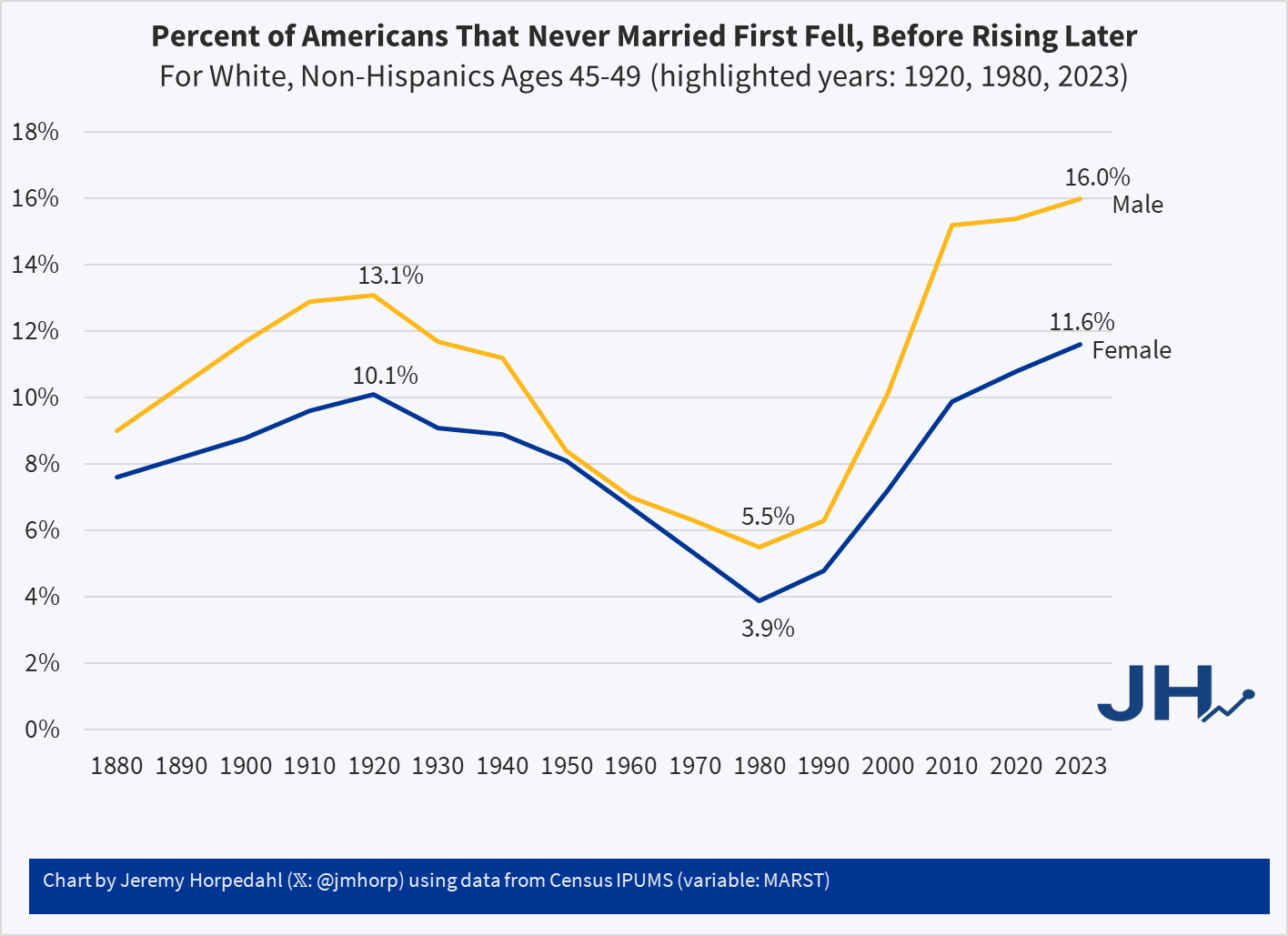
Looking at people in their late 40s is useful because, at least for women, they are past their childbearing years. And using, say, the late 50s age group doesn’t alter the picture much: even though some people get married for the first time in their 50s, it’s always been a small number.

Here we can see an even more dramatic pattern. 100 years ago, it was not super rare for people to never marry: over 1/10 of the population didn’t! But by 1980 (thus, for people born in the early 1930s), it was much rarer: less than 4% of women were never married (among White, Non-Hispanics). In fact, the peak in 1920 of 10% unmarried women wasn’t surpassed again until 2013! And it’s not substantially higher today than 1920 for women, especially when considering the full swing downward. Men are quite a bit higher today, though the 1920 peak of 13% wasn’t surpassed again until 2006.

For a measure that peaks in 1920, we might wonder if new immigrants are skewing the data in some way, given that this is right at the end of about 4 decades of mass immigration. But just the opposite: if we focus on native-born women, the 1920 level was even higher at 11.1%, which wasn’t surpassed until 2022, and even in the latest figures it is less than 1 percentage point higher than 1920.

Precisely why we observed this U-shaped pattern in marriage (both first age and ever married) is debated among scholars, though my sense among the general public is that it isn’t much thought about. Most people (from my casual observation) seem to assume that marriage rates and ages were always lower in the past, and that modern times are the outliers. But in reality, the middle part of the 20th century seems to be the outlier. The “Baby Boom” of roughly 1935-1965 is possibly better understood as a “Marriage Boom,” with more babies naturally following from more and younger marriages.

Who is the Wealthiest Generation? Mid-2023 Update

The Federal Reserve has released the latest update to their Distributional Financial Accounts data, which the data underlying several of my past posts on generational wealth. With that recent data, I have updated the chart of wealth for Baby Boomers, Generation X, and Millennials.

The data is shown on a log scale to better show growth rates and allow for easier visual comparisons. But if you are interested in the more precise numbers, in the most recent quarter (2023q2) Generation X has, on average about $620,000 in net wealth, which compares favorably with Baby Boomers at about the same age (in 2006) with about $539,000 in net wealth per person. That’s about 20 percent more.

Millennials have about $115,000 in net wealth on average, which also compares favorably with Baby Boomers, who had slightly more at about the same age (in 1990) with $121,000 in net wealth on average. Given the uncertainties of all the data that goes into this, I’d say those are roughly equal. Gen X had a bit more around the same age (in 2007) with $149,000, but that fell significantly the next two years during the Great Recession.

(For more detail on my approach to creating the chart, see the linked post above, but in short I’m using the Fed DFA data for wealth, Census Bureau data by single year of age for population, and the Personal Consumption Expenditures price index for inflation adjustments (I also have a chart with the CPI-U — it’s not much different). Wealth data is for the 2nd quarter in each year (to match 2023), except for 1989 since the 3rd quarter is the first available.)

Given how much wealth can fluctuate based on housing values (see above for Gen X from 2007-2009), it might be useful to look at the data with housing. Housing is also a weird kind of wealth — for the most part, you can’t access it without selling (other than certain home equity loans), and when you do sell, unless your home appreciated more than average, you just have to move to another home that also appreciated.

Here’s the chart excluding housing value and mortgage debt:

The chart… doesn’t change much. The values are all lower, of course, but the comparisons across generations look pretty similar. Gen X right now is 17 percent wealthier than Boomers at the same age. And if we look at all three generations around the median age of 35, they are pretty close: Gen X with $123,000 (but slipping over the next few years), Boomers with $99,000, and Millennials with $90,000.

Who is the Wealthiest Generation?

Have you seen this chart?

I have seen it many times. It comes from this Washington Post article, but it seems to go viral on Twitter about every 6 months or so.

The implication of the chart seems to confirm what many young people feel in their bones: Boomers had it much easier, and it’s getting harder and harder for later generations to catch up and build wealth. For many the graph… explains a lot, as one recent viral Tweet put it (in the weird world of social media, 5 short words and a recycled chart are all it takes for 20,000 retweets).

But wait. A few questions probably come to mind. For example, when Boomers were young they comprised a much larger share of the population. The original article makes an attempt to adjust for this, by calculating a few ratios towards the end of the article. However, there’s a much more straightforward way to adjust for this, which also nicely fits into a chart: put wealth in per capita terms!

If we do that, here’s the chart we get (also, of course, adjusted for inflation).

Data is for 1989-2021 from the Federal Reserve’s Distributional Financial Accounts, but only the first quarter is available right now for 2021. For 1989, it is the average of the third and fourth quarters. Population data comes from Census single-year of age estimates for various years. 2020 and 2021 population estimated using growth rate from 2010-2019.
Continue reading

OK, Millennial?

How do young people fare when it comes to household wealth? The recently released Survey of Consumer Finances from the Federal Reserve provides some insights. One major takeaway: the much-maligned Millennials are doing pretty good! Ernie Tedeschi created this informative chart on Twitter:

Looking at household net worth at roughly the same age, Millennials today have roughly the same household wealth as Boomers did in the past. And both of these generations beat the generation between them, Gen X, as well as the “microgeneration” creatively labeled Oregon Trail.

And it’s something of a running joke on Twitter, but I must add: Yes! It’s adjusted for inflation!

Part of this may be driven by the increase in dual-income households. Certainly that matters. While wealth data by number of earners is harder to track down, income data is more readily available. What if we look at single-income households? Millennials are still in the lead! (Once again, the chart comes from Ernie Tedeschi.)

And before you ask: Yes! It’s adjusted for inflation!

None of this means that Millennials don’t face challenges, including financial ones. This data is current through 2019, so 2020 will almost certainly make these numbers look worse, for a time. But all things considered and anecdotes aside, the kids today seem to be as well or better than past generations.

(Oh, and before you ask: Yes! It’s adjusted for housing, medical, and education costs! In fact, these three factors make up half or more of most inflation adjustment indices.)