The chart originates from Statista, as you can see from the label in the image. But it is very frequently shared on social media, Reddit, and elsewhere (often with the Statista label clipped), occasionally generating millions of views and lots of heated comments.
But it’s a bad graph. In so many ways. Let’s break them down.
The data comes from BLS’s Consumer Expenditures Survey. I use this data frequently, as regular readers probably know. The data in the viral chart is from 2021 (more on that in a moment), but if I create a similar chart using the most recent data in 2023 but also include spending by those older than Baby Boomers (primarily the Silent Generation), you will notice a curious thing:
Has it gotten easier or harder for Americans to afford the basic necessities of life? Part of the answer to this question depends on how you define “basic necessities,” but using the common triad of food, clothing, and housing seems like a reasonable definition since these composed over 80% of household spending in 1901 in the United States.
If we use that definition of necessities, here is what the progress has looked like in the US since 1901:
The data comes from various surveys that the Bureau Labor Statistics has collected over the years, collectively known as the Consumer Expenditure Surveys. The surveys were conducted about once every 1-2 decades from 1901 up until the 1980s, and then annually starting in 1984. Some of these are multi-year averages, but to simplify the chart I’ll just state one year (e.g., “1919” is for 1918 and 1919). The categories are fairly comprehensive: “food” includes both groceries and spending at restaurants; “housing” includes either mortgage or rent, plus things like utilities and maintenance; and “clothing” includes not only the cost of the clothes themselves, but services associated with them such as repairs or alterations (much more important in the past).
We can see in the chart that over time the share spent on these three areas of spending has declined dramatically, taken as a group. Housing is different, but it has been fairly stable over time, mostly staying between 22% and 29% of income (the Great Depression being an exception). There are two time periods when these costs rose: the Great Depression and the late 1970s/early 1980s. Both are widely recognized as bad economic times, but they are aberrations. The jump from 1973 to 1985 in spending on necessities was fully offset by 2003, and today spending on necessities is well below 1973 — even though for housing, it is a few percentage points greater.
A chart like this shows great progress over time, but it will inevitably raise many questions. Let me try to answer a few of them in advance.
Today BLS released the annual update to the Consumer Expenditure Survey, which is exactly what it sounds like: a survey of US consumers about what their spending. The sample size is “20,000 independent interview surveys and 11,000 independent diary surveys” so it’s a pretty big sample. And this is a really great data source, because versions of it go back over 100 years (though the current, annual survey with a lot of detail starts in 1984).
What does this new data tell us? One area that has received a lot of attention lately is food spending (including a lot of attention on this blog), especially the cost of groceries. According to the CPI food at home index, grocery prices are up almost 26 percent since the beginning over 2020. That’s a lot! But incomes are up too, so how does this affect spending patterns?
Here’s what food and grocery spending for middle-quintile households looks like:
Compared to the pre-pandemic 2019 levels, consumers are spending slightly less of their income on food (12.7% vs. 13.2%), though a slightly larger share of their income is being spent on groceries (8.1% vs. 7.8%). Those changes are noticeable, though this isn’t the radical realignment of spending patterns you might expect from such a big change in food prices. The reason is clear: while grocery prices are up about 26%, middle-quintile incomes are up a similar 25% since 2019. That’s falling behind a little bit, but incomes have roughly kept pace with rising food prices. And from 2022 to 2023, both of these percentages decreased slightly, by about 0.3 percentage points.
Despite recent increases in prices of food, we should still all be very thankful this Thanksgiving for the abundance of affordable food available in the modern world. Looking back at my past few blog posts, I notice that I have been very food-centric in my choice of topics! And last week I also showed how the Thanksgiving meal this year will be the second cheapest ever (only behind 2019). While it’s absolutely true that food prices are up a lot in the past 2 and 4 years, they probably aren’t up as much as you have heard.
It’s always my preference to take as long-term perspective as possible when thinking about economic progress. So here’s the best way I’ve come up with to show how cheap and abundant food is today: food as a share of household spending fell dramatically in the 20th century.
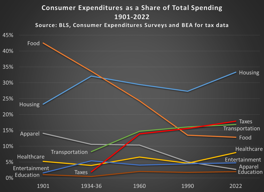
Most of the data in this chart comes from the BLS Consumer Expenditure Surveys. This survey was done occasionally since 1901, and then annually since 1984. I also use BEA data to estimate personal taxes paid as a percent of spending (the CEX Surveys have some tax data, but it’s not reliable nor consistent). I picked as close to 30-year intervals as I could (with a preference for showing the earliest and latest years available), and I chose spending categories that are 90-100% of total expenditures in most of these years. Keep in mind also that these are consumer expenditures. As a nation, we spend a lot more on healthcare and education than this chart suggests, but most of that spending is not directly from households (of course, it is indirectly). Think of this chart as an average household budget.
I hope the thing that jumps out at you is that the amount money households spend on food has fallen dramatically since 1901, from over 42 percent to under 13 percent of household expenditures. To be clear, this data includes both spending on food at home and at restaurants (after 1984 we can track them separately, and groceries are pretty consistently about 60 percent of food spending). And you may be wondering about very recent trends too, such as before the pandemic. In 2022, household spent slightly less on food than they did in 2019, falling from 13.5 to 12.8%.
You may also notice that taxes have increased, though not much since 1960. Housing cost have been consistently high, and also a bit higher than 1990, going from 27 percent to 33 percent in 2022. And housing is now the single largest budget expenditure category, but for most of the first half of the 20th century, it was food that was the largest. And since people aren’t changing their housing situation more than once a year (if that), it would also have been food that dominated weekly and monthly budget decisions and worry about price fluctuations.
This year there will be lots of complaining about prices around the Thanksgiving table. And much of that is warranted! But let’s also be thankful on this food-intensive holiday for how cheap the food is.
And if some smart-aleck youngster tries to tell you that they learned on TikTok that things were better during the Great Depression (yes, people are really saying this!), have them watch this video by Christopher Clarke. Or show them that in the mid-1930s an average family spent one-third of their budget on food in my chart above, or how much labor it would have taken to buy that turkey in the 1930s (about 40 times as much time spent working as today).