The chart originates from Statista, as you can see from the label in the image. But it is very frequently shared on social media, Reddit, and elsewhere (often with the Statista label clipped), occasionally generating millions of views and lots of heated comments.
But it’s a bad graph. In so many ways. Let’s break them down.
The data comes from BLS’s Consumer Expenditures Survey. I use this data frequently, as regular readers probably know. The data in the viral chart is from 2021 (more on that in a moment), but if I create a similar chart using the most recent data in 2023 but also include spending by those older than Baby Boomers (primarily the Silent Generation), you will notice a curious thing:
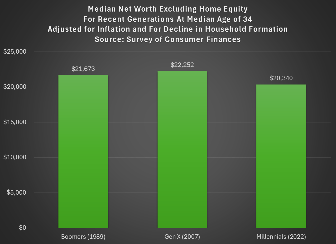
Last week I tried to address whether rising wealth for younger generations was primarily driven by rising home values. My analysis suggested that it was a cause, but not the only cause. Here’s another chart on that topic, showing median net worth excluding home equity for recent generations:
Two things are notable in the chart. For millennials, even excluding home equity they are well ahead of past generations, though of course their net worth is much smaller excluding this category of wealth (the total median net worth for millennials in 2022 was $93,800). But for Gen X in 2022 (last data in that chart), they are slightly behind Boomers, never having recovered from the decline in wealth after 2007 (primarily from the stock market decline, since we’re excluding housing).
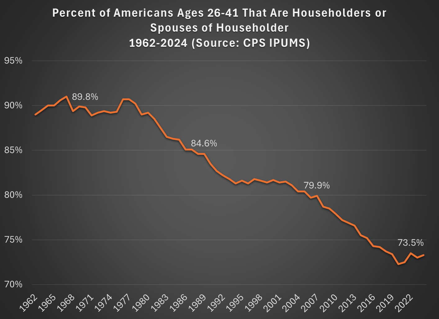
But today I want to address another general objection to the wealth data found in the Fed’s SCF and DFA programs. That objection has to do with household formation. Specifically, these surveys are calculated for households, and the age/generation indicators are for the household head (or “householder” as it is now called). And we know that household formation has been declining over time, as more young people live with parents, with roommates, etc. So the Millennial data we see in the chart above is excluding any Millennials that have not yet formed their own household.
Here’s a general picture of the decline, which has been happening gradually since about 1980. Note: I use the age group 26-41, because this is the age of Millennials in 2022 (the most recent SCF survey year). The highlighted years on the chart are when the Silent, Baby Boomer, Gen X, and Millennial generations were about the same age (26-41).
What this means is that when we are looking at households in these wealth surveys (or any survey that focuses on households) we aren’t quite comparing apples to apples. Does this mean the surveys are worthless? No! With the microdata in the SCF, we can look at not only the median value, but the entire distribution. Since the household formation rate has fallen by about 11 percentage points between Boomers in 1989 and Millennials in 2022, one solution is to look up or down the distribution for a rough comparison.
For example, if we assume all of the 11 percent of non-householders among Millennials have wealth below the median, we can make a rough correction by looking at the 39th percentile for Millennials — the 39th percentile would be the median if you included all of those 11 percent of non-householders as households. Similarly, for Gen X would move down 5 percentage points in the distribution to the 45th percentile in 2007.
The household-formation-adjusted chart does paint a more pessimistic picture than just looking at the median for each generation: the 39th percentile Millennial has about 20% less wealth than the median Boomer did at roughly the same age. Seems like generational decline! Is there any silver lining?
First, you should interpret the chart above as a worst case scenario for Millennial wealth. It assumes all non-householders have low wealth. But likely not all of them do. If instead we use the 43rd percentile of Millennials in 2022, their net worth is $61,000, slightly above Boomers at the same age. (The household formation problem isn’t going away anytime soon as generations age — even if we look at Gen Xers, with a median age of 50 in 2022, their household formation is still 6 percentage points behind Boomers at that age.)
Second, my worst case scenario almost certainly overstates the problem. If all of those 11 percent fewer Millennials not yet forming households were to get married to other millennials, it would only add half of that many households to the aggregate distribution (when two non-householders get married, it becomes one household). So instead of moving down 11 percentage points to the 39th percentile, we should only move down 5 or 6 percentiles. The 44th percentile of Millennial net worth in 2022 was $63,060 — again, compare this to Boomers in the chart above.
Finally, if we combine both of the adjustments discussed in this post, looking at wealth excluding home equity and also adjusting for the decline in household formation, we get the following chart (here I once again use the 39th percentile for Millennials and the 45th percentile for Gen X, i.e., the worst case scenario):
With this final adjustment, we get a slightly different picture. The wealth of these three generations is roughly the same at the same age. No increase in wealth, but no decline either. You could read this as pessimistic, if your assumption is that wealth should rise over time, but the general vibes out there are that young people are worse off than in the past. This wealth data suggests, once again, that the kids are doing all right.
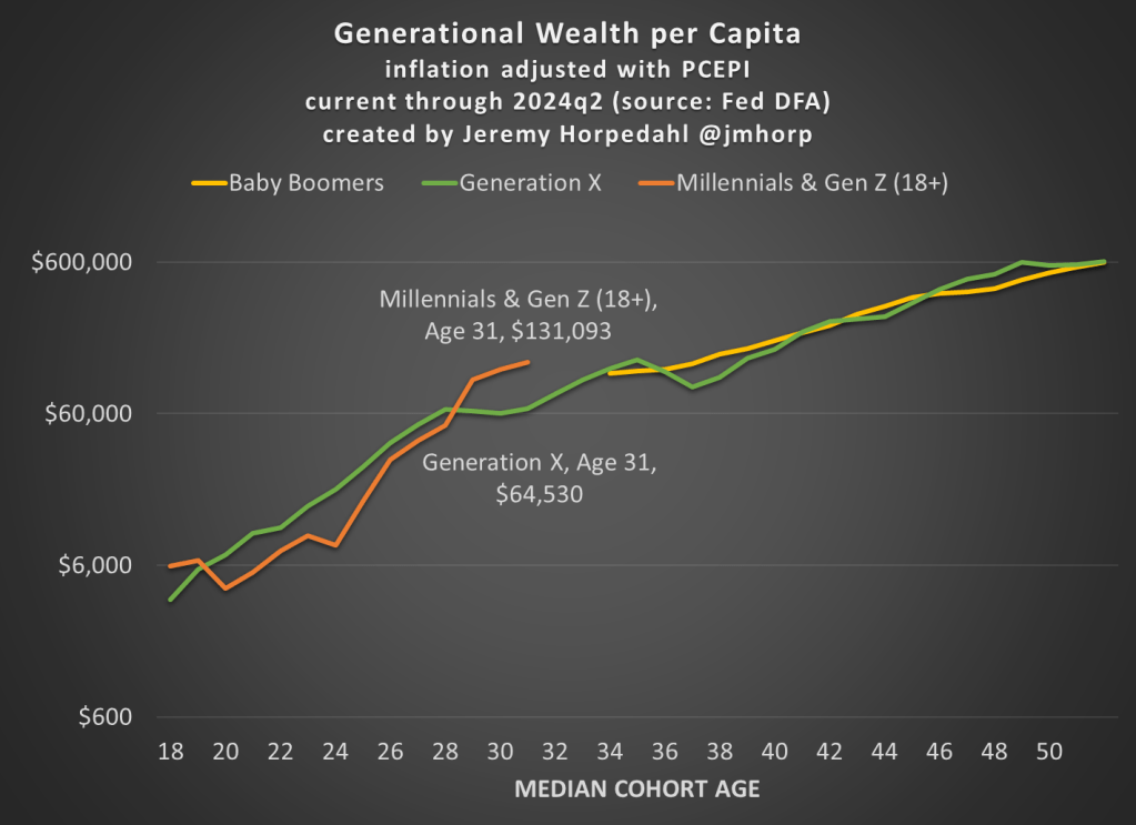
The Fed’s Distributional Financial Accounts have been updated with one more quarter of data, so here’s the latest update to the generational wealth chart:
Not much has changed from last quarter, and please do read my post from June 2024 for an explanation of why I’ve combined Millennials and Gen Z in this chart (and some data on inequality within generations).
First, here is an updated chart on average wealth by generation, which gives us the first glimpse at 2024 data:
I won’t go into too much detail explaining the chart here, as I have done that in more detail in pastposts. But one brief explanatory note: I’m now labeling the most recent generation “Millennials & Gen Z (18+).” Because of the nature of the data from the Fed’s DFA, I can’t separate these two generations (it can be done with the Fed SCF data, but that is now 2 years old). This combined generation now includes everyone from ages 18 to 43 (which means that technically the median age is 30.5, not quite 31 yet), somewhere around 116 million people, which makes it a bit of a weird “generation,” but you work with the data you have. Note though that this makes the case even harder for young Americans to be doing well, as every year I am adding about 400,000 people to the denominator of the calculation, even though 18-year-olds don’t have much wealth.
What’s notable about the data is just how much the youngest “generation” in the chart has jumped up in recent years. They have now have about double the wealth that Gen X had at roughly the same age. Average wealth is about as much as Gen X and Boomers had 5-6 years later in life — and while there are no guarantees, odds are Millennial/Gen Z wealth will be much, much higher in another 5-6 years. You may notice at the tail end of the chart that Gen X and Boomers now have roughly equal amounts of average wealth at the same age (Gen X’s current age), while 2 years ago they were $100,000 ahead. I suspect this is just temporary, and Gen X will soon be ahead again, but we shall see.
Of course, the most common complaint about my data is that these are just averages, so they don’t tell us a lot about the distribution of wealth and could be impacted by outliers. That’s why I’m really excited to share this new data on wealth by decile from the 2022 Fed SCF survey. This data was put together by Rob J. Gruijters and co-authors, and it allows us to compare the wealth of Boomers, Gen X, and Millennials across the wealth distribution. You should read their analysis of the data, but in this post I’ll give my slightly different (and optimistic) interpretation of it.
For all three generations, wealth in the bottom 10% is negative when that generation is in their 30s. And for Millennials, it is the most negative: -$65,000 compared to -$30,000 for Gen X and -$17,000 for Boomers in the bottom decile (as always, the figures are adjusted for inflation). While I haven’t dug into the data, my suspicion is that student debt is driving a lot of the increase. Since this is households in their 30s, I suspect a lot of the bottom decile is composed of folks that just finished graduate and professional school, and are only now starting to acquire assets and pay down debt — they have very high earning potential, which means over their lifetime they will do great, but they are starting from behind. Again, we’ll have to wait and see, but I suspect many in the bottom will quickly climb up the wealth distribution over their working years.
That being said, in the following chart I have left off the bottom 10% for each generation, since displaying negative wealth would make the chart look a little weird. But this chart shows a very optimistic result: Millennials are doing better than Boomers across the distribution, and Millennials are ahead of almost all deciles for Gen X except a few, where they are essentially equal to Gen X (2nd, 7th, and 8th deciles).
The chart may be a little confusing (give me your suggestions to improve it!), but here’s how to read it. The blue bars show Millennial wealth relative to Gen X, at the same age, for each decile (excluding the bottom 10%). For example, the first bar shows that Millennials in the 2nd wealth decile had 100% of the wealth that Gen Xers in the 2nd wealth decile had at the same age — in other words, they were equal. The orange bars show Millennial wealth relative to Baby Boomer wealth at the same age, in the same decile (to repeat, it’s all adjusted for inflation).
Notice that other than the very first bar (Millennials vs. Gen X in the 2nd wealth decile), all of the other bars are over 100%, indicating that Millennials have more wealth than the two prior generations for almost every decile. For some of these, they are much, much greater than 100%. In the 5th decile (close to the median), Millennials have over 50% more wealth than Gen X and almost 200% (double the wealth) of the wealth of Boomers. That’s a massive increase!
A pessimistic read of the chart is that the biggest gains went to the top 10%. Though notice that’s only true relative to Baby Boomers. When compared with Gen X, the 4th and 5th deciles did better than the top 10% in terms of relative improvement. To relate this to the earlier chart in this post, it suggests that relative to Boomers, outliers at the top end might be skewing the average a bit, but that’s probably not the case relative to Gen X. And again, the broad-based gains are visible throughout the distribution from the 2nd decile on up.
Finally, on social media I’ve got several objections about the chart, such as folks not liking the log scale y-axis, and preferring the CPI-U for inflation adjustments instead of the PCEPI that I use. For those objectors, here is a different version of the chart:
Regular readers know that I’ve written numerous times about the wealth levels of younger generations, such as this post from last month. Judged by average (and usually median too) wealth, younger generations are doing as well and often better than past generations. This is not too surprising, if you generally think that subsequent generations are better off than their parents, but many people today seem to think that progress has stopped. The data suggest it hasn’t stopped!
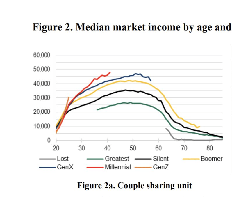
Now there’s a great new paper by Kevin Corinth and Jeff Larrimore which looks at not wealth but income levels by generation. The look at income in a variety of different ways, including both market income and post-tax/transfer income. But the result is pretty consistent: each generation has higher incomes (inflation adjusted) than the previous generation. Here’s a typical chart from the paper:
I’ve written numerous times about generational wealth on this blog. My biggest post was one comparing different generations using the Fed’s Distributional Financial Accounts back in September 2021. I’ve posted several updates to that post as new the quarterly data was released, but this post contains a major update. I’ll explain in great detail below about the updates, but first let me present the latest version of the chart (through 2023q3):
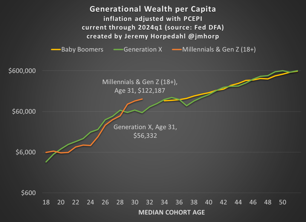
Regular readers will notice a few differences compared with past charts. The big one is that young people have a lot more wealth than it appeared in past versions of this chart! You’ll also notice that I have relabeled this line “Millennials & Gen Z (18+)” and shifted that line over to the left a few years to account for the fact that this isn’t just the wealth of Millennials, and therefore the median age of this group is lower than in my past charts. The two dollar figures I highlighted are at the median age of 30 for these age cohorts (unfortunately we don’t have data for Boomers at that age).