Among the former G8 countries, Russia has by far the highest cumulative inflation rate since January 2020, almost double the amount of inflation we’ve seen in the US and in most G7 countries. No doubt the effects of the wartime economy are contributing to this, but even in February 2022 before they invaded Ukraine, their inflation still had clearly been worse.
The US is on the high end for this group, but pretty close to the median. Japan looks really good on inflation, but that’s probably not much comfort to them since their economy is still smaller than before the pandemic. By this measure, the US looks pretty good (chart from Joey Politano):
GDP estimates for Russia are a little tricky because of the war, but according to IMF estimates, Russia’s economy in 2023 was about 5.6% larger than 2019 in real terms.
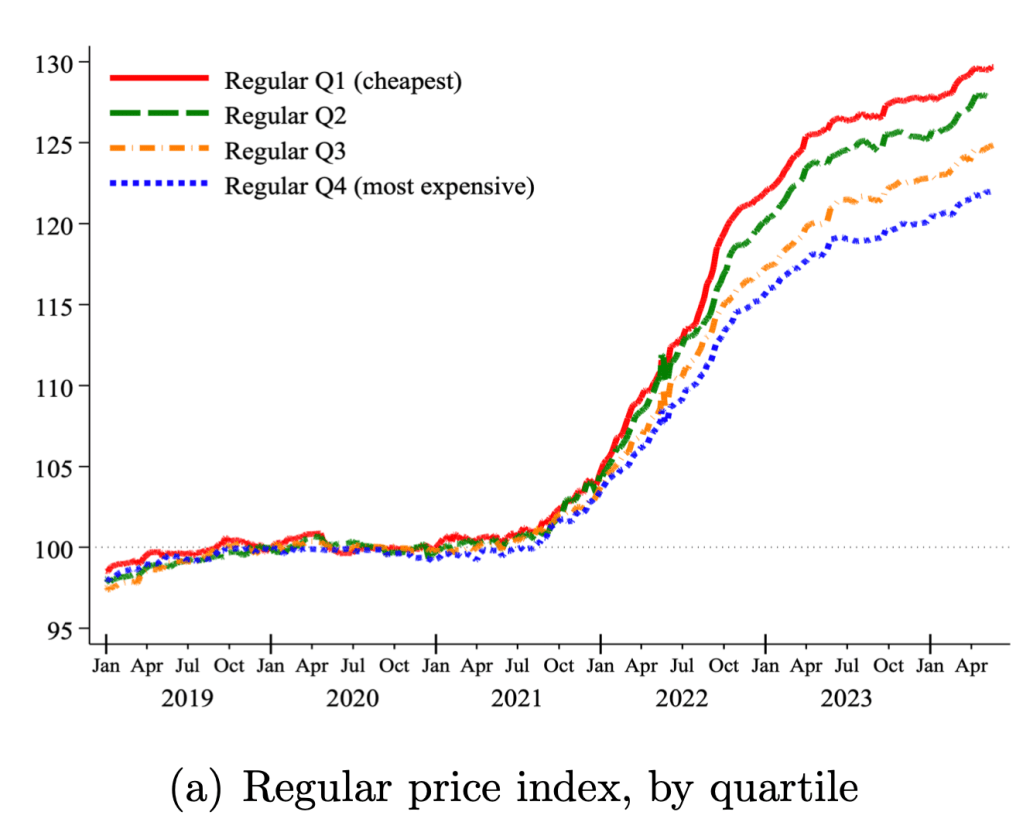
During the peak of the Covid inflation in 2022 I speculated that food inflation was worst for the cheapest products:
a typical McDouble now costs well over $2 in most of the US, while a typical Big Mac is still well under $6. You used to be able to get 4-5 McDoubles for the price of a Big Mac; now you typically get less than 3 and sometimes, as in Keene, less than 2.
What’s going on here? First, the McDouble was always absurdly cheap. Second, prices rise most quickly where demand is inelastic, and demand is less elastic for goods that are cheaper and goods that are more like “necessities” than “luxuries”.
We use micro price data for food products sold by 91 large multi-channel retailers in ten countries between 2018 and 2024. Measuring unit prices within narrowly defined product categories, we analyze two key sources of variation in prices within a store: temporary price discounts and differences across similar products. Price changes associated with discounts grew at a much lower average rate than regular prices, helping to mitigate the inflation burden. By contrast, cheapflation—a faster rise in prices of cheaper goods relative to prices of more expensive varieties of the same good—exacerbated it. Using Canadian Homescan Panel Data, we estimate that spending on discounts reduced the change in the average unit price by 4.1 percentage points, but expenditure switching to cheaper brands raised it by 2.8 percentage points….
The prices of cheaper brands grew between 1.3 to 1.9 times faster than the prices of more expensive brands—and only when inflation surged, not before or after.
We all know about inflation. One popular measure is the Consumer Price Index (CPI), which measures the change in price of a fixed basket of goods. The other popular measure used for inflation is the Personal Consumption Expenditures (PCE) price index. This index measures the price of what consumers actually purchase and captures the effects of consumers changing their consumption bundles over time. While the latter is a better measure for the prices at which consumers make purchases, it takes longer to calculate. In practice, the earlier CPI release gives a pretty accurate preview to the PCE price index.
While consumption is a substantial two-thirds of total expenditures in the US economy, other prices definitely matter. On average, a third of our income is spent on other things. Below is a stacked bar chart of quarterly GDP components – the classic Y=C+I+G+NX.* Investment spending composes a relatively stable 16.7% and Government spending composes about 16.5% of GDP. We almost never hear much about the price of these other things.
The Fed has now almost landed the plane, bringing us down from 9% inflation during the Covid era to something approaching their 2% target today. But it is not yet clear how hard the landing will be. Back in March I thought recurrent inflation was still the big risk; now I see the risk of inflation and recession as balanced. This is because inflation risks are slightly down, while recession risk is up.
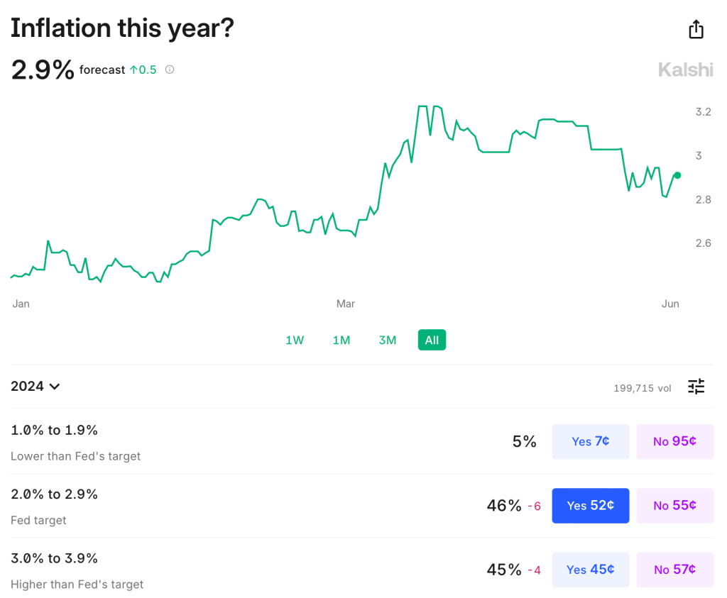
Inflation remains somewhat above target: over the last year it was 3.3% using CPI, 2.7% by PCE, and 2.8% by core PCE. It is predicted to stay slightly above target: Kalshi estimates CPI will finish the year up 2.9%; the TIPS spread implies 2.2% average inflation over the next 5 years; the Fed’s own projections say that PCE will finish the year up 2.6%, not falling to 2.0% until 2026. The labels on Kalshi imply that markets are starting to think the Fed’s real target isn’t 2.0%, but instead 2.0-2.9%:
The Fed’s own projections suggest this to be the somewhat the case- they plan to start cutting over a year before they expect inflation to hit 2.0%, though they still expect a long run rate of 2.0%. In short, I think there is a strong “risk” that inflation stays a bit elevated the next year or two, but the risk that it goes back over 4% is low and falling. M2 is basically flat over the last year, though still above the pre-Covid trend. PPI is also flat. The further we get from the big price hikes of ’21-’22 with no more signs of acceleration, the better.
But I would no longer say the labor market is “quite tight”. Payrolls remain strong but unemployment is up to 4.0%. This is still low in absolute terms, but it’s the highest since January 2022, and the increase is close to triggering the Sahm rule (which would predict a recession). Prime-age EPOP remains strong though. The yield curve remains inverted, which is supposed to predict recessions, but it has been inverted for so long now without one that the rule may no longer hold.
Looking through this data I think the Fed is close to on target, though if I had to pick I’d say the bigger risk is still that things are too hot/inflationary given the state of fiscal policy. But things are getting close enough to balanced that it will be easy for anyone to find data to argue for the side that they prefer based on their temperament or politics.
To me the big wild card is the stock market. The S&P500 is up 25% over the past year, driven by the AI boom, and to some extent it pulls the economy along with it. The Conference Board’s leading economic indicators are negative but improving overall this year; recently their financial indicators are flat while non-financial indicators are worsening.
Overall things remind me a lot of the late ’90s: the real economy running a bit hot with inflation around 3% and unemployment around 4%; the Fed Funds rate around 5%; and a booming stock market driven by new computing technologies. Naturally I wonder if things will end the same way: irrational exuberance in the stock market giving way to a tech-driven stock market crash, which in turn pushes the real economy into a mild recession.
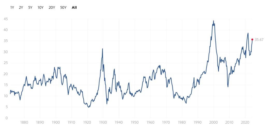
Of course there is no reason this AI boom has to end the same way as the late-90’s internet boom/bubble. There are certainly differences: the Federal government is running a big deficit instead of a surplus; there are barely a tenth as many companies doing IPOs; many unprofitable tech stocks already got shaken out in 2022, while the big AI stocks are soaring on real profits today, not just expectations. Still, to the extent that there are any rules in predicting stock crashes, the signs are worrying. Today’s Shiller CAPE is below only the internet and Covid meme-stock bubble peaks:
Again, this doesn’t mean that stocks have to crash, or especially that they have to do it soon; the CAPE reached current levels in early 1998, but then stocks kept booming for almost two years. I’m not short the market. But the macro risk it poses is real.
Economics as a discipline really likes to boil things down to their essentials. There are plenty of examples. How many goods can one consume? Just two, bread and not bread. How can you spend your time? You can labor or leisure. How do you spend your money? Consume or save. It’s this last one that I want to emphasize here.
First, all income ultimately ends up being spent on consumption. Saving today is just the decision to consume in the future. And if not by you, then by your heirs. One determinant of inter-temporal consumption decisions is the real rate of return. That is, how many apples can you eat in the future by forgoing an apple eaten today? The bigger that number is, the more attractive the decision to save.
Further, since most saving is not in the form of cash and is instead invested in productive assets, we can also characterize the intertemporal consumption problem as the current budget allocation decision to consume or invest. The more attractive capital becomes, the more one is willing to invest rather than consume. The relative attractiveness between consumption and investment informs the consumption decision.
How attractive is investment? I’ll illustrate in two graphs. First, if the price of investment goods falls relative to consumption goods, then individuals will invest more. The graph below charts the price ratio of investment goods to consumption goods. Relative to consumption, the price of investment has fallen since 1980. Saving for the future has never been cheaper!
Of course, as in a price taker story, I am assuming that individuals don’t affect this price ratio. Truly, prices are endogenous to consumption/investment decisions. For all we know, it may be that the prices of investment goods are falling because demand for investment goods has fallen. But that doesn’t appear to be the case.
Financial markets have sustained themselves for nearly two years now on the hope that within 1-2 quarters, the Fed will finally relent and start lowering interest rates. This hope gets dashed again and again by data showing stubbornly persistent high employment, high GDP growth, and high inflation, but the hope refuses to die.
Long-term interest rates had been falling nicely for the last month, based on expectations of rate cuts in the fall. Then came Friday’s jobs report, and, blam, up went 10-year rates again. The Bureau of Labor Statistics (BLS) published its “Establishment” survey of data gleaned from employers. Non-farm payrolls rose by US 272k. This was appreciably higher than the 180k consensus expectation.
The plot below indicates that this number fits into a trend of essentially steady, fairly high employment gains (suggesting ongoing inflationary pressures):
There are fundamental reasons to take the BLS Establishment figures with a grain of salt. They have a history of significant revisions some months after first publication. Also, BLS uses a “birth/death” model for small businesses, which can account for some 50% (!) of the job gains they report. [1]
Another factor is that all of the net “jobs” created in recent quarters are reported to be part-time. According to Bret Jensen at Seeking Alpha, “Part-time jobs rose 286,000 during the quarter, while full-time jobs fell by just over 600,000. This is a continuation of a concerning trend where over the past year, roughly 1.5 million part-time positions were created while approximately one million full-time jobs were lost. This difference is that the BLS survey does not account for people working two or three jobs, which are now at a record as many Americans have struggled to maintain their standard of living during the inflationary environment of the past couple of years.”
It seems, then, that this week’s huge “jobs added” figure is not to be taken as indicating that the economy is overheated. However, it is still warm enough that rate cuts will be postponed yet again. A different BLS survey (“Household”) showed unemployment creeping up from 4.0% to 4.1%, which again suggests a more or less steady and fairly robust employment picture.
As far as drivers of inflation, I would look especially at wage growth. That is fitfully slowing, but not nearly enough to get us to the Fed’s 2% annual inflation target. My sense is that ongoing enormous federal deficit spending will keep pumping money into the economy fast enough to keep inflation high. High inflation will prevent significant interest rate cuts, assuming the Fed remains responsible. The interest payments on the federal debt will balloon due to the high rates, leading to even more deficit spending. If we actually get an economic downturn, leading to job insecurity and a willingness of workers to accept slower wage growth in the private sector, the federal spending floodgates will open even wider.
This makes hard assets like gold look attractive, to hedge against inflating U.S. dollars. This is one reason China has been quietly selling off its dollar hoard, and buying gold instead.
[1] For more in-depth treatments of employment statistics, see posts by fellow blogger Jeremy Horpedahl, e.g. here.
Many people have nostalgia for nominal prices of the past. I’ve written about this topic in various contexts before, but the primary error in doing this is that you must also look at nominal wages from the past. Prices in isolation give us little context of how affordable they were.
One area with a lot of nostalgia is food prices of the past, specifically grocery prices (I’ve also written about fast food prices). While I have addressed grocery price inflation since 2021 in another post (it’s bad, but probably not as bad as social media leads you to believe), there is another version of grocery price nostalgia that goes back even further. For example, this image shows up on social media frequently with nostalgia for 1980 prices:
(Note that the image also mentions housing prices, but the clear focus of the image is on groceries. I won’t dig into housing in this post, but it’s something I have written a lot about before, and I would recommend you start with this post on housing prices from February 2024. But she sure looks happy! As models often do in promotional photos.)
Could you buy all those groceries for $20 in 1980? And how should we think about comparing that to grocery prices today?
One approach to grocery affordability is to look at how much a family spends as a share of their budget on food and other items. In the past I’ve used this approach to show that food spending has fallen dramatically over time as a share of a household’s budget, including since the early 1980s. But perhaps that approach is flawed. Maybe housing has got more expensive, so families are cutting back on food spending to accommodate for that fact, but they are getting less or lower quality food.
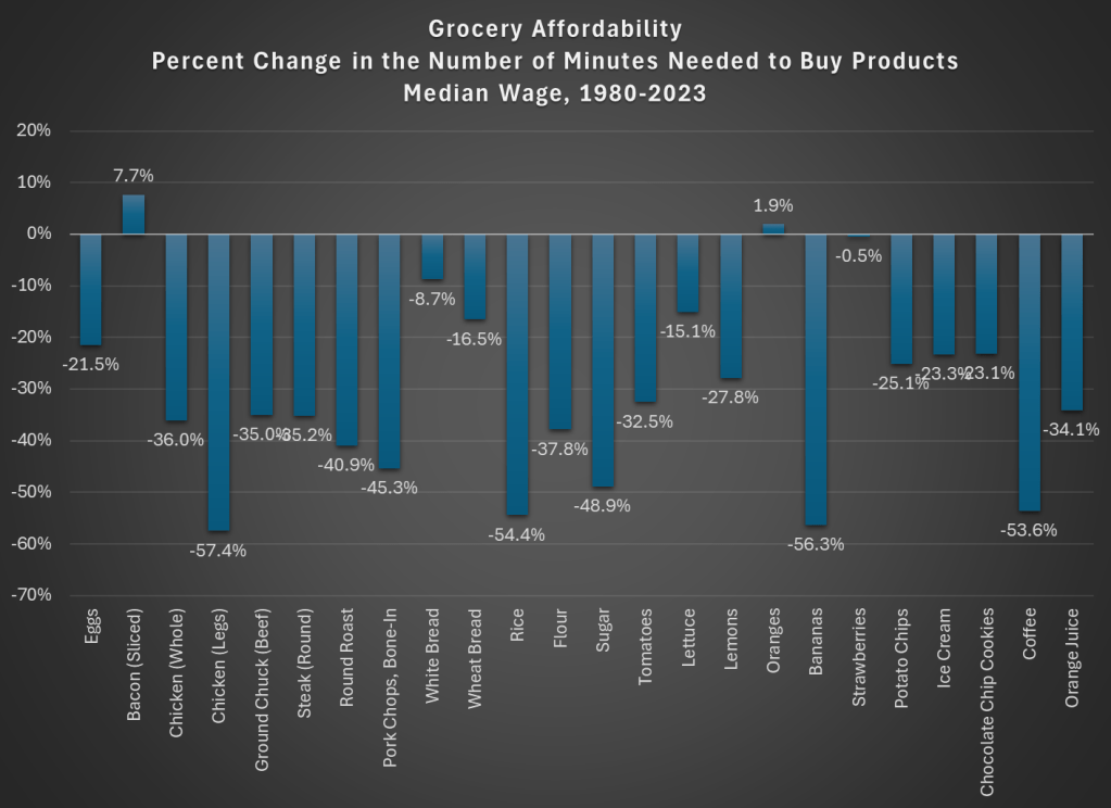
For another approach, I will use Average Price Data for grocery items from the BLS CPI series. Note that I am using actual average retail price data, not prices series data, which means there are not adjustments for quality changes or substitutions. No funny stuff, just the raw price data (the only adjustment is if product sizes changes, which of course we want them to do, so we aren’t fooled by shrinkflation — so BLS uses a constant package size, such as 1 pound for many items or a dozen eggs, etc.).
The items I have chosen out of the 150-plus price series are the 24 items which are available in both 1980 and 2024. There may be some biases by doing this, but in general BLS is continuing to collect data on things that people continue buying. So it’s the best apples-to-apples comparison we can do (note that there are no apples in this list! Apples are tracked in the CPI, but there is no continuous price series from 1980 to 2024 for one apple variety).
How best to compare prices over time? Rather than “adjusting for inflation,” as is common in the popular press and by some economists, a better approach that I and other economists use is called “time prices.” Time prices show the number of hours or minutes it would take to purchase the good in two different years, using some measure of wages or income (I will use both average and median wages in this post). By looking at prices compared with wages for individual items, we can see whether each items as well as the entire basket has become more or less affordable.
Here is what time prices for these 24 items look like if we use average wages (I use a series that covers about 80% of the workforce, but excludes supervisors and managers). For this chart, I use prices in April 1980 and April 2024, since there is some seasonality to some prices (and April 2024 is the most recent price and wage data available, so it’s as current as I can get).
The chart shows that for 23 out of the 24 items, it takes fewer minutes of work to buy the items in April 2024 than it did in April 1980. For many items, it is a huge decrease: 13 items decrease by 30 percent or more (30 percent is also the average decrease). And while we once again might be concerned by selection bias of the goods, we have a nice variety here of proteins, grains, baking items, vegetables, fruits, snacks, and drinks. Unfortunately for the bacon lovers out there it is the one product going in the other direction, but there are still a variety of other proteins that have become much more affordable (pork chops are much cheaper!).
Here’s one way in which the image of the lady shopping wasn’t wrong: you could get a basket of groceries for about $20 in 1980. The basket I’ve put together (which is obviously different from the woman’s basket, but you work with the data you have) would cost $27 if you bought the package sizes BLS tracks (e.g., one pound for most of the meats and produce). In 2024, that same basket would cost $84. That’s 3 times as much! But since wages are over 4 times higher, the family is better off and groceries are, in a real sense, more affordable.
Speaking of wages though, is my chart perhaps biased because I’m using the average wage? What if we used another measure, such as the median wage? For that, I can use the EPI’s median wage series (which comes from the CPS), and I also converted it to a nominal wage for 2023. This wage data is only available annually, with the most recent being 2023, so I will also use 2023 price data for this chart (note: for oranges and strawberries, I use the second quarter average price, since they weren’t available year round in 1980 — another subtle example of growing abundance and prosperity today).
The immediate thing you will notice is that there isn’t much difference between the average wage chart. Bacon is still less affordable. We know have oranges being slightly less affordable and strawberries being basically the same, though keep in mind as I mentioned above the chart that these weren’t available year-round in 1980.
But other than bacon and those seasonal fruits, everything is more affordable in 2023 than 1980. The average decrease is the same as the prior chart: 30 percent fewer minutes of work at the median wage to purchase this basket of goods, with 13 of the 24 items decreasing by more than that 30 percent average. The reason for this similarity is that both the average and median wages as measured by these series are more than 4 times higher than 1980.
But are these 24 items representative of other grocery items that we don’t have complete price data in the public BLS series? They are probably pretty close. The unweighted percent change in the items from April 1980 to April 2024 was 201%. If we use the CPI Food at Home component, which includes many more items but also changes in composition as buying habits change, we see a slightly larger 255% increase. But that is still less than wages have increased since 1980 (by over 300% for both average and median wages). As our incomes rise, we will naturally switch to better and more expensive foods, which can explain the 255% vs 201% difference in price increases, but it also shows the BLS isn’t engaging in any funny business with the indexes: if they kept the basket of goods constant, price increases would be smaller.
While the rise in prices since 2021 might rightly make us nostalgic for the pre-pandemic era of prices, let’s not be nostalgic for 1980 grocery prices.
If we have learned anything in the past 2 years, it’s that people don’t like inflation. Well, you probably already knew that. But I guess we learned that they really, really don’t like inflation. Polls of various sorts still indicate that Americans are upset about inflation, even though the worst of it was happening in June 2022, almost 2 full years ago.
But how much inflation do Americans want? The answer: almost 0%. In fact, the median preference is exactly 0% according to a new working paper titled simply “Inflation Preferences.” The mean preference was 0.2%.
But this paper does more than just survey people on their preferences. It also presents to them several “narratives” about inflation, and to see whether people who have considered those narratives have different preferences. Given my many blog posts about the relationship between wages and inflation (or rather, the race between them), this narrative was interesting to me:
T4 (Wage inflation) When prices increase over time (inflation), worker’s wages may not immediately adjust in proportion. Inflation, therefore, affects the amount of goods and services that workers can buy with their wages. By keeping inflation low, workers can buy a similar amount of goods and services over time.
People who had considered that narrative (wages increases trail price increases) tended to prefer even lower inflation rates, by about 0.7 percentage points. Again, perhaps this is obvious, but it is important to understand how different individuals think about inflation (it was the only one of five narratives that had a statistically significant negative impact on inflation preferences).
Finally, as one final interesting tidbit, survey respondents that were also Economics Majors in college reported higher inflation preferences, by about 1 percentage point.
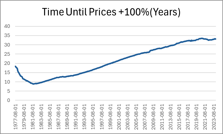
Last month, Jeremy wrote about how long it takes for prices to double. He identified a few intervals of time that are sensible. But I want to pick up the ball and move it further down the field. Not only can we identify how long it took for prices to double in particular eras, we can also do it for *every month*. Below, is a graph that shows us how many years had passed since prices were half as high (PCE Chained Prices).
Expectedly, the minimum time to double consumer prices was in the early 80s, taking just under 9 years for price to double. The prior decade included the highest inflation rates in the past 70 years. Since that time, the number of years needed in order for prices to double steadily rose as the average inflation rate fell. That is, until after the pandemic stimuli which caused the time to plateau. But to be clear, that must mean that prices aren’t doubling any fast that they used to, despite what we’ve heard on the news.
Except… prices are in fact rising faster by 21st century standards. Indeed, measuring the time that it took prices to double covers up a lot of variation. After all, The PCEPI was 15.19 in 1959 and is 122.3 now. That’s only enough difference for three doublings. But as we lower the threshold for price changes, we can see more of the price level patterns. Below-left is the time that was necessary for prices to increase by 50% and below-right is the time that was necessary for prices to rise by 25%.
In these graphs we can see more of the action that happened post-Covid. The time needed for prices to rise by 50% has fallen by about five years since 2020. That’s a 20% shorter time necessary for a 50% increase in prices. The time needed for a 25% increase in prices is even more drastic. As of 2020, people were accustomed to experiencing upwards of 14 years before overall prices rose by 25%. That number fell below 8 years by 2024.
And finally, the most unnerving graph of all is below: the time that was needed for prices to rise by 10%.
While there are many factors to consider, ultimately whether living standards are rising is a race between prices and income. What does that race look like if we start the clock in December 2019, just before the pandemic?
Whether we use median weekly earnings (the purple line) or average hourly earnings for non-management workers (the blue line), they have clearly won the race with two commonly used price indexes (the CPI-U and the PCEPI). That’s good news, and probably not something you hear very often in the discourse about the economy (unless you spend a lot of time reading this blog).