The Toyota Camry is Much More Affordable Than 30 Years Ago

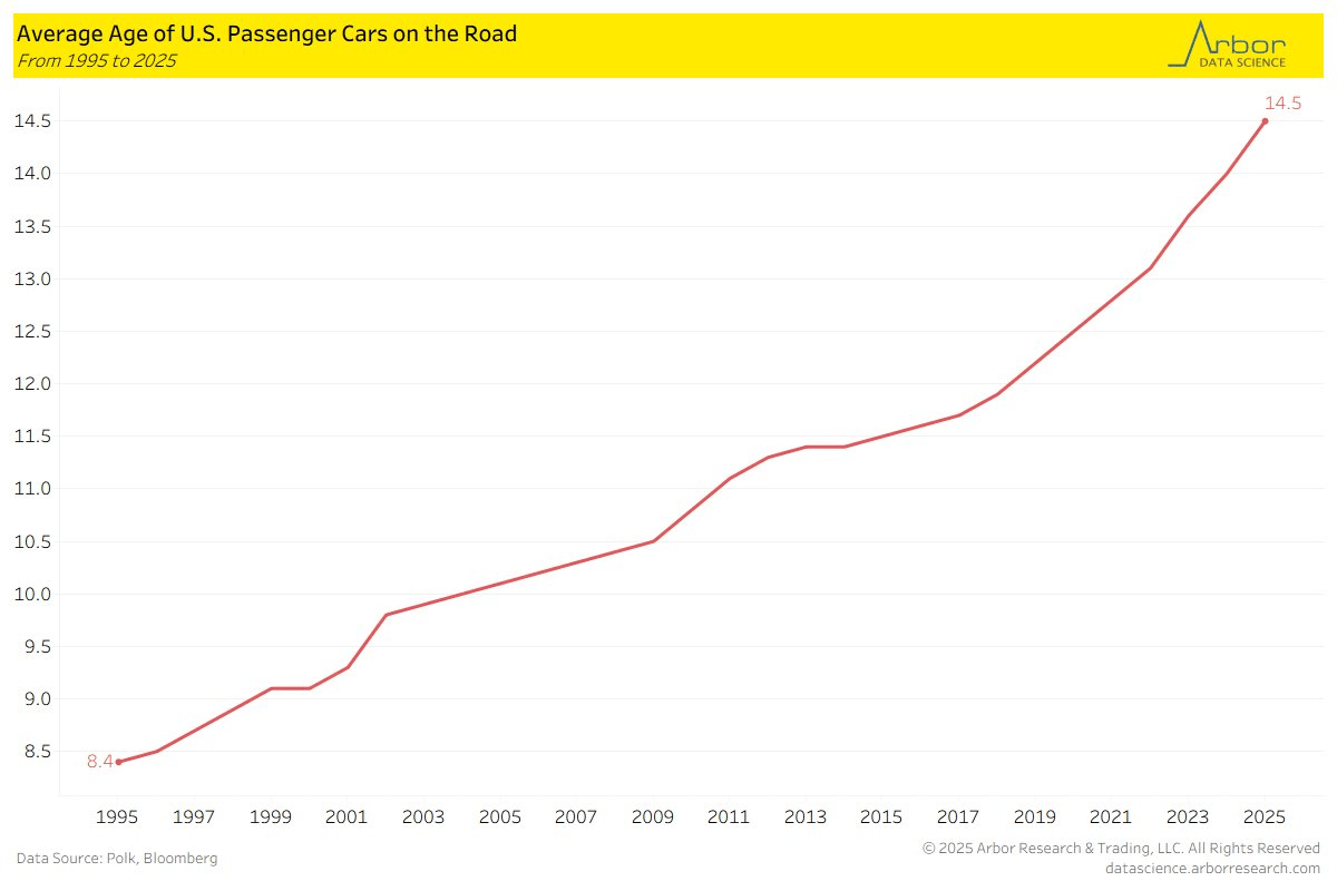
The following chart from Arbor Research shows that the average age of cars on the road in the US is 14.5 years. If we go back to 1995, it was almost half that, and the increase has been steady since over the past 30 years. Similar data from the Bureau of Transportation Statistics confirms these numbers.

Why would this be? I see two primary explanations that are possible. One is that cars are becoming more reliable (better quality), so consumers are happy to drive them longer. The other is that cars today are less affordable, so people are only hanging onto old cars because they are forced to. One of these is a happy explanation, one is consistent with a narrative of stagnation. Which is true?

I am not a car expert, so I can’t speak to the first, though I will note that there are Facebook groups dedicated to people that have cars with hundreds of thousands of miles on their odometers.

On the affordability question, we do have some good data, but it points in the opposite direction: cars are much more affordable today than in 1995, or even before that.

Continue reading

Nintendo vs Nintendo: Time Prices of Video Games in 1986 and 2024

For decades one of the most popular Christmas gifts for kids (and often adults) has been video game systems. And Nintendo has long been a dominant player in this market: the original NES arguably launched the modern gaming market in 1986 (even though it wasn’t the first, it was the first blockbuster) and Nintendo’s latest offering, the Switch, is now the best-selling console ever in the US.

As we often ask on this blog: has it become more or less affordable for an average worker to buy this iconic Christmas gift (or even buy one for yourself)?

When it comes to the consoles themselves, the Switch and NES are, perhaps surprisingly, equally affordable. The original NES cost $90 in 1986, while the Switch costs $300 today. Average wages in late 1986 were $9/hour and they are about $30/hour today. So in both years, it took about 10 hours of work to buy the console (alternatively, it’s about 25% of median weekly earnings in both years).

But as any serious gamer will tell you, the individual game cartridges can cost as much or more than the console if you want to play a lot of games. For example, the games available in the 1986 Sears catalog ranged from $25-$30. To buy just the 10 games in that catalog would cost $275 — over 30 hours of labor at the average wage, or about 3 hours of labor per game.

Today there is a wider range of prices for games, but the most expensive Switch games are around $60, or just 2 hours of labor at the average wage. There are also plenty of games around $30, or just 1 hour of labor.

The challenge with the comparison is that video games today are much higher quality, challenging, and advanced in so many ways. Is there any way to make a more direct comparison?

Yes. Nintendo offers an annual subscription for $20 to Nintendo Switch Online. Included in the subscription is access to nearly every NES game, plus Super Nintendo and Gameboy games. Not only do you get the 10 games from the 1986 Sears catalog, but many dozens more. All for less than $1 hour of labor at the average wage.

In other words, for 30 hours of labor today (the time to purchase those 10 original NES games), you could buy about 46 years worth of subscriptions to Nintendo online. That’s almost a lifetime of video game play, with many more advanced games.
House Prices and Quality: 1971 vs 2023

Last week I did a comparison of “time prices” for several goods and services in 1971 compared with 2024. For almost all goods and services, it took fewer hours of work in 2023 to purchase them. In some cases, huge increases in affordability; air travel is 79% cheaper and milk is 59% cheaper, in terms of how much time an average worker needs to labor to pay for them.

There was one major exception though: housing. Especially the cost of buying a new home. Just using the median sale price of a home, the cost (in terms of hours of work) roughly doubled between 1971 and 2024. That’s not good!

Many who commented on the post mentioned that houses are much bigger today, and I noted that in the post but still claimed this is a worrying trend: “since 1971 you can’t really argue the quality improvements make up for the increase. Yes, houses are much bigger (about double in size), but that’s not clearly driven by consumer demand (more so by zoning and other laws). The 1971 house also had indoor plumbing (but maybe not air conditioning).”

Furthermore, housing is the largest expense for most families, both today and in 1971. In the early 1970s it was 30.8% of consumer spending, and in 2023 it was slightly higher at 32.9%. Given all this, it is worth investigating further.

First, let’s consider the size of a typical house. For most of the 1971 data, I will use this HUD report on new single-family homes. And I will use the similar Characteristics of New Housing report for 2023 (the latest year available) to compare.

Are houses bigger today? Yes, but not nearly enough to account for the decreasing affordability I showed in the previous post. In 1971, the median new home had 1,400 square feet of floor space. In 2023, it was 2,286. That’s a big increase (over 60%), but let’s now do the time-price affordability calculation, which I show in the table below.

Continue reading

“Time Prices” Today Compared With 1924 and 1971

I’ve written before on this blog about “time prices”: the amount of time it takes at a particular wage to buy a specific product. Time prices are especially useful for making historical comparisons of the real price of a good or service. Rather than adjusting historical prices for inflation (which only tells you whether they have increased faster or slower than average prices), time prices give you a real comparison of whether a good has become more or less affordable.

Antony Davies recently did a 100-year comparison of time prices for an average worker in the US. He compared prices in 1924 for several common food items, gasoline, electricity, movie tickets, airline tickets, an automobile, and several measures of housing costs to the best comparable thing in 2024. This following table shows his results:

You will notice a few things here. For the median worker, most things are much more affordable in 2024. Some things are dramatically so! For many items, the median worker in 2024 is similar to someone in the top 1% in 2024. Huge improvements in the standard living.

It will probably not surprise you that one major exception is housing. For renters, things are not obviously worse, but they are not better, depending on what size of city you are in (renters also have lower incomes, but that would be true in both time periods). However compared to the average home price, things look much worse in 2024. You can reasonably reply that the home is much larger and better quality in 2024 (as late as 1940, barely half of homes had complete indoor plumbing!), and this is all true. Still, an average house today is much better, but also much less affordable.

Despite the high cost of housing, the average worker today is much better off than 1924. It’s hard to deny it.

But what about more recent times? As a recurring meme likes to date it, what about since 1971?

Continue reading