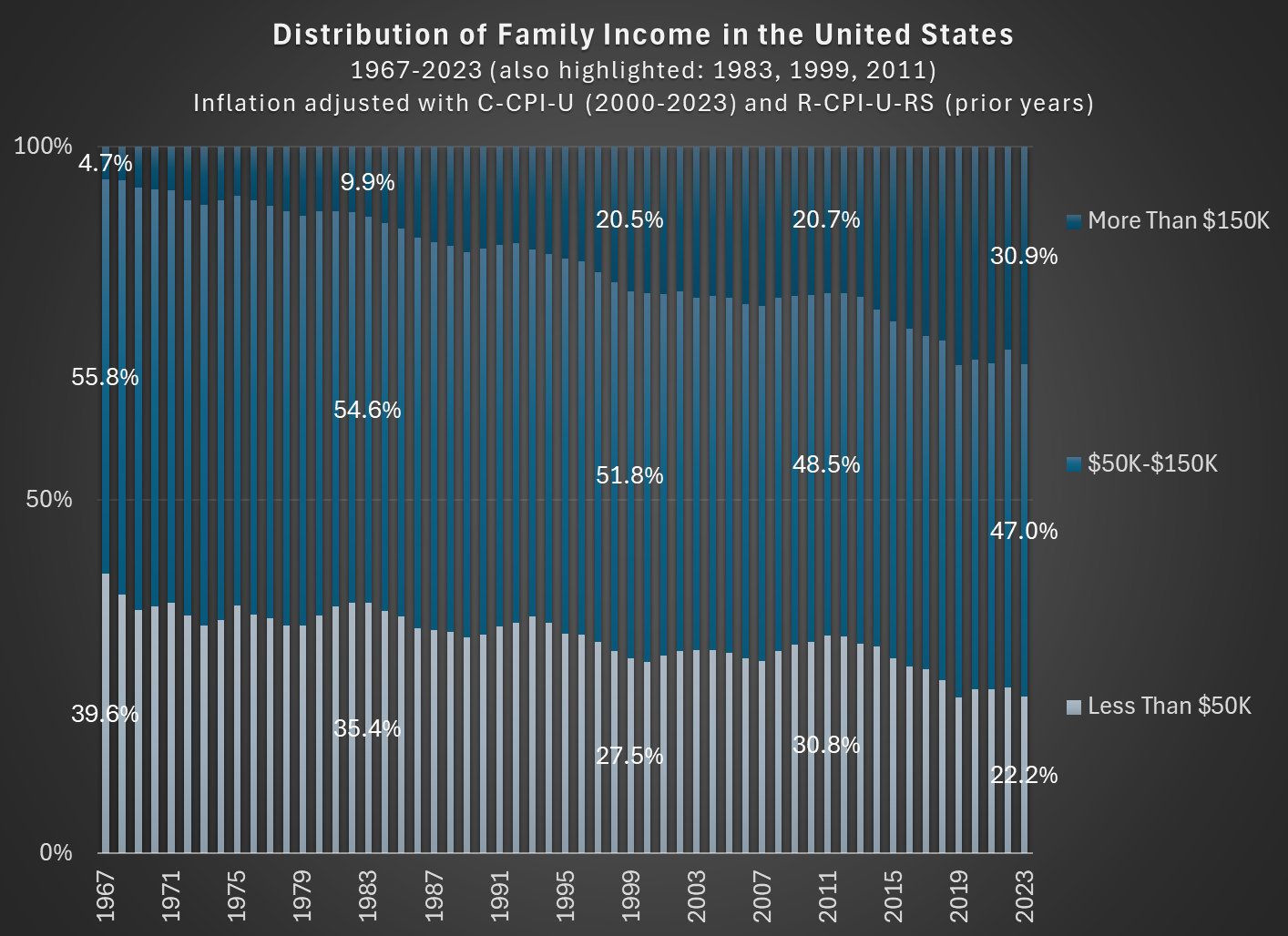
In 1967, about 56 percent of families in the US had incomes between $50,000 and $150,000, stated in 2023 inflation-adjusted dollars. In 2023, that number was down to 47 percent. So the American middle class shrunk, but why? (Note: you can do this analysis with different income thresholds for middle class, but the trends don’t change much.)
The data comes from the Census Bureau, specifically Table F-23 in the Historical Income Tables.
As you can see in the chart, the proportion of families that are in the high-income section, those with over $150,000 of annual income in 2023 dollars, grew from about 5 percent in 1967 to well over 30 percent in the most recent years. And the proportion that were lower income shrunk dramatically, almost being cut in half as a proportion, and perhaps surprisingly there are now more high-income families than low-income families (using these thresholds, which has been true since 2017). The number is even more striking when stated in absolute terms: in 1967 there were only about 2.4 million high-income households, while in 2023 there were 11 times as many — over 26 million.
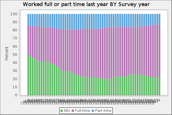
Is this increase in family income caused by the rise of two-income households? To some extent, yes. Women have been gradually shifting their working hours from home production to market work, which will increase measured family income. However, this can’t fully explain the changes. For example, the female employment-population ratio peaked around 1999, then dropped, and now is back to about 1999 levels. Similarly, the proportion of women ages 25-54 working full-time was about 64 percent in 1999, almost exactly the same as 2023 (this chart uses the CPS ASEC, and the years are 1963-2023).
But since the late 1990s, the “moving up” trend has continued, with the proportion of high-income families rising by another 10 percentage points. Both the low-income and middle-income groups fell by about 5 percentage points. Certainly some of the trend in rising family income from the 1960s to the 1990s is due to increasing family participation in the paid workforce, but it can’t explain much since then. Instead, it is rising real incomes and wages for a large part of the workforce.