Donald Trump has repeatedly said that the US was at our “richest” or “wealthiest” in the high-tariff period from 1870-1913, and sometimes he says more specifically in the 1890s. Is this true?
First, in terms of personal income or wealth, this is nowhere near true. I’ve looked at the purchasing power of wages in the 1890s in a prior post, and Ernie Tedeschi recently put together data on average wealth back to the 1880s. As you can probably guess, by these measures Trump is quite clearly wrong.
So what might he mean?
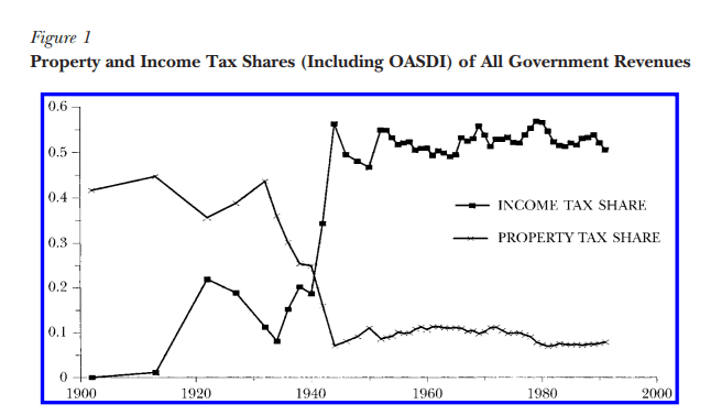
One possibility is tax revenue, since he often says this in the context of tariffs versus an income tax. Broadly this also can’t be true, as federal revenue was just about 3% of GDP in the 1890s, but is around 16% in recent years.
But perhaps it is true in a narrower sense, if we look at taxes collected relative to the country’s spending needs. Trump has referenced the “Great Tariff Debate of 1888” which he summarized as “the debate was: We didn’t know what to do with all of the money we were making. We were so rich.” Indeed, this characterization is not completely wrong. As economic historian and trade expert Doug Irwin has summarized the debate: “The two main political parties agreed that a significant reduction of the budget surplus was an urgent priority. The Republicans and the Democrats also agreed that a large expansion in government expenditures was undesirable.” The difference was just over how to reduce surpluses: do we lower or raise tariffs?
It does seem that in Trump’s mind being “rich” in this period was about budget surpluses. Let’s look at the data (I have truncated the y-axis so you can actually read it without the WW1 deficits distorting the picture, but they were huge: over 200% of revenues!):

It is certainly true that under parts of the high-tariff period, we did collect a lot of revenue from tariffs! In some years, federal surpluses were over 1% of GDP and 30% of revenues collected. But notice that this is not true during Trump’s favored decade, the 1890s. Following the McKinley Tariff of 1890, tariff revenue fell sharply (though probably not likely due to the tariff rates, but due to moving items like sugar to the duty-free list, as Irwin points out). The 1890s were not a decade of being “rich” with tariff revenue and surpluses.
Finally, also notice that during the 1920s the US once again had large budget surpluses. The income tax was still fairly new in the 1920s, but it raised around 40-50% of federal revenue during that decade. By the Trump standard, we (the US federal government) were once again “rich” in the 1920s — this is true even after the tax cuts of the 1920s, which eventually reduced the top rate to 25% from the high of 73% during WW1.
If we define a country as being “rich” when it runs large budget surpluses, the US was indeed rich by this standard in the 1870s and 1880s (though not the 1890s). But it was rich again by this standard in the 1920s. This is just a function of government revenue growing faster than government spending. And the growth of revenue during the 1870s and 1880s was largely driven by a rise in internal revenue — specifically, excise taxes on alcohol and tobacco (these taxes largely didn’t exist before the Civil War).
1890 was the last year of big surpluses in the nineteenth century, and in that year the federal government spent $318 million. Tariff revenue (customs) was just $230 million. There was only a surplus in that year because the federal government also collected $108 million of alcohol excise taxes and $34 million of tobacco excise taxes. In fact, throughout the period 1870-1899, tariff revenues are never enough to cover all of federal spending, though they do hit 80% in a few years (source: Historical Statistics of the US, Tables Ea584-587, Ea588-593, and Ea594-608):

One more thing: in some of these speeches, Trump blames the Great Depression on the switch from tariffs to income taxes. In addition to there really being no theory for why this would be the case, it just doesn’t line up with the facts. The 1890s were plagued by financial crises and recessions. The 1920s (the first decade of experience with the income tax) was a period of growth (a few short downturns) and as we saw above, large budget surpluses. The Great Depression had other causes.