When you see prices from the past, especially the distant past, your normal reaction is perhaps one of envy or nostalgia. Take for example the Thanksgiving menu from the Plaza Hotel in New York in 1899. As you browse the menu, note that the prices are in cents, not dollars.
The most expensive items on the menu are only a few dollars, while many items can be had for around 50 cents. But hopefully your nostalgia will soon fade when you recall that wages were probably lower back then.
But how much lower?
According to data from MeasuringWorth.com (an excellent resource affiliated with the Economic History Association), the average wage for production workers in manufacturing was 13 cents per hour in 1899. From this we can immediately see that a dish such as Ribs of Prime Beef (60 cents) would take about 4.5 hours of work for a production worker to purchase.
How can we compare these prices and wages from 1899 to today?
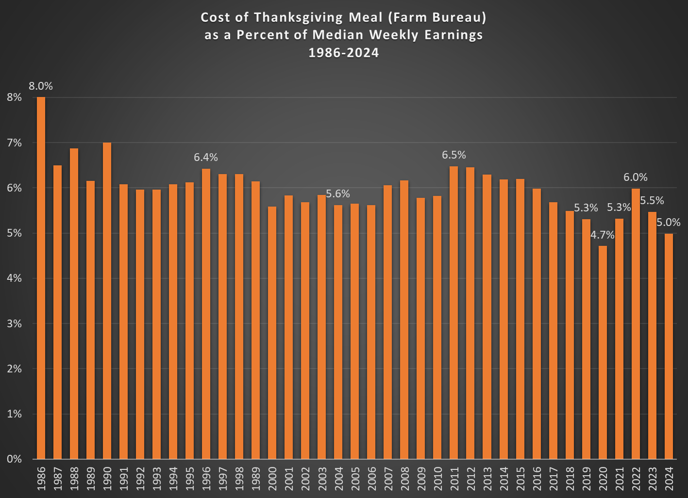
Farm Bureau has released their annual data on the cost of a Thanksgiving meal. The headline is that this meal has declined, in nominal terms, for 2 years in a row — back-to-back years of roughly a 5 percent decline. That’s good news for consumers. But they note it’s not all good news, because the meal is still 19 percent higher than 2019, “which highlights the impact inflation has had on food prices – and farmers’ costs – since the pandemic.”
However, the news is even better than they say. If we compare the price of this meal to median earnings, it is actually cheaper than it was in 2019. It’s now the second most affordable Thanksgiving on record, and the only lower year was 2020 — an anomalous year for many reasons (prices fell, due to decreased demand, while median wages were artificially lifted by lower-wage workers losing their jobs).
As a percent of median weekly earnings for full-time workers, the Farm Bureau Thanksgiving meal will cost just 5 percent of weekly earnings (note: I use 3rd quarter earnings for each year, since it is the latest available for 2024). In 2020 it was only 4.7 percent, but other than that 2024 is lower than all other years for which we have data, which goes back to the mid-1980s, when it took 6-8 percent of earnings to buy this meal.
Last year I also said that this meal was the second cheapest ever — if you ignore the weird years of the pandemic. But now if you ignore those years, it is the most affordable it has ever been.
That’s something to be thankful for next week, but also every time you go to the grocery store. Since October 2019, average wages have increased more than prices at the grocery store — not by much, but still better than you might suspect (and yes, I have checked my receipts). If we go back to the 1980s, wages beat inflation by a much larger margin.
A new essay by J. Zachary Mazlish answers the title question in the affirmative: yes, inflation made the median voter poorer. The post is data-heavy, with lots of charts and different ways of slicing the data, which is great! But since I am called out by name (or rather, my evil twin, Jeremy Horpendahl), I want to respond specifically to the claim about my data, but also I’ll make a few broader points.
Regular readers will recognize the chart in that Tweet comes from an EWED post from April 2024. Mazlich says that my chart and others like it are “misleading for understanding the election because a) they compare wages now versus January 2020, rather than January 2021.”
Fair enough, but if you read my Tweet you will see that I am specifically responding to an NPR story which said, “if you look at the difference between what… groceries cost in 2019 and what it costs today, and what wages looked like in 2019 and today, the gap is really gigantic.” So, they are specifically using 2019 as a baseline in that story, and my chart specifically used that as the baseline too! That’s why I thought that chart was relevant.
It’s true, of course, that if you want to understand median voter sentiment about the Biden administration, you should probably start the data at the beginning of the Biden administration. But I was responding to the more general claim people make, that they are worse off than in 2019.
With that clarification out of the way, what does Mazlich’s broader post say?
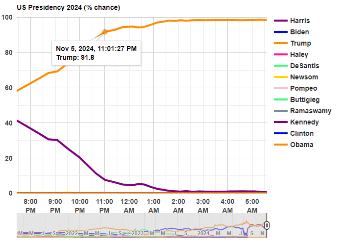
Last night was a big win for Trump, but it was also a big win for prediction markets. In January 2024, I suggested that one of the best ways to follow the election was by following prediction markets. That prediction turned out to be correct!
Before any polls had closed, prediction markets had Trump with about 60% odds of winning. That’s far from a sure thing, but it’s much better than many prediction models, which all had the race as basically a 50-50 toss-up with a very slight edge to Harris (though one simple model that I wrote about two weeks ago had Harris slightly losing the popular vote, a good call in hindsight). So going into the election results, you would have been more confident that a Trump win was a real possibility if you watched predictions markets
Last night after the results started coming in, the average over five different prediction markets from Election Betting Odds put Trump at over 90% odds by 11:00pm Eastern Time. By about 12:45am, he was already over 95%. These aren’t absolutely certain odds, but if you were watching the election night news coverage, they were still treating this as essentially a toss-up in the battleground states.
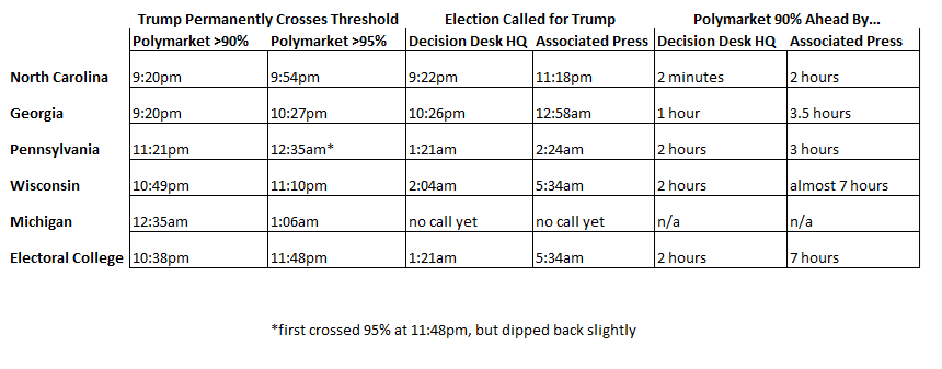
The Associated Press hadn’t even called Georgia, the second of the battleground states, by the time prediction markets were over 95% for the overall race! Decision Desk HQ, which is a very good source for calling races in real time, didn’t declare Trump the winner until 1:21am, when they called Pennsylvania (they also have a nice explanation of how they made the call). The AP didn’t declare Trump the winner until 5:34am, when they called Wisconsin.
Polymarket is the largest of the five markets in the Election Betting Odds average, and they are also a good source because they have markets for all of the battleground states (here’s the market for Michigan, which still hasn’t been called as of 11:30am on Wednesday by most news sources!). This table shows when the 90% and 95% thresholds were permanently crossed on Polymarket odds for each of the 5 early battleground states, in comparison with the DDHQ and the AP.
Notice that the 90% threshold consistently beats DDHQ by at least an hour (the one exception is North Carolina, where DDHQ called it very early — they are very good at what they do!). And the 90% threshold is consistently beating the AP by at least 3 hours.
None of this should be read as a criticism of the Associated Press. They should be cautious about predictions! But if you want to know things fast (or, before your bedtime in this case), prediction markets are clearly worth following.
How can prediction markets be so far ahead of media sources? Because there is a strong incentive to be right early: that’s how you make money in these markets! How exactly this is done is unclear, since the traders are all anonymous and we generally can’t ask them. But likely they are doing a similar analysis of counties results compared to the 2020 election, as DDHQ told us they did after the fact, just quicker (indeed, if you were watching news coverage, they were doing the same thing, just in an ad hoc way, and much more slowly).
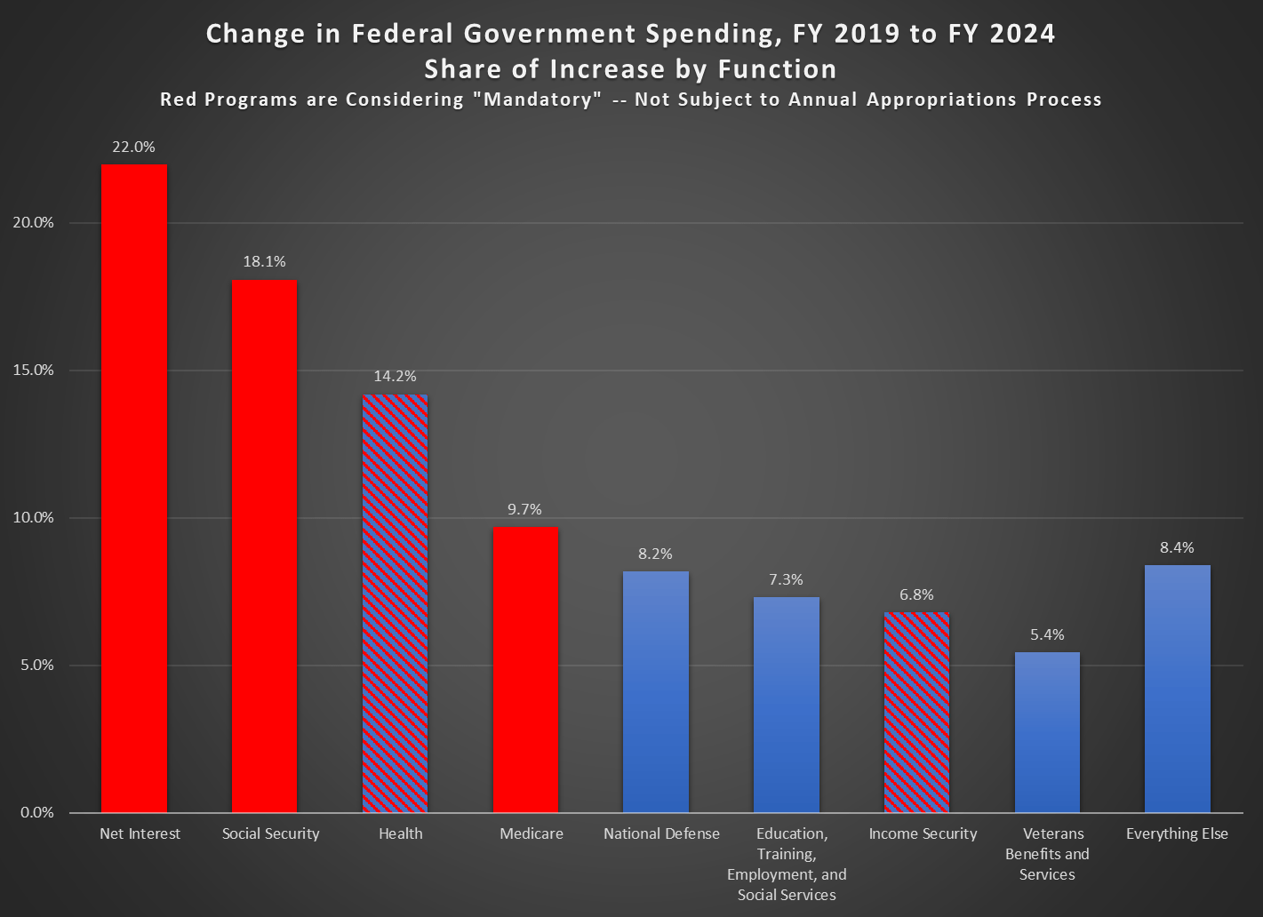
In Fiscal Year 2019, the US federal government spent $4.45 trillion dollars. In Fiscal Year 2024, spending was $6.75 trillion, or an increase of $2.3 trillion dollars. If you adjusted the 2019 number for inflation with the CPI, it would only be about $1 trillion more. Where did that additional $2.3 trillion go?
It will probably not surprise you that most of the increase in spending went to the largest categories of spending. Historically these have been health, Social Security, and defense, but now we must also include interest spending (roughly equal in size to defense and Medicaid in 2024). Indeed, with these areas of spending, 72 percent of the increase is accounted for. Add in the next three functions, and we’ve already accounted for over 90 percent of the increase.
Importantly, most of these categories are outside of the annual federal budget process, meaning that Congress does not need to approve new spending each year (Congress could change them, just as it could change any law, but it’s not part of the annual budgeting process). The “mandatory” categories, as they are called in federal law, are shaded red. I’ve striped with red and blue the health and income security functions, because some of this is subject to the annual budget process, but most of it is not. For example, Medicaid is not subject to the budget process (biggest part of the “health” function) and SNAP is not subject to the budget process (a big part of income security — it is set by the Farm Bill, usually on a five-year cycle).
So, when we talk about the $2 trillion increase since 2019, or the roughly $2 trillion cuts that would be needed to balance the budget, keep in mind that most of this is not subject to the annual budget process. It would require Congress to consider them specifically to enact cuts — though some big categories, such as Social Security, would be automatically cut under current law once their trust funds are exhausted (coming up on about a decade for the Social Security Old-Age Trust Fund).
As the presidential race finishes out the last two weeks, it’s clearly a close race. In the past I have recommended prediction markets, and right now these are giving Trump about 60% odds. There have been lately a few big bettors coming into the markets and primarily betting on Trump, so there has been speculation of manipulation, but even at 60-40 the race is pretty close to a toss-up.
Another tool many use to follow the election are prediction models, which usually incorporate polling data plus other information (such as economic conditions or even prediction markets themselves). One of the more well-known prediction models is from Nate Silver, who right now has the race pretty close to 50-50 (Trump is slightly ahead and has been rising recently).
But Silver’s model, and many like it, is likely very complicated and we don’t know what’s actually going into it (mostly polls, and he does tell us the relative importance of each, but the exact model is his trade secret). I think those models are useful and interesting to watch, but I actually prefer a much simpler model: Ray Fair’s President and House Vote-Share Models.
The model is simple and totally transparent. It uses just three variables, all of which come from the BEA GDP report, and focuses on economic growth and inflation (there are some dummy variables for things like incumbency advantage). Ray Fair even gives you a version of the model online, which you can play with yourself. Because the model uses data from the GDP report, we still have one more quarter of data (releasing next week), and there may be revisions to the data. So you can play with it (and one of the variables uses the 3 most recent quarters of growth), but mostly these numbers won’t change very much.
You may have heard that there are roughly 7 million men of working age that are not currently in the labor force — that is, not currently working or looking for work. The statistic has been produced in various ways using slightly different definitions by different researchers, but the most well-known is from Nicholas Eberstadt who uses the age cohort of 25-55 years old and gets about 7 million (in 2015). More recently and perhaps more prominently is from Senator JD Vance, and as with almost all issues he has tied this to illegal immigration.
The 7-million-men statistic is true enough, and if we limit it to native-born American men with native-born parents (I assume this is the group Vance is concerned about), we can get right at 7 million non-working men in 2024 by expanding the age cohort slightly to 20-55 year olds.
Why are these men not working? According to what they report in the CPS ASEC, here are the reasons broken down by 5-year age cohort (I drop 55-year-olds here to keep the group sizes equal, which shrinks the total to 6.7 million men):
By far the largest reason given for not working is illness or disability, which is 42% of the total for all of these men, the largest reason for every age group except 20-24 (who are mostly in school if they aren’t working), and it’s the majority for workers ages 30-54 (about 56% of them report illness or disability). Slightly less than 10% report “could not find work” as the reason they weren’t working, which is about 650,000 men in this age group (and are native-born with native-born parents). And over half of those reporting that they couldn’t find work are under age 30 — for those ages 30-54, it’s only about 7% of the total.
More men report that they are taking care of the home/family (800,000) than report not being able to find work (650,000). And a lot more report that they are currently in school — almost 1.5 million, and even though they are mostly concentrated among 20–24-year-olds, about one-third of them are 25 or older.
It’s certainly true that the number of working age men in the labor force has fallen over time. In 1968, 97% of men ages 20-54 had worked at some point in the past 12 months (that’s for all men regardless of nativity, which isn’t available back that far in the CPS ASEC). In 2024, that was down to about 87%. But even if we could wave a magical wand and cure all of the men that are ill or disabled, this would add less than 3 million people to the labor force, not nearly enough to make up for all of the immigrants that Vance and others are suggesting have taken the jobs of native-born Americans.
The Tax Cuts and Jobs Act was passed in late 2017 and went into effect in 2018. For academic research to analyze the effects, that’s still a very recent change, which can make analyzing the effects challenging. In this case the challenge is especially important because major portions of the Act will expire at the end of next year, and there will be a major political debate about renewing portions of it in 2025.
Despite these challenges, a recent Journal of Economic Perspectives article does an excellent job of summarizing what we know about the effects so far. In “Sweeping Changes and an Uncertain Legacy: The Tax Cuts and Jobs Act of 2017,” the authors Gale, Hoopes, and Pomerleau first point out some of the obvious effects:
TCJA increased budget deficits (i.e., it did not “pay for itself”)
Most Americans got a tax cut (around 80%), which explains #1 — and only about 5% of Americans saw a tax increase (~15% weren’t affected either way)
Following from #2, every quintile of income saw their after-tax income increase, though the benefits were heavily skewed towards the top of the distribution ($1,600 average increase, but $7,600 for the top quintile, and almost $200,000 for the top 0.1%)
Beyond these headline effects, it seems that most of the other effects were modest or difficult to estimate — especially given the economic disruptions of 2020 related to the pandemic.
For example, what about business investment? Through both lowering tax rates for corporations and changing some rules about deductions of expenses, we might have expected a boom in business investment (it was also stated goal of some proponents of the law). Many studies have tried to examine the potential impact, and the authors group these studies into three buckets: macro-simulations, comparisons of aggregate data, and using micro-data across industries (to better get at causation).
In general, the authors of this paper don’t find much convincing evidence that there was a boom in business investment. The investment share of GDP didn’t grow much compared to before the law, and other countries saw more growth in investment as a share of GDP. Could that be because GDP is larger, even though the share of investment hasn’t grown? Probably not, as GDP in the US is perhaps 1 percent larger than without the law — that’s not nothing, but it’s not a huge boom (and that’s not 1 percent per year higher growth, it’s just 1 percent).
Ultimately though, it is hard to say what the correct counterfactual would be for business investment, even with synthetic control analyses (the authors discuss a few synthetic control studies on pages 21-22, but they aren’t convinced).
What’s important about some of the main effects is that these were largely predictable, at least by economists. The authors point to a 2017 Clark Center poll of leading economists. Almost no economists thought GDP would be “substantially higher” from the tax changes, and economists were extremely certain that it would increase the level of federal debt (no one disagreed and only a few were uncertain).
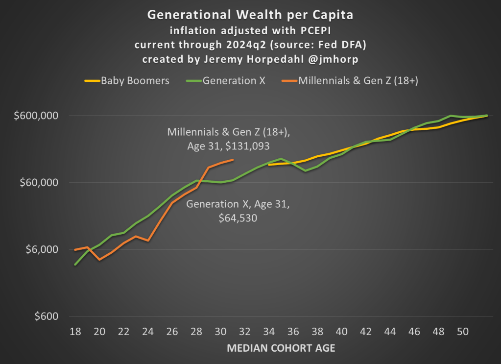
The Fed’s Distributional Financial Accounts have been updated with one more quarter of data, so here’s the latest update to the generational wealth chart:
Not much has changed from last quarter, and please do read my post from June 2024 for an explanation of why I’ve combined Millennials and Gen Z in this chart (and some data on inequality within generations).
Today BLS released the annual update to the Consumer Expenditure Survey, which is exactly what it sounds like: a survey of US consumers about what their spending. The sample size is “20,000 independent interview surveys and 11,000 independent diary surveys” so it’s a pretty big sample. And this is a really great data source, because versions of it go back over 100 years (though the current, annual survey with a lot of detail starts in 1984).
What does this new data tell us? One area that has received a lot of attention lately is food spending (including a lot of attention on this blog), especially the cost of groceries. According to the CPI food at home index, grocery prices are up almost 26 percent since the beginning over 2020. That’s a lot! But incomes are up too, so how does this affect spending patterns?
Here’s what food and grocery spending for middle-quintile households looks like:
Compared to the pre-pandemic 2019 levels, consumers are spending slightly less of their income on food (12.7% vs. 13.2%), though a slightly larger share of their income is being spent on groceries (8.1% vs. 7.8%). Those changes are noticeable, though this isn’t the radical realignment of spending patterns you might expect from such a big change in food prices. The reason is clear: while grocery prices are up about 26%, middle-quintile incomes are up a similar 25% since 2019. That’s falling behind a little bit, but incomes have roughly kept pace with rising food prices. And from 2022 to 2023, both of these percentages decreased slightly, by about 0.3 percentage points.