Visual Decision Trees in SAS Viya

As I said earlier, I used SAS Viya for Learners this semester. I assigned a final project for students. They had to use the data pre-loaded into the free version of SAS Viya, but otherwise had freedom to select their own variables and construct their own research question.

SAS Viya for Learners just recently opened for any users to make an account. This will allow you to learn SAS Viya functions (but not do your own actual work, because you cannot import new data). I’m using SAS Viya 3.4.

I like the way SAS Viya allows users to create a beautiful intuitive interactive decision tree model. This blog is to show you what that looks like. In traditional EconLit, regressions are more popular than decisions trees. Decision trees are a simple and useful machine learning technique. If you are trying to teach a first-timer about decision trees, then the visualization in SAS Viya for Learners can be helpful.

I’ll demonstrate using a decision tree for classification using built-in SAS data. One of the larger datasets available is USCENSUS1990. I’ll use it to demonstrate (and I do love the 90’s!). Consider the variable about the number of children a person has. This could be reasonably predicted by age and education level. [Footnote 1]

Here’s a chart showing the frequency of family sizes for adult women. (I used a Filter to only include people who are not coded zero in iFertil. See Footnote 1.)

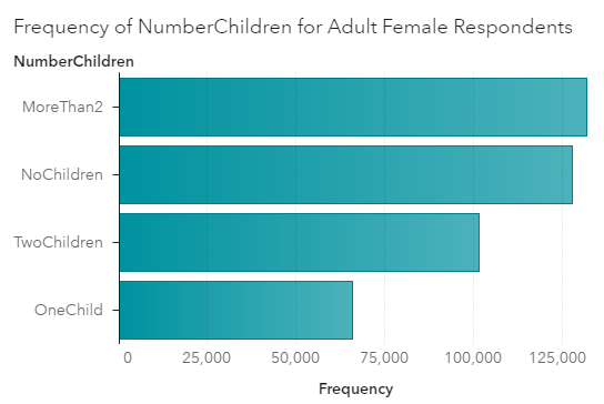
For adult women in 1990, the most frequent category is to have more than 2 children. This would include the parents of Boomers. Think about those big families you know from the Boomer generation.

For input variables to my model, I’ll use age categories and also education levels. I set the new categorical variable I created called NumberChildren as the Response variable for a decision tree model. [Footnote 2] Here’s a zoomed out picture of the visual model output.

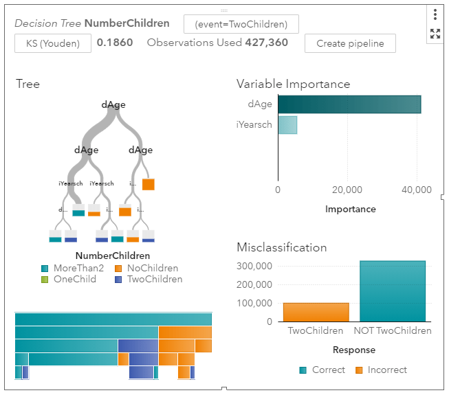
It’s immediately obvious that age is more informative than schooling. Women under the age of 30 are much more likely to have no children. The width of the grey tree branches makes it easy to see where the majority of the observations are.

I’ll zoom in on the left side of the tree where most of the people are.

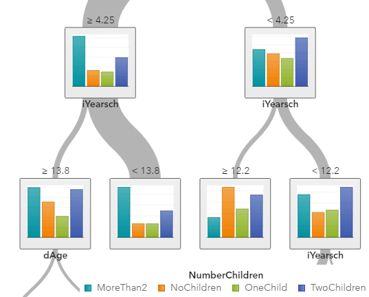
The “>= 4.25” means that women on the far left side are over the age of 40. Among older women, the norm is to have 2 or more children. If you are looking for the older women with exactly two children, you are more likely to find them among those who have an education score of larger than “13”, meaning that they have a Bachelor’s degree or higher.

My point is not to posit causal relationships among education and fertility. My point is how awesome these graphs are. You do have to learn some point-and-click functions within SAS Viya to make them. But I don’t know of any other software that can produce this.

SAS Viya also provides tables and statistics on each node, which is more like what I could get from free open source software a few years ago when I looked into decision tree packages.

[Footnote 1] If you want to replicate what I did, know that the USCENSUS1990 dataset in SAS Viya comes with no explanation. Google brought me to UCI, where I found what I needed in terms of technical documentation.

dAge, iFertil, iSex, iYearsch are the names of the variables you will find in SAS. To create my graphs and models, I converted some of them to categorical variables using the “+New Data Item -> Custom Category” functions. No programming is required.

iSex: 0 indicates Male, 1 indicates Female

dAge is coded as follows: 0 is babies; 1 is under 13, 2 is under 20 (but over 13), 3 is under 30, 4 is under 40, 5 is under 50, 6 is under 65,  7 is for 65 and over

iFertil is coded: 0 is either less than 15 years old or male, 1 is no child, 2 means they have one child (confusing…), 3 means they have two children, all the way up to a 13 which is the code for 12 or more children

iYearsch:  3-10 refers to primary school up to a 10 indicating graduating from high school, 11-13 refer to some college and associate degrees, 14 is a Bachelors degree, 15-17 refers to higher degrees

[Footnote 2]  I decided to set Maximum levels to 5 in Options. This keeps the tree smaller which looks better in the blog.

Alabama’s Covid Data Hero

Housekeeping: There was no post yesterday on Economist Writing Every Day. It was my day to write and family responsibilities just took up every minute. This might happen occasionally.

Last week I wrote about American Data Heroes. There are many that I don’t know of , but I wanted to share the work of tireless Frank McPhillips. For months he wrote a succinct post every single day within a private Facebook group for concerned citizens of Alabama. Recently he switched to Substack, meaning I can share it here.

McPhillips summarizes and explains the Covid data for the state of Alabama, where I live. This is data that is publicly available, but most people like myself don’t want to do as much work as he does to understand it. He also understands when the reporting might be wrong or late.

I’m going to quote from his most recent posts.

Dec 5:

The Chairman of the Madison County Commission was more blunt. “We’re now talking about alternative space for a morgue”, he said, adding that he has never faced such a decision in 25 years of public service.

According to HHS, 87.7% of Alabama’s ICU beds are occupied… Our State added 3,390 more COVID cases today (incl. 655 probables), raising the 7-day moving average to 3,228 cases per day, which is twice the daily average 3 weeks ago.

Dec 6:

With 473 more cases, Birmingham’s home county, Jefferson, has a 14-day positivity rate that tops 30% for the first time. 

Dec 7:

Now, brace yourself for the updated hospitalization data:  2,079 patients (105 reporting hospitals), a jump of 163 patients in a single day. The Huntsville Hospital system reported 378 COVID patients, an increase of 76 patients in one week. DCH Health system reported 138 patients, double the number just 9 days ago. And finally, Regional Medical Center (Anniston) announced new visitation restrictions due to the pandemic: “For end-of-life care, two visitors will be permitted to remain in the patient’s room, without leaving or re-entering the building and without substitution”.

I appreciate all his work. It’s obvious when he’s getting depressed or exhausted, but he’s decided to keep going (almost) every day. He keeps writing new prose on how this is the most deadly “war” of our time. He wants people to keep fighting back and not get complacent. See his Dec 7 post for more war comparisons.

McPhillips has helped a lot of people in his locality. He inspires me for Writing Every Day.

Teaching with SAS Viya for Learners: Last Report

I used SAS Viya for Learners to teach data analytics to undergraduate business students for one semester.

I’ll start with the benefits of SAS Viya: It’s free; It’s visually appealing and requires no coding; There are some SAS tutorial materials that teachers can use; The way decision tree results are displayed makes intuition easy for students who are new to data mining.

I made a post earlier in which I reported that it actually works. I still think that, but at the end of the semester I did have individual students experience errors and mysterious interruptions to service. It made me wonder if the server gets busy at the end of an academic semester.

SAS is known for making excellent products and charging high fees for them. Since SAS Viya is free, they aren’t going to be giving all the functionality with it. The free version does not let students import any data. There is a sandbox of data to learn with, which is more than enough to fill a semester. I didn’t even open most of the available data sets.

My students did their final projects by choosing one of the pre-loaded datasets and using that for analysis. As far as applying the principles I taught, this was fine. In one sense, it was easier than telling them to fend for themselves and find data on the world wide web.

The downside is that the software-specific skills students learn from free student SAS Viya can’t be used on a project for work or for a different class. Eventually, any useful work involves importing new data.

The decision to use SAS Viya for Learners instead of R should depend on what your students want to do next. Both products will allow them to learn concepts and common functions.

If you are going to use SAS Viya, I highly recommend using the tutorials made by SAS with screenshot-by-screenshot instructions. You can give the instructions to the students, so students aren’t coming to you with questions about every click they need to make.

I paired SAS Viya with a Business Intelligence Textbook. Also note that students had already taken a traditional Business Statistics course previously.

Meaningful Life and The Queen’s Gambit

If you liked Star Wars: A New Hope, and everyone does, then you will enjoy The Queen’s Gambit. It’s like The Mighty Ducks for chess, with a lot more drugs and female coming-of-age.

The main character, Beth, achieves success and seems happy at the end. There is some pretty on-the-nose dialogue about happiness in the show.

Other female characters represent other arenas of achievement. A high school friend, Margaret, has a baby. The baby curtailed Margaret’s freedom and locally-high-status social life. Marriage and children is portrayed as a drag. Margaret’s baby carriage basket contains only clinking bottles of alcohol, which I suppose is meant to indicate that Margaret is even more miserable than the face she presents to Beth when they meet in a store.

Motherhood is not interesting to Cleo, a model. However, even her own achievements in terms of physical beauty leave Cleo unsatisfied.  Cleo says, “Modeling and models are insipid.” Cleo’s life might seem exciting to those of us on the outside of the fashion world, but Cleo wishes she could win at chess and is openly envious of Beth.

A non-Beth female character who is pursuing a life of the mind is Jolene. Jolene is a paralegal who aspires to be a lawyer because she believes that will make her powerful and respected. Jolene envies Beth’s winner status. Jolene has an active role in giving Beth straight talk about drugs and also in loaning Beth money.

Patriotism and religion are despised by Beth and Jolene. They hate the Christians who run an orphanage where Beth and Jolene apparently received an excellent education. Jolene says she was happy when the director of the “Home for Girls” broke her hip and became crippled thereafter.

The irony of the Queen’s Gambit is that the show exalts intellectual ability and yet a social scientist is left with very little to think about. The star of the show is mesmerizingly beautiful. Viewers mostly just stare at her. Here is some honesty from Twitter

In the show, every typical source of meaning is knocked over like a king in checkmate. It all works out for Beth, because of her inimitable talent and adoring fans.

If you are actually thinking, you might wonder what those of us who are not chess champions should do with ourselves. We can’t all become lawyers, and not even all lawyers are happy.  

Some research shows that American women report wishing they had more children.

In the show, Beth is just as beautiful and fashionable as Cleo, but also wins at chess. Some of us mortals can’t have it all. If anyone is wondering, this is the haircut of the woman who might be the most comparable historical female to Beth.

Incidentally, a social science book has recently been written about the economic power wielded by the Cleo’s. You can listen to Ashley Mears on status and beauty here.

Saving the Chattanooga pedestrian bridge

If you aren’t from the Southeast, you might not know that Chattanooga is a fun city. I recommend it as a place to spend a day, with or without kids. The aquarium and Lookout Mountain attractions are fun.

The riverfront downtown area is booming (in a low height building restriction kind of way). Developers are building fancy new townhomes near the Walnut Street pedestrian bridge. The middle of the bridge offers lovely views of the river and mountains.

I noticed a sign saying that residents had “fought” to save the bridge from being demolished. Sometimes, it seems like a bad idea for residents to fight to save a historic structure. Insisting that a house built in 1890 must remain as it looked in 1890 can stifle the growth of a city. This instance seems different to me. The story of this beautiful bridge is an example of having a vision, clever city planning, and providing public goods through a mix of private and government funds.

The bridge was closed to motor vehicles in 1978. It’s not hard to imagine why a bridge built before automobiles could become unsafe for modern traffic by 1980.

I’ll quote the American Planning Association for the rest of the story:

The Tennessee Department of Transportation recommended demolishing the bridge, but Chattanooga’s then-Mayor Pat Rose suggested another idea: use it for pedestrians only. Rose and Ron Littlefield, AICP, the city’s Public Works Commissioner, kept the idea alive by hiring local architects … to develop a study for restoring the bridge.

Under the auspices of the not-for-profit organization Chattanooga Venture, a committee was formed to determine whether the bridge could and should be restored. Once it was determined a rehabilitated bridge could support pedestrian traffic, the local community rallied behind saving the bridge. Helping transfer the $2.5 million in federal funds originally designated for demolition to rehabilitation were former Chattanooga Mayor Gene Roberts, former U.S. Representative Marilyn Lloyd and former Sen. Al Gore. Local fundraising efforts secured the additional $2 million needed to restore the bridge.

The ice cream and coffee shop at the beginning of the bridge has a menu in English, Spanish, French, Chinese, and Russian. That’s pretty cosmopolitan for the American South. The lovely historic bridge really draws a crowd.

Thanksgiving Thoughts: Should I Be Cooking More Soup?

On Thanksgiving, we cook a bird. We eat meat. Then I make turkey soup by boiling the carcass and such. After making turkey soup, I have nagging thoughts, ‘That seemed quite economical. I have so much food now. I should make soup from scratch again soon.’

In fact, I will not make soup from scratch again until next Thanksgiving.*

Part of the reason for starting this blog is to explore my own cognitive dissonance. Is making soup from scratch economical and should I be doing it more? Right now I’m trying to work full-time and also produce food for a family 2 or 3 times every day. I want to minimize the time I spend cooking.

To start, naturally, I Googled “is soup the most economical food”.

Peasants and poor folk could get nutrients out of bones and root vegetables by making soup. Soup is economical in that sense, but I’m not talking about making broth.**

The Seattle Times has an article about chicken soup from scratch. In their introduction, they gave themselves away:

During America’s inexorable march toward processed food, chicken soup became something to buy, not something to make … and many cooks simply don’t know how satisfying a project it is.

So, they are admitting that it’s a lot of work. I do not want a “satisfying project”. I want food that is healthy and appealing; and I also want to avoid buying food from restaurants constantly.

Another article I arrived at was by Prudent Penny Pincher. The title is “60 CHEAP AND EASY FALL SOUPS”. Never trust all-caps. According to this site:

Name brand soups are about $2 per serving. Many soups can be made at home for under $1 per serving with less 30 minutes of prep/cook time.

The Prudent Penny Pincher page is little more than a list of links to other recipe sites. They wash their hands of the responsibility of telling you how to actually make soup. For research, I clicked their link for chicken soup.

What do you need to have on hand to make chicken soup in a mere 30 minute? Canned broth, for one. Making your own broth is not ‘quick and easy.’ You also need to have cooked chopped chicken and chopped vegetables.

If I have cooked chopped chicken and chopped vegetables, then I could just eat that! That’s a meal nearly finished. My guilt over not making soup from scratch regularly was completely resolved when I read that.

I had a similar revelation after I tried juicing for a week. Not counting the cost of a juicing machine, should you be juicing? If you have never once felt a pang of guilt for not juicing, then maybe you are male.

I borrowed a juicer once and I bought lots of fresh produce. I chopped fruits and veggies into chunks and juiced them. One cup of juice came out, which I drank while spending 20 minutes cleaning the yucky machine covered in pulp.

I realized that I should stop at the step where I have chopped fruits and veggies and just eat them. Fortunately, I hadn’t bought the juicer. Pity the women who juice regularly because of sunk cost bias after they bought the machine. Anyway, I concluded that juicing was expensive in terms of ingredients and time.

Through writing this, I realized that I make soup from scratch at Thanksgiving because it’s a holiday and I’m on vacation. It’s fun when you have free time.

Anyone who disagrees is welcome to comment. Am I discounting the future too much? Should I put work into making soup so that we can eat soup for days?

*There is an exception. I make delicious scallop corn chowder once a year when I am on vacation with extended family in the summer. So, that’s also when I’m not doing my professional work and an extended family member is taking care of my children.

**I do not participate in trendy “bone broth”. Do you think my son would be happy if I put bone broth on the table for dinner?

Happy Thanksgiving 2020

We wish you all a happy Thanksgiving day. I wondered if the academic literature could provide any insights to use on this day. If Google is a good guide, the formal economics literature has ignored the phenomenon of the Thanksgiving tradition.

“We Gather Together” from the Journal of Consumer Research in 1991 does, at the very least, exist. The first line of the abstract made me smile.

Thanksgiving Day is a collective ritual that celebrates material abundance enacted through feasting.

The third line of the abstract made me think.

So certain is material plenty for most U.S. citizens that this annual celebration is taken for granted by participants. 

Here is the official guidance from the CDC about 2020 holiday gatherings. They recommend against large gatherings and also provide tips for visiting people more safely: https://www.cdc.gov/coronavirus/2019-ncov/daily-life-coping/holidays.html

Data Heroes

How often do we hear about “data heroes”? As a data analytics teacher, this just thrills me. Bloomberg reported on the Data Heroes of Covid this week.

One of the terrible things about Covid-19 from the perspective of March 2020 was how little we knew. The disease could kill people. We knew the 34-year-old whistleblower doctor in China had died of it. We knew the disease had caused significant disruption in China and Italy. There were so many horror scenarios that seemed possible and so little data with which to make rational decisions.

The United States has government agencies tasked with collecting and sharing data on diseases. The CDC did not make a strong showing here (would they argue they need more funding?). I don’t know if “fortunately” is the right word here, but fortunately private citizens rose to the task.

The Covid Tracking Project gathers and releases data on what is actually happening with Covid and health outcomes. They clearly present the known facts and update everything as fast as possible. The scientific community and even the government relies on this data source.

Healthcare workers have correctly been saluted as heroes throughout the pandemic. The data heroes volunteering their time deserve credit, too. Lastly, I’d like to give credit to Tyler Cowen for working so hard to sift through research and deliver relevant data to the public.

New Research on Stress

This weekend I am participating (virtually, remotely) in the Southern Economics Association annual meeting where economists talk about research in progress. I saw Laura Razzolini present a new project yesterday.

She and coauthors surveyed people in the city of Birmingham, AL before and after a major disruption to commuter traffic. One thing they find is that people who have a longer commute due to a road closure are more stressed.

AS IT HAPPENED, Covid came along and started stressing people soon after. So they did another round of surveys and have great baseline data to compare Covid-stressed people with. I will not discuss her results on how stress affects decision making here. She has got some really neat results. The paper will be called something like “Uncovering the Effects of Covid-19 on Stress, Well-Being, and Economic Decision-Making”.

The magnitude of the increase in stress from a longer commute was something like 2.5 on a scale of 1-10. (Do not quote me – I do not have her paper to reference – this is from memory)

A comment from the audience was that it looked like the magnitude of the increase of stress from a longer commute and from Covid were similar. How could that be? Isn’t a deadly disease worse than traffic?

To explain this, I return to my favorite xkcd comic. When you hover your mouse over the comic, it says “Our brains have just one scale, and we resize our experiences to fit.” (Apropos of nothing, the fact that the comic artist picked Joe Biden as an example of someone who isn’t very important in 2011 seems pretty strange now.)

So, when traffic got worse people could only express “my life got worse”. And when Covid-19 caused shutdowns in the Spring of 2020, people again said “my life got worse”.

We only have one scale, and we resize our experience to fit. Thanksgiving is coming up. I would hope that we could take a day off from the 2020 year-of-doom talk and find something to be grateful for, because things actually can get worse. I also send out sincere condolences to all those who will be spending The Holidays apart from loved ones because of Covid-19.

Locals react to new condos

My local Facebook community group is a treasure trove of unfiltered NIMBY and YIMBY sentiments. I’m creating a “nimby” tag for blogs I write about them.

This FB post went up last week about some proposed townhouses that would be built on what is currently an ugly empty paved area of land on the side of a highway.

There were 40 “likes” and only 5 angry face reactions. Given some of the vitriol I have seen against building previously, I was surprised at how many people reacted positively. This can’t be treated as a scientific poll, but the fact that so many people bothered to say they approve was interesting to me.

Most of the land in our city is zoned for single-family detached houses, meaning most of it looks more like what people call suburbs.

Here’s what people said in the comments:

“I like the look. I also like Chaise’s term ‘vibrancy’.”

“ I wish they weren’t going to be so tall.” (Note that they are not tall. Most of this town used to be one-story 1-bathroom ranch houses, and there is a lot of nostalgia for those tiny houses.)

“Why are we junking up our downtown with condos.” (That one got 8 likes, and someone replied “because they sell.” Isn’t it astounding that someone would call this “junking”?)

“Almost Anything built in that location is a step in the right direction.” (8 likes)

Some people complained that this is not adding “affordable housing” to our city because these units are expensive. I might post more explicit debates over affordable housing in the future.  

Apparently, currently, there isn’t much opposition to developing an empty lot on the side of the highway with a few expensive units. There has been a WAR for the past year after a proposal to increase the density of housing closer to downtown. Anti-development types are angry that the city council is not doing more to block new building.

The prospective developer for this empty weed lot needs approval from the city council. Our city elections last month became rather contentious. It was, in part, a struggle between people who want to preserve curbs and doors just as they were in 1970 versus newer younger residents who are more pro-development.