Forget “The Christmas Prince” or “The Prince Christmas” or whatever is on Netflix. Why not spend your holiday refreshing this new vaccine dashboard?
Here’s the announcement:
Launching a new dashboard to track local news reports and state press releases on how many vaccine doses will be allocated to each state, since there seems to be no public federal effort. Browse each state's allocations and a map of doses per capita.https://t.co/CUP2W2ph7X
I personally know a few health care workers who got their shots (do not say “jab” to me) this past week. It’s all very exciting! Here at University of Alabama at Birmingham (UAB), the medical community has freezers, fortunately.
Jeremy and Doug have both talked about allocation this week. Economists get really jazzed about allocating scarce resources. It’s been frustrating to watch first tests and now vaccines not be available on a market. Excellent points are also made every week over at Marginal Revolution on how we are missing an opportunity to get the incentives right. Supply. Curves. Slope. Up. (Thousands. Dying. Every. Week.)
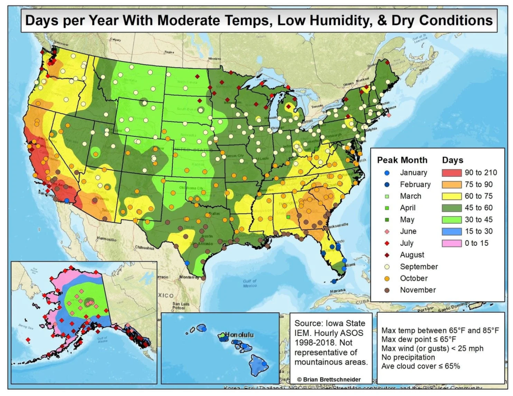
I’m relatively new to Birmingham, Alabama. I was nervous about moving to a place with famously long hot humid summers. My intuition since moving here is that there are many days throughout the year when, at some point in the day, the weather is nice for doing something outside with my kids.
Yesterday, Sunday, was very nice. To have such a nice warm sunny day in mid-December is strange to me. I grew up further north where Decembers are chilly. Here is a picture of a neighbor’s son enjoying the summer-like feel of this technically-winter day. This picture was taken at noon.
Although I am grateful for this particular day, I also think about the hot summer days when noon is a time to hide indoors with air conditioning. Is it nice here? How can that question be answered scientifically?
There is actually a great map of answers, available on several websites, credited to Brian Brettschneider, thanks to data from Iowa State.
This map confirmed my intuition. My old life in New Jersey was in the dark green zone, and my new life in Alabama is one level better, in terms of how many “nice” days you can expect in a year.
If you don’t have climate control, then you might be more worried about weather extremes. If you are lucky enough to have a regulated indoor environment, then a nice place to live is largely a question of how many days you get when it’s nice to “go out”.
This map accounts for “nice days”. I wonder if New Jersey would seem closer to Alabama if the measure changed to “nice daylight hours”. Yesterday was beautiful, but it was dark by 5pm. When I get time, I’m going to make a map of where in the lower 48 you can enjoy dinner outside after work many times per year (and why is it Southern California?).
As I said earlier, I used SAS Viya for Learners this semester. I assigned a final project for students. They had to use the data pre-loaded into the free version of SAS Viya, but otherwise had freedom to select their own variables and construct their own research question.
SAS Viya for Learners just recently opened for any users to make an account. This will allow you to learn SAS Viya functions (but not do your own actual work, because you cannot import new data). I’m using SAS Viya 3.4.
I like the way SAS Viya allows users to create a beautiful intuitive interactive decision tree model. This blog is to show you what that looks like. In traditional EconLit, regressions are more popular than decisions trees. Decision trees are a simple and useful machine learning technique. If you are trying to teach a first-timer about decision trees, then the visualization in SAS Viya for Learners can be helpful.
I’ll demonstrate using a decision tree for classification using built-in SAS data. One of the larger datasets available is USCENSUS1990. I’ll use it to demonstrate (and I do love the 90’s!). Consider the variable about the number of children a person has. This could be reasonably predicted by age and education level. [Footnote 1]
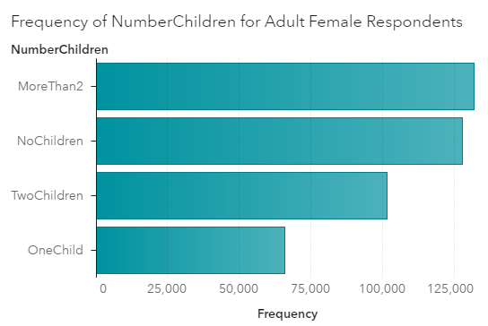
Here’s a chart showing the frequency of family sizes for adult women. (I used a Filter to only include people who are not coded zero in iFertil. See Footnote 1.)
For adult women in 1990, the most frequent category is to have more than 2 children. This would include the parents of Boomers. Think about those big families you know from the Boomer generation.
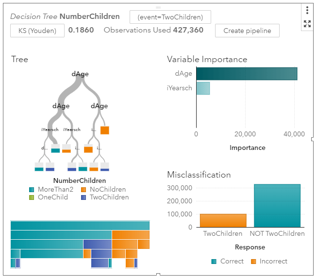
For input variables to my model, I’ll use age categories and also education levels. I set the new categorical variable I created called NumberChildren as the Response variable for a decision tree model. [Footnote 2] Here’s a zoomed out picture of the visual model output.
It’s immediately obvious that age is more informative than schooling. Women under the age of 30 are much more likely to have no children. The width of the grey tree branches makes it easy to see where the majority of the observations are.
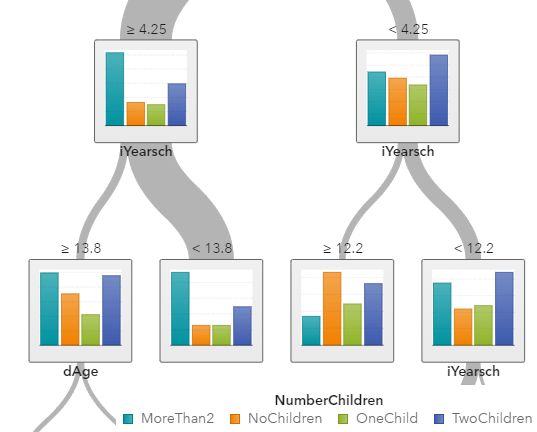
I’ll zoom in on the left side of the tree where most of the people are.
The “>= 4.25” means that women on the far left side are over the age of 40. Among older women, the norm is to have 2 or more children. If you are looking for the older women with exactly two children, you are more likely to find them among those who have an education score of larger than “13”, meaning that they have a Bachelor’s degree or higher.
My point is not to posit causal relationships among education and fertility. My point is how awesome these graphs are. You do have to learn some point-and-click functions within SAS Viya to make them. But I don’t know of any other software that can produce this.
SAS Viya also provides tables and statistics on each node, which is more like what I could get from free open source software a few years ago when I looked into decision tree packages.
[Footnote 1] If you want to replicate what I did, know that the USCENSUS1990 dataset in SAS Viya comes with no explanation. Google brought me to UCI, where I found what I needed in terms of technical documentation.
dAge, iFertil, iSex, iYearsch are the names of the variables you will find in SAS. To create my graphs and models, I converted some of them to categorical variables using the “+New Data Item -> Custom Category” functions. No programming is required.
iSex: 0 indicates Male, 1 indicates Female
dAge is coded as follows: 0 is babies; 1 is under 13, 2 is under 20 (but over 13), 3 is under 30, 4 is under 40, 5 is under 50, 6 is under 65, 7 is for 65 and over
iFertil is coded: 0 is either less than 15 years old or male, 1 is no child, 2 means they have one child (confusing…), 3 means they have two children, all the way up to a 13 which is the code for 12 or more children
iYearsch: 3-10 refers to primary school up to a 10 indicating graduating from high school, 11-13 refer to some college and associate degrees, 14 is a Bachelors degree, 15-17 refers to higher degrees
[Footnote 2] I decided to set Maximum levels to 5 in Options. This keeps the tree smaller which looks better in the blog.
Housekeeping: There was no post yesterday on Economist Writing Every Day. It was my day to write and family responsibilities just took up every minute. This might happen occasionally.
Last week I wrote about American Data Heroes. There are many that I don’t know of , but I wanted to share the work of tireless Frank McPhillips. For months he wrote a succinct post every single day within a private Facebook group for concerned citizens of Alabama. Recently he switched to Substack, meaning I can share it here.
McPhillips summarizes and explains the Covid data for the state of Alabama, where I live. This is data that is publicly available, but most people like myself don’t want to do as much work as he does to understand it. He also understands when the reporting might be wrong or late.
The Chairman of the Madison County Commission was more blunt. “We’re now talking about alternative space for a morgue”, he said, adding that he has never faced such a decision in 25 years of public service.
According to HHS, 87.7% of Alabama’s ICU beds are occupied… Our State added 3,390 more COVID cases today (incl. 655 probables), raising the 7-day moving average to 3,228 cases per day, which is twice the daily average 3 weeks ago.
Now, brace yourself for the updated hospitalization data: 2,079 patients (105 reporting hospitals), a jump of 163 patients in a single day. The Huntsville Hospital system reported 378 COVID patients, an increase of 76 patients in one week. DCH Health system reported 138 patients, double the number just 9 days ago. And finally, Regional Medical Center (Anniston) announced new visitation restrictions due to the pandemic: “For end-of-life care, two visitors will be permitted to remain in the patient’s room, without leaving or re-entering the building and without substitution”.
I appreciate all his work. It’s obvious when he’s getting depressed or exhausted, but he’s decided to keep going (almost) every day. He keeps writing new prose on how this is the most deadly “war” of our time. He wants people to keep fighting back and not get complacent. See his Dec 7 post for more war comparisons.
McPhillips has helped a lot of people in his locality. He inspires me for Writing Every Day.
I used SAS Viya for Learners to teach data analytics to undergraduate business students for one semester.
I’ll start with the benefits of SAS Viya: It’s free; It’s visually appealing and requires no coding; There are some SAS tutorial materials that teachers can use; The way decision tree results are displayed makes intuition easy for students who are new to data mining.
I made a post earlier in which I reported that it actually works. I still think that, but at the end of the semester I did have individual students experience errors and mysterious interruptions to service. It made me wonder if the server gets busy at the end of an academic semester.
SAS is known for making excellent products and charging high fees for them. Since SAS Viya is free, they aren’t going to be giving all the functionality with it. The free version does not let students import any data. There is a sandbox of data to learn with, which is more than enough to fill a semester. I didn’t even open most of the available data sets.
My students did their final projects by choosing one of the pre-loaded datasets and using that for analysis. As far as applying the principles I taught, this was fine. In one sense, it was easier than telling them to fend for themselves and find data on the world wide web.
The downside is that the software-specific skills students learn from free student SAS Viya can’t be used on a project for work or for a different class. Eventually, any useful work involves importing new data.
The decision to use SAS Viya for Learners instead of R should depend on what your students want to do next. Both products will allow them to learn concepts and common functions.
If you are going to use SAS Viya, I highly recommend using the tutorials made by SAS with screenshot-by-screenshot instructions. You can give the instructions to the students, so students aren’t coming to you with questions about every click they need to make.
I paired SAS Viya with a Business Intelligence Textbook. Also note that students had already taken a traditional Business Statistics course previously.
How often do we hear about “data heroes”? As a data analytics teacher, this just thrills me. Bloomberg reported on the Data Heroes of Covid this week.
One of the terrible things about Covid-19 from the perspective of March 2020 was how little we knew. The disease could kill people. We knew the 34-year-old whistleblower doctor in China had died of it. We knew the disease had caused significant disruption in China and Italy. There were so many horror scenarios that seemed possible and so little data with which to make rational decisions.
The United States has government agencies tasked with collecting and sharing data on diseases. The CDC did not make a strong showing here (would they argue they need more funding?). I don’t know if “fortunately” is the right word here, but fortunately private citizens rose to the task.
The Covid Tracking Project gathers and releases data on what is actually happening with Covid and health outcomes. They clearly present the known facts and update everything as fast as possible. The scientific community and even the government relies on this data source.
Healthcare workers have correctly been saluted as heroes throughout the pandemic. The data heroes volunteering their time deserve credit, too. Lastly, I’d like to give credit to Tyler Cowen for working so hard to sift through research and deliver relevant data to the public.
How have countries around the world fared so far in the COVID-19 pandemic? There are many ways to measure this, but two important measures are the number of deaths from the disease and economic growth.
Over the past few weeks, major economies have started releasing data for GDP in the third quarter of 2020, which gives us the opportunity to “check in” on how everyone is doing.
Here is one chart I created to try to visualize these two measures. For GDP, I calculated how much GDP was “lost” in 2020, compared with maintaining the level from the fourth quarter of 2019 (what we might call the pre-COVID times). For COVID deaths, I use officially coded deaths by each country through Nov. 15 (I know that’s not the end of Q3, but I think it’s better than using Sept. 30, as deaths have a fairly long lag from infections).
One major caution: don’t interpret this chart as one variable causing the other. It’s just a way to visualize the data (notice I didn’t try to fit a line). Also, neither measure is perfect. GDP is always imperfect, and may be especially so during these strange times. Officially coded COVID deaths aren’t perfect, though in most countries measures such as excess deaths indicate these probably understate the real death toll.
You can draw your own conclusions from this data, and also bear in mind that right now many countries in Europe and the US are seeing a major surge in deaths. We don’t know how bad it will be.
Here’s what I observe from the data. The countries that have performed the worst are the major European countries, with the very notable exception of Germany. I won’t attribute this all to policy; let’s call it a mix of policy and bad luck. Germany sits in a rough grouping with many Asian developed countries and Scandinavia (with the notable exception of Sweden, more on this later) among the countries that have weathered the crisis the best (relatively low death rates, though GDP performance varies a lot).
And then we have the United States. Oddly, the country we seem to fit closest with is… Sweden. Death rates similar to most of Western Europe, but GDP losses similar to Germany, Japan, Denmark, and even close to South Korea. (My groupings are a bit imperfect. For example, Japan and South Korea have had much lower death tolls than Germany or Denmark, but I think it is still useful.)
To many observers, this may seem strange. Sweden followed a mostly laissez-faire approach, while most US states imposed restrictions on movement and business that mirrored Western Europe. Some in the US have advocated that the US copy the approach of Sweden, even though Sweden seems to be moving away from that approach in their second wave.
Counterfactuals are hard in the social sciences. They are even harder during a public health crisis. It’s really hard to say what would have happened if the US followed the approach of Sweden, or if Sweden followed the approach of Taiwan. So I’m trying hard not to reach any firm conclusions. To me, it seems safe to say that in the US, public policy has been largely bad and ineffective (fairly harsh restrictions that didn’t do much good in the end), yet the US has (so far) fared better than much of Europe.
All of this could change. But let’s be cautious about declaring victory or defeat at this point.
Coda on Sweden Deaths
Are the officially coded COVID deaths in Sweden an accurate count? One thing we can look to is excess deaths, such as those reported by the Human Mortality Database. What we see is that Swedish COVID deaths do almost perfectly match the excess deaths (the excess over historical averages): around 6,000 deaths more than expected.
Some have suggested that the high COVID deaths for Sweden are overstated because Sweden had lower than normal deaths in recent years, particularly 2019. This has become known as the “dry tinder” theory, for example as stated in a working paper by Klein, Book, and Bjornskov (disclosure: Dan Klein was one of my professors in grad school, and is also the editor of the excellent Econ Journal Watch, where I have been published twice).
But even the Klein et al. paper only claims that “dry tinder” factor can account for 25-50% of the deaths (I have casually looked at the data, and these seems about right to me). Thus, perhaps in the chart above, we can move Sweden down a bit, bringing them closer to the Germany-Asia-Scandinavia group. Still, even with this correction, Sweden has 2.5x the death rate of Denmark (rather than 5x) and 5x the death rate of Finland (rather than 10x, as with officially coded deaths).
As with all things right now, we should reserve judgement until the pandemic is over (Sweden’s second wave looks like it could be pretty bad). The “dry tinder” factor (a term I personally dislike) is worth considering, as we all try to better understand the data on how countries have performed in this crisis.
Throughout this semester, I have asked some students in my data analytics class to think about how data is relevant to current events. Undergraduate Jack Brittle wrote this article about data and election news.
Sometimes public attention moves on quickly after an election is over. Today, on November 15th, voting and messaging is still being debated. It was a month ago on October 14th that Twitter locked up the digital platform of the New York Post, a right-leaning newspaper.
This was an important development in the debate about whether tech companies have the authority to censor posts written by users.
Twitter initially said that linking to the Post stories violated the social-media company’s policies against posting material that contains personal information and is obtained via hacking. As the story broke, Twitter began preventing users from tweeting the stories. Twitter locked the Post’s account, saying it would be unlocked only after it deleted earlier tweets that linked to the stories.” (Wall Street Journal). Twitter suspended a major American newspaper. This move is viewed by some as a direct threat to the freedom of the press. Twitter and other major tech companies came under fire for their ability to manipulate and control media. After major pressure and backlash, Twitter released the account back to the New York Post. “Twitter on Friday unlocked the New York Post’s Twitter account, ending a stalemate between the social-media company and the newspaper stemming from the latter’s publication of stories it said were based on documents obtained from the laptop of Hunter Biden. “We’re baaaaaaack,” the Post’s Twitter account tweeted on a Friday afternoon, just minutes after Twitter said that it was reversing its policies in a way that would allow the Post to be reinstated.” (Wall Street Journal).
It seems that Twitter backed down in that instance. The fundamental question has not been resolved. Should Big Tech censor material on their platforms?
First, there is a school of thought that believes Twitter has the right to control the flow of information on its platforms. Companies like Twitter are not breaking any laws by doing this. Do they not have the right to support and defend certain social causes? By only allowing users to see certain opinions and facts, Twitter can choose to support different policies. It’s not laws but our expectation of media that leads to controversy. Twitter should allow a free flow of information in order to create an open marketplace of ideas.
However, a new difficulty arises because of “fake news”. Now more than ever, media can be manipulated to create certain storylines by nefarious users. According to studies, “fake news” spreads nearly six times faster across digital platforms that real news stories. This leaves Twitter between a rock and a hard place. Do they control information spreading on their site and risk censoring the wrong material, like some consider to be the case of the New York Post article? Or do they take a hands-off approach, allowing all stories to have a place in the arena?
These giant tech firms have unprecedented power. Not only are they gaining massive amounts of data about people and firms, they also have the unique ability to shape their users’ outlook on a variety of ideas and events. These data giants are struggling with how to manage these capabilities and will no doubt continue to update and reform policy.
A example of evolving policies is the treatment of President Trump since November 3rd. Since election day, Donald Trump, has tweeted challenges to official vote counts. Trump has not only claimed voter fraud but also claimed he has won states where vote counts favor Joe Biden. Twitter has since developed a flagging system that adds a note on any tweet that Twitter deems misleading. Instead of censoring the president by locking the entire account, there are flags warning about disinformation. This system seems to be an improvement over previous ways Twitter has handled misleading information. It allows users to see all information but also be warned about potentially questionable information. I expect these policies to continue to evolve as tech companies grapple with the difficult task of managing the flow of information.
Why can computers beat humans at chess but not predict election outcomes with great precision? Experts in 2020 mostly forecasted that Biden would win by a large enough margin to avoid the kind of quibbling and recounts we are now seeing. I don’t write this as a criticism of the high-profile clever Nate Silver, or any other forecaster. I’m thinking through it as a data scientist.
First, consider a successful application of modern data mining. How did AlphaZero “learn” to play chess? It generated millions of hypothetical games and decided to use the strategies that looked successful ex-post. AlphaZero has excellent data and lots of it.
If we think about actual election outcomes, there aren’t enough observations to expect accurate forecasts. If each presidential election is one observation, then there have only been about 50 since the founding hundreds of years ago. No data scientist would want to work with 50 data points.
You can’t say “in the years when ‘defund the police!’ was associated with Democrats, the GOP presidential candidate gained among married women”. There has only ever been one presidential election when that occurred. Judging by what I have been observing of the DNC post-mortem on Twitter in the past week, that might not happen again. See this tweet for example:
Rep. James Clyburn on @MeetThePress: “Defund the police” cost Democrats in House and Senate races.
I know very little about political analysis. Only from what I know about data science, I would imagine that computers will get better at predicting the outcomes of races for the House of Representatives.
House representatives serve 2-year terms. There are over 400 House elections every 2 years.
Think about this over one decade of American history. There are actually more than 400 representatives in the house, but let’s imagine a “Shelter” of Reps with 400 members for ease of calculation.
In one decade, there are usually two presidential elections. That means we get 2 observations to learn from. In the same decade, there would be 400×5 “Shelter” elections. That yields 2,000 observations, which is considered respectable for the application of data mining methods.
One application of such a forecasting machine would be to determine which slogans are the most likely to lead to success.
I’m going to teach text mining in the upcoming week. Most of my students have never heard of it. We have spent the semester talking about what do to with structured data, which includes some of the basic concepts from traditional statistics.
I often ask them to think about what computers can do. We talk about why “data analytics” classes are happening in 2020 and did not happen in 1990. Hardware and software innovations have expanded the boundaries of what computers can do for us.
The gritty details of how text mining works can make for a boring lecture, so I’m going to use the following narrative to get intellectually curious students on board. It always helps to start with fighting Nazis. Alan Turing helps defeat the Nazis by using a proto-computer to crack codes. The same brilliant Turing was smart enough to realize that computer could play chess someday (acknowledgement for me knowing that trivia: Average is Over). Turing didn’t live to see computers beat humans in chess but, in a sense, it didn’t take very long. Only about 50 years later, computers beat humans at chess.
Maybe chess is exactly the kind of thing that is hard for humans and easy for computers. When we discuss basic data mining, I tell students to think about how computers can do simple calculations much faster than humans can. It’s their comparative advantage.
Could Turing ever have imagined that a human seeking customer service from a bank could chat with a bot? Maybe text mining is a big advance over chess, but it only took about one decade longer for a computer (developed by IBM) to beat a human in Jeopardy. Winning Jeopardy requires the computer to get meaning from a sentence of words. Computers have already moved way beyond playing a game show to natural language processing.
How computers make sense of words starts with following simple rules, just as computer do to perform data mining on a spreadsheet of numbers. As I explain those rules to my students this week, I’m hoping that starting off the lecture with fighting Nazis will help them persevere through the algorithms.