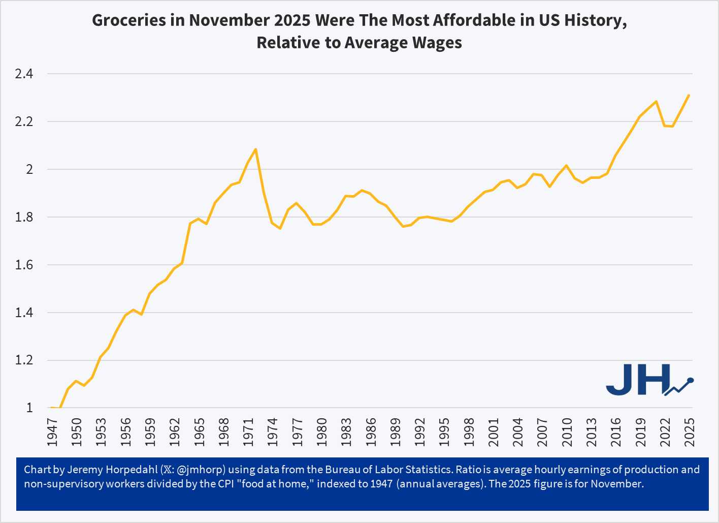
The chart shows a simple measure of relative grocery affordability. Starting with the levels of wages and grocery prices in 1947, if in any year wages increase more than prices, the line goes up (it can also go down, as it does in some years). Cumulatively, you can see that today groceries are over twice as affordable as in 1947.
You could reasonably complain that there hasn’t been much progress since the early 1970s. Fair enough. But there has been significant progress since the 1990s. Even if the progress is less than we would have liked, groceries are still, right now, the most affordable they have ever been in the US relative to average wages. And since US consumers spend by far the lowest share of their income on groceries in the world, we might be tempted to say that right now groceries in the US are the most affordable they have ever been in human history. Period.
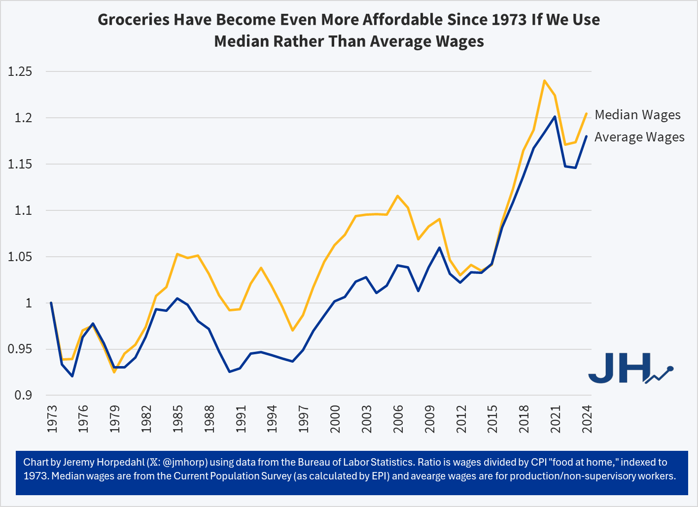
This is not just a trick of using average wages, which can be distorted by outliers. First, we are already using an average wage series that strips out the highest earners (supervisors, managers, etc.). But we can show this more clearly by using a median-wage series, such as the CPS series (calculated by EPI) starting in 1973. Notice this affordability trend gets slightly better if we use median wages from 1973-2024:
It’s true that using the median wage series, 2020 and 2021 look more affordable than 2024 — but that’s because the compositional effects of the job losses in the pandemic really throw off the median wage. But the growth rate since 1973 is slightly better for median rather than average wages — it’s not a trick! And when we have the median wage data for 2025, it will also likely be the most affordable measure on this chart.
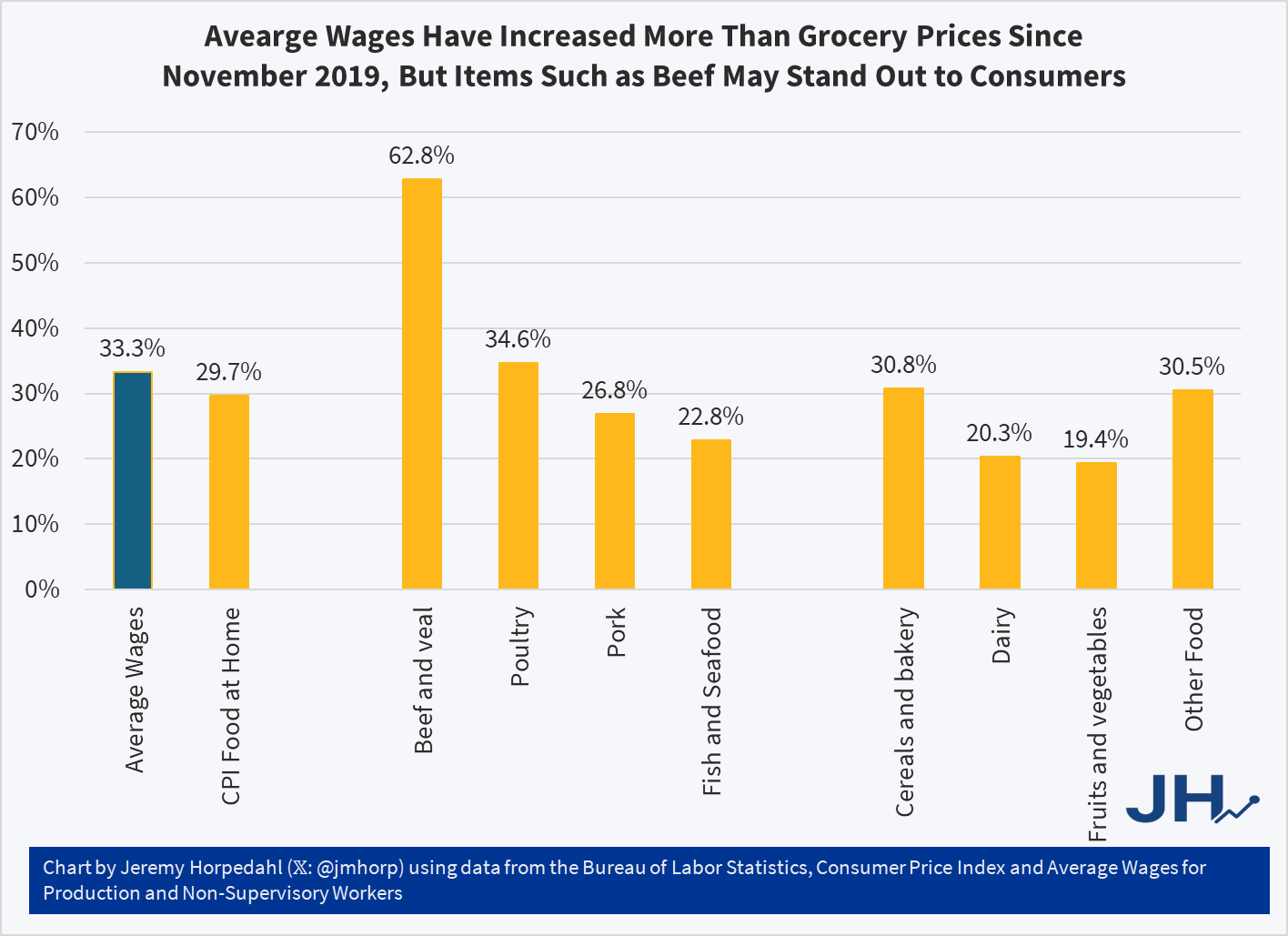
So why are people so pessimistic if wages have been rising faster than grocery prices? One theory: availability bias. People focus on the prices where they notice goods becoming less affordable, but ignore the ones that are more affordable. Many consumers could probably tell you that a dozen eggs increased from $1.40 per dozen in November 2019 to $2.86 today, and at times was much higher, topping $6 briefly in early 2025. Likewise they could tell you that a pound of ground beef soared from $3.81 in late 2019 to $6.54 today. Both of these prices increases vastly exceed wage increases over the same timeframe (about 33 percent for wages), but most consumers probably couldn’t tell you that these were outliers and most major categories of food increased by less than average wages since late 2019:
While the “beef and veal” category has clearly outpaced wages — by almost twice as much! — nearly every other category of meat and as well as other food product prices increased less than wages. Poultry is the one exception, though here it is almost equal to wage increases. But if we are talking about pork or fish, or the non-meat categories, most food is more affordable than in late 2019 relative to wages. Consumers won’t as easily identify these more affordable categories, and they probably have no idea how much average wages increased.
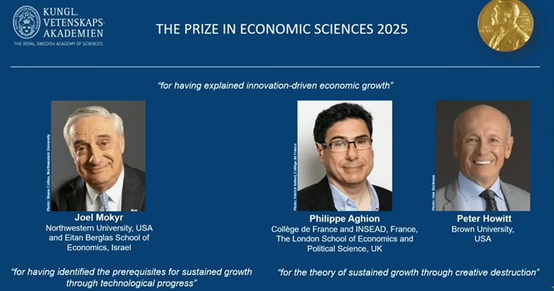
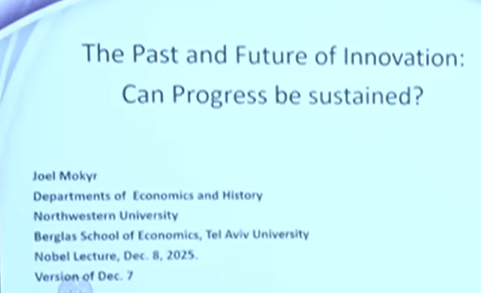
Fellow EWED blogger Jeremy Horpedahl generally gives good advice. Therefore, when the other week he provided a link and recommended that we watch Joel Mokyr’s 2025 Nobel lecture*, I did so.
There were three speakers on that linked YouTube, who were the economics laureates for this year. They received the prize for their work on innovation-driven economic growth. The whole video is nearly two hours long, which is longer than most folks want to listen to, unless they are on a long car trip. Joel’s talk was the first, and it was truly engaging.
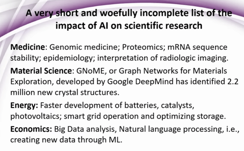
For time-pressed readers here, I have snipped many of the speakers’ slides, and pasted them below, with minimal commentary.
First, here are the great men themselves:
Talk # 1. Joel Mokyr: Can Progress in Innovation Be Sustained?
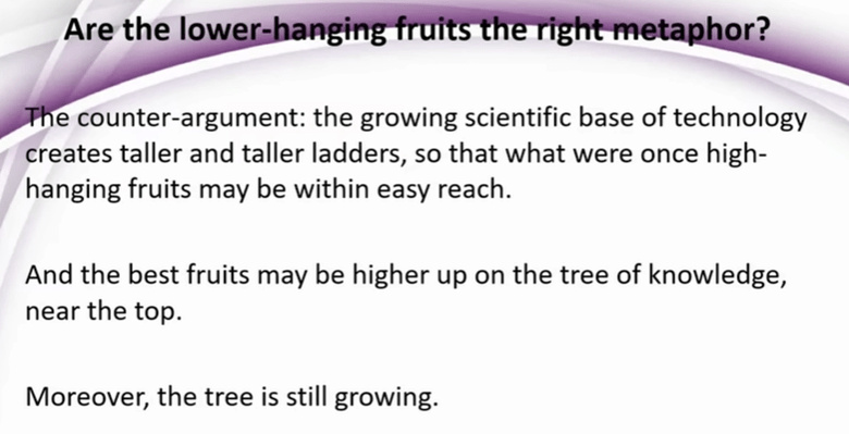
And indeed, one can find pieces of evidence that point in this direction, such as the slower pace of pharm discoveries.
But Joel is optimistic:
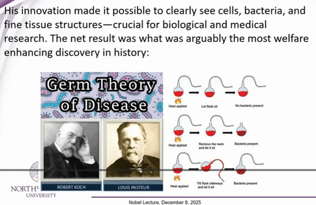
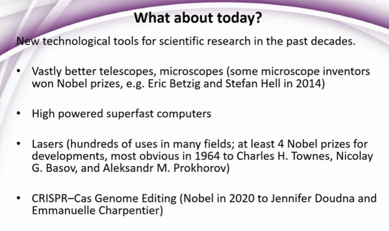
Joel provides various examples of advances in theoretical knowledge and in practical technology (especially in making instruments) feeding each other. E.g., nineteenth century advances in high resolution microscopy led to study of micro-organisms which led to germ theory of disease, which was one of the all-time key discoveries that helped mankind:
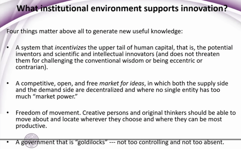
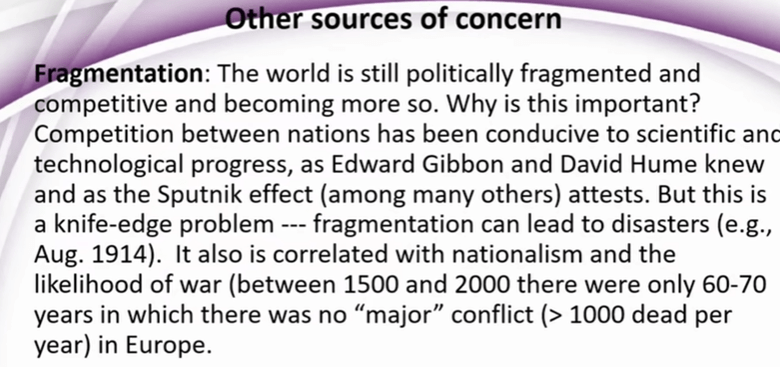
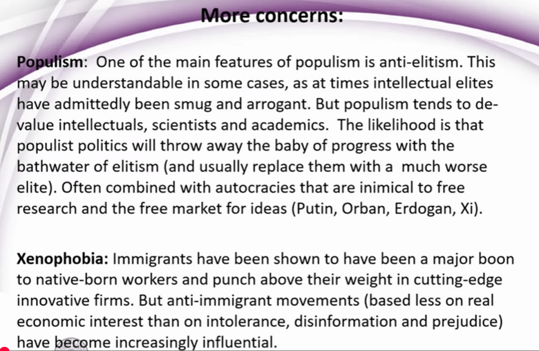
So, on the technical and intellectual side, Joel feels that the drivers are still in place for continued strong progress. What may block progress are unhelpful human attitudes and fragmentation, including outright wars.
Or, as Friedrich Schiller wrote, “Against stupidity, the gods themselves contend in vain”.
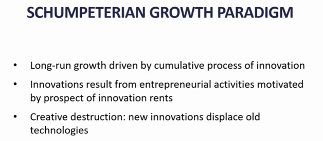
Talk # 2: Philippe Aghion, The Economics of Creative Destruction
He commented that on the personal level, what seems to be a failure in your life can prove to be “a revival, your savior” (English is not his first language; but the point is a good one).
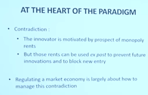
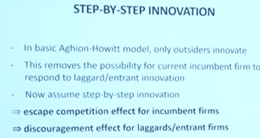
Much of his talk discussed some inherent contradictions in the innovation process, especially how once a new firm achieves dominance through innovation, it tends to block out newer entrants:
KEY SLIDE:
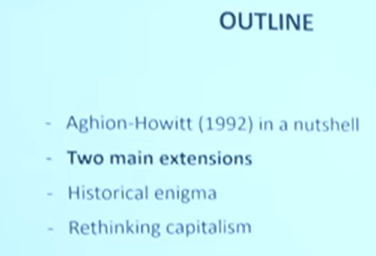
Outline of the rest of his talk:
[ There were more charts on fine points of his competition/innovation model(s)]
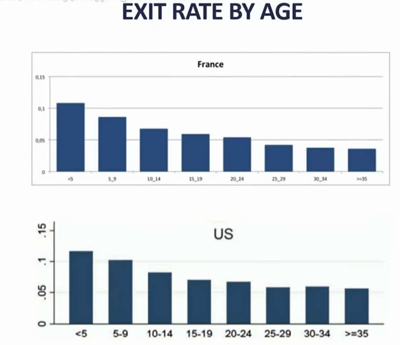
Slide on companies’ failure rate, grouped by age of the firm:
His comment..if you are a young , small firm, it only takes one act of (competitors’) creative destruction to oust you, whereas for older, larger, more diverse firms, it might take two or three creative destructions to wipe you out.
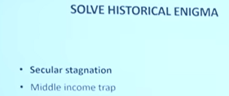
He then uses some of these concepts to address “Historical enigmas”
First, secular stagnation:
[My comment: Total factor productivity (TFP) growth rate in economics measures the portion of output growth not explained by increases in traditional inputs like labor and capital. It is often considered the primary contributor to GDP growth, reflecting gains from technological progress, efficiency improvements, and other factors that enhance production]
I think this chart was for the US. Productivity, which grew fast in the 1996-2005 timeframe, then slowed back down.
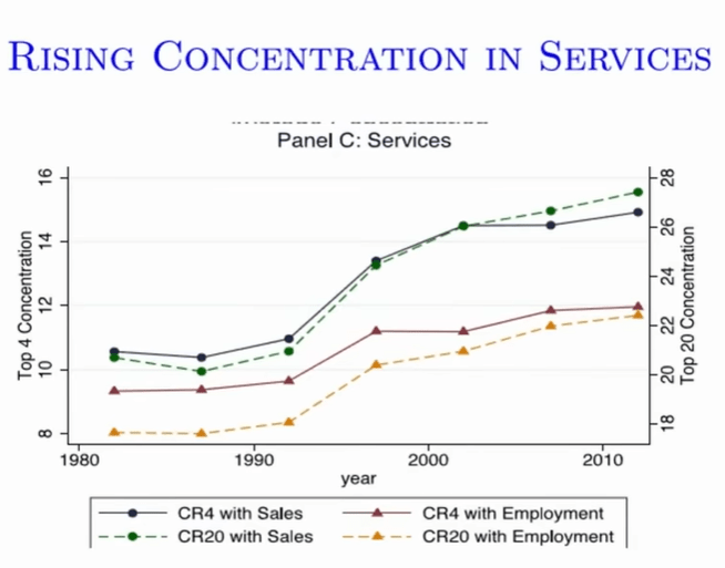
In the time of growth soaring, there was increased concentration in services. The boost in ~1993-2003 was a composition effect, as big techs like Microsoft, Amazon, bought out small firms, and grew the most. But then this discouraged new entries.
Gap is increasing between leaders and laggers, likely due to quasi-monopoly of big tech firms.
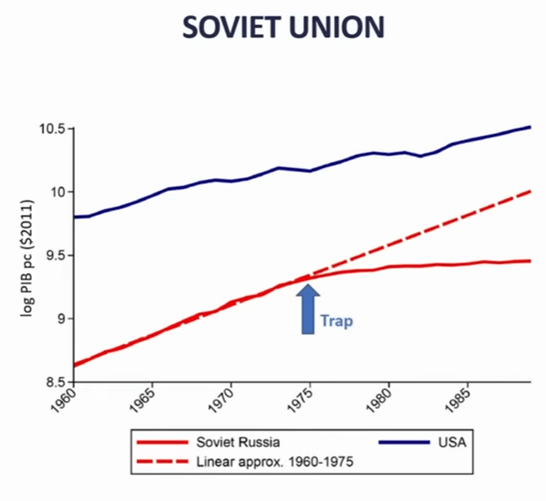
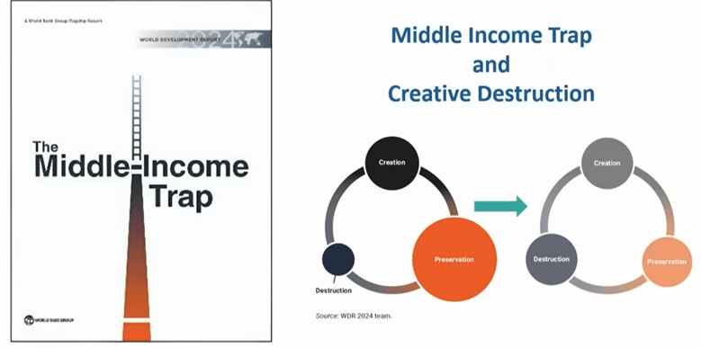
Another historical enigma – why do some countries stop growing? “Middle Income Trap”
s
Made a case for Korea, Japan growing fastest when they were catching up with Western technology, then slowed down.
China for past 30 years has been growing by catching up, absorbing outside technology. But the policies for pioneering new technologies are different than those for catching up.
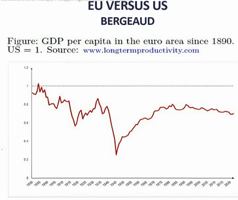
Europe: During WWII lot of capital was destroyed, but they quickly started to catch up with US (Europe had good education, and Marshall plan rebuilt capital)…but then stagnated, because not as strong in innovation.
Europeans are doing mid-tech incremental innovation, whereas US is doing high tech breakthrough.
[my comment: I don’t know if innovation is the whole story, it is tough to compete with a large, unified nation sitting on so much premium farmland and oil fields]
Patents:
Red =US, blue=China, yellow=Japan, green=Europe. His point: Europe is lagging.
Europe needs true unified market, policies to foster innovation (and creative destruction, rather than preservation).
Finally: Rethinking Capitalism
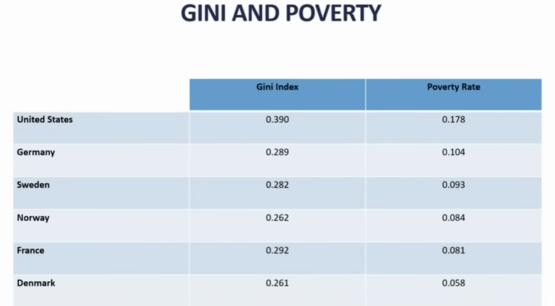
GINI index is a measure of inequality.
Death of unskilled middle-aged men in U.S.…due in part to distress over of losing good jobs [I’m not sure that is the whole story]. Key point of two slides above is that US has more innovation, but some bad social outcomes.
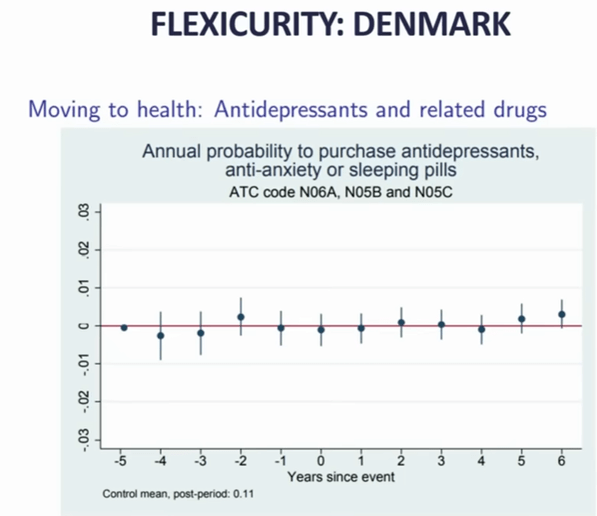
So, you’d like to have best of both…flexibility (like US) AND inclusivity (like Europe).
Example: with Danish welfare policies, there is little stress if you lose your job (slide above).
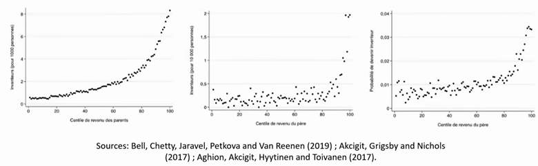
Found that innovation (in Europe? Finland?) correlated with parents’ income and education level:
…but that is considered suboptimal, since you want every young person, no matter parents’ status, to have the chance to contribute to innovation. Pointed to reforms of education in Finland, that gave universal access to good education..claimed positive effects on innovation.
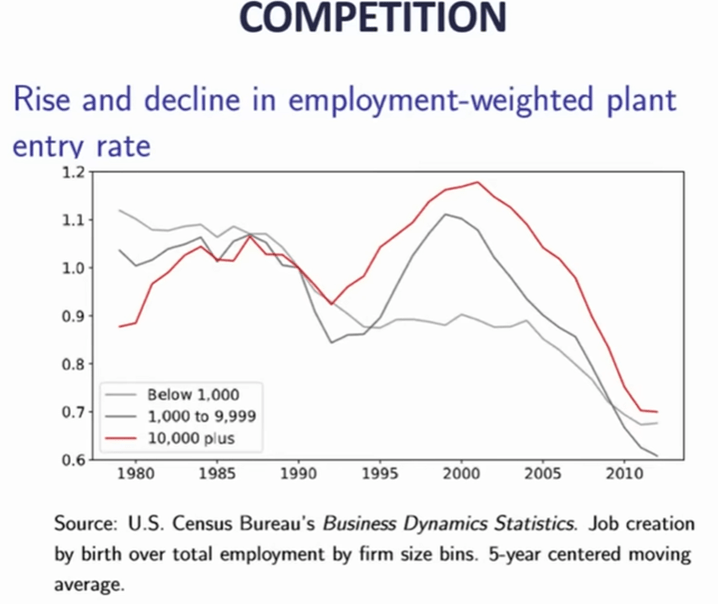
Final subtopic: competition. Again, the mega tech firms discourage competition. It used to be that small firms were the main engine of job growth, now not so much:
Makes the case that entrant competition enhances social mobility.
The third speaker, Peter Howitt showed only a very few slides, all of which were pretty unengaging, such as:
So, I don’t have much to show from him. He has been a close collaborator of Philippe Aghion, and he seemed to be saying similar things. I can report that he is basically optimistic about the future.
* The economics prize is not a classic “Nobel prize” like the ones established by the Swedish dynamite inventor himself, but was established in 1968 by the Swedish national bank “In Memory of Alfred Nobel.”
Here is an AI summary of the 2025 economics prize:
The 2025 Sveriges Riksbank Prize in Economic Sciences in Memory of Alfred Nobel was awarded to Joel Mokyr, Philippe Aghion, and Peter Howitt for their groundbreaking work on innovation-driven economic growth. Mokyr received half of the prize for identifying the prerequisites for sustained growth through technological progress, emphasizing the importance of “useful knowledge,” mechanical competence, and institutions conducive to innovation. The other half was jointly awarded to Aghion and Howitt for developing a mathematical model of sustained growth through “creative destruction,” a concept that explains how new technologies and products replace older ones, driving economic advancement. Their research highlights that economic growth is not guaranteed and requires supportive policies, open markets, and mechanisms to manage the disruptive effects of innovation, such as job displacement and firm failures. The award comes at a critical time, as concerns grow over threats to scientific research funding and the potential for de-globalization to hinder innovation.
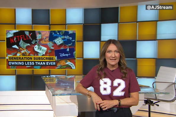
Our episode began with some clips from TikTok of young people expressing anger over feeling trapped in “the subscription economy.” Watch our show at the link above to see.
The subscription economy is a business model shift where consumers pay recurring fees for ongoing access to products/services (like Netflix, SaaS) instead of one-time purchases, focusing on “access over ownership” for predictable revenue. Gen Z feels upset that they are getting charged for subscriptions, some of which they simply forgot to cancel. They have nostalgia for the days of toting a zipper case of CDs onto the yellow school bus in 2004.
My commentary starts around minute 5:30 in the show. The first thing I point out is that, by and large, we have more entertainment available to us at a lower price than people did in that bygone era of mostly cable TV and physical discs. (This is a bit like the point I made on The Stream in March 2025 about how fast fashion represents more stuff for consumers at lower prices, which is good.)
In the episode, we discussed how people can still buy CDs today. Sanya Dosani made the point that, “there’s a place for buying and a place for renting.” Everyone should be aware of how cheap DVDs, books, and CDs are at rummage sales in the United States in 2025. You can get a music album for 50 cents. Some youths have (re)discovered that DVD players are cheaper than a year of streaming subscription costs.
Around minute 17, I got to bring up my research about intellectual property, digital goods, and morality.
We find that people do not feel bad about taking the digital goods, or “pirating.” We even find that, in a controlled experiment with no previous context for what we might call intellectual property protection, the creators of these digital goods do not call such taking stealing either. It seems to be understood that folks will take and share if they can.
The proposed reason for artificially restricting the taking and resale of intellectual property is that creators need a way to profit from providing a public good. (Intellectual property rights in the U.S. Constitution are covered by Article I, Section 8.)
I said in the interview, “If you were able to just give a song to all of your friends, you probably would, and then that artist might not be able to make songs the next year.”
Thus, I suggested, “The subscription economy is a reaction to the fact that most people don’t view it as wrong to take things they can take and not necessarily pay for them. Companies had to find a new way to be able to make money and stay in business.”
I’ll clarify that I have not done quantitative research to prove that subscription models emerged causally because of pirating. I’m speculating. Another side to this is that people simply want to stream and companies are providing exactly what people want (despite the complaints circulating on TikTok). People reminisce about the “golden days” of early Netflix, but most people forget that the company was losing money at that time. Media production and distribution companies have to make money to stay in business.
At the end, the host asked me, “… what does it mean for who we are as humans, more of an existential question, where we are going with this age?”
That’s a deeper question than you might expect for a conversation about CD-ROMs. However, people do care about having some tangible form of art about them. Think of the ancients buried alongside beads and dolls. Netflix will never be the only thing that people want. As for Gen Z being upset about convenient Spotify, “what does it mean for who we are” has got to be part of it.
As an aside, furthermore, I’ll say here on the blog that Gen Z is by some measures the most entertained generation in history. For spiritual, not financial, reasons, I encourage them to cancel their subscriptions, take out their AirPods, and feel the silence and dread for a week.
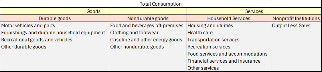
In aggregate, consumer spending on different broad categories of goods is relatively stable. The year 2019 feels like forever ago – and it was more than half a decade ago. But since then we’ve been hit by a pandemic and an AI shock and a trade war, and tariffs, and… plenty. We live in different times. Except, broadly, consumers are spending their money much as they did six years ago. Let’s compare some data from the 2nd quarter of 2019 and 2025.
First the Spending
Consumption spending is categorized in the below table.
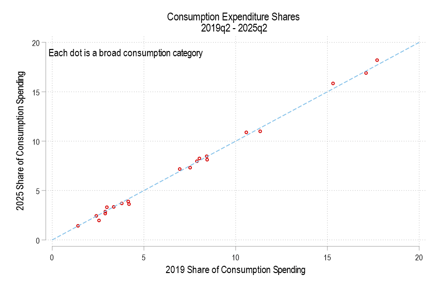
If total consumption spending (not inflation-adjusted) is 100%, then how has the allocation of spending changed? Below is a graph comparing each consumption component’s 2019 share versus 2025. The dotted line denotes an identical share. I haven’t labeled the categories because, suffice it to say, that spending shares are little different. None is more than one percentage point different.
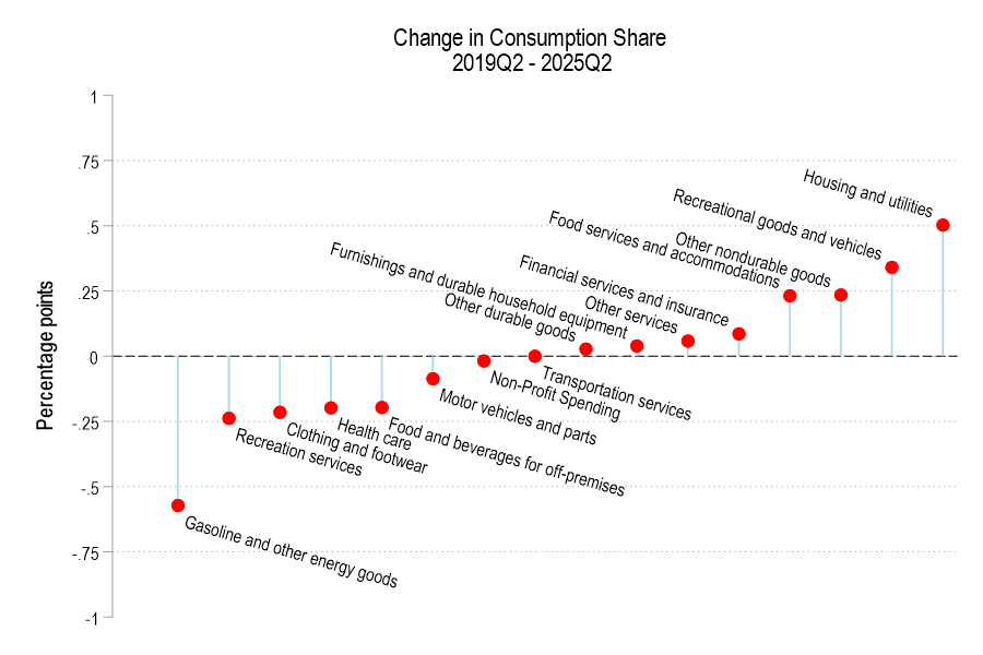
The below figure displays the spending share difference. We’re spending less of our consumption on gasoline and the like, recreational services, and clothing. Surprisingly, we’re also spending less on healthcare and food for off-premises consumption (non-restaurants). However, we’re spending a greater share on housing, recreational goods, food services for on-premises consumption (restaurants).
The Little Book of Common Sense Investing: “John Bogle, the founder of Vanguard, wrote a short book in 2006 that explains his investment philosophy. I can sum it up at much less than book length: the best investment advice for almost everyone is to buy and hold a diversified, low-fee fund that tracks an index like the S&P 500.”
The Little Book that Beats the Market: “Greenblatt offers his own twist on value investing that emphasizes just two value metrics- earnings yield (basically P/E) and return on capital (return on assets). The idea is to blend them, finding the cheapest of the high-quality companies…. Greenblatt’s Little Book is a quick and easy way to learn a bit about value investing, but I think Bogle’s Little Book has the better advice.”
When Genius Failed: “Myron Scholes was on top of the world in 1997, having won the Nobel Prize in economics that year for his work in financial economics, work that he had applied in the real world in a wildly successful hedge fund, Long Term Capital Management. But just one year later, LTCM was saved from collapse only by a last-minute bailout that wiped out his equity (along with that of the other partners of the fund) and cast doubt on the value of his academic work…. The story is well-told, and the lessons are timeless”
The Art of Spending Money: “Its main point is that people tend to be happier spending money on things they value for their own sake- rather than things they buy to impress others, or piling up money as a yardstick to measure themselves against others (this is repeated with many variations). Overall it is well-written at the level of sentences and paragraphs with well-chosen stories and quotes, but I’m not sure what it all adds up to.”
Non-fiction I didn’t previously mention here:
The Napoleonic Wars: A Global History, Alexander Mikaberidze: Aims to educate us about the surprisingly major effects of the Napoleonic Wars outside of Europe. Succeeds wildly; I also learned a lot about the main European theatre. Hadn’t realized how poor British Russian relations were in this era, since they defeat Napoleon together in the end. But they were heading for war early on until a czar was assassinated, then actually went to war in the middle over Sweden and trade. Outside Europe, Britain briefly took Buenos Aires and Montevideo, and accidentally (?) captured Iceland, along with all the French and Dutch overseas colonies.
Talent: How to Identify Energizers, Creatives, and Winners Around the World, Tyler Cowen and Dan Gross: A business book that works best for someone who hires a lot. How to attract and retain diverse candidates, including but not limited to the most-discussed types of diversity. Tyler says that when he lived in Germany people often thought he was Turkish, and one told him to ‘get out of here, you Turk’.
Almost Human: The Astonishing Tale of Homo Naledi and the Discovery That Changed Our Human Story, Lee Berger and John Hawks: The story of how the authors excavated a cave in South Africa that held many remains from a previously unknown type of early human. Good storytelling, good explanations of what we know about early humans from other discoveries, and surprisingly frank discussions of the academic politics behind getting paleontology research funded.
The Ends of the World, Peter Brannen: The book explains Earth’s 5 previous mass extinctions and the geology / science behind how we found out what we know about them. Written explicitly about what all this means for current global warming; see my full review on that here.
Annals of the Former World, John McPhee: New Yorker writer follows geologists from New York to San Fransisco to learn about the land in between. Published as a series of 4 books (Basin and Range, In Suspect Terrain, Rising from the Plains, Assembling California), each one focusing on a different geologist and region. McPhee is known as an excellent stylist but the books are also quite substantive, I feel like I learned a lot.
Fiction
The Works of Dashiell Hammet: My friend Dashiell mentioned that this is who he was named after, and that Red Harvest was a good book of his to start with. He was right, and it lead me to read many others: The Thin Man (you may have heard of Hammet because of the movies adapted from this and The Maltese Falcon), Best Cases of the Continental Op, Honest Gain: Dicey Cases of the Continental Op. Almost every story has a twist more interesting than “the murderer isn’t who you suspected”.
Tress of the Emerald Sea, Brandon Sanderson. Sanderson is one of the most prolific authors of our time, so where do you start with him? He suggests “Mistborn or Tress of the Emerald Sea, depending if they want something more heisty and actiony or something more whimsical.”
The Frugal Wizard’s Handbook for Surviving Medieval England, Brandon Sanderson: Sanderson doing his best impression of Terry Pratchett rewriting Mark Twain’s Connecticut Yankee in King Arthur’s Court, with shades of Scott Meyer’s Off to Be the Wizard.
Janissaries, Jerry Pournelle: What if instead of going to a more primitive world alone, you got sent there with an army?
The Narrow Road Between Desires, Patrick Rothfuss: Enough of an expansion of The Lightning Tree to be worth reading, but at this point anything Rothfuss does other than finally finish Doors of Stone can’t help but be disappointing.
Beguilement, Lois McMaster Bujold: Her Sci Fi works are great so I looked forward to her take on the Fantasy genre, but this turns out to be her take on the Romance genre.
Meta
This year I realized that Hoopla has a lot of books that Libby doesn’t, it is worth checking both apps for a book if you have access to libraries that offer both
In some quarters there is a sense that quantitative easing (QE), the massive purchase of Treasury and other bonds by the Fed, is something embarrassing or disreputable – – an admission of failure, or an enabling of profligate financial behaviors. For months, pundits have been smacking their lips in anticipation of QE-like Fed actions, so they could say, “I told you so”. In particular, folks have predicted that the Fed would try to disguise the QE-ness of their action by giving some other, more innocuous name.
Here is how liquidity analyst Michael Howell humorously put it on Dec 7:
All leave has been cancelled in the Fed’s Acronym Department. They are hurriedly working over-time, desperately trying to think up an anodyne name to dub (inevitable) future liquidity interventions in time for the upcoming FOMC meeting. They plainly cannot use the politically-charged ‘QE’. We favor the term ‘Not-QE, QE’, but odds are it will be dubbed something like ‘Bank Reverse Management Operations’ (BRMO) or ‘Treasury Market Liquidity Operations’ (TMLO). The Fed could take a leaf from China’s playbook, since her Central Bank the PBoC, now uses a long list of monetary acronyms, such as MTL, RRRs, RRPs and now ORRPs, probably to hide what policy makers are really doing.
And indeed, the Fed announced on Dec 10 that it would purchase $40 billion in T-bills in the very near term, with more purchases to follow.
But is this really (the unseemly) QE of years past? Cooler heads argue that no, it is not. Traditional QE has focused on longer-term securities (e.g. T-bonds or mortgage securities with maturities perhaps 5-10 years), in an effort to lower longer-term rates. Classically, QE was undertaken when the broader economy was in crisis, and short-term rates had already been lowered to near zero, so they could not be lowered much further.
But the current purchases are all very short-term (3 months or less). So, this is a swap of cash for almost-cash. Thus, I am on the side of those saying this is not quite QE. Almost, but not quite.
The reason given for undertaking these purchases is pretty straightforward, though it would take more time to explicate it that I want to take right now. I hope to return to this topic of system liquidity in a future post.Briefly, the whole financial system runs on constant refinancing/rolling over of debt. A key mechanism for this is the “repo” market for collateralized lending, and a key parameter for the health of that market is the level of “reserves” in the banking system. Those reserves, for various reasons, have been getting so low that the system is getting in danger of seizing up, like a machine with insufficient lubrication. These recent Fed purchases directly ease that situation. This management of short-term liquidity does differ from classic purchases of long-term securities.
The reason I am not comfortable saying robustly, “No, this is not all QE” is that the government has taken to funding its ginormous ongoing peacetime deficit with mainly short-term debt. It is that ginormous short-term debt issuance which has contributed to the liquidity squeeze. And so, these ultra-short term T-bill purchases are to some extent monetizing the deficit. Deficit monetization in theory differs from QE, at least in stated goals, but in practice the boundaries are blurry.
In August, I listed the Top EWED Posts of 2025. Here are a few more highlights. This list is roughly based on web traffic, starting with the highest number of views for 2025, since the August list.
Our breakout post for the entire year is Jeremy Horpedahl with:
It has been cited in the Washington Post and the Financial Times, and shared many times.
Mr. Green has understated typical family income by something like 70 percent. Knowing this fact alone would, I think, cause him to reconsider his entire essay. But it’s worse than that: he also overstates the amount of spending required to support a family!
On Twitter I joked that if it is true, you should just run all of GDP through SNAP and we could be 80% richer. But my joke isn’t quite fair, because it could be true at the margin, but the effects might dissipate at some point. At what point? Well, a key assumption by USDA’s model is that the recipients of SNAP benefits have a higher marginal propensity to consume than the average household…
6. I rarely do this in top post roundups, but I’ll mention that Mike Makowsky’s post from 2022 generated a lot of interest this year, possibly because of the rise of interest in “agents”: Why Agent-Based Modeling Never Happened in Economics
I, myself, am embarking on a research project about AI agents. More to come on that.
Though don’t worry: not everyone went to Europe this summer, despite what social media might have you believe.
Just wait for my posts from Europe, people. I’ll get back there soon.
This cuts against the idea that all progress is just more people staring into their screens. Although, arguably, people travel for the social media engagement it generates. Sometimes I feel like my Facebook friends document their trips so thoroughly that I don’t even need to go.
16. This post hasn’t had weeks to pick up a high views score, but Mike was one of the first to this paper, and I subsequently saw big accounts talking about it: Obviously baseline economic security matters, but…
If you asked me five years ago where a new UBI might, at the margin, have a zero effect, I would have picked a Nordic country, but still…
Our biggest source of web traffic is Google search. We get readers who click through links shared by our friends (thank you). And, something that’s way up in percentage terms is referral traffic from a certain “chatgpt.com” – 8 times more than in 2024.
Much of what economics has to say about tariffs comes from microeconomic theory. But it’s mostly sectoral in nature. Trade theory has some insights. But the effects on the whole of an economy are either small, specific to undiversified economies, or make representative agent assumptions that avoid much detail. Given that the economics profession has repeatedly said that the Trump tariffs would contribute to inflation, it seems like we should look at the historical evidence.
Lay of the Land
Economists say things like ‘competition drives prices closer to marginal cost’. Whether the competitor lives abroad is irrelevant. More foreign competition means lower prices at home. But that’s a partial equilibrium story. It’s true for a particular type of good or sector. What happens to prices in the larger economy in seemingly unrelated industries? The vanilla thinking that it depends on various elasticities.
I think that the typical economist has a fuzzy idea that the general price level will be higher relative to personal incomes in some sort of real-wages and economic growth mental model. I don’t think that they’re wrong. But that model is a long-run model. As we’ve discovered, people want to know about inflation this month and this year, not the impact on real wages over a five-year period.
Part of the answer is technical. If domestic import prices go up, then we’ll sensibly see lower quantities purchased. The magnitude depends on the availability of substitutes. But what should happen to total import spending? Rarely do we talk about the expenditure elasticity of prices. Rarely do we get a simple ‘price shock’ in a subsector. It’s unclear that total spending on imports, such as on coffee, would rise or fall – not to mention the explicit tax increase. It’s possible that consumers spend more on imports due to higher prices, or less due to newly attractive substitutes. The reason that spending matters is that it drives prices in other parts of the economy.
For example, I argued previously that tariffs reduce dollars sent abroad (regardless of domestic consumer spending inclusive of tariffs) and that fewer dollars will return as asset purchases. I further argued that uncertainty makes our assets less attractive. That puts downward pressure on our asset prices. However, assets don’t show up in the CPI.
According to the above discussion, it’s unclear whether tariffs have a supply or demand impact on the economy. The microeconomics says that it’s a supply-side shock. But the domestic spending implications are a big question mark.
What is a Tariff Shock?
That’s the title of a recent working paper from the Federal Reserve Bank of San Francisco. It’s a fun paper and I won’t review the entirety. They start by summarizing historical documents and interpreting the motivation of tariffs going back to 1870. They argue that tariffs are generally not endogenous to good or bad moments in a business cycle and they’re usually perceived as permanent. The authors create an index to measure tariff rates.
Here’s the fun part. They run an annual VAR of unemployment, inflation, and their measure of tariffs. Unemployment in negatively correlated with output and reflects the real side of the economy. Along with inflation, we have the axes of the Aggregate Supply & Aggregate Demand model. Tariffs provide the shock – but to supply or demand?. Below are the IRF results:
What I’m telling my Intro Macro students on the last day of class, since we weren’t able to get through every chapter in the textbook:
A few of you might end up working in economic policy, or in highly macro-sensitive businesses like finance. For you, I recommend taking followup classes like Intermediate Macroeconomics or Money and Banking so you can understand the details. For everyone else, here are the very basics:
In the long run, economic growth is what matters most. The difference between 2% and 3% real GDP growth per capita sounds small in a given year, but over your lifetime it is the difference between your country becoming 5 times better off vs 10 times better off.
How to increase long-run economic growth? This is complicated and mostly not driven by traditional macroeconomic policy, but rather by having good culture, institutions, microeconomic policy, and luck.
In the shorter run, you want to avoid recessions and bursts of inflation.
High inflation means too many dollars chasing too few goods. To fix it, the federal government and the central bank need to stop printing so much money (the details can get very complicated here, but if we’re talking moderately high inflation like 5% the solution is probably the central bank raising interest rates, and if we’re talking very high inflation like 50% the solution is probably a big cut to government spending).
If there is a recession (which will look to you like a big sudden increase in layoffs and bankruptcies), the solution is probably to reverse everything in the previous point. The government should make money ‘easier’ via the central bank lowering interest rates while the federal government spends more and taxes less.
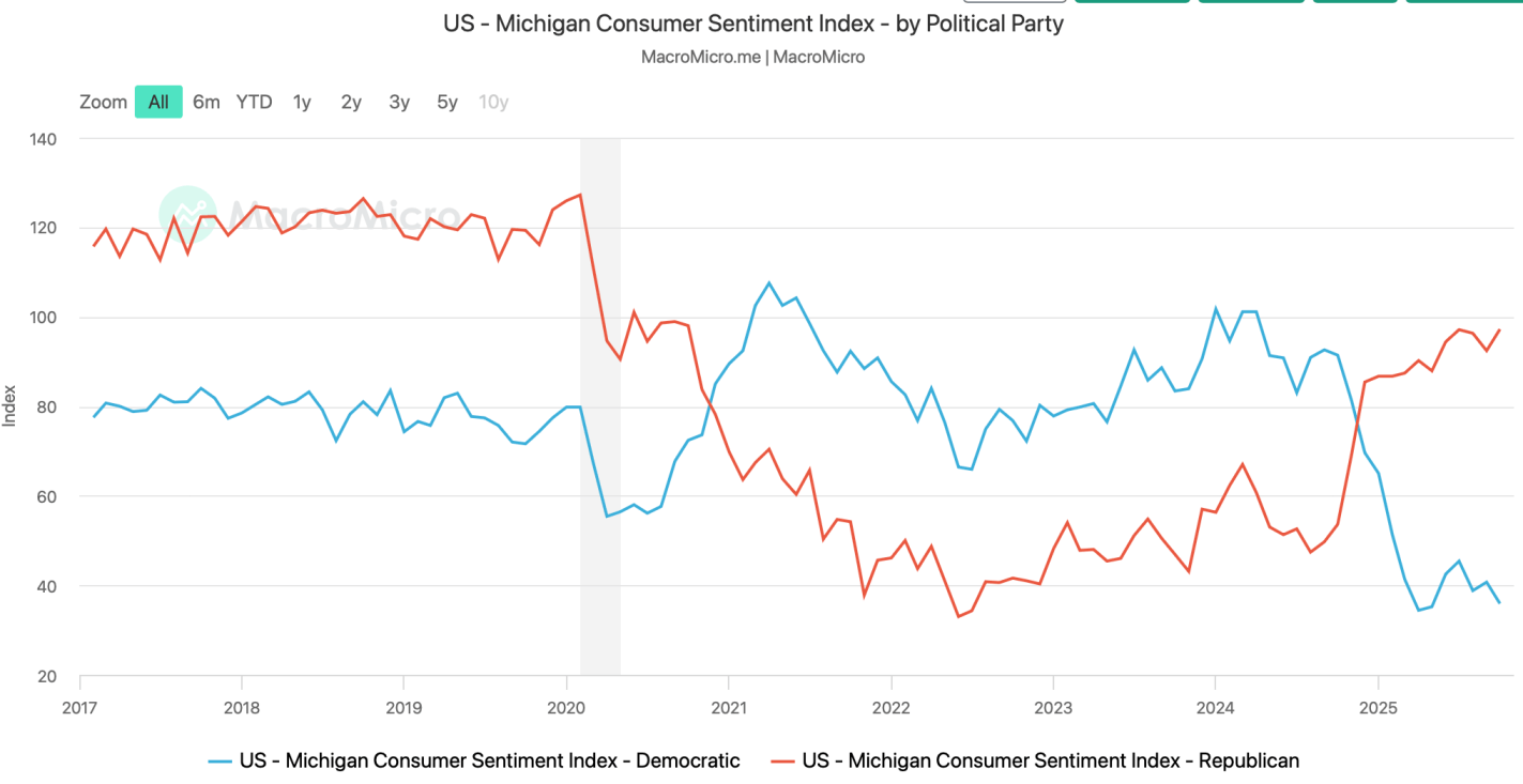
If you don’t take more economics classes, you will likely hear about macro issues mainly through the news media and social media. You should be aware of their two main biases: negativity bias and political bias.
Negativity Bias: If It Bleeds, It Leads on the news. Partly this is because bad news tends to happen suddenly while good news happens slowly, so it doesn’t seem like news; partly it just seems to be what people want from the news and from social media.
Political Bias: People tend to seek out news and social media sources that match their current preferences. These sources can be misleading in consistent ways for ideological reasons, or in varying ways based on whether the political party they like is currently in power.
There are different ways to measure each key macroeconomic variable. Think through them now and make a principled decision about which ones you think are the best measures, and track those. Otherwise, your media ecosystem will cherry-pick for you whichever measures currently make the economy look either the best or the worst, depending on what their biases or incentives dictate.
There are good ways to keep learning about economics outside of formal courses and textbooks, I list a few here.