The government is unique among economic institutions insofar as it can use coercion legally. But not all activities are coercive. Clearly, taxation is overwhelmingly coercive. Some people say that they are happy to pay taxes, but the voluntary gifts to the US Treasury are itsy-bitsy (just over $1m for FY 2023). Most regulations also include the threat of fines or jail time for non-compliance.
But once the government has the money in their coffers, there is plenty that they can do consensually. Once they have the resources, they are often just another potential transactor in the markets for goods and services. While the government can transact as well as anyone else, there is a fundamental theoretical difference for how we should interpret those transactions. Specifically, there is a principal-agent problem such that we can’t quite identify the welfare that is enjoyed by consumers when the government makes purchases. We really have very little idea.
Garett Jones uses the analogy of the government confiscating potatoes. The worst use would be for the government to throw the valuable resources into the river. Those resources help no one. Improved welfare would be yielded if the government just transferred those potatoes back to people. Sure, there’s the transaction cost of administration, but people get their potatoes back. Finally, the great hope is that the government takes the potatoes and makes tasty potato fritas such that they return to the public something more valuable than they took. These might be things that fall into the public goods category or solving collective action problems generally.
The above examples illustrates that how the government spends matters a lot for the welfare implications of the newly purchased government resources. But, we need to recall that there is an entire private segment of the market that is affected by the government transactions.
Short-Run Analysis
In a competitive market, firms face increasing marginal costs and make decisions about their levels of output. When the government makes purchases, it’s simply acting as another demander. How does the entry of a larger demander affect everyone else in the market? See the below GIF.
Last time the gifs were simply about price & quantity and welfare. I’m sharing some more GIFs, this time in regard to welfare and taxes.
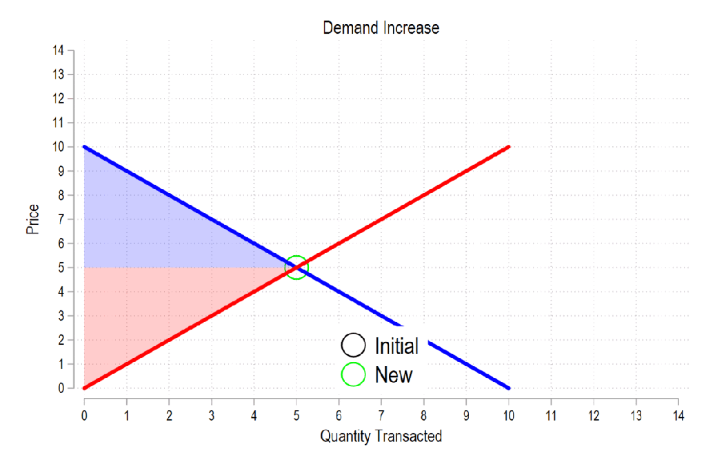
First, see the below gif. It shows us that both consumer surplus (blue area) and producer surplus (red area) always rise if there is a demand increase (assuming the law of supply and law of demand).
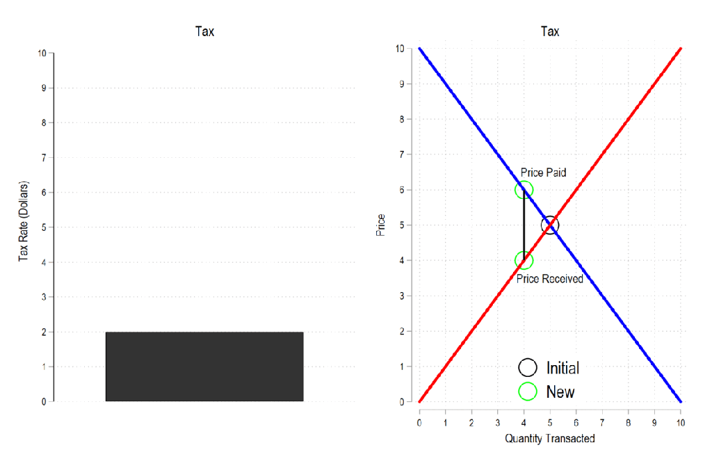
Next, let’s consider a basic tax. We can represent it as the difference between what the demander pays and what the supplier receives. The bigger the tax, the bigger the difference between the two.
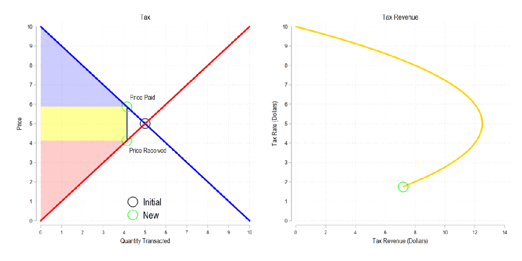
Now let’s combine the tow ideas: If taxes rise, then the quantity transacted falls, price paid rises, price received falls, and both consumer and producer surplus fall. Not only that, since there is an inverse relationship between the tax rate and the quantity transacted, it may be that increasing the tax rate more *reduces* revenue. The idea that there is a tax revenue maximizing tax rate is illustrated below right and is known as the Laffer curve.
I’ve discussed the ways to teach supply and demand in the past. Regardless, almost all principles of economics classes require a book. But even digital books are often just intangible versions of the hard copy. Supply and demand are illustrated as static pictures, using arrows and labels to do the leg-work of introducing exogenous changes. There’s often a text block with further explanation, but it lacks the kind of multi-sensory explanation that one gets while in a class.
In a class, the instructor can gesticulate and vary their speech explain the model, all while drawing a graph. That’s fundamentally different from reading a book. Studying a book requires the student to repeatedly glance between the words and the graph and to identify the appropriate part of the graph that is relevant to the explanation. For new or confused students, connected the words to one of many parts of a graph is the point of failure.
This is part of why the Marginal Revolution University videos do well. They’re well produced, with context and audio-overlaid video of graphs. It’s pretty close to the in-person experience sans the ability to ask questions, but includes the additional ability to rewind, repeat, adjust the speed, display captions, and share.
The Differences-in-Differences literature has blown up in the past several years. “Differences-in-Differences” refers to a statistical method that can be used to identify causal relationships (DID hereafter). If you’re interested in using the new methods in Stata, or just interested in what the big deal is, then this post is for you.
First, there’s the basic regression model where we have variables for time, treatment, and a variable that is the product of both. It looks like this:
The idea is that that there is that we can estimate the effect of time passing separately from the effect of the treatment. That allows us to ‘take out’ the effect of time’s passage and focus only on the effect of some treatment. Below is a common way of representing what’s going on in matrix form where the estimated y, yhat, is in each cell.
Each quadrant includes the estimated value for people who exist in each category. For the moment, let’s assume a one-time wave of treatment intervention that is applied to a subsample. That means that there is no one who is treated in the initial period. If the treatment was assigned randomly, then β=0 and we can simply use the differences between the two groups at time=1. But even if β≠0, then that difference between the treated and untreated groups at time=1 includes both the estimated effect of the treatment intervention and the effect of having already been treated prior to the intervention. In order to find the effect of the intervention, we need to take the 2nd difference. δ is the effect of the intervention. That’s what we want to know. We have δ and can start enacting policy and prescribing behavioral changes.
Easy Peasy Lemon Squeezy. Except… What if the treatment timing is different and those different treatment cohorts have different treatment effects (heterogeneous effects)?* What if the treatment effects change over time the longer an individual is treated (dynamic effects)**? Further, what if the there are non-parallel pre-existing time trends between the treated and untreated groups (non-parallel trends)?*** Are there design changes that allow us to estimate effects even if there are different time trends?**** There’re more problems, but these are enough for more than one blog post.
For the moment, I’ll focus on just the problem of non-parallel time trends.
What if untreated and the to-be-treated had different pre-treatment trends? Then, using the above design, the estimated δ doesn’t just measure the effect of the treatment intervention, it also detects the effect of the different time trend. In other words, if the treated group outcomes were already on a non-parallel trajectory with the untreated group, then it’s possible that the estimated δ is not at all the causal effect of the treatment, and that it’s partially or entirely detecting the different pre-existing trajectory.
Below are 3 figures. The first two show the causal interpretation of δ in which β=0 and β≠0. The 3rd illustrates how our estimated value of δ fails to be causal if there are non-parallel time trends between the treated and untreated groups. For ease, I’ve made β=0 in the 3rd graph (though it need not be – the graph is just messier). Note that the trends are not parallel and that the true δ differs from the estimated delta. Also important is that the direction of the bias is unknown without knowing the time trend for the treated group. It’s possible for the estimated δ to be positive or negative or zero, regardless of the true delta. This makes knowing the time trends really important.
STATA Implementation
If you’re worried about the problems that I mention above the short answer is that you want to install csdid2. This is the updated version of csdid & drdid. These allow us to address the first 3 asterisked threats to research design that I noted above (and more!). You can install these by running the below code:
program fra
    syntax anything, [all replace force]
    local from "https://friosavila.github.io/stpackages"
    tokenize `anything'
    if "`1'`2'"==""  net from `from'
    else if !inlist("`1'","describe", "install", "get") {
        display as error "`1' invalid subcommand"
    }
    else {
        net `1' `2', `all' `replace' from(`from')
    }
    qui:net from http://www.stata.com/
end
fra install fra, replace
fra install csdid2
ssc install coefplot
Once you have the methods installed, let’s examine an example by using the below code for a data set. The particulars of what we’re measuring aren’t important. I just want to get you started with the an application of the method.
local mixtape https://raw.githubusercontent.com/Mixtape-Sessions
use `mixtape'/Advanced-DID/main/Exercises/Data/ehec_data.dta, clear
qui sum year, meanonly
replace yexp2 = cond(mi(yexp2), r(max) + 1, yexp2)
The csdid2 command is nice. You can use it to create an event study where stfips is the individual identifier, year is the time variable, and yexp2 denotes the times of treatment (the treatment cohorts).
The above output shows us many things, but I’ll address only a few of them. It shows us how treated individuals differ from not-yet treated individuals relative to the time just before the initial treatment. In the above table, we can see that the pre-treatment average effect is not statistically different from zero. We fail to reject the hypothesis that the treatment group pre-treatment average was identical to the not-yet treated average at the same time period. Hurrah! That’s good evidence for a significant effect of our treatment intervention. But… Those 8 preceding periods are all negative. That’s a little concerning. We can test the joint significance of those periods:
estat event, revent(-8/-1)
Uh oh. That small p-value means that the level of the 8 pretreatment periods significantly deviate from zero. Further, if you squint just a little, the coefficients appear to have a positive slope such that the post-treatment values would have been positive even without the treatment if the trend had continued. So, what now?
Wouldn’t it be cool if we knew the alternative scenario in which the treated individuals had not been treated? That’s the standard against which we’d test the observed post-treatment effects. Alas, we can’t see what didn’t happen. BUT, asserting some premises makes the job easier. Let’s say that the pre-treatment trend, whatever it is, would have continued had the treatment not been applied. That’s where the honestdid stata package comes in. Here’s the installation code:
local github https://raw.githubusercontent.com
net install honestdid, from(`github'/mcaceresb/stata-honestdid/main) replace
honestdid _plugin_check
What does this package do? It does exactly what we need. It assumes that the pre-treatment trend of the prior 8 periods continues, and then tests whether one or more post-treatment coefficients deviate from that trend. Further, as a matter of robustness, the trend that acts as the standard for comparison is allowed to deviate from the pre-treatment trend by a multiple, M, of the maximum pretreatment deviations from trend. If that’s kind of wonky – just imagine a cone that continues from the pre-treatment trend that plots the null hypotheses. Larger M’s imply larger cones. Let’s test to see whether the time-zero effect significantly differs from zero.
What does the above table tell us? It gives us several values of M and the confidence interval for the difference between the coefficient and the trend at the 95% level of confidence. The first CI is the original time-0 coefficient. When M is zero, then the null assumes the same linear trend as during the pretreatment. Again, M is the ratio by which maximum deviations from the trend during the pretreatment are used as the null hypothesis during the post-treatment period. So, above, we can see that the initial treatment effect deviates from the linear pretreatment trend. However, if our standard is the maximum deviation from trend that existed prior to the treatment, then we find that the alpha is just barely greater than 0.05 (because the CI just barely includes zero).
That’s the process. Of course, robustness checks are necessary and there are plenty of margins for kicking the tires. One can vary the pre-treatment periods which determine the pre-trend, which post-treatment coefficient(s) to test, and the value of M that should be the standard for inference. The creators of the honestdid seem to like the standard of identifying the minimum M at which the coefficient fails to be significant. I suspect that further updates to the program will come along that spits that specific number out by default.
I’ve left a lot out of the DID discussion and why it’s such a big deal. But I wanted to share some of what I’ve learned recently with an easy-to-implement example. Do you have questions, comments, or suggestions? Please let me know in the comments below.
The above code and description is heavily based on the original author’s support documentation and my own Statalist post. You can read more at the above links and the below references.
*Sun, Liyang, and Sarah Abraham. 2021. “Estimating Dynamic Treatment Effects in Event Studies with Heterogeneous Treatment Effects.” Journal of Econometrics, Themed Issue: Treatment Effect 1, 225 (2): 175–99. https://doi.org/10.1016/j.jeconom.2020.09.006.
**Sant’Anna, Pedro H. C., and Jun Zhao. 2020. “Doubly Robust Difference-in-Differences Estimators.” Journal of Econometrics 219 (1): 101–22. https://doi.org/10.1016/j.jeconom.2020.06.003.
***Callaway, Brantly, and Pedro H. C. Santa Anna. 2021. “Difference-in-Differences with Multiple Time Periods.” Journal of Econometrics, Themed Issue: Treatment Effect 1, 225 (2): 200–230. https://doi.org/10.1016/j.jeconom.2020.12.001.
****Rambachan, Ashesh, and Jonathan Roth. 2023. “A More Credible Approach to Parallel Trends.” The Review of Economic Studies 90 (5): 2555–91. https://doi.org/10.1093/restud/rdad018.
I’ve taught GT a total of 5 time. Below are my average student course evaluations for “I would recommend this class to others” and “I would consider this instructor excellent”. Although the general trend has been improvement, improving ratings and the course along the way, some more context would be helpful. In 2019, my expectations for math were too high. Shame on me. It was also my first time teaching GT, so I had a shaky start. In 2020, I smoothed out a lot of the wrinkles, but I hadn’t yet made it a great class.
In 2021, I had a stellar crop of students. There was not a single student who failed to learn. The class dynamic was perfect and I administered the course even more smoothly. They were comfortable with one another, and we applied the ideas openly. In 2022, things went south. There were too many students enrolled in the section, too many students who weren’t prepared for the course, and too many students who skated by without learning the content. Finally, in 2023, the year of my changes, I had a small class with a nice symmetrical set of student abilities.
Historically, I would often advertise this class, but after the disappointing 2022 performance, and given that I knew that I would be making changes, I didn’t advertise for the 2023 section. That part worked out perfectly. Clearly, there is a lot of random stuff that happens that I can’t control. But, my job is to get students to learn, help the capable students to excel, and to not make students *too* miserable in the process – no matter who is sitting in front of me.
Short post today because I’m busy watching my kids, who had their school canceled because of excessive heat, like many schools in Rhode Island today.
I thought this was a ridiculous decision until my son told me he heard from his teacher that his elementary school is the only one in town that has air conditioning for every classroom. Given that, the decision to cancel given the circumstances is at least reasonable, but the lack of AC is not.
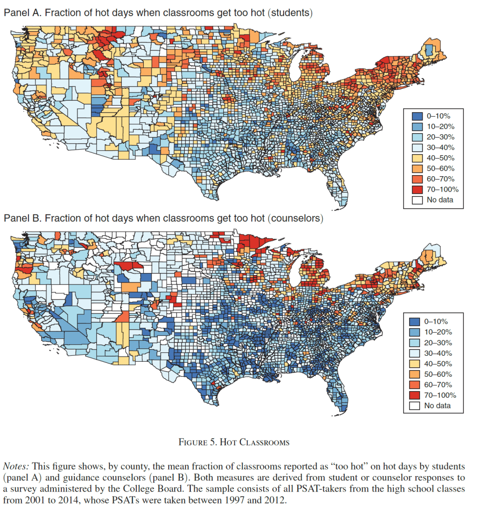
It’s not just that hot classrooms are unpleasant for students and staff, or that sudden cancellations like this are a major burden for parents. Several economics papers have found that air conditioning significantly improves students’ learning as measured by test scores (though some find not). Park et al. (2020 AEJ: EP) find that:
Student fixed effects models using 10 million students who retook the PSATs show that hotter school days in the years before the test was taken reduce scores, with extreme heat being particularly damaging. Weekend and summer temperatures have little impact, suggesting heat directly disrupts learning time. New nationwide, school-level measures of air conditioning penetration suggest patterns consistent with such infrastructure largely offsetting heat’s effects. Without air conditioning, a 1°F hotter school year reduces that year’s learning by 1 percent.
This can actually be a bigger issue in somewhat Northern places like Rhode Island- we’re South enough to get some quite hot days, but North enough that AC is not ubiquitous. Data from the Park paper shows that New York and New England are actually some of the worst places for hot schools:
This is because of the lack of AC in the North:
The days are only getting hotter…. it’s time to cool the schools.
I’m gearing up to teach macroeconomics for the first time. The following is a story that I will keep in mind as I work to make technical material relevant to undergraduates.
Years ago, I was an undergraduate sitting in a macroeconomics class. As it happened, I was in an intermediate-level macro class with no relevant background or context for the material. (If I had taken principles-level econ, then maybe I wouldn’t have been in this situation.)
My instructor was grinding through theory in a methodical way. By the end of the first month, as I remember it, we had covered the short run and the medium-term effects of monetary policy.
For anyone who is not familiar, see these MRU videos on shifting the aggregate supply curve.
In summary, the government can inject money into the economy to achieve a short-term increase in output. For a short amount of time, you can help, and that seemed good to me. I had signed up for the course to understand how to reduce poverty and make the world better. I was acing the exams. Things were going well at first.
Then we got bad news. Increasing the money supply does not work for long. Consumers realize that everything is more expensive, so they cut back on real spending. The economy shifts back to where it was before. Nothing actually improves. I had spent a month of my life on this class and we were getting nowhere.
After the lecture on returning to the long-run aggregate supply curve, I went up to the professor after class. I asked him what was going on and when would we learn something that matters. (I was polite. I realized I was going to sound dumb to him, but life is short. I needed to know if this class was going to deliver anything.)
He looked at me, surely confused that I was unsatisfied with the standard progression of material in his course. Then he explained, “Oh. You are talking about the long term, and we will get to that next month.” That’s what I needed. I did not drop the course or the major. I’m an economics professor today because I didn’t mind looking like an idiot if I could get my questions answered.
This story helps me remember what it was like to be an undergrad in an economics class. Tyler says “context is that which is scarce.” Economics teachers need to do two things at once: present technical material and provide context. I will try to get that mix right going forward.
Note to students: Students, don’t be afraid to ask stupid questions. This is your chance. A good teacher will be glad you took the initiative. However, if the question occurs to you right in the middle of a lecture, then it may or may not be the appropriate time for the lecturer to stop and have a conversation with you. Teachers will be most amenable to having a deep conversation after class or during office hours.
I like a good lump sum tax. People *must* pay the tax without exception and the advantage over current progressive marginal income taxes is that the marginal wage received doesn’t fall with greater earnings. Employment rises and output rises. To the extent that college students fail to understand their student loans, the indebted graduates essentially pay a lump sum tax each period.
Of course, the exception is income based repayment (IBR) – especially with forgiveness after X years. IBR adjusts the incentives substantially. Under the standard system, your wages are garnished if you fail to make loan payments. Under IBR, lower earnings trigger lower monthly payments. Clearly, in contrast to the standard method, IBR incentivizes more leisure, less income, more black market activity, and higher loan balances. Indeed, all the more so if there is a forgiveness horizon. Someone just has to have low enough income for say 15 years, and their past debt is forgiven (with caveats & conditions).
My principal objection to IBR policy is the resulting malinvestment in human capital. Defaulting on loans is a sign that some investment was inadequately productive to repay the resources consumed by its endeavor. We call that a loss. Real resources of time, attention, and goods and services were consumed in order to produce capital that failed to serve others more than the opportunity cost of those resources.
I want to share some changes that I’ll make to my game theory course, just for the record. It’s an intense course for students. They complete homeworks, midterm exams, they present scholarly articles to the class, and they write and present a term paper that includes many parts. Students have the potential to learn a huge amount, including those more intangible communication skills for which firms pine.
There is a great deal of freedom in the course. Students model circumstances that they choose for the homeworks, and they write the paper on a topic that they choose. The 2nd half of the course is mathematically intensive. When I’ve got a great batch of students, they achieve amazing things. They build models, they ask questions, they work together. BUT, when the students are academically below average, the course much less fun (for them and me). We spend way more time on math and way less time on the theory and why the math works or on the applicable circumstances. All of that time spent and they still can’t perform on the mathematical assignments. To boot, their analytical production suffers because of all that low marginal product time invested in math. It’s a frustrating experience for them, for me, and for the students who are capable of more.
This year, I’m making a few changes that I want to share.
Minimal Understanding Quizzes: All students must complete a weekly quiz for no credit and earn beyond a threshold score in order to proceed to the homework and exams. I’m hoping to stop the coasters from getting ‘too far’ in the course without getting the basics down well enough. The quizzes must strike the balance of being hard enough that students must know the content, and easy enough that they don’t resent the requirement.
Incentives matter. I’ve taught at both public and private universities, and students have given me both great course evaluations and less great student evaluations. The private university cared a lot more about them. Obviously, some parts of student evaluations of their instructors are beyond the instructor’s control. The instructor can’t control inalienables and may not be able to change their charisma. But what about the things that instructors can control? Regardless of your current evals, here are 5 policies that are guaranteed to improve your course evaluations.
1: Very Clear Expectations/Schedule
Have all deadlines determined by the time that the semester starts. Students are busy people and they appreciate the ability to optimally plan their time. Relatedly, students desire respect from their instructor. Having clear rubrics and deadlines helps students know your expectations and how to meet them – or at least understand how they failed to meet them. Students want to feel like they were told the rules of the game ahead of time. This means no arbitrary deductions or deadlines. The syllabus is a contract if you treat it like one.
2: Mid-Semester Evaluations
One of the absolute best ways to improve your evaluation is to ask your evaluators for a performance update. Make a copy of your end-of-semester course evaluation and issue it about halfway through the semester. Then, summarize the feedback and review it with your class. This achieves three goals. (1) It is an opportunity to clarify policy if there are misplaced complaints. You may also wish to explain why policy is what it is. Knowing a good reason makes students more amenable to policies that they otherwise don’t prefer. (2) It provides voice to students who have things to say. Often, students want to be heard and acknowledged. It’s better that a student vents during the informal mid-semester survey than on the important one at the conclusion of the course. (3) If there are widespread issues with your course, then make changes. If you’re on the fence about something, then take a poll. And if you decide to make changes, then be graciously upfront about it. Unexplained or covert changes violate policy #1.