This is a guest post by Mary Buchanan, a Board Certified Behavior Analyst. Here she explores the intersection of behavioral economics with her own health and fitness behavior change.
My childhood dentist often said, “Take care of your teeth, or they’ll go away.” As I approach my 40th birthday, I’m learning the same is true of my muscle mass. I can use it or lose it. And I can lose it faster or slower based on my lifestyle choices.
As a behavior analyst, I have spent many years practicing the science of behavior, specifically teaching others how to master new, meaningful skills. I see myself as my own client now as I work to replace my old aimless approach to fitness with evidence-based eating and exercise interventions.
I wish I could say I embraced strength training as soon as I heard about its benefits. Instead, as I noticed more and more recommendations for women to “lift heavy”, I kept filing that information away for someday in the future. When I joined a gym last January, I returned to what I used to do in years past: Pilates classes or cardio machines. After 9 months of that approach with no benefits to show for my efforts, it was time to change my behavior.
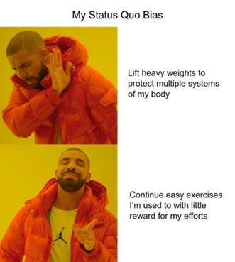
Behavioral economics has a term for what causes people to resist changing their behaviors without a significant incentive for doing so: status quo bias.
Another behavioral economics term, loss aversion, helps to explain what moved me into action. Loss aversion refers to how people are often more motivated not to lose something they have than they are motivated to gain something similar. All humans start to lose muscle mass around age 30, but that fact was not on my radar until recently. I wasn’t interested in building muscles when I thought mine were adequate to my daily tasks. Now that I realize my muscle loss has been underway for years and the liabilities of that loss are clear to me, I’m motivated to rebuild and mitigate future muscle loss. How? By doing heavy lifting 2-3x per week and eating enough protein for my body to keep the muscle it makes.
There are many great resources that provide advice in this area, but I’ve decided to begin
with learning from Dr. Stacy Sims since she specializes in what works for women. Based on what I’ve learned, here are my target behaviors for increase:
- Practice strength training for at least 30 minutes, 2x per week.
Dr. Sims says 3x per week is better, but 2x is an acceptable minimum that I can commit to either through classes at a gym or YouTube videos. As a behavior analyst, I know that I’m more likely to maintain a new behavior pattern when it is easy to feel successful early and often. - Continue to challenge myself throughout strength training by adding weight as I get stronger.
To stimulate muscle growth you must challenge your muscles so they break down and repair stronger. How heavy is enough? If you lift a weight 10x and it’s difficult to lift on the last two reps, but still possible for you to maintain good form, that is an appropriate weight for you to train with. When that weight gets easy to lift, it’s no longer heavy enough for your training purposes. - Increase my healthy protein intake.
In Roar, Dr. Sims suggests that women aim for .75-0.8 grams of protein per lb. on a light or non-training day, and increase to 1-1.2 grams of protein per lb. on strength training days.
Working on these goals together creates synergy. I am more motivated to make healthier eating choices because my eating is connected to my strength training goal. Strength training has also become more exciting for me the more I’ve learned about its benefits, including:
- Increased metabolic rate
- Improved posture and stability
- Stronger bones
- Better blood pressure control
- Improved immunity
- Maintenance of healthy body composition (lifting heavy helps maintain lean muscle and reduce fat gain)
As if that weren’t enough, I have another reason to keep going. As soon as I started resistance training, my sleep improved! I’ve had difficulty sleeping for many years already, both with falling asleep and staying asleep, and honestly, if sleeping through the night was the only benefit available to me from resistance-based workouts, I would still be all in.
While none of this constitutes professional medical advice, it is worth looking into, especially if you, like me, never saw role models strength training as a young person. Once you understand how it works in your favor now and as you age, the benefits are too good to pass up.
RESOURCES
Stacy Sims, MSC, PHD is an exercise physiologist and nutrition scientist. She specializes in teaching women what works for their bodies based on their body type, stage of life, and fitness goals.
My first introduction to her work and recommendations was this 26-minute interview: https://www.youtube.com/watch?v=APwKKUtjINo
Her book, Roar, is helpful for those who want to learn about general women’s health, though it is especially geared towards female athletes. https://www.amazon.com/ROAR-Revised-Fitness-Physiology-Performance/dp/059358192X/
Next Level focuses on the physical changes women experience with the natural aging process. It clearly presents how we can use the latest research to work with what is happening in the body instead of against it. https://www.amazon.com/Next-Level-Kicking-Crushing-Menopause-ebook/dp/B091JVW6QR/
Pistol Squats Complete the Home Workout from James