Inpatient costs were 27% higher (95% CI 0.252, 0.285), but length of stay was 12% shorter (95% CI −0.131, −0.100), in Comprehensive Cancer Centers relative to community hospitals.
In other words, these cutting-edge hospitals that tend to treat complex cases are more expensive, as you would expect; but despite getting tough cases they actually manage a shorter average length of stay. We can’t nail down the mechanism for this but our guess is that they simply provide higher-quality care and make fewer errors, which lets people get well faster.
The NCI Cancer Centers Program was created as part of the National Cancer Act of 1971 and is one of the anchors of the nation’s cancer research effort. Through this program, NCI recognizes centers around the country that meet rigorous standards for transdisciplinary, state-of-the-art research focused on developing new and better approaches to preventing, diagnosing, and treating cancer.
Our paper focuses on New York state because of their excellent data, the New York State Statewide Planning and Research Cooperative System Hospital Inpatient Discharges dataset, which lets us track essentially all hospital patients in the state:
We use data on patient demographics, total treatment costs, and lengths of stay for patients discharged from New York hospitals with cancer-related diagnoses between 2017 and 2019.
You know I’m all about sharing data; you can find our data and code for the paper on my OSF page here.
My coauthor on this paper is Ryan Fodero, who wrote the initial draft of this paper in my Economics Senior Capstone class last Fall. He is deservedly first author- he had the idea, found the data, and wrote the first draft; I just offered comments, cleaned things up for publication, and dealt with the journal. I’ve published with undergraduates several times before but this is the first time I’ve seen one of my undergrads hit anything close to a top field journal. You can find a profile of Ryan here; I suspect it won’t be the last you hear of him.
This past week, smoke from wildfires in Canada once again drifted southward and gave very unhealthy air in parts of the U.S. Several sources I checked indicated that it is unrealistic to expect human effort to extinguish these fires (see here , here, and here). The Canadian forests are just too huge in relation to the fire-fighting resources. What usually happens, even during a normal fire season, is that summer fires just keep burning until they are dampened down by winter rain, snow, and cold. Most of the fire-fighting efforts are devoted to saving communities that are in the path of the flames.
Thus, we may expect periodic episodes of unhealthy air for the next several months. The most hazardous smoke particles are those less than 2.5 microns in size. Particles this small make it past your body’s defenses and penetrate deep into your lungs, promoting a number of serious medical conditions. These smoke particles are made of toxic chemicals like polycyclic aromatic hydrocarbons.
What to do to protect yourself? A first line of defense is to don an effective mask, even indoors. We all probably have Chinese KN95 or Korean KM94 masks left over from pandemic days, and (properly fitted around the nose) these should filter out most of the smoke, including the particles that are less than 2.5 microns. (I prefer the more-comfortable KM94 masks, as discussed here.) These masks are supposedly about as effective as the more-rigid N95 masks that are the U.S. standard.
Air Filters in Your Furnace
See here for some general tips on dealing with smoke in the home, e.g. damp-mop non carpet floors rather than vacuuming, to avoid shooting settled particles into the air. However, what is really needed is some means to filter the smoke out of the air in your home, otherwise over time the air inside may be as polluted as the air outside. All furnace/central air conditioning systems have a filter in the circuit. A simple solution would be to use an air filter which can catch the smoke particles. The problem here is that the better the filter is at catching small particles, the more restrictive of air flow it is.
Most air filters are rated according to MERV values. MERV 13 filters can remove most smoke particles in a single pass. Unfortunately, most home heating/cooling systems cannot handle that much restriction in air flow; the fan motor would get overloaded and perhaps burn out. One solution here is to install a parallel air filter, with its own booster fan, using a MERV 13 filter. Here, only part of the home air circulation goes through the MERV 13 filter on each pass, but with time most of the home air gets cleaned.
Another approach is to install a MERV 11 or (if your furnace is newer) MERV 12 filter in the furnace. A MERV 11 filter might only capture around 25% of smoke particles per pass, but in the course of a day your whole house air volume should pass through the filter several times. If you have a common size air filter, you can probably get a MERV 11 that would fit on Amazon or at a local big box store. For uncommon sizes, try here.
Make Your Own High-Capacity Filter Box
In addition to working with your furnace/air conditioning filter, you can buy a compact stand-alone air purifier for your home. This Shark HP202 model will provide a continuous read-out of air quality.
For even more air-cleaning muscle, you can make a box-style air purifier by duct-taping together four MERV 13 furnace air filters (four sides of a cube), and adding a box fan on top. Instructions (including YouTube links) for doing this are here, with further details here. These diagrams give the general picture:
An example of a finished product is below; note the red tape covering the outer part of the fan outlet. Blocking that outer area, giving a smaller diameter opening for the air to blow out, increases the net air flow significantly. (It prevents back-eddies of air around the edges).
It turns out that the air flow through one of these home-made air filters is so high that, even though the per-pass capture efficiency is lower than a HEPA filter, the home-made filter box can remove more particulates from a room than a store-bought HEPA filter.
I have made two of these filter boxes so far, using premium and regular filters. They have worked quite well in clearing the smoke from our rooms: the benefit is well worth the cost of parts and labor. See here for more on my experiences and construction tips.
Some on-line resources:
Accuweather seems to have straightforward reporting of air quality, including specifically the less than 2.5 micron particles. (Search on your location, then find Air Quality and click Details).
NOAA provides a real time satellite map of smoke patterns (click on “Surface Smoke”), but don’t rely on their color coding to decide whether your local condition is orange or red.
This web site from Natural Resources Canada shows locations of current wildfires in Canada. See Overlays for the meaning of the symbols; red denotes fires that are out of control. You can click Fire Perimeter Estimate to see the enormous extents of some of these fires.
Two recent essays push back against the concept of “disinformation” in thoughtful but, I believe, ultimately incorrect ways.
Martin Gurri is primarily concerned with government trying to stamp out what it views as disinformation. I am concerned about that too, but there are ways for private actors to correct bad information too.
Dan Klein (my friend and professor in grad school) argues that most labeling of “disinformation” or “misinformation” is not really about information, but instead about knowledge. I agree that sometimes this is true. But sometimes it is not true. Sometimes we really are talking about information. And sometimes the information is about extremely important topics.
As I search through my own Twitter history for these terms, I see that there is overwhelmingly one period of time and one piece of information that I used them for: the total number of deaths in the United States in 2020. If you can think way back to the fall and winter of 2020/early 2021, you might recall that we were just finishing up the first year of the pandemic, and we were also going through one of the worst periods in the pandemic. Vaccines were now starting to become widely available as we got into 2021, and people were starting to make person decisions about whether to “get the jab.”
The number of total deaths in 2020 was an important number. There was still a lot of uncertainty about exactly how bad the pandemic was, or (to a small but vocal minority) whether the pandemic was even “real.” The data was crucial to this debate. Of course, once we have the data, we must interpret it. This is one of Klein’s main points, and a good one. But if we aren’t starting from a common baseline of true information, there is really no point in discussions based on interpretations of those different apparent realities. We will, by definition, be “talking past each other.”
So what were people saying about total deaths in 2020 during this moment of importance in late 2020/early 2021?
Last week South Carolina Governor McMaster signed a bill repealing almost all Certificate of Need (CON) laws in the state. If you want to open or expand a health care facility in South Carolina, you can now do so faster, cheaper, and with more certainty.
This is a bigger deal than West Virginia’s reform earlier this year because it applies to almost all types of facilities, and applies to both new facilities and expansions of existing facilities. Only two parts of the CON system remain: a 3-year sunset where hospitals still need special permission to add beds, and a permanent restriction on nursing homes (why? see my recent post on why states hate nursing homes).
As is often the case, this reform took years to enact. I wrote last year about a repeal bill passing the SC Senate; it didn’t make it through the House then, but did this time. As I said then:
This seems like good news; here at EWED we’ve previouslywritten about some of the costs of CON. I’ve written several academic papers measuring the effects of CON, finding for instance that it leads to higher health care spending. I aimed to summarize the academic literature on CON in an accessible way in this article focused on CON in North Carolina.
CON makes for strange bedfellows. Generally the main supporter of CON is the state hospital association, while the laws are opposed by economists, libertarians, Federal antitrust regulators, doctors trying to grow their practices, and most normal people who actually know they exist. CON has persisted in most states because the hospitals are especially powerful in state politics and because CON is a bigger issue for them than for most groups that oppose it. But whenever the issue becomes salient, the widespread desire for change has a real chance to overcome one special interest group fighting for the status quo. Covid may have provided that spark, as people saw full hospitals and wondered why state governments were making it harder to add hospital beds.
Why did reform succeed this time in South Carolina? From where I sit in Rhode Island I can only guess, but here are my guesses. First, the reform side really had their stuff together. See this nice page from SC think tank Palmetto Promise on why to repeal CON, and this paper from Matt Mitchell that does a comprehensive review of the literature on CON and explains what it means for South Carolina. Legislative supporters like Senator Wes Climer just kept pushing.
Second, the biggest opponent of CON reform is usually the state hospital association, but in this case they did not formally oppose repeal. Why not? Here I’m really speculating, but in general it has been faster-growing states that repeal CON. Population growth makes it obvious that new facilities are needed, and it means that existing facilities are thinking about how to grow to take advantage of new opportunities, rather than thinking about lobbying to maintain their share of a static or shrinking pie. You can see some hospital CEOs say they don’t mind repeal in this article (where I’m also quoted). South Carolina has been growing at a decent clip, as is Florida, which also almost-entirely repealed CON in 2019. On this theory, the next big CON reform would happen in a fast-growingCON state like Montana, Delaware, North Carolina, Georgia, or Tennessee. If I had to pick one, I’d say North Carolina.
Update: Apparently Montana already repealed all non-nursing home CON in 2021 and I missed it!
In his NY Times column today, Ross Douthat argues that legalizing marijuana is a big mistake. Douthat makes a number of arguments, but let me focus on one point he makes in the column: that recent research suggests legalizing marijuana increases opioid deaths. This point is made in just one sentence of the essay, so let me quote it in full:
There was hope, and some early evidence, that legal pot might substitute for opioid use, but some of the more recent data cuts the other way: A new paper published in the Journal of Health Economics finds that “legal medical marijuana, particularly when available through retail dispensaries, is associated with higher opioid mortality.”
Kudos to Mr. Douthat for actually linking to the paper. That’s what the internet is for! Yet so many writers in traditional news sources fail to do this.
Now, on to the paper itself. There is nothing untrue in what Douthat writes. First, there was plenty of “early evidence” that legalizing marijuana reduced opioid deaths. More on this in a moment. And the study he cites by Mathur and Ruhm is particularly well done. It is published in the top health economics journal. But the main point of the paper is to say “we think the rest of the literature is wrong, and we’re going to try really hard to convince you that we are right.”
What does the rest of this literature say? Here’s a brief tour (all of these are cited in Mathur and Ruhm). The variable in question is opioid deaths.
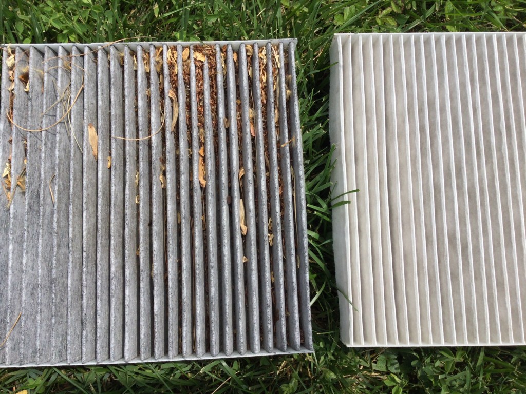
I have done various maintenance and repairs on my cars over the decades. Usually, they turn out to be harder and more time-consuming than I thought. Changing the engine oil and oil filter has become genuinely harder since the oil filters have migrated deep up under the engine, where it is hard to access them without putting the car on a lift, and disposing of a milk jug of used oil has gotten more difficult. I used to be able to easily change out a light bulb in the headlight, but the last car where that needed doing required you to take apart much of the front end of the car to get at the headlight. However, I recently found that changing the cabin air filters in my two vehicles (van and sedan) is so easy, I wish I had started doing it years ago.
Why Change the Cabin Air Filter?
The cabin air filter filters the air coming into the passenger section of the car. It knocks out road dust and pollen, and other bits of whatever that might get sucked into your air system as you are going down the road. So, it protects your and your family’s lungs as well as the components of the air handling system. Typical recommendations are to change out the filter about once a year or every 15,000-20,000 miles.
The photo below shows the cabin air filter I just pulled out of my van after maybe 2 years and 25,000 miles, next to a relatively clean filter. Obviously, I let this one go a bit too long: it is grey with dust/dirt, and partly blocked with plant debris.
I have not been quick to change out these filters because garages or dealers often charge something like $80-$100 for this. And until recently, I never considered doing it myself, because for some reason I thought it was a hard job. I had read of people having to contort in unnatural positions with heads inserted under dashboards as they disassemble layers of car to get at the filter.
It Is (Often) Super Easy to Change a Cabin Air Filter
It all depends on where the filter is located. For most models of cars, you can find guidelines on line, including YouTube videos. There are some models where you indeed may have to unscrew a cover plate somewhere below the dashboard to expose the filter. But in most cars, you remove the glove box to expose the filter. That may involve undoing come screws or a snap or strut, and squeezing the edge of the glove box inward. For my Hondas, all I had to do was empty the glovebox, (authoritatively) squeeze in the edges, and the glove box pivoted down, and behold, there was the filter in its little holder. Then slide out the holder, pull out the old filter and put in the new filter (purchased at AutoZone for $20 each), slide the holder back in place, and finally tilt the glovebox back up until it snapped in place.
Ten minutes max, easy-peasy. Obviously, this saved money, but it also felt empowering. I highly recommend trying it.
One of the oldest theories in economics is the idea of compensating differentials. A job represents not just a certain amount of money per hour, but a whole package of positive and negative things. Jobs have more or less stability, flexibility, fun, room to grow, danger… and non-cash benefits like health insurance. The idea of compensating differentials is that, all else equal, jobs that are good on these other margins can pay lower cash wages and still attract workers (thus, the danger of doing what you love). On the other hand, jobs that are bad on these other margins need high wages if they want to hire anyone (thus, the deadliest catch)
I think this theory makes perfect sense, and we see evidence for it in many places. But when it comes to health insurance, everything looks backwards. A job that offers employer-provided health insurance is better to most employees than one that doesn’t, so by compensating differentials it should be able to offer lower wages. There’s just one problem: US data shows that jobs offering health insurance also offer significantly higher wages. The 2018 Current Population Survey shows that workers with employer-provided health insurance had average wages of $33/hr, compared to $24/hr for those without employer insurance.
All the economists are thinking now: that’s not a problem, compensating differentials is an “all else equal” claim, but not all else is equal here. The jobs with health insurance pay higher wages because they are trying to attract higher-skilled workers than the jobs that don’t offer insurance.
That’s what I thought too. It is true that jobs with insurance hire quite different workers on average:
The problem is, once we control for all the observable ways that insured workers differ, we still find that their wages are significantly higher than workers who don’t get employer-provided insurance. Like, 10-20% higher. That’s after controlling for: year, sex, education, age, race, marital status, state of residence, health, union membership, firm size, whether the firm offers a pension, whether the employee is paid hourly, and usual hours worked. I’ve thrown in every possibly-relevant control variable I can think of and employer-provided health insurance always still predicts significantly higher wages. Of course, there are limits to what we get to observe about people using surveys; I don’t get any direct measures of worker productivity. Possibly the workers who get insurance are more skilled in ways I don’t observe.
We can try to account for these unobserved differences by following the same person from one job to another. When someone switches jobs, they could have health insurance in both jobs, neither, only the new, or only the old. What happens to the wages of people in each of these situations? It turns out that gaining health insurance in a new job on average brings the biggest increase in wages:
What could be going on here? One possibility is that health insurance makes people healthier, which improves their productivity, which improves their wages. But we control for health status and still find this effect. The real mystery is that papers that study mandatory expansions of health insurance (like the ACA employer mandate and prior state-level mandates) tend to find that they lower wages. Why would employer-provided health insurance lower wages when it is broadly mandated, but raise wages for individuals who choose to switch to a job that offers it?
My current theory is that “efficiency benefits” are offered alongside “efficiency wages”. The idea of efficiency wages is that some firms pay above-market wages as a way of reducing turnover. Workers won’t want to leave if they know their current job pays above-market, and so the company saves money on hiring and training. But this only works if other firms aren’t doing it. The positive correlation of wages and insurance could be because the same firms that pay “efficiency wages” are more likely to pay “efficiency benefits”- offering unusually good benefits as a way to hold on to employees.
I still feel like these results are puzzling and that I haven’t fully solved the puzzle. This post summarizes a currently-unpublished paper that Anna Chorniy and I have been working on for a long time and that I’ll be presenting at WVU tomorrow. We welcome comments that could help solve this puzzle either on the empirical side (“just control for X”) or the theoretical side (“compensating differentials are being overwhelmed here by X”).
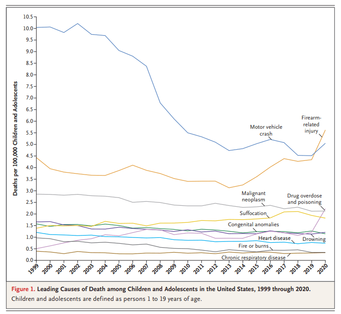
You might have seen this chart recently. It comes from a letter published in the New England Journal of Medicine in April 2022. The data comes directly from the CDC. It shows the leading causes of death for children in the US. You will notice that firearm-related deaths have been rising for much of the past decade, and in 2020 eclipsed car accidents as the leading cause.
Many are sharing this chart in response to the recent elementary school shooting in Nashville. It’s natural to want to study these problems more in the wake of tragedies. After the Uvalde shooting last year, I tried to read as much as I could about the history of homicide and gun violence in the US, and to look at the research on what might work to reduce gun violence, which is summarized in a post I wrote last June.
That being said, I don’t think the chart above accurately characterizes the problem of elementary school shootings. It might accurately describe some broader problem, but it’s misleading with respect to the shooting we all just witnessed. The most important reason is that the definition of “children” here extends to 18- and 19-year-olds. Much of the gun-related homicides for “children” shown here are gang-related violence, not random school shootings at elementary schools. It’s not that we shouldn’t care about these deaths too — we very much should care — but the causes and solutions are entirely different from elementary school mass shootings.
It covers the years 1990 to 2019 for every US state, and has life expectancy at birth, age 25, and age 65. It includes breakdowns by sex and by race and ethnicity, though the race and ethnicity breakdowns aren’t available for every state and year.
This is one of those things that you’d think would be easy to find elsewhere, but isn’t. The CDC’s National Center for Health Statistics publishes state life expectancy data, but only makes it easily available back to 2018. The United States Mortality DataBase has state life expectancy data back to 1959, but makes it quite hard to use: it requires creating an account, uses opaque variable names, and puts the data for each state into a different spreadsheet, requiring users who want a state panel to merge 50 sheets. It also bans re-sharing the data, which is why the dataset I present here is based on IHME’s data instead.
The IHME data is much more user-friendly than the CDC or USMDB, but still has major issues. By including lots of extraneous information and arranging the data in an odd way, it has over 600,000 rows of data; covering 50 states over 30 years should only take about 1,500 rows, which is what I’ve cleaned and rearranged it to. IHME also never actually gives the most basic variable: life expectancy at birth by state. They only ever give separate life expectancies for men and women. I created overall life expectancy by state by averaging life expectancy for men and women. This gives people any easy number to use, but a simple average is not the ideal way to do this, since state populations aren’t exactly 50/50, particularly for 65 year olds. If you’re doing serious work on 65yo life expectancy you probably want to find a better way to do this, or just use the separate male/female variables. You might also consider sticking with the original IHME data (if its important to have population and all cause mortality by age, which I deleted as extraneous) or the United States Mortality DataBase (if you want pre-1990 data).
Overall though, my state life expectancy panel should provide a quick and easy option that works well for most people.
Here’s an example of what can be done with the data:
If states are on the red line, their life expectancy didn’t change from 1990 to 2019. If a state were below the red line, it would mean their life expectancy fell, which done did (some state names spill over the line, but the true data point is at the start of the name). The higher above the line a state is, the more the life expectancy increased from 1990 to 2019. So Oklahoma, Mississippi, West Virginia, Kentucky and North Dakota barely improved, gaining less than 1.5 years. On the other extreme Alaska, California, New York improved by more than 5 years; the biggest improvement was in DC, which gained a whopping 9.1 years of life expectancy over 30 years. My initial thought was that this was mainly driven by the changing racial composition of DC, but in fact it appears that the gains were broad based: black life expectancy rose from 65 to 72, while white life expectancy rose from 77 to 87.
On the Positivity Blog are no less than “67 Don’t Look Back Quotes to Help You Move on and Live Your Best Life”. Some of these sayings from notable folks include:
“Never look back unless you are planning to go that way.” – Henry David Thoreau
“If you want to live your life in a creative way, as an artist, you have to not look back too much. You have to be willing to take whatever you’ve done and whoever you were and throw them away.” – Steve Jobs
“There are far, far better things ahead than any we leave behind.” – C.S. Lewis
“Don’t cry because it’s over, smile because it happened”
– attributed to Dr. Seuss, though that attribution is heavily disputed
The Random Vibez offers another “60 Don’t Look Back Quotes To Inspire You To Move Forward”’ including “Don’t look back. You’ll miss what’s in front of you” and “I tend not to look back. It’s confusing”. The Bible would add sayings such as, “Let your eyes look straight ahead; fix your gaze directly before you” (Proverbs 4:25); Paul wrote to the Philippians, “One thing I do: Forgetting what is behind and straining toward what is ahead, I press on toward the goal to win the prize for which God has called me”.
The Landy-Bannister Statue
What put me in mind of this whole theme of not looking back was seeing a bronze statue involving Roger Bannister. Sports buffs, and most educated people who are over 60, will know that he was the first man to break the four-minute mile. During many previous decades of trying, no human had been able to run that fast that long: that is a velocity of 15 miles per hour, sustained for a full four minutes. That is like a full sprint for most people, or a moderate bicycling speed.
Bannister found that he was naturally a fast runner, and he employed scientific principles in his training. (He was a medical student at the time, and went on to become a noted research neurologist). On May 6, 1954 Bannister finally cracked the four-minute mile, with a 3:59.4 time. As may be imagined, the crowd went wild.
Records, however, are made to be broken, and just 46 days later a rival runner, John Landy, ran the mile in just 3:57.9 to become the world’s fastest man. A few months after that Bannister and Landy ran head-to-head in the August, 1954 Commonwealth games in Vancouver. Landy was in the lead nearly the whole way, with a ten-yard lead by the end of the third lap. Bannister then started his signature kick and managed to catch up with Landy on the final bend. Landy must have heard footsteps, and at the end of the race glanced over his left shoulder to gauge Bannister’s position. That distraction slowed him just enough to allow Bannister to power past him on his right side. Landy’s time was still a respectable 3:59.6, but Bannister won with 3:58.8. Both runners later agreed that Landy would have won if he had not looked back. More on that race, including link to video of it, here.
This finish of this “Miracle Mile” race was immortalized by a larger-than-life bronze statue by Vancouver sculptor Jack Harman. Landy later quipped, “”While Lot’s wife was turned into a pillar of salt for looking back, I am probably the only one ever turned into bronze for looking back.”


