EWVED could be our new name. Americans worked so hard to develop a vaccine (here’s Jeremy’s ode to development) and now we are seeing the distribution become painfully slow.
Covid
Vaccine Innovation: A Marvel of Modern Science and Modern Markets
We’ve already talked about different methods for distributing the vaccine in the face of limited supply on this blog (see my post and Doug Norton’s post). But today I want to talk about something different: the speed at which this vaccine was developed. It is truly amazing.
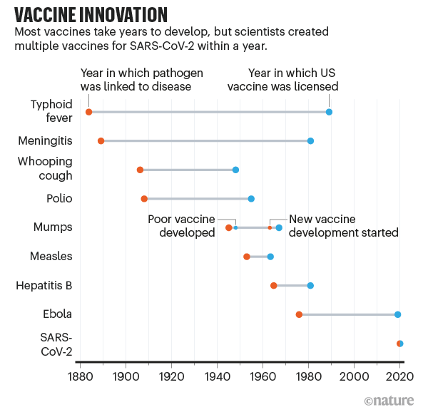
This chart from Nature (adapted from the fantastic Our World in Data) dramatically shows just how quickly the COVID-19 vaccine was developed compared with past vaccines. What used to take decades or even a century was done in mere months (yes, even with all the regulatory barriers today).
Exactly how we developed this vaccine so quickly is a complex story that involves the advanced state of modern science, incentives offered by concerned governments, and the harnessing of the profit motive to advance the public good. We don’t know all the details yet, and likely won’t for a long time since, like a pencil, no one person knows how to make and distribute a vaccine.
Continue readingChurch Attendance and Covid
Today is the last Sunday of 2020. The disruption to employment and rise of remote work might be the bigger story of 2020. However, for a significant fraction of Americans, 2020 is also the year their ability to meet as an in-person church was curtailed. Gathering in a room with many people singing is an efficient means of spreading the virus. For some, church has been an online-only experience since March.
Social scientists are interested in religiosity. Christian devotion has often been measured by asking how many times a person goes to church.
My colleagues who study the economics of religion will have an important issue to study. How does the switch to online church in 2020 affect Christian engagement in the future? How will this affect our ability to track long-term trends on religiosity?
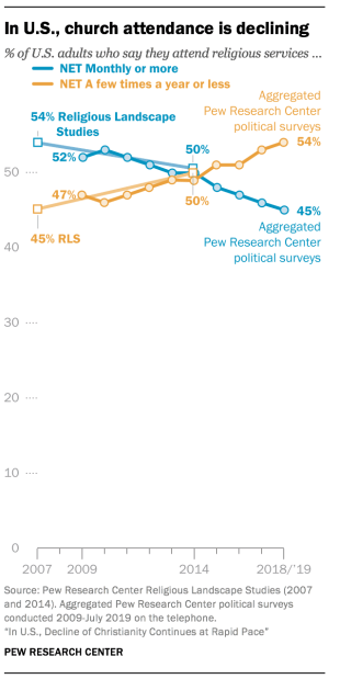
If it is true that large gatherings are safe in a year from now, it will be interesting to compare in-person church attendance in 2022 to 2019. If it turns out that attendance has decreased, then we would need to see a break in the trend to conclude that Covid is the cause. Here’s a graph of church attendance in an article from B.C. (Before Covid).
A book that was published in the 1950s made it sound like, even then, people who attended church weekly were in the minority. Joy Davidman published Smoke on the Mountain in 1953.
The inspiration for this post was reading this line about “remote” church experiences:
Others, instead of stirring their stumps, listen in comfortable living rooms to a sermon on the radio, arguing that it is “just the same.” They have forgotten that one of the first necessities of a Christian life is a congregation…
Overall, Davidman is disappointed in how few of her American countrymen attend church. Early in life, she was a militant atheist. She’s a Christian at the time of writing, but still somewhat militant.
Davidman frowns on radio church, when in-person church was available. However, virtual church today is closer to the traditional visual church experience. Going forward, it will be important to consider whether people who use the internet for church experiences should get counted.
Here are some examples of what churches have been up to, virtually:
Trinity United Methodist Church in Birmingham, AL
Truro Anglican Church in Fairfax, VA
Nativity, a Catholic church in Burke, VA
Larger churches have been podcasting and Youtube-ing for years. One of the top productions is Bethel Church of Redding, CA. They even already had their own Bethel.tv ecosystem, so shutting down in-person services for Covid probably coincided with an increase in viewership for them.
2020 Holiday Viewing
Forget “The Christmas Prince” or “The Prince Christmas” or whatever is on Netflix. Why not spend your holiday refreshing this new vaccine dashboard?
Here’s the announcement:
I personally know a few health care workers who got their shots (do not say “jab” to me) this past week. It’s all very exciting! Here at University of Alabama at Birmingham (UAB), the medical community has freezers, fortunately.
Here’s VP Mike Pence getting his vaccine:
Jeremy and Doug have both talked about allocation this week. Economists get really jazzed about allocating scarce resources. It’s been frustrating to watch first tests and now vaccines not be available on a market. Excellent points are also made every week over at Marginal Revolution on how we are missing an opportunity to get the incentives right. Supply. Curves. Slope. Up. (Thousands. Dying. Every. Week.)
Reflections on Teaching in Fall 2020
As the Fall semester comes to close on college campuses, it’s a good time to reflect on and assess how the past semester went. Many universities went to almost exclusively virtual learning, but other schools tried to make Fall 2020 as normal as possible given the circumstances of the COVID-19 pandemic.
My school, the University of Central Arkansas, chose the route of trying to have things as normal as possible — by which I mean students live on campus, classes are mostly in-person — while still accommodating students and faculty that preferred a more physically distant atmosphere. For example, UCA increased the number of fully online courses available, roughly trying to meet faculty and student demand. I normally teaching one online course per semester anyway, and I continued that this semester. Other faculty had more online classes than usual, or moved their class to be partially online.
So what was my experience?
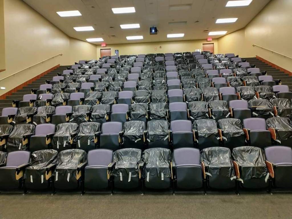
First, the students, the most important part of the teaching process. Overall, I would say my students did very well. At least in the classroom, they complied with all the rules the University set forth: wearing masks, physical distancing in classrooms (seen in the image below), even the one-way entrances and exits to the building. There were only 3-4 times I can recall this semester when a student entered my classroom without a mask, and they immediately asked me for one upon realizing their mistake (I kept a pack of surgical masks with me).
As far as academic performance of students, I was very pleased with the students. For those students that were able to stick with the class and keep up, which was most students, they perform as well or better than previous semesters. Some students, due to personal circumstances, had trouble keeping up. I tried as much as possible to accommodate students in these situations, by being flexible with deadlines, offering additional resources, and generally just trying to listen to them and empathize. It was hard for everyone.
On my end, I tried to make the teaching atmosphere of the classroom as normal as possible. I usually do have some interactive aspects of the classroom, where students work in small groups, talk to their neighbors, etc. Most of those activities didn’t happen, unfortunately. But otherwise, the classroom atmosphere operated as usual.
As my students did, I also wore a mask in the classroom while I lectured. For students that had to miss class due to quarantine, isolation, or other reasons, we were asked to record every lecture and have an option for students to watch the lecture virtually if needed. Making sure that the video was properly recording and the I had set up the Zoom link for students that needed to be remote added an extra element to think about at the beginning of each class, but it was the kind of thing that once you get used to it, it just became normal.
I will say that I often felt very exhausted after teaching each day. The mental load of making sure everything was working right in the classroom, combined with the constant sense of doom in the world around us, made this a challenging semester mentally. I’m sure this was even more true for some of my students. But, we made it.
Finally, how about the administration of my University. I’ll bite my tongue a little here: I am up for tenure this year! But really, I don’t have anything major to complain about. Guidance was communicated well, although sometimes big changes were rolled out a bit more quickly than the faculty liked. UCA provided isolation and quarantine dorms for students, though these never came close to capacity. Weekly updates on testing, cases, and related data were provided to everyone (and made publicly available, so I’m not revealing any secrets here).
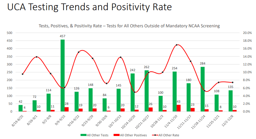
As you can see above, the general student body at UCA did report positive COVID cases every week. And some weeks the positive test rate was a little higher than I was comfortable with! But we never had a large spike in cases, and the University held firm to its commitment to offer in-person classes for everyone that wanted them, as long as the campus was generally safe.
All in all, I think it was the best semester we could have had under the circumstances. The only thing really weighing on my mind: we are going to do it all over in the Spring semester. And we’ll do it as well as we can.
Alabama’s Covid Data Hero
Housekeeping: There was no post yesterday on Economist Writing Every Day. It was my day to write and family responsibilities just took up every minute. This might happen occasionally.
Last week I wrote about American Data Heroes. There are many that I don’t know of , but I wanted to share the work of tireless Frank McPhillips. For months he wrote a succinct post every single day within a private Facebook group for concerned citizens of Alabama. Recently he switched to Substack, meaning I can share it here.
McPhillips summarizes and explains the Covid data for the state of Alabama, where I live. This is data that is publicly available, but most people like myself don’t want to do as much work as he does to understand it. He also understands when the reporting might be wrong or late.
I’m going to quote from his most recent posts.
The Chairman of the Madison County Commission was more blunt. “We’re now talking about alternative space for a morgue”, he said, adding that he has never faced such a decision in 25 years of public service.
According to HHS, 87.7% of Alabama’s ICU beds are occupied… Our State added 3,390 more COVID cases today (incl. 655 probables), raising the 7-day moving average to 3,228 cases per day, which is twice the daily average 3 weeks ago.
With 473 more cases, Birmingham’s home county, Jefferson, has a 14-day positivity rate that tops 30% for the first time.
Now, brace yourself for the updated hospitalization data: 2,079 patients (105 reporting hospitals), a jump of 163 patients in a single day. The Huntsville Hospital system reported 378 COVID patients, an increase of 76 patients in one week. DCH Health system reported 138 patients, double the number just 9 days ago. And finally, Regional Medical Center (Anniston) announced new visitation restrictions due to the pandemic: “For end-of-life care, two visitors will be permitted to remain in the patient’s room, without leaving or re-entering the building and without substitution”.
I appreciate all his work. It’s obvious when he’s getting depressed or exhausted, but he’s decided to keep going (almost) every day. He keeps writing new prose on how this is the most deadly “war” of our time. He wants people to keep fighting back and not get complacent. See his Dec 7 post for more war comparisons.
McPhillips has helped a lot of people in his locality. He inspires me for Writing Every Day.
YLL or VSL? Cost-Benefit Analysis in the Year of COVID
How do we conduct cost-benefit analysis when different policies might harm some in order to help others? This question has become increasingly important in the Year of COVID.
In particular, it is possible that some interventions to prevent the spread of COVID may save the lives of the vulnerable elderly, but have the unfortunate effect of causing other harms and potentially deaths. For example, increased social isolation could lead to increased suicides among the young (we don’t quite have good data on this yet, but it’s at least a possibility).
If you don’t think any public policies will reduce COVID deaths, then the post isn’t for you. It’s all cost, no benefit!
But for those that do recognize the trade-offs, a common way to do the cost-benefit analysis is to look at “years of life lost” or YLL. This is a common approach on Twitter and blogs, but I’ve seen it in academic papers too. In this approach, you look at the age of those that died from COVID, and use an actuarial life table to see how long they would have been expected to live. For example, an 80-year-old male is expected to live about 8 more years. Conversely, a 20-year-old males is expected to live another 56 years.
So, here’s the crude (and possibly morbid) YLL calculus: if a policy saves six 80-year-olds, but causes the death of one 20-year-old, it’s a bad policy. Too much YLL! (Net loss of 8 years of life.) However, if the policy saves eight elderly and kills just one young person, it’s a good policy. A net gain 8 years of life. (Of course, we can never know these numbers with precision, but that’s the basic idea.)
But I think this approach is fundamentally flawed. Not because I oppose such a calculation (though maybe you do, especially if you are not an economist!), but because it’s using the wrong numbers. Briefly: we shouldn’t value every year of life equally.
The superior approach for this calculation is to use an approach called the “value of a statistical life” (VSL). In this approach, we assign a value to human life (the non-economists are really cringing now) based on revealed preferences of various sorts. Timothy Taylor has a nice blog post summarizing how this value can be estimated, which is much better than how I would explain it.
In short, the average VSL in the US is around $10-12 million, depending on how you calculate it. You might be skeptical of this figure (I was at first too!), but what really convinced me is that you get roughly this number when you do the calculation using very different approaches. It just keeps coming up.
So how does VSL apply to our COVID calculation? What’s really interesting about VSL is that it varies with age. And not perhaps as you might expect, as a constantly declining number. It’s actually an inverted-U shape, with the highest values in the middle of the age distribution. Young and old lives are roughly equally valued! Once we realize this, I think we can see how the YLL approach to analyzing COVID trade-offs is flawed.
Kip Viscusi has been the pioneer in establishing the VSL calculation. If you’ve heard that “a life is worth about $10 million” and scratched your head, Viscusi is the man to blame. Over the weekend, Viscusi gave his Presidential Address to the Southern Economic Association (he actually delivered it in-person at the conference in New Orleans, but to a very small crowd since the conference was over 90% virtual).
As you might have guessed given his area of research, Viscusi used this address to estimate the costs of COVID, both mortality and morbidity (the talk is partially based on this paper). He didn’t talk much about the policy trade-offs, but we can use his framework to talk about them. Here’s a very relevant slide from the presentation.

Notice here we see the inverted-U shaped VSL curve. You may not be able to read it very well, but Viscusi helps us with a bullet point: VSL at age 62 is greater than at age 20. Joseph Aldy, a frequent co-author of Viscusi, has extended the curve even further up to age 100 which you can see in this column. Aldy and Smyth use a slightly different approach, but the short version is that the VSL for a 62-year-old is much greater than a 20-year-old (roughly double). The 20-year-old VSL is roughly equal to that of an 80-year-old.
So let’s go back to the above YLL calculation, which told us that if a policy intervention only saves six 80-year-olds but results in the death of one 20-year-old, it’s bad policy. Too many YLL!
However, using the VSL calculation, this policy is actually good, since 20- and 80-year-olds have roughly equally valued lives. The policy only becomes bad if it kills more 20-year-olds than elderly folks. This may seem strange, given the short life left for the 80-year-old, but it is where the VSL calculus leads us.
I will admit, this calculations are morbid in some sense. But we live in morbid times. Death is all around us, and we need to some clear method for assessing trade-offs. YLL seems like the wrong approach to me. VSL seems better, but if we take a third approach, something like All Lives Matter (and matter equally), we end up with the same calculation when comparing a 20- and 80-year-old.
In the end, we should also be looking for policy interventions that have low costs and don’t result in additional deaths. For example, I think there is now good evidence that wearing masks slows the spread of viruses, which will lower deaths without any major costs. But if we are going to talk about trade-offs, let’s do it right.
(Final technical note: there is an approach that combines YLL and VSL, called “value of a statistical life year” [VSLY]. Viscusi discusses VSLY in the paper that I linked to above. I won’t get into the technicalities here, but suffice it to say VSLY involves more than simply adding up the years of life lost.)
Data Heroes
How often do we hear about “data heroes”? As a data analytics teacher, this just thrills me. Bloomberg reported on the Data Heroes of Covid this week.
One of the terrible things about Covid-19 from the perspective of March 2020 was how little we knew. The disease could kill people. We knew the 34-year-old whistleblower doctor in China had died of it. We knew the disease had caused significant disruption in China and Italy. There were so many horror scenarios that seemed possible and so little data with which to make rational decisions.
The United States has government agencies tasked with collecting and sharing data on diseases. The CDC did not make a strong showing here (would they argue they need more funding?). I don’t know if “fortunately” is the right word here, but fortunately private citizens rose to the task.
The Covid Tracking Project gathers and releases data on what is actually happening with Covid and health outcomes. They clearly present the known facts and update everything as fast as possible. The scientific community and even the government relies on this data source.
Healthcare workers have correctly been saluted as heroes throughout the pandemic. The data heroes volunteering their time deserve credit, too. Lastly, I’d like to give credit to Tyler Cowen for working so hard to sift through research and deliver relevant data to the public.
New Research on Stress
This weekend I am participating (virtually, remotely) in the Southern Economics Association annual meeting where economists talk about research in progress. I saw Laura Razzolini present a new project yesterday.
She and coauthors surveyed people in the city of Birmingham, AL before and after a major disruption to commuter traffic. One thing they find is that people who have a longer commute due to a road closure are more stressed.
AS IT HAPPENED, Covid came along and started stressing people soon after. So they did another round of surveys and have great baseline data to compare Covid-stressed people with. I will not discuss her results on how stress affects decision making here. She has got some really neat results. The paper will be called something like “Uncovering the Effects of Covid-19 on Stress, Well-Being, and Economic Decision-Making”.
The magnitude of the increase in stress from a longer commute was something like 2.5 on a scale of 1-10. (Do not quote me – I do not have her paper to reference – this is from memory)
A comment from the audience was that it looked like the magnitude of the increase of stress from a longer commute and from Covid were similar. How could that be? Isn’t a deadly disease worse than traffic?
To explain this, I return to my favorite xkcd comic. When you hover your mouse over the comic, it says “Our brains have just one scale, and we resize our experiences to fit.” (Apropos of nothing, the fact that the comic artist picked Joe Biden as an example of someone who isn’t very important in 2011 seems pretty strange now.)
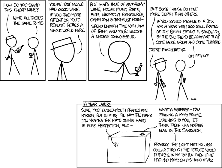
So, when traffic got worse people could only express “my life got worse”. And when Covid-19 caused shutdowns in the Spring of 2020, people again said “my life got worse”.
We only have one scale, and we resize our experience to fit. Thanksgiving is coming up. I would hope that we could take a day off from the 2020 year-of-doom talk and find something to be grateful for, because things actually can get worse. I also send out sincere condolences to all those who will be spending The Holidays apart from loved ones because of Covid-19.
Third Quarter Check-In: COVID and GDP
How have countries around the world fared so far in the COVID-19 pandemic? There are many ways to measure this, but two important measures are the number of deaths from the disease and economic growth.
Over the past few weeks, major economies have started releasing data for GDP in the third quarter of 2020, which gives us the opportunity to “check in” on how everyone is doing.
Here is one chart I created to try to visualize these two measures. For GDP, I calculated how much GDP was “lost” in 2020, compared with maintaining the level from the fourth quarter of 2019 (what we might call the pre-COVID times). For COVID deaths, I use officially coded deaths by each country through Nov. 15 (I know that’s not the end of Q3, but I think it’s better than using Sept. 30, as deaths have a fairly long lag from infections).

One major caution: don’t interpret this chart as one variable causing the other. It’s just a way to visualize the data (notice I didn’t try to fit a line). Also, neither measure is perfect. GDP is always imperfect, and may be especially so during these strange times. Officially coded COVID deaths aren’t perfect, though in most countries measures such as excess deaths indicate these probably understate the real death toll.
You can draw your own conclusions from this data, and also bear in mind that right now many countries in Europe and the US are seeing a major surge in deaths. We don’t know how bad it will be.
Here’s what I observe from the data. The countries that have performed the worst are the major European countries, with the very notable exception of Germany. I won’t attribute this all to policy; let’s call it a mix of policy and bad luck. Germany sits in a rough grouping with many Asian developed countries and Scandinavia (with the notable exception of Sweden, more on this later) among the countries that have weathered the crisis the best (relatively low death rates, though GDP performance varies a lot).
And then we have the United States. Oddly, the country we seem to fit closest with is… Sweden. Death rates similar to most of Western Europe, but GDP losses similar to Germany, Japan, Denmark, and even close to South Korea. (My groupings are a bit imperfect. For example, Japan and South Korea have had much lower death tolls than Germany or Denmark, but I think it is still useful.)
To many observers, this may seem strange. Sweden followed a mostly laissez-faire approach, while most US states imposed restrictions on movement and business that mirrored Western Europe. Some in the US have advocated that the US copy the approach of Sweden, even though Sweden seems to be moving away from that approach in their second wave.
Counterfactuals are hard in the social sciences. They are even harder during a public health crisis. It’s really hard to say what would have happened if the US followed the approach of Sweden, or if Sweden followed the approach of Taiwan. So I’m trying hard not to reach any firm conclusions. To me, it seems safe to say that in the US, public policy has been largely bad and ineffective (fairly harsh restrictions that didn’t do much good in the end), yet the US has (so far) fared better than much of Europe.
All of this could change. But let’s be cautious about declaring victory or defeat at this point.
Coda on Sweden Deaths
Are the officially coded COVID deaths in Sweden an accurate count? One thing we can look to is excess deaths, such as those reported by the Human Mortality Database. What we see is that Swedish COVID deaths do almost perfectly match the excess deaths (the excess over historical averages): around 6,000 deaths more than expected.
Some have suggested that the high COVID deaths for Sweden are overstated because Sweden had lower than normal deaths in recent years, particularly 2019. This has become known as the “dry tinder” theory, for example as stated in a working paper by Klein, Book, and Bjornskov (disclosure: Dan Klein was one of my professors in grad school, and is also the editor of the excellent Econ Journal Watch, where I have been published twice).
But even the Klein et al. paper only claims that “dry tinder” factor can account for 25-50% of the deaths (I have casually looked at the data, and these seems about right to me). Thus, perhaps in the chart above, we can move Sweden down a bit, bringing them closer to the Germany-Asia-Scandinavia group. Still, even with this correction, Sweden has 2.5x the death rate of Denmark (rather than 5x) and 5x the death rate of Finland (rather than 10x, as with officially coded deaths).
As with all things right now, we should reserve judgement until the pandemic is over (Sweden’s second wave looks like it could be pretty bad). The “dry tinder” factor (a term I personally dislike) is worth considering, as we all try to better understand the data on how countries have performed in this crisis.
