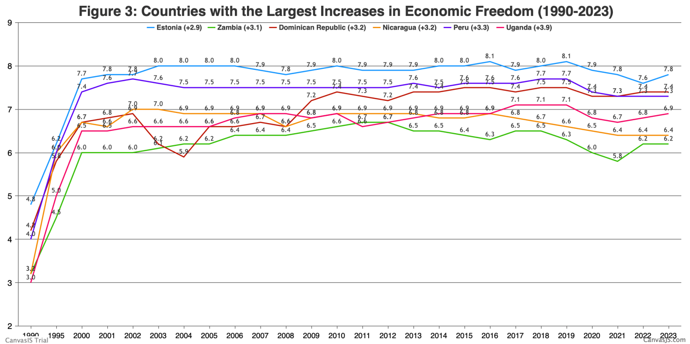
In September we covered the release of the Fraser Institute’s 2025 Economic Freedom of the World report. I said then:
The authors are doing great work and releasing it for free, so no complaints, but two additional things I’d like to see from them are a graphic showing which countries had the biggest changes in economic freedom since last year, and links to the underlying program used to create the above graphs so that readers could hover over each dot to identify the country
Well, now Matthew Mitchell of the Fraser Institute has done that:
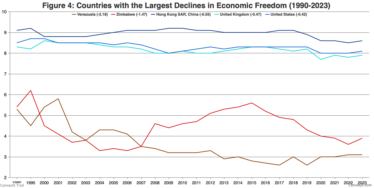
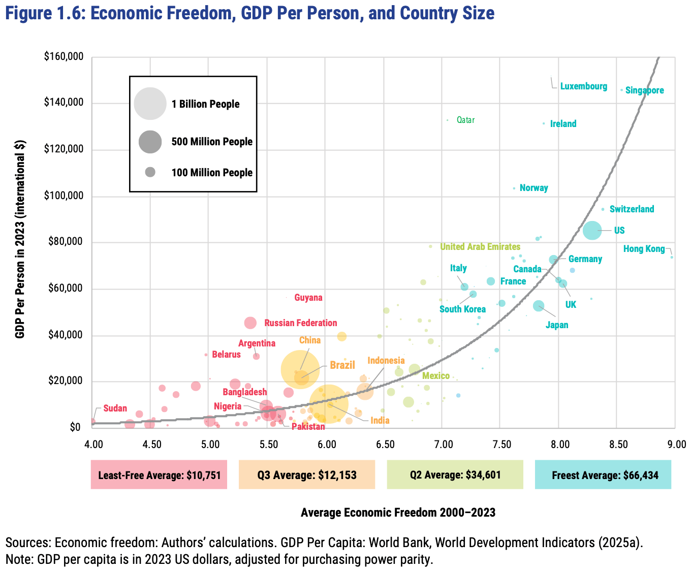
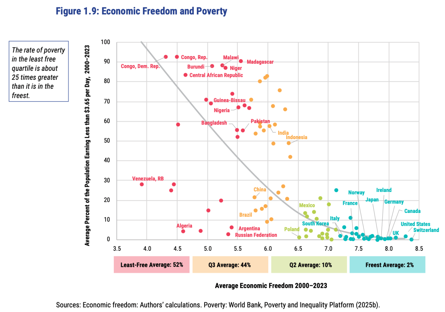
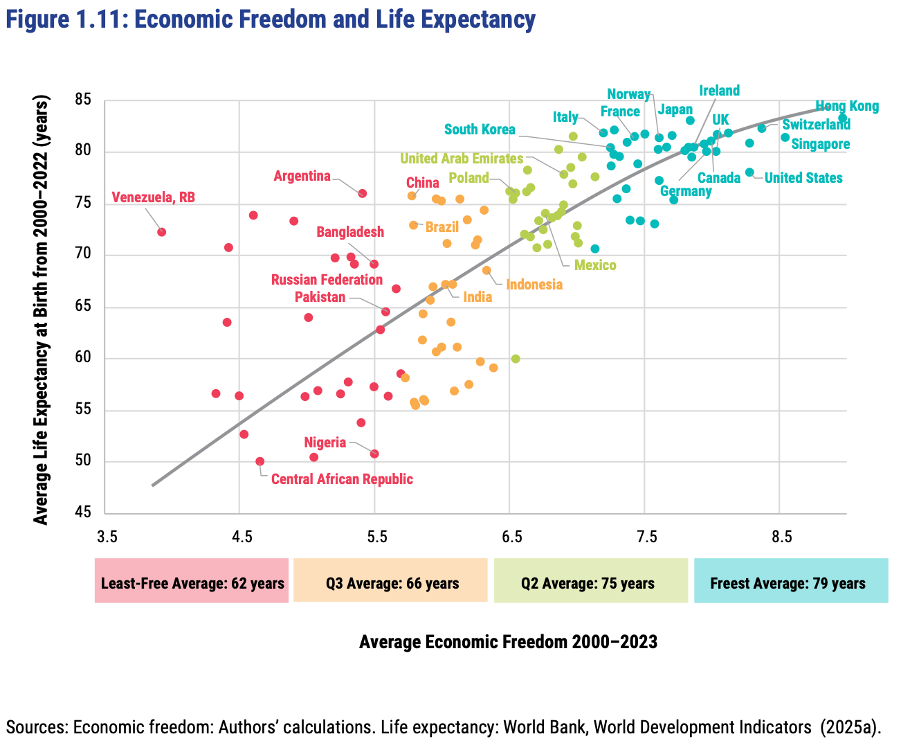
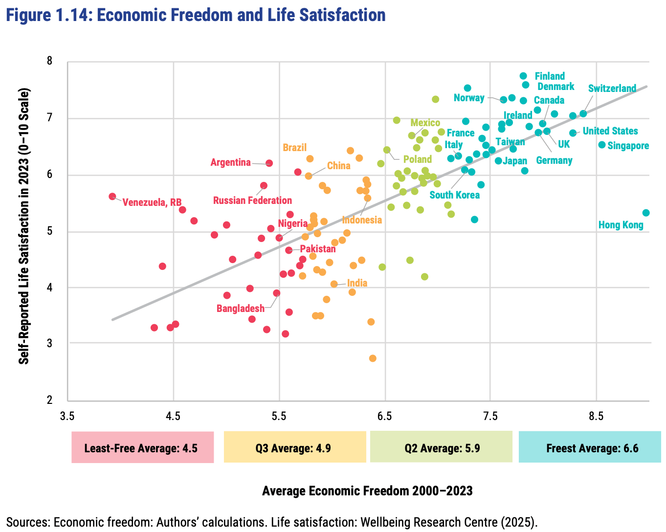
I can only post a screenshot of a scatterplot here, but if you click through to the Fraser report you can hover over any dot to see which country it represents: